
The pricing page is where a visitor decides whether your product is worth it.
It is also one of the hardest pages on the site to design. It has to show what each plan costs, explain the differences, point the right buyer to the right plan and leave the door open for a sales conversation, all without overwhelming anyone.
We looked at 14 live SaaS pricing pages from Linear, GitHub, Airtable, Gusto, Cloudflare and others, and broke each one down by how it is set up and what it does differently. Every page was checked on October 23, 2026.
The short version: most pricing pages use the same building blocks: three or four plans, a free option, a highlighted plan and a monthly or annual switch. The ones that stand out change one block to fit their buyer.
Draft a pricing page in Ploy.
What is a pricing page?
A pricing page is the page on a website that lists a product’s plans and prices. On a software site it usually shows each plan side by side, what each includes, and a button to start or to talk to sales.
A good pricing page answers three questions quickly:
- What does it cost? For a typical customer, without needing a sales call.
- Which plan is for me? Through plan names, descriptions, limits and a recommended plan.
- What do I do next? A clear button on every plan.
How we checked these 14
Each pricing page was loaded in a desktop browser at 1440 × 1100 on October 23, 2026. We recorded the plans, the prices as shown, the labels and the controls on the page. Prices change often, so treat the figures here as a snapshot of that day.
Left out: Slack, Notion and Calendly (their pages show logos or integrations of companies we do not feature), Zoom, Dropbox, Canva, Asana, monday.com, DocuSign and Stripe (they showed prices in Canadian dollars to our connection), Grammarly, 1Password and Superhuman (a cookie banner covered the plans), and Ramp, Zapier and PostHog (the first screen did not show the plans).
What the 14 showed:
| What we counted | Result |
|---|---|
| Offer a free plan | 9 of 14 |
| Highlight one plan with a label | 8 of 14 |
| Have a monthly or annual switch | 9 of 14 |
| Show an enterprise or custom plan with no price | 9 of 14 |
The free plans: Linear, GitHub, Airtable, Miro, Loom, Jira, Cloudflare, Sentry and ClickUp, plus Mercury’s $0 account (10 if you count Mercury). The labels: Airtable, Miro, Loom, Jira, Gusto, Deel and ClickUp, plus GitHub’s “Recommended” Enterprise plan.
Pricing pages with a clean plan table
1. Linear
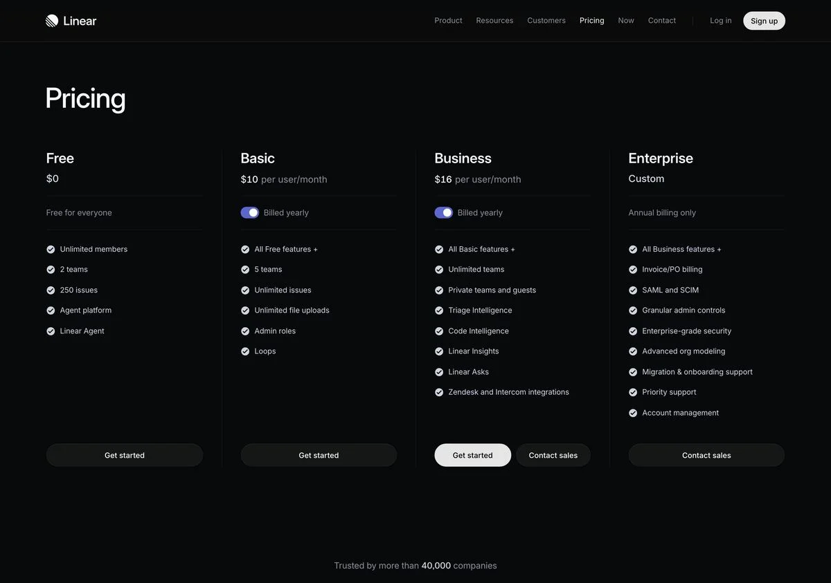
Example: Linear pricing
How it is set up: Four plans in one row, headed simply “Pricing”: Free at $0, Basic at $10 and Business at $16 per user per month billed yearly, and Enterprise at Custom with “Annual billing only”.
What stands out: The first bullets on each plan are its limits: 2 teams and 250 issues on Free, 5 teams on Basic, unlimited on Business. You can see exactly where you would hit the ceiling.
Steal this: Lead each plan with the limit that makes people upgrade. It answers “which plan do I need?” faster than a feature list.
2. GitHub
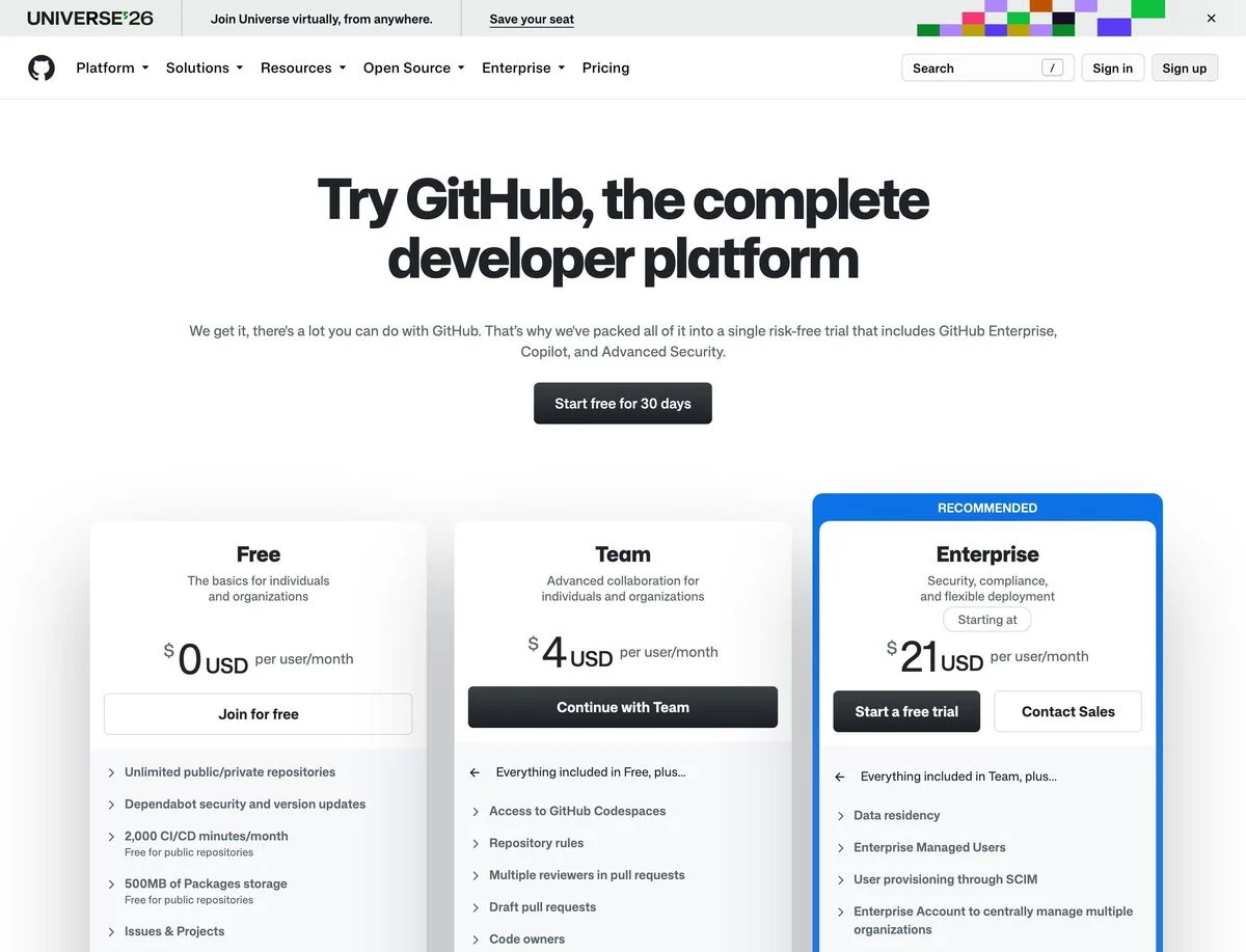
Example: GitHub pricing
How it is set up: Above the plans, one offer: “Start free for 30 days” with a trial that includes GitHub Enterprise, Copilot and Advanced Security. Below, three plans: Free at $0, Team at $4 and Enterprise from $21 USD per user per month.
What stands out: The page opens with a trial of everything rather than a choice. Only after that does it ask you to pick a plan.
Steal this: If choosing a plan is hard, let people try the top plan first. The decision gets easier once they have used it.
3. Airtable
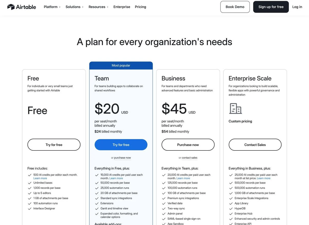
Example: Airtable pricing
How it is set up: Four plans: Free, Team, Business and Enterprise Scale. Team carries a “Most popular” banner and a filled button; the others have outlined buttons.
What stands out: Each paid plan shows both prices at once: Team is 24 billed monthly” right beneath.
Steal this: Show the annual and monthly price together. Visitors see the saving without having to flip a toggle.
4. Miro
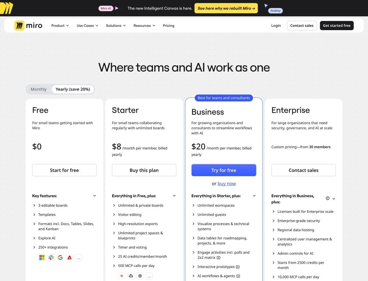
Example: Miro pricing
How it is set up: Four plans with a Monthly or Yearly toggle (“save 20%”): Free, Starter at $8 and Business at $20 per member per month billed yearly, and Enterprise with custom pricing from 30 members.
What stands out: The highlighted plan is labelled “Best for teams and consultants” rather than “Most popular”.
Steal this: Label the recommended plan by who it is for. It helps the right buyer pick it, instead of just following the crowd.
Pricing pages that change with your input
5. Loom
Example: Loom pricing
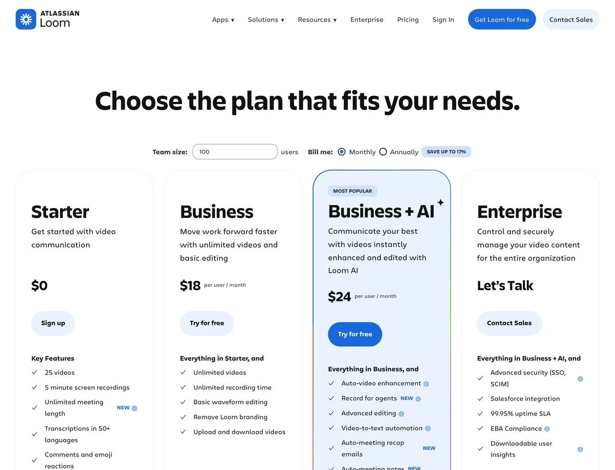
How it is set up: A team size box and a Monthly or Annually toggle (“save up to 17%”) above four plans: Starter, Business, Business + AI and Enterprise. Business + AI is marked “Most popular”.
What stands out: Enterprise shows no price, just “Let’s Talk”. The AI features get their own plan rather than being spread across all of them.
Steal this: If AI is a separate value for you, give it its own plan name. “Business + AI” makes the upgrade obvious.
6. Jira
Example: Jira pricing
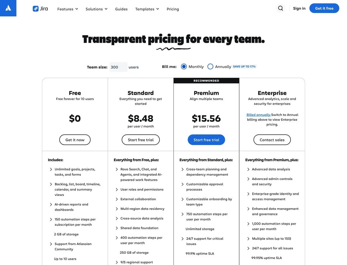
How it is set up: “Transparent pricing for every team.” A team size box and billing toggle sit above four plans: Free for up to 10 users, Standard, Premium (marked “Recommended”) and Enterprise.
What stands out: Prices update with the number of users you enter. Enterprise pricing only appears once you switch to annual billing, and the page says so.
Steal this: Let visitors type their team size and see their real price. It saves them a calculation and a sales call.
7. Gusto
Example: Gusto pricing
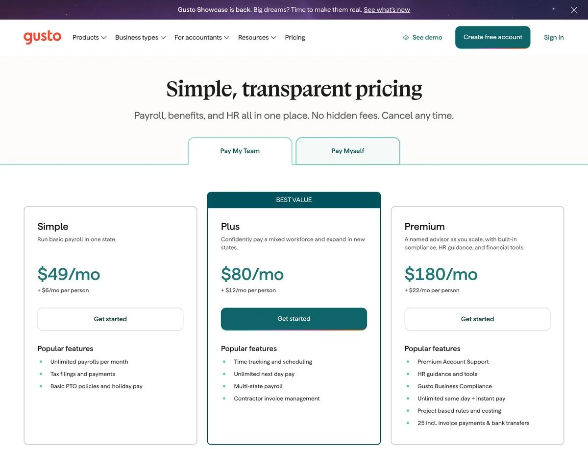
How it is set up: “Simple, transparent pricing” with “No hidden fees. Cancel any time.” A switch at the top toggles between “Pay My Team” and “Pay Myself”. Three plans: Simple at $49 a month plus $6 per person, Plus at $80 plus $12 (marked “Best value”), and Premium at $180 plus $22.
What stands out: The switch is by type of customer, not billing period. A one-person business sees different plans from an employer.
Steal this: If different customers need different plans, let them say which customer they are before they see a price.
8. Cloudflare
Example: Cloudflare pricing
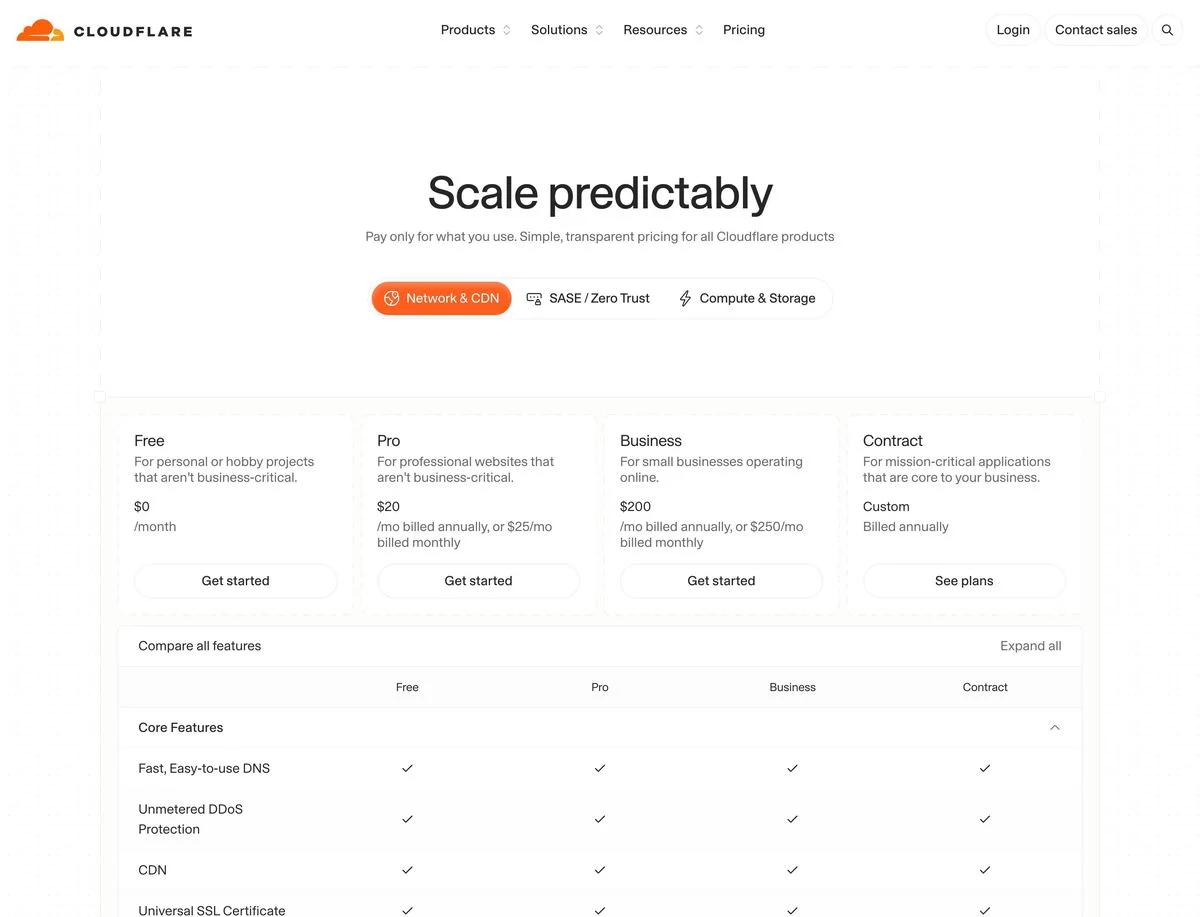
How it is set up: “Scale predictably” and “Pay only for what you use.” Tabs for three product lines: Network and CDN, SASE and Zero Trust, and Compute and Storage. Under the first tab: Free, Pro, Business and Contract.
What stands out: Each plan states both billing options in one line: Pro is “$20/mo billed annually, or $25/mo billed monthly”. A full feature comparison sits directly beneath.
Steal this: If you sell several products, give each its own tab on one pricing page rather than a separate page for each.
Test your plan layout before launch
Draft plan cards, a monthly or annual switch and one clear start button in Ploy, then compare versions on your own pricing page.
Pricing pages built around the job or the usage
9. Deel
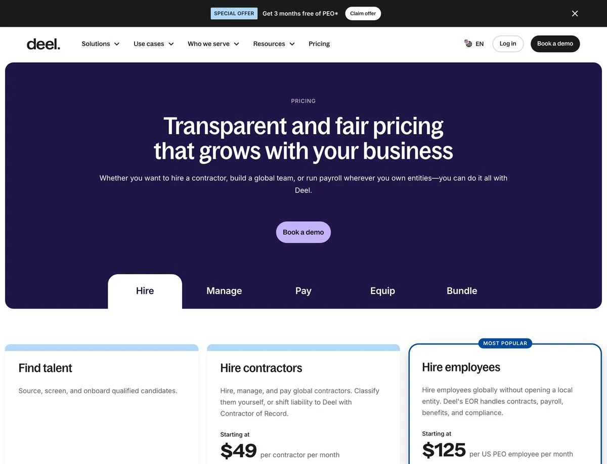
Example: Deel pricing
How it is set up: “Transparent and fair pricing that grows with your business”, with tabs for Hire, Manage, Pay, Equip and Bundle. Under Hire: find talent, hire contractors from $49 per contractor per month, and hire employees (marked “Most popular”) from $125 per US PEO employee per month.
What stands out: Pricing is organized by the job the customer wants done, and each price is per worker, using “Starting at”.
Steal this: When customers buy for different jobs, organize the page by job. A company hiring a contractor does not need to read about payroll.
10. Intercom
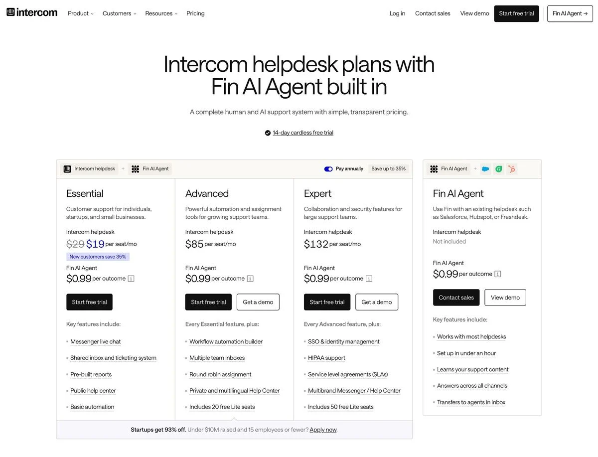
Example: Intercom pricing
How it is set up: Three helpdesk plans, Essential, Advanced and Expert, priced per seat per month, with a toggle to pay annually and “save up to 35%”. A 14-day cardless free trial is mentioned above the plans.
What stands out: Each plan has two prices: one per seat for the helpdesk, and $0.99 per outcome for the Fin AI Agent. The page shows a seat price and a usage price side by side.
Steal this: If part of your product is priced on results, show that price on every plan, in the same place, so the total cost is clear.
11. Typeform
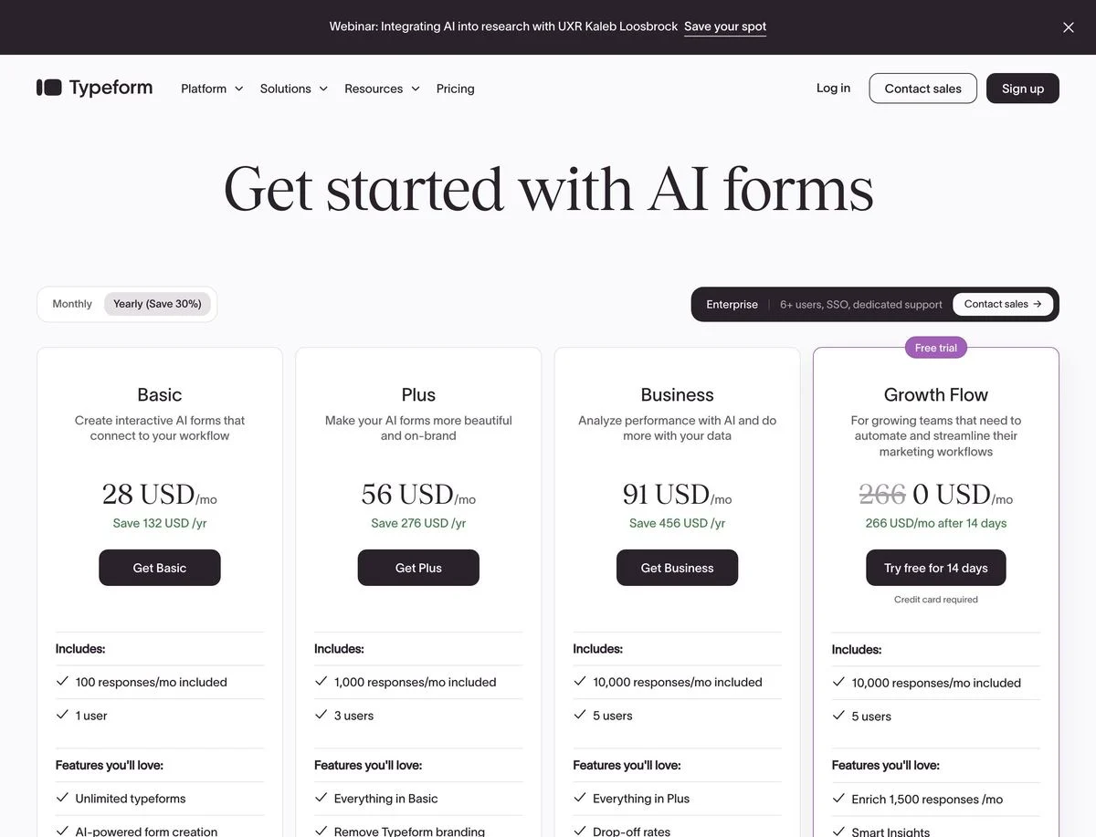
Example: Typeform pricing
How it is set up: A Monthly or Yearly toggle (“save 30%”) above four plans: Basic, Plus, Business and Growth Flow. Enterprise sits in a separate bar: “6+ users, SSO, dedicated support”.
What stands out: With yearly selected, every plan shows the saving in dollars: Basic at 28 USD a month says “Save 132 USD / yr”. The main limit on each plan is responses per month.
Steal this: Show the annual saving as an amount, not just a percentage. A dollar figure is easier to weigh.
12. Sentry
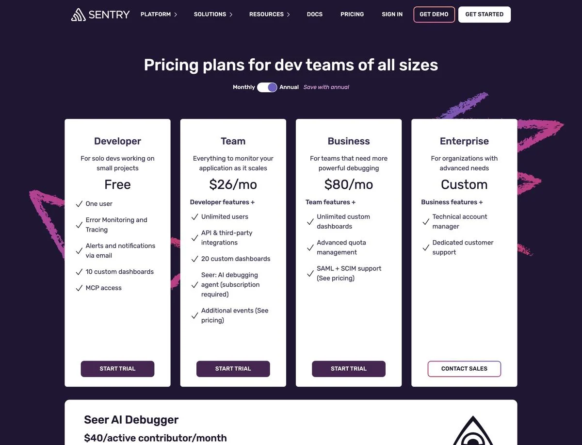
Example: Sentry pricing
How it is set up: “Pricing plans for dev teams of all sizes”: Developer (free, one user), Team at $26 a month, Business at $80 a month and Enterprise (custom). Below, its AI debugger, Seer, is priced separately at $40 per active contributor per month.
What stands out: The AI product is sold as an add-on to any paid plan, with its own box and its own price, rather than bundled into a tier.
Steal this: An add-on box below the plans lets you price a new product without redesigning the whole table.
Pricing pages that remove the risk
13. ClickUp
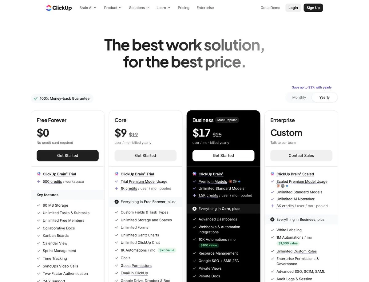
Example: ClickUp pricing
How it is set up: “The best work solution, for the best price.” A “100% money-back guarantee” badge and “Save up to 33% with yearly” sit above four plans: Free Forever, Core, Business (marked “Most popular”) and Enterprise.
What stands out: The yearly prices show the regular price struck through: Core at $9 instead of $12, Business at $17 instead of $25.
Steal this: A money-back guarantee next to the plans removes the biggest risk of choosing wrong.
14. Mercury
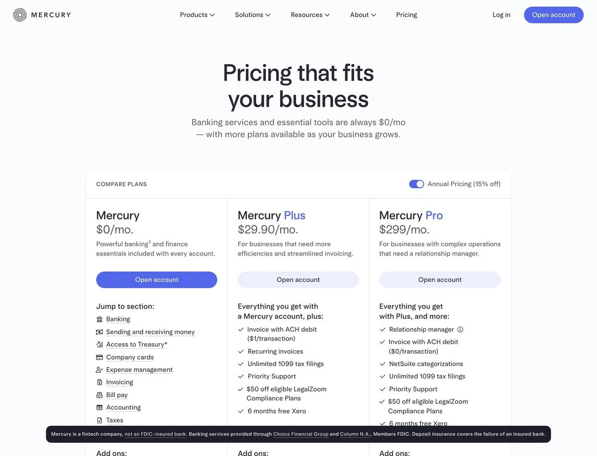
Example: Mercury pricing
How it is set up: “Pricing that fits your business”: banking and essential tools “are always $0/mo”. Three plans side by side: Mercury at $0, Mercury Plus at $29.90 and Mercury Pro at $299 a month, with an “Annual Pricing (15% off)” toggle.
What stands out: Add-ons are listed under each plan with their own prices, and two were “waived until Dec 31, 2026”. A disclaimer at the bottom of the screen explains that Mercury is a fintech company, not a bank.
Steal this: Make the free plan the default and put it first. “Always $0” tells visitors they can start without a decision.
What the best pricing pages have in common
- Three or four plans. Every page here shows three or four main plans. More than that and the choice gets hard.
- A recommended plan. Eight of 14 label one plan, with “Most popular”, “Recommended”, “Best value” or who it is for.
- The limit that matters, up front. Linear’s issue limit, Typeform’s responses, Sentry’s users. Visitors pick a plan by the limit they will hit.
- A price for most buyers, a conversation for the biggest. Nine of 14 have an enterprise plan with no price, but every one also shows prices for its other plans.
- One way to lower the risk. A free plan, a free trial, a money-back guarantee or “cancel any time”.
How to design a pricing page
- Keep it to three or four plans. Put anything else in add-ons, like Sentry’s AI debugger.
- Name each plan for who it is for, or add one line that says so.
- Lead each plan with its key limit, then the features.
- Recommend one plan with a label and a stronger button.
- Show annual and monthly prices clearly, either with a switch or side by side like Airtable and Cloudflare.
- Add a price calculator if price depends on team size, like Jira and Loom.
- Answer objections near the plans: free trial, money-back guarantee, cancel any time.
- Test it. Small changes to labels, order and defaults can move which plan people choose.
Pricing pages are a natural place to experiment, because the page is visited by people already close to a decision. A/B testing your plan labels, order and default billing period shows what actually moves sign-ups. With Ploy’s AI landing page builder, a new version of the page is a chat instruction against your existing brand components. For the pages that lead visitors to pricing, see our SaaS landing page examples and best SaaS websites.
Turn these examples into your own pricing page
Start with your plan names and limits, then build the page with your existing brand components in Ploy.