Most SaaS landing page roundups are a wall of screenshots. You scroll, you nod, you close the tab, and nothing about your own page changes.
The problem is that a screenshot does not tell you what a page is trying to do. A page built to start a free trial and a page built to book an enterprise demo can look almost identical and work nothing alike. One is trying to get an email address in four seconds. The other is trying to disqualify you.
So we opened 15 SaaS landing pages, counted exactly what each one asks the visitor for, and wrote down the mechanic doing the work. Every number below was counted off the page itself.
The short version: the ask is the design decision. Everything else — the headline, the screenshot, the gradient — is downstream of how many fields you put in front of someone and what you give them in return.
Build a SaaS landing page around one clear action.
What counts as a SaaS landing page
A landing page is a page with one job. A homepage has several.
That distinction matters more than it sounds, because it changes what you measure. A homepage is judged on whether people find their way somewhere useful. A landing page is judged on whether people do the one thing it asks.
In practice, SaaS companies run six kinds, and all six are in this list:
- Free trial and signup pages — the ask is an account, usually from a paid click or a nav button.
- Demo request pages — the ask is a form that routes to sales.
- Gated content pages — the ask is an email in exchange for something specific.
- Programme and offer pages — the ask is an application, and eligibility is the point.
- Use-case and solution pages — the ask is softer, because these pages also have to rank.
- Contact sales pages — the ask is qualification.
If you want whole websites rather than single pages, we broke down 20 SaaS websites separately, and a wider set of landing page examples across consumer and B2B.
How we checked these pages
Each page was loaded in a desktop browser at 1440 × 900 in early October 2026. For every one we counted the visible form fields at the first step, what the primary button says, whether a navigation menu is in view, and whether any proof — logos, review scores, customer numbers — appears before you scroll.
Counting was done by reading the rendered page. We ran an automated field count across all 26 pages we captured as a cross-check, and it was wrong often enough to be worth saying out loud: it missed forms served inside an iframe entirely, it counted a video player’s two sliders as form fields, and its header-link count reported 42 links on a page showing nothing but a logo. Where the automation and the page disagreed, the page won.
What the 15 pages showed:
| What we counted | Result |
|---|---|
| Form fields at the first step | 0 to 9 |
| Pages asking for one field or none | 8 of 15 |
| Pages asking for seven or more | 5 of 15 |
| Pages with no navigation menu in view | 10 of 15 |
| Pages showing proof above the fold | 5 of 15 |
Two patterns are worth pulling out before the list.
All four free trial pages remove the navigation. All three use-case pages keep it. That is not inconsistency, it is intent: a trial page is the end of a funnel, and a use-case page is a search landing page that also has to let people browse.
Proof above the fold is more common here than on homepages, but it is still the minority. A third of these landing pages show a review score, a customer count or a named customer before the scroll, against three of the twenty SaaS homepages we measured separately. A landing page has one chance to be believed, and ten of these fifteen still spend the fold on a promise rather than evidence.
Free trial and signup pages
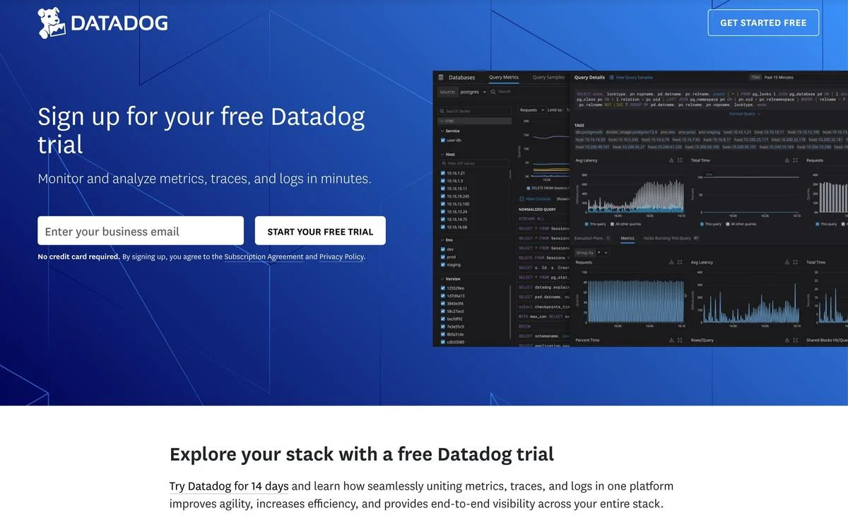
1. Datadog: one field, and nothing else to click
Example: Datadog free trial
The ask: One field — a business email — and a button that reads “Start your free trial.”
The mechanic: The navigation is gone. There is no menu, no footer links in view, no second offer. The only interactive things above the fold are the field and the button, with “No credit card required” set directly underneath.
Watch out for: A one-field form moves the qualification problem rather than solving it. You will get the signup and then have to work out who it was.
Steal this: If a page is the destination of a paid click, delete the navigation. Every link you keep is a way to leave without converting.
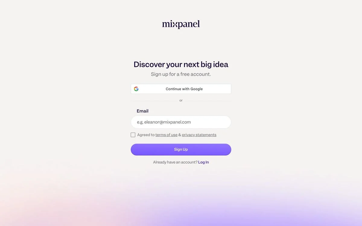
2. Mixpanel: make the form the fallback
Example: Mixpanel signup page
The ask: A “Continue with Google” button, then — below a divider — one email field and a terms checkbox.
The mechanic: The page is almost empty. A wordmark, a six-word headline, “Sign up for a free account,” and the two routes in. Putting single sign-on above the divider makes the one-click path the default and the typed path the exception, which is the right order when most of your buyers are already signed into a work Google account.
Watch out for: Single sign-on is only an advantage if your buyers use those accounts at work. For a developer tool, GitHub will often beat Google.
Steal this: Put the fastest signup method above the form, not below it. The form is the fallback, not the main event.
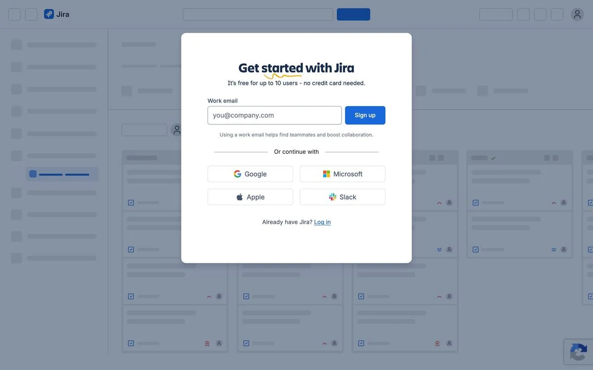
3. Jira: say why you want the work email
Example: Jira free signup
The ask: One work email field, plus four single sign-on options — Google, Microsoft, Apple and Slack.
The mechanic: Two lines are doing the work. Above the field: “It’s free for up to 10 users – no credit card needed,” which answers the price question before it is asked. Below it: “Using a work email helps find teammates and boost collaboration,” which explains why they want a work address instead of a personal one. The whole card floats over a blurred screenshot of the product you are about to get.
Watch out for: Four sign-on options is close to the limit. Past that the buttons become a decision rather than a shortcut.
Steal this: When you ask for something people hesitate over — a work email, a phone number, a company size — put the reason next to the field. One sentence recovers more completions than a redesign.
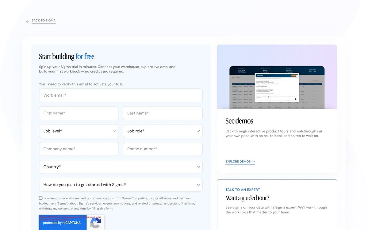
4. Sigma: the long form on a free trial
Example: Sigma free trial
The ask: Nine fields — work email, first and last name, job level, job role, company name, phone number, country, and how you plan to get started — plus a marketing consent checkbox.
The mechanic: This is the counter-example in the set, and it is deliberate. Sigma sells to data teams with real infrastructure, so the form doubles as a qualifier. The page also hedges: a side rail offers self-guided product tours with “no call to book and no rep to wait on,” and a second option to talk to an expert. Three routes, one page.
Watch out for: Nine fields on something called a free trial will cost you volume. That is only the right trade if your sales team genuinely works every signup.
Steal this: If you must ask a lot, give the impatient visitor somewhere else to go on the same page. The product tour link is doing real work here.
Build the page around the ask
Use Ploy to draft an on-brand SaaS landing page that gives its form and supporting proof a clear place.
Demo request pages
5. Wiz: one field at a time
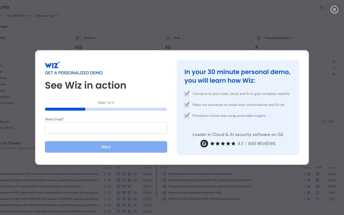
Example: Wiz demo request
The ask: One field, labelled “Step 1 of 3.”
The mechanic: The form is a modal over a blurred product screenshot, and the progress bar is the whole trick — it tells you the form is short and it tells you there is more, which is more honest than a one-field form that unfolds into six. Beside it, a panel lists three things the 30-minute demo will cover, with a G2 score of 4.7 from 845 reviews underneath.
Watch out for: Multi-step forms only help if step one is genuinely the easiest field. Putting phone number first defeats the point.
Steal this: Show the step count. “Step 1 of 3” sets an expectation that a long scrolling form never does.
6. Greenhouse: put the numbers next to the form
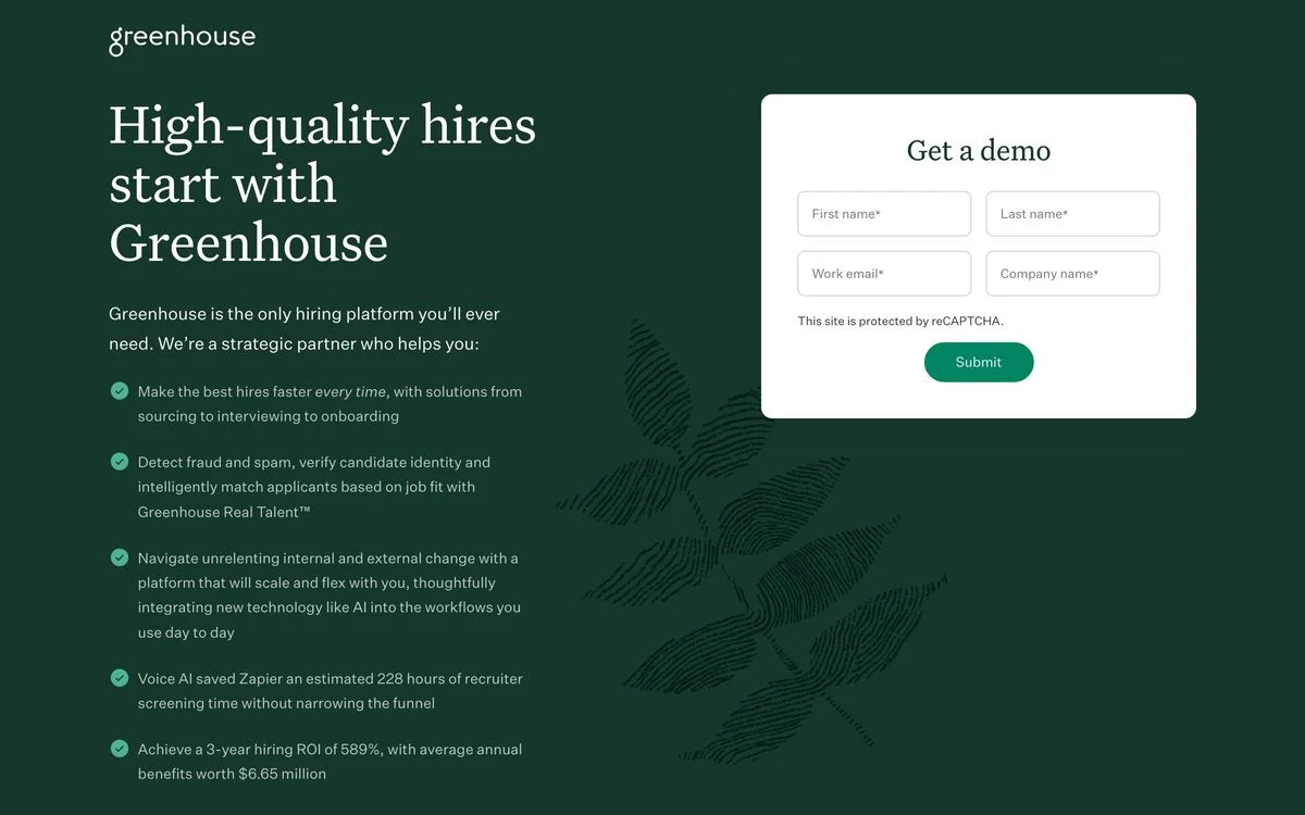
Example: Greenhouse demo page
The ask: Four fields — first name, last name, work email, company name.
The mechanic: The left column is four specific claims, not adjectives: that their voice AI saved one customer an estimated 228 hours of recruiter screening time, and that customers achieve a three-year hiring ROI of 589% with average annual benefits worth $6.65 million. The form sits to the right of those numbers, so the justification and the ask are on screen together.
Watch out for: Numbers this specific need a source behind them. If a prospect asks where 589% came from, someone in sales has to have an answer.
Steal this: Replace the benefit bullets next to your form with the three most specific outcome numbers you can defend.
7. Vanta: let people tell you what they came for
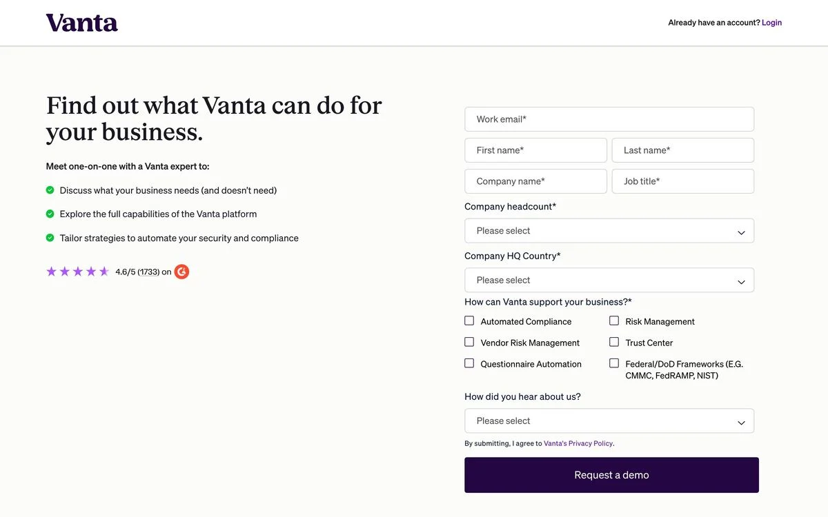
Example: Vanta demo page
The ask: Eight fields — work email, first and last name, company name, job title, company headcount, company HQ country, and how you heard about them — plus a grid of six checkboxes asking how Vanta can support your business, from automated compliance to Federal and DoD frameworks.
The mechanic: That checkbox grid is the interesting part. It does the routing a dropdown cannot, because a prospect can tick three things at once, and it tells the rep what the call is about before it starts. The page pairs it with a short agenda — “Meet one-on-one with a Vanta expert to” — and a 4.6 out of 5 rating from 1,733 reviews. Navigation is reduced to the logo and a login link.
Watch out for: Eight fields and six checkboxes is one of the longest asks here. It works because compliance buying is scoped, not impulsive; on a self-serve product the same form would be a wall.
Steal this: Replace your “what are you interested in” dropdown with checkboxes. Multi-select tells you more, and it lets the prospect describe a messy situation accurately.
8. Customer.io: proof on the left, form on the right
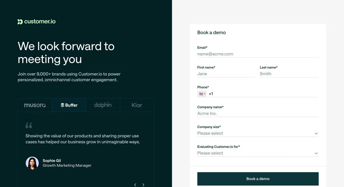
Example: Customer.io demo page
The ask: Seven fields, including company size and a dropdown asking what you are evaluating Customer.io for.
The mechanic: The left half carries the credibility — “Join over 9,000+ brands,” a logo row, and a named customer quote with a photograph and job title. The right half is pure form. Splitting the page this way means the proof is still on screen while someone is deciding whether to finish the seventh field.
Watch out for: A quote only works if the person is identified. An anonymous “Growth Marketer at a leading brand” is worth less than nothing.
Steal this: Keep your proof in the viewport beside the form, not stacked above it where it scrolls away mid-fill.
We collected 25 more ways companies do this in our testimonial examples roundup.
9. Fivetran: the form with nothing to balance it
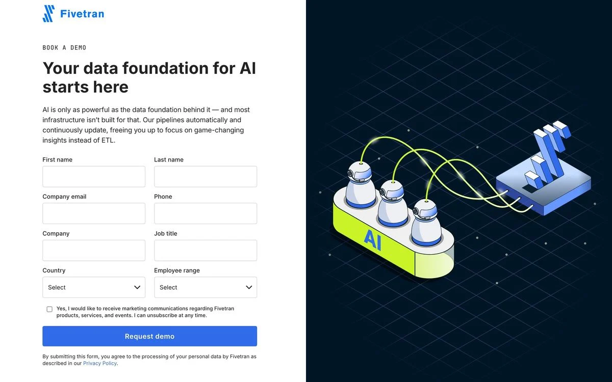
Example: Fivetran demo page
The ask: Eight fields — first and last name, company email, phone, company, job title, country, employee range — plus a marketing consent checkbox.
The mechanic: The headline does the positioning work: “Your data foundation for AI starts here,” with two sentences on why pipelines matter for AI. The navigation is stripped back to the logo.
Watch out for: This is the one page in the set where a long form sits next to an illustration rather than next to proof. Compare it with Greenhouse or Vanta, where the space beside the form argues for filling it in. An illustration is decoration; a number is a reason.
Steal this: If your form is long, the space next to it is the most valuable real estate on the page. Do not spend it on a graphic.
Gated content
10. Dialpad: a library behind one small gate
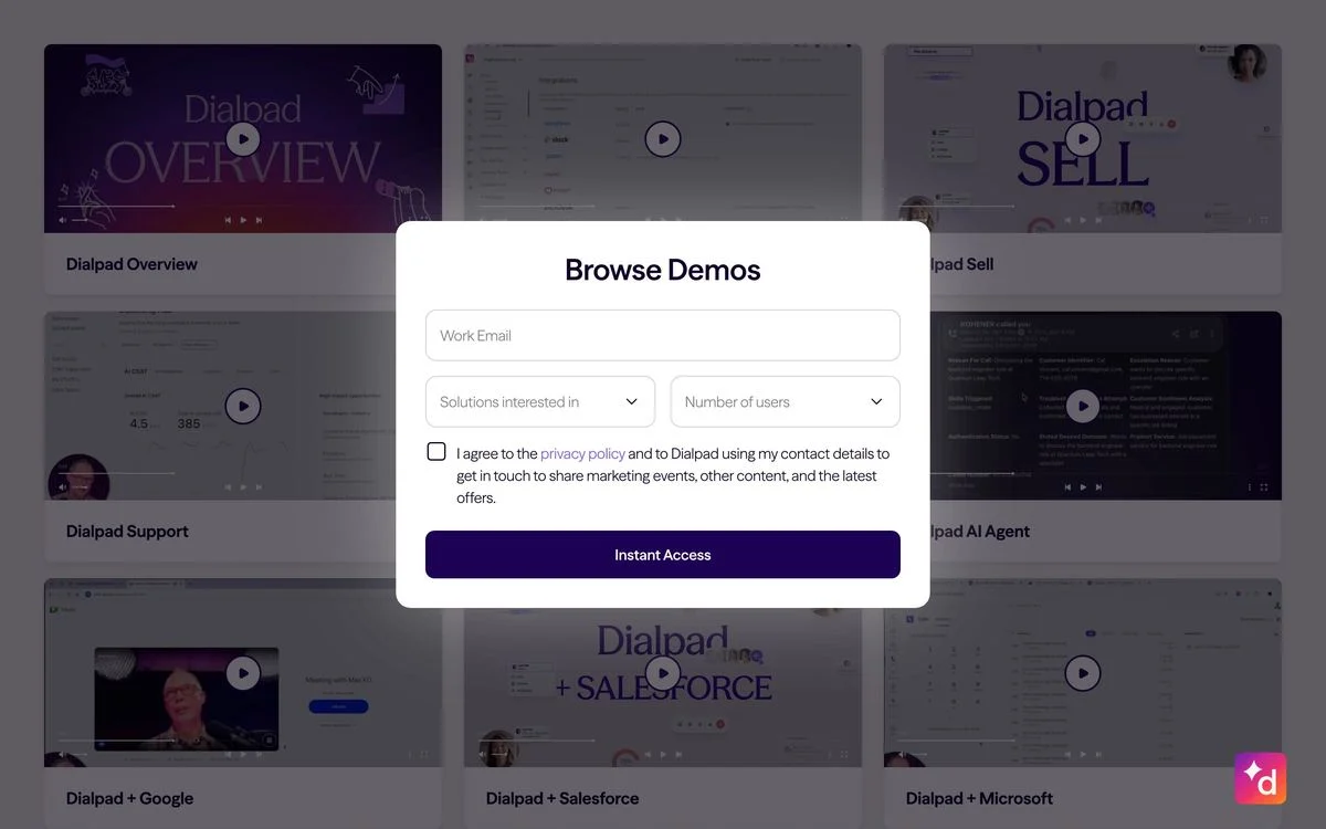
Example: Dialpad demo library
The ask: Three fields — work email, which solution you are interested in, and number of users — plus a consent checkbox. The button says “Instant Access.”
The mechanic: Behind the modal sits a visible grid of demo videos by product and integration. You can see exactly what you are unlocking before you decide whether it is worth an email, and the two qualifying dropdowns do segmentation work that a bare email capture cannot.
Watch out for: “Instant Access” is a promise. If the next step is a confirmation email and a wait, the page has lied and the bounce comes later.
Steal this: Show the content behind the gate. A blurred or hidden offer converts worse than a visible one.
Programme and offer pages
11. Linear: two buttons for two different readers
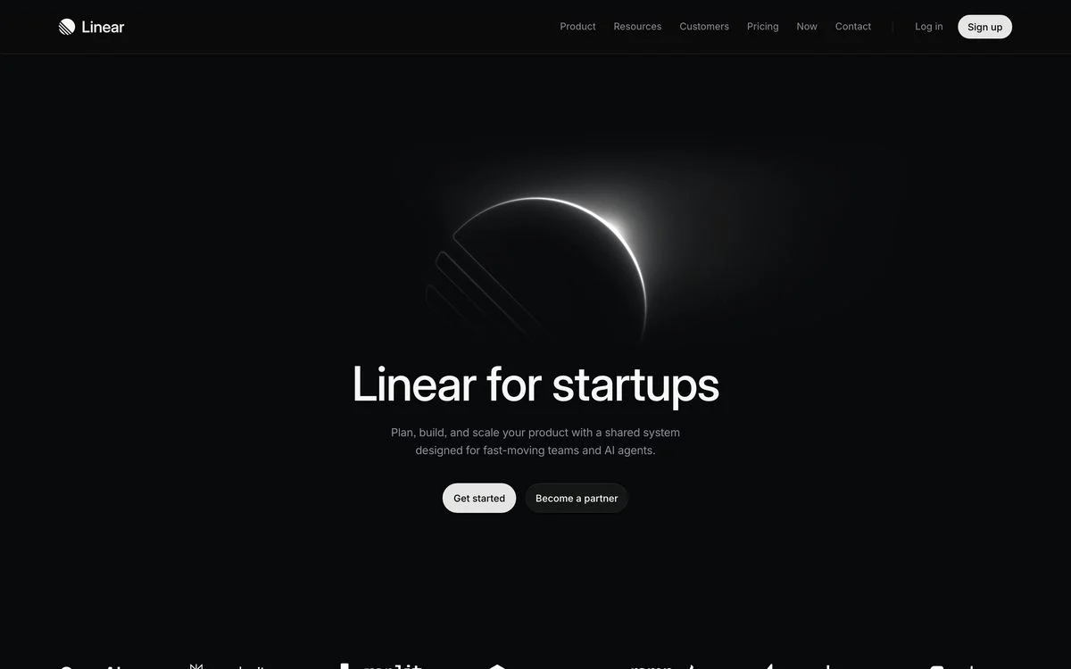
Example: Linear for startups
The ask: No form above the fold at all — two buttons, “Get started” and “Become a partner.”
The mechanic: One page, two audiences. Startups take the first button; accelerators and investors take the second, which leads to a partner application further down the page asking for name, email, role, organisation, website and a description. The eligibility rules — who qualifies, what happens if you are over 50 employees, whether you can apply without a partner — are answered in a questions section rather than guarded at the form, so nobody fills in six fields to discover they were never eligible.
Watch out for: Two equally weighted buttons split attention. This works because the two audiences are genuinely different people, not two moods of the same visitor.
Steal this: Put eligibility in a Q&A above the form, not in a rejection email. Disqualifying people early is a feature on an offer page.
Use-case and solution pages
12. Sentry: two buttons for two buying motions
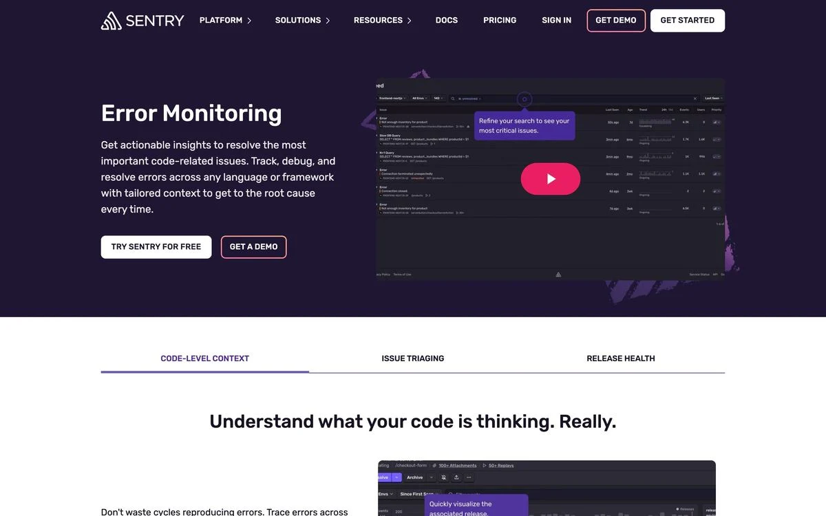
Example: Sentry error monitoring
The ask: Two CTAs side by side — “Try Sentry for free” and “Get a demo.”
The mechanic: The page names a job rather than a product category: error monitoring, with a product screenshot showing the actual interface. Below the hero, three tabs split the page into code-level context, issue triaging and release health, so one URL serves three different searches.
Watch out for: Two equal buttons means no recommendation. If most of your revenue comes through self-serve, the trial button should be visually heavier than the demo button.
Steal this: On a use-case page, keep both motions available — someone searching a problem term may be a solo developer or a platform team, and you do not know which.
13. ClickUp: name the team in the eyebrow
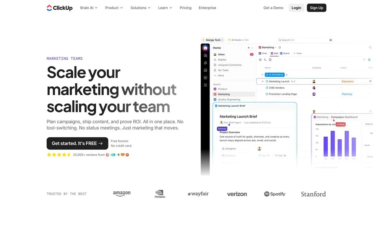
Example: ClickUp for marketing
The ask: One button — “Get started. It’s FREE” — with “Free forever. No credit card.” directly beneath it.
The mechanic: A small eyebrow label reads “Marketing teams,” so a visitor knows in one word that the page is for them. The headline then states the tension plainly: scale your marketing without scaling your team. Underneath the button sit a star rating with a review count and a logo wall.
Watch out for: Audience pages multiply fast. Six teams means six pages that all need maintaining, and a thin variant that only swaps the noun will not rank.
Steal this: Label the audience above the headline. It costs two words and it stops the wrong visitor reading on.
This is the pattern that scales into programmatic landing pages once you have more than a handful.
14. Remote: one promise, one button
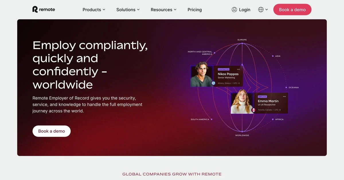
Example: Remote employer of record
The ask: A single “Book a demo” button. No form, no second CTA.
The mechanic: The hero is three adverbs — compliantly, quickly, confidently — against a globe showing regional coverage with named employees attached to specific countries. For a category where the buyer’s fear is legal risk in a country they do not understand, showing the map is the argument.
Watch out for: A single CTA on a service this considered means the page has to carry the whole objection load further down. The hero cannot be the entire page.
Steal this: When you sell against a fear, illustrate the coverage rather than describing it.
Contact sales
15. Plaid: ask the question that routes the lead
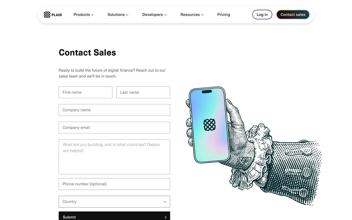
Example: Plaid contact sales
The ask: Seven fields, including an open text box reading “What are you building, and in which countries? Details are helpful!”
The mechanic: That one open question does more routing than three dropdowns would. It tells Plaid the use case and the regulatory geography in the prospect’s own words, which is exactly what their sales team needs to triage. Phone number is explicitly marked optional, which lowers the cost of the longest field on the page.
Watch out for: Open text fields produce unusable answers if the prompt is vague. “Tell us about your project” gets you nothing; naming the two things you want gets you both.
Steal this: Replace one dropdown with one specific open question, and mark your optional fields optional.
What the 15 have in common
Strip out the design and the same decisions keep showing up.
- The ask matches the motion. Self-serve products ask for one field or none. Products with a scoped implementation ask for seven or more and use the form to qualify.
- The space next to the form is argument space. The pages that ask for the most put their strongest proof directly beside the fields. The one that puts an illustration there is the weakest page in the set.
- Proof is specific or it is absent. Review scores with counts, named customers with job titles, numbers with units. No page in this set uses a vague trust badge.
- Trial pages remove the exits. All four strip the navigation.
- Use-case pages keep them. All three are also search landing pages, and a search visitor who is not ready to convert should still be able to browse.
- The best pages explain the ask. Jira says why it wants a work email, Wiz says how many steps are left, Dialpad shows what is behind the gate, Linear publishes who is eligible.
How to decide how many fields to ask for
A short checklist that follows from the 15:
- Will sales call every submission? If no, you do not need job title and phone number. Ask for the email and enrich.
- Is this the destination of a paid click? Then remove the navigation and the second offer.
- Does the page need to rank? Then keep the navigation, and write enough on it to deserve the ranking.
- Is the form longer than four fields? Then put proof beside it, and consider splitting it into steps with a visible counter.
- Can the visitor see what they get? Show the demo library, the agenda, or the product before asking.
- Will some people be ineligible? Say so before the form, not after it.
For what to expect once it is live, we keep a running set of landing page conversion rates and conversion benchmarks by industry rather than quoting a single number, because the spread between a trial page and an enterprise demo page is enormous.
How to build pages like these
The constraint on most SaaS teams is not knowing what a good landing page looks like. It is that every variant needs a developer, so the page you launched with is the page you keep.
- Pick the page type from the list above — trial, demo, gated content, offer, use-case, contact.
- Decide the ask before the design. The number of fields determines the layout, not the other way round.
- Build it in your own components. With Ploy’s AI landing page builder, a new variant is a chat instruction against your existing brand, published to your site or a subdomain.
- Test the ask, not the button colour. Field count and form placement move numbers; A/B testing the headline and the form length is where the wins are.
Build your next SaaS landing page in Ploy
Draft a trial, demo or use-case page in your existing brand components, with one clear next step.