A testimonial section is the easiest thing to add to a page and the easiest thing to skip past. Three quotes, three headshots, three adjectives. Game changer. Love this product. Best decision we ever made.
Nobody reads them, because there is nothing in them to read.
So we went looking for testimonial examples that do more work than that. We took the social proof block off 25 sites, from Ramp and Stripe to AG1 and Oura, and recorded what is actually in each one: who gets named, what gets quantified, whether anyone can filter it, and how far down the page it sits.
The customer testimonial examples that came back are more varied than the usual row of quote cards. A searchable proof library. A story index you can scan like a spreadsheet. A rating badge sitting next to the email field. A page that asks you for a testimonial while it shows you everyone else’s.
The short version: the best social proof is specific about who said it, what changed, and by how much. Most of the proof we measured is missing at least two of those three.
Turn stronger social proof into an on-brand page
What we found in 25 testimonial sections
Here is what showed up when we compared them side by side:
- Only 9 of 25 name a person. The rest attribute proof to a company, a review site, a publication, or nobody at all. A named human with a job title is rarer than it should be.
- Only 4 of 25 put a number in or beside the quote. Atlassian, Gusto, Calendly, and Asana do it. Everywhere else the customer says the product is great without saying what changed.
- 6 of 25 outsource credibility to review sites. G2, Capterra, Software Advice and app store ratings do the talking, because a score a company can’t edit reads as more honest than a quote it chose.
- 5 of 25 let you filter or search the proof. Filters by industry, company size, role and use case turn a testimonial wall into something a buyer can actually use. Gong goes furthest and publishes a card with a complaint in it.
- Only 3 use video, and the caption always carries the claim. In all three cases the sentence next to the player is doing the selling, not the video.
- On homepages, proof sits a median 43% down the page. Only two of the nine homepages put it in the first two screens: Rippling, beside the signup field, and Olipop, on its product cards.
How we reviewed them: in September 2026 we loaded each page in a desktop browser at 1440 pixels wide, scrolled the whole page so lazy sections loaded, then captured the social proof block itself rather than the top of the page. For each one we recorded the format, the attribution (name, role, company, or none), whether a number appeared, whether the proof could be filtered or searched, and how far down the page the block sat. Pages change often, so check the live version before copying anything.
25 testimonial examples, grouped by format
| Format | Use it when | Examples |
|---|---|---|
| Quote testimonials | You have named customers who will go on record | Ramp, Granola, Attio, Miro, Loom, Headspace, Atlassian |
| Ratings and badges | Third parties already rate you | Brex, Rippling, monday.com, Descript, Olipop |
| Numbers as proof | Your scale or usage is the argument | Zapier, Attio, PostHog |
| Customer stories | The buyer needs detail, not adjectives | Stripe, Gusto, Linear, Zendesk, Gong |
| Video testimonials | The customer is better on camera than on paper | Calendly, Asana |
| Press and reviews | Other people wrote about you already | Oura, AG1 |
| Collecting in public | You want more proof than you have | Superhuman |
Quote testimonial examples
The classic format. What separates these from the usual three-card row is attribution: a name, a job title, and a company the reader recognizes.
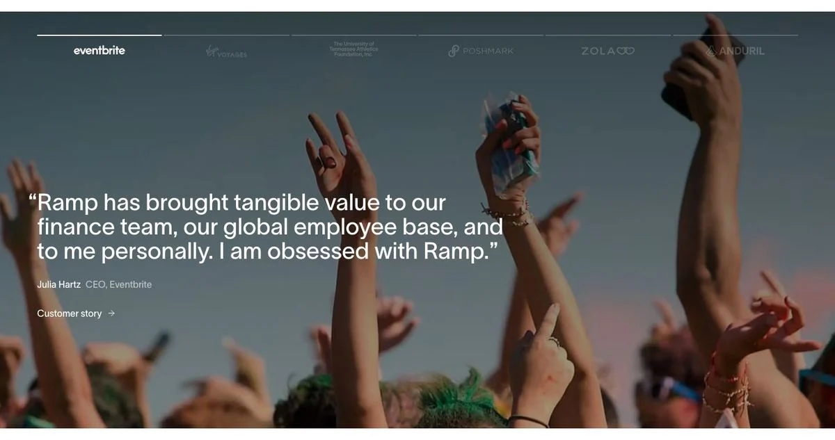
1. Ramp: one quote, one face, full width
Page: Ramp customers page
What’s on the page: A full-width photograph with one quote laid over it: “Ramp has brought tangible value to our finance team, our global employee base, and to me personally. I am obsessed with Ramp.” It is attributed to Julia Hartz, CEO of Eventbrite, with a “Customer story” link underneath. A row of customer logos sits above it.
Why it works: One quote at full width reads like a statement. The same sentence in a three-card grid would read like filler. “I am obsessed” is also the kind of phrasing a marketer would never write, which is what makes it sound real.
Steal this: Give your single best quote a whole section. Quotes get weaker when you group them.
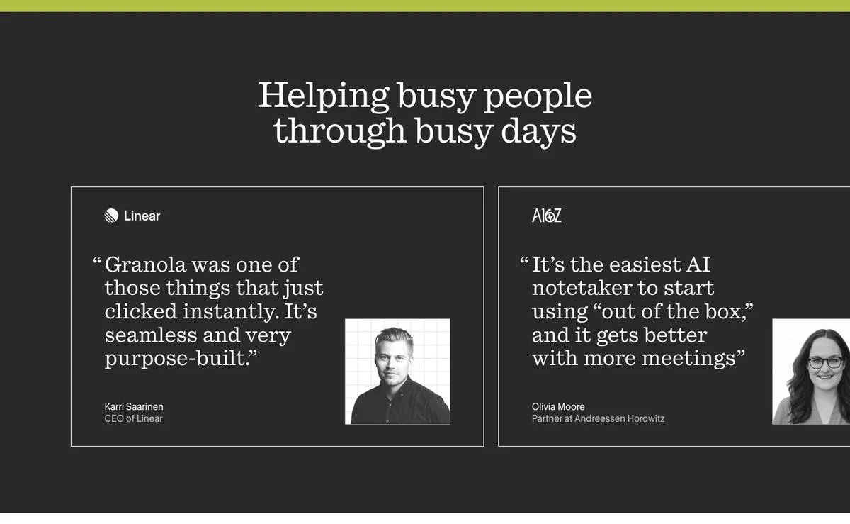
2. Granola: borrow the credibility of the person, not the logo
Page: Granola homepage
What’s on the page: Under the heading “Helping busy people through busy days,” two dark cards each carry a company logo, a quote, a name, a role, and a black-and-white headshot. Karri Saarinen, CEO of Linear: “Granola was one of those things that just clicked instantly. It’s seamless and very purpose-built.” Olivia Moore, Partner at Andreessen Horowitz: “It’s the easiest AI notetaker to start using out of the box, and it gets better with more meetings.”
Why it works: Granola’s buyers are people who follow product and venture. A founder and an investor they already read carry more weight than a Fortune 500 logo would.
Steal this: Pick quotes from people your specific buyer already follows, not from your largest accounts.
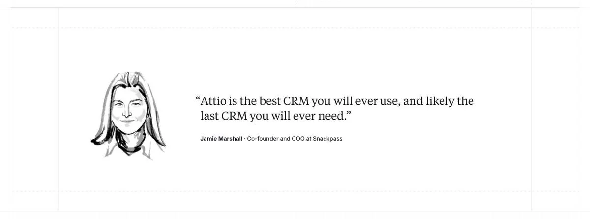
3. Attio: one line, nothing else on the screen
Page: Attio customers page
What’s on the page: A single quote centered in white space: “Attio is the best CRM you will ever use, and likely the last CRM you will ever need.” It is attributed to Jamie Marshall, Co-Founder and COO at Snackpass, next to a hand-drawn portrait instead of a photo.
Why it works: The quote makes a claim strong enough to carry a whole screen, and the illustration keeps it from looking like a stock testimonial. Nothing else competes for attention.
Steal this: If one customer said something you would put on a billboard, treat it like a billboard.
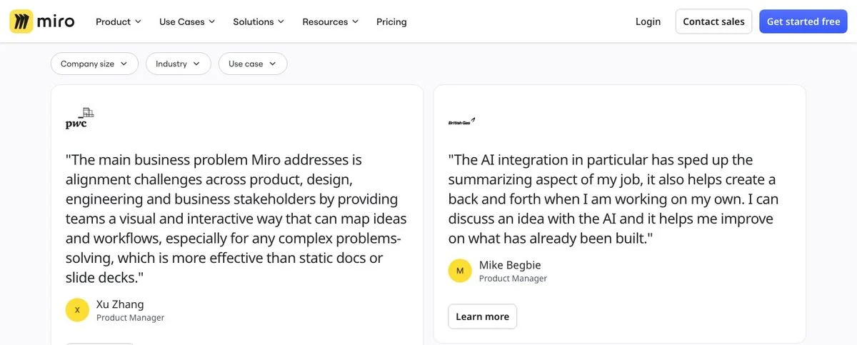
4. Miro: let buyers filter the quotes
Page: Miro customers page
What’s on the page: Filter chips for company size, industry and use case sit above a grid of quote cards. Each card carries the customer’s logo, a long quote, a name and a role, and a “Learn more” link. The quotes are unusually long and specific, describing exactly how a team uses the product.
Why it works: An enterprise buyer doesn’t want 40 quotes. They want quotes from companies their size in their industry. The filters do that, and the length signals these are real words, not marketing copy trimmed to fit a card.
Steal this: Add filters as soon as you have more than a dozen quotes, and let the long ones stay long.
5. Loom: a wall of short cards
Page: Loom customers page
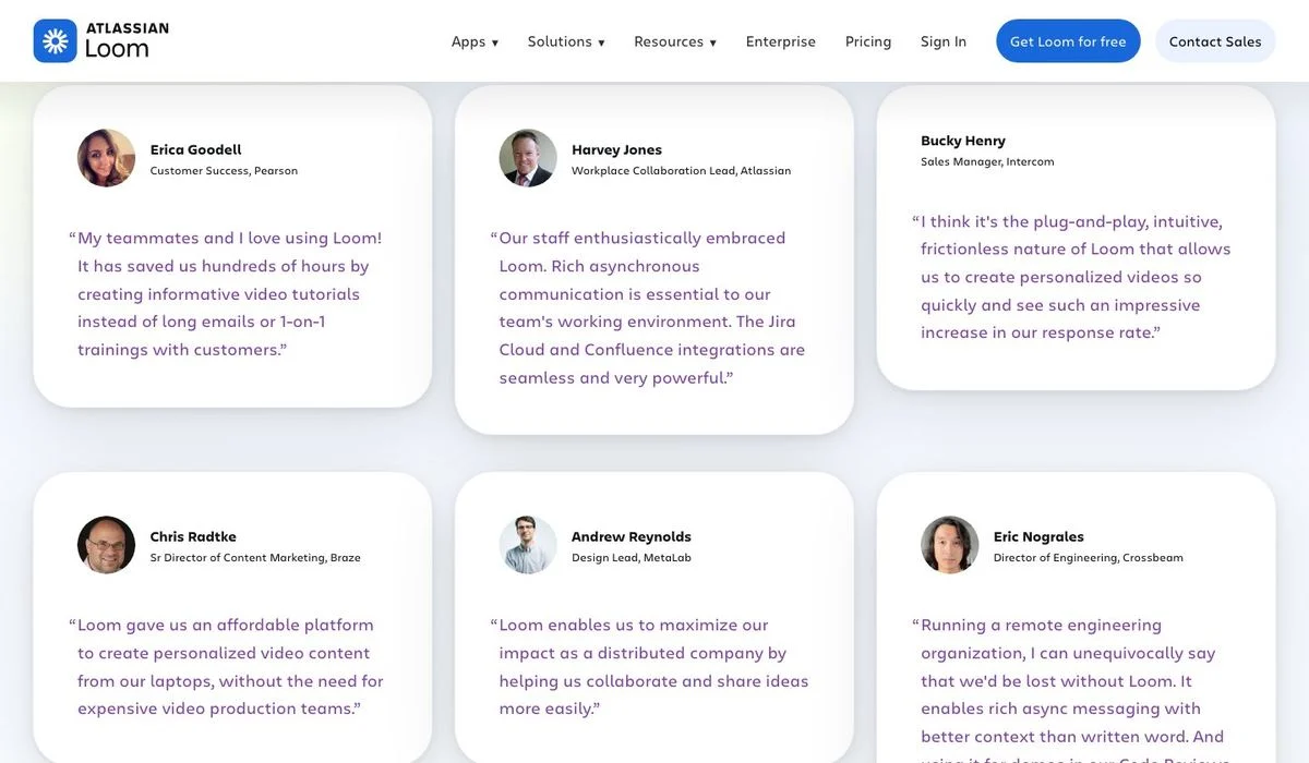
What’s on the page: A grid of cards, each with a headshot, a name, a role, and a company: a customer success lead at Pearson, a workplace collaboration lead at Atlassian, a sales manager at Intercom, a content marketing director at Braze, a design lead at MetaLab. The quotes are two or three sentences, and several describe a habit rather than a feature (“Record a Loom instead”).
Why it works: Volume is the argument. No single card has to be brilliant, because the effect comes from a dozen different job titles all saying the same thing in their own words.
Steal this: For a wall, breadth of job titles matters more than the eloquence of any one quote.
6. Headspace: anonymous quotes, labeled by situation
Page: Headspace homepage
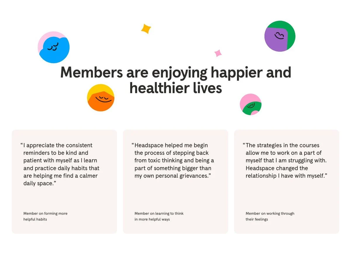
What’s on the page: “Members are enjoying happier and healthier lives,” followed by three quotes with no names and no photos. Each is attributed by situation instead: “Member on forming more helpful habits,” “Member on learning to think in more helpful ways,” “Member on working through their feelings.”
Why it works: In mental health, finance or anything medical, customers often won’t attach their name to a quote. Labeling the situation instead of the person keeps the proof useful and the customer anonymous.
Steal this: If your customers can’t be named, attribute the quote to the problem it solves.
7. Atlassian: executive quotes with the number inside
Page: Atlassian customers page
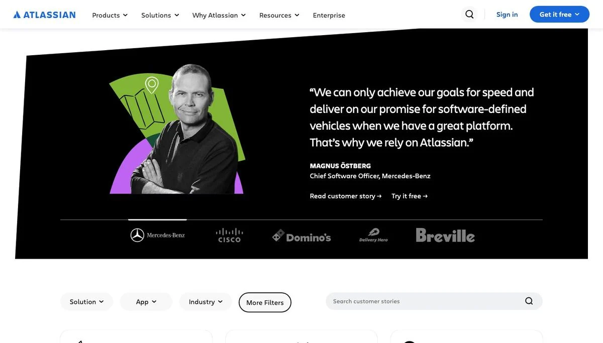
What’s on the page: A dark carousel where each slide is one executive quote. The one on screen reads: “We can only achieve our goals for speed and deliver on our promise for software-defined vehicles when we have a great platform. That’s why we rely on Atlassian.” It is signed Magnus Östberg, Chief Software Officer, Mercedes-Benz, with “Read customer story” and “Try it free” links. Logos below (Mercedes-Benz, Cisco, Domino’s, Delivery Hero, Breville) switch the slide. Another slide quotes a Cisco vice president saying tooling spend is down 54% annually and 40% of operating expenses went back into the business within three years.
Why it works: The quotes come from named executives at companies everyone knows, and the strongest ones carry their own numbers. A percentage inside a quotation mark is far more persuasive than the same percentage in your own copy.
Steal this: When you interview a customer, ask for the number and get permission to keep it in the quote.
Ratings and badges as social proof
You can’t edit a G2 score, and buyers know it. These five hand the credibility problem to a third party.
8. Brex: review-site cards with the stars left in
Page: Brex customers page
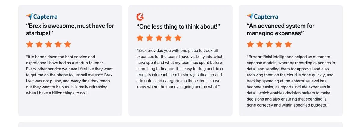
What’s on the page: Three cards, each with the source badge at the top (Capterra, G2), a bold review title in quotation marks (“Brex is awesome, must have for startups!”), five orange stars, and the full review body underneath. The reviews read like reviews, complete with plain phrasing and the occasional rough sentence.
Why it works: Keeping the source badge and the star row makes it checkable. The reader knows this was written on a review site, not solicited for the website.
Steal this: When you reuse a review, keep the platform badge, the stars, and the original wording. Polishing it removes the proof.
9. Rippling: put the rating next to the field
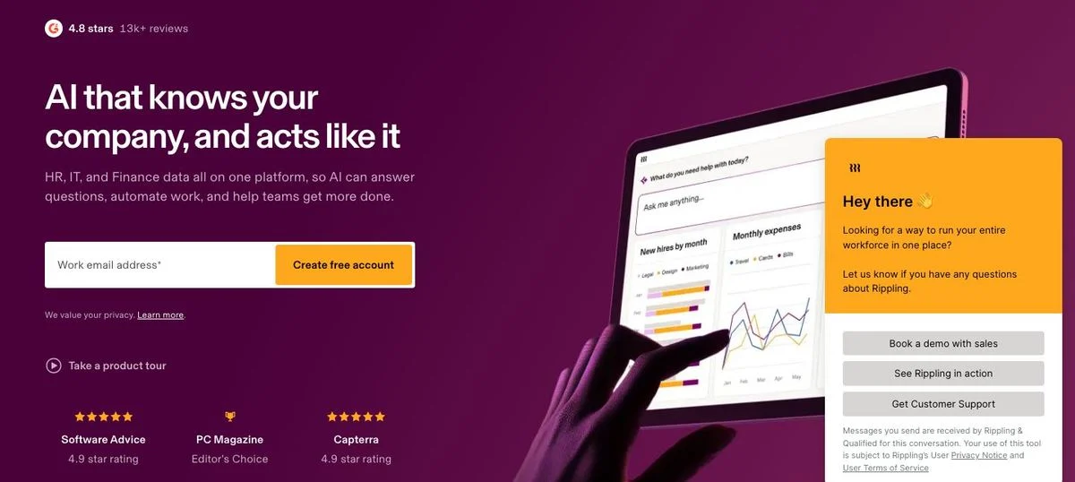
Page: Rippling homepage
What’s on the page: Above the headline, a small line: 4.8 stars, 13K+ reviews. Below the work email field and the “Create free account” button, a row of three rating badges: Software Advice 4.9, PC Magazine Editor’s Choice, Capterra 4.9.
Why it works: This is the only homepage of the 25 with proof in the first screen, and it sits exactly where hesitation happens: the moment before typing an email address.
Steal this: Move one proof element to within an inch of your form. The footer is too late.
10. monday.com: a grid of category badges
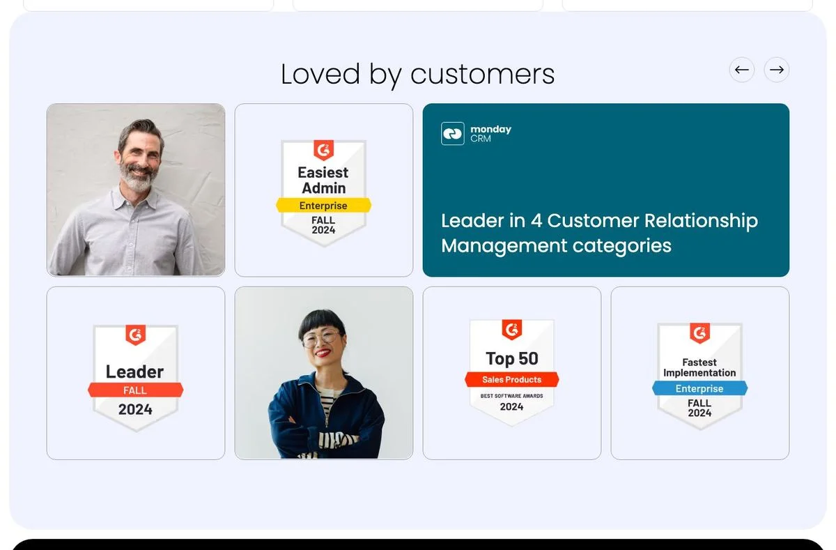
Page: monday.com customers
What’s on the page: A section titled “Loved by customers” mixes customer portraits with G2 badges: Easiest Admin, Leader, Top 50 Sales Products, Fastest Implementation. A teal card sums it up: “Leader in 4 Customer Relationship Management categories.”
Why it works: Individual badges are wallpaper. The card that counts them (“Leader in 4 categories”) turns a pile of graphics into a single claim a buyer can repeat internally.
Steal this: Don’t just display badges. Add the sentence that adds them up.
11. Descript: the average rating, then quotes by use case
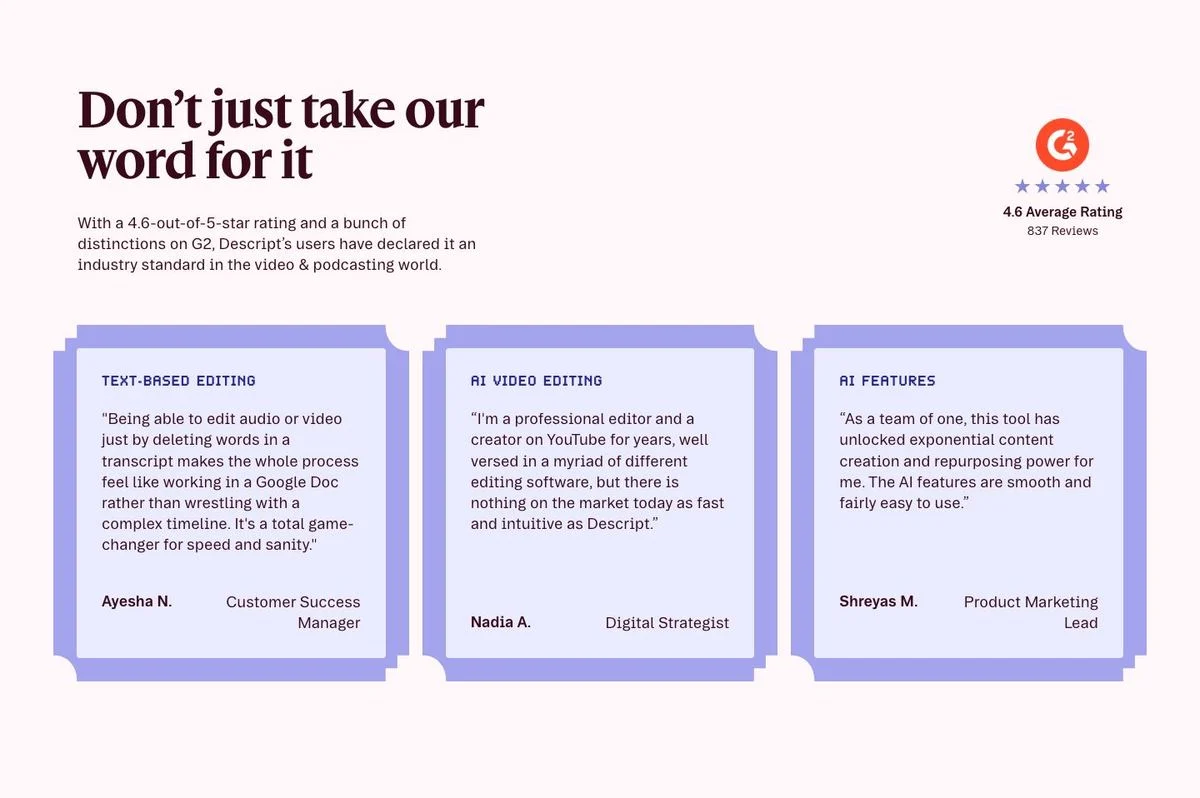
Page: Descript homepage
What’s on the page: “Don’t just take our word for it,” with a line explaining the 4.6-out-of-5 rating on G2 and a badge showing 637 reviews. Three quote cards follow, each labeled by use case rather than by industry: text-based editing, AI video editing, AI features. Each is signed with a first name, last initial, and role.
Why it works: The aggregate rating answers “do people like it?” and the use-case labels answer “does it work for the thing I need?” Most testimonial sections only answer the first.
Steal this: Group quotes by the job the reader came to do, then label the group.
12. Olipop: ratings on every product card
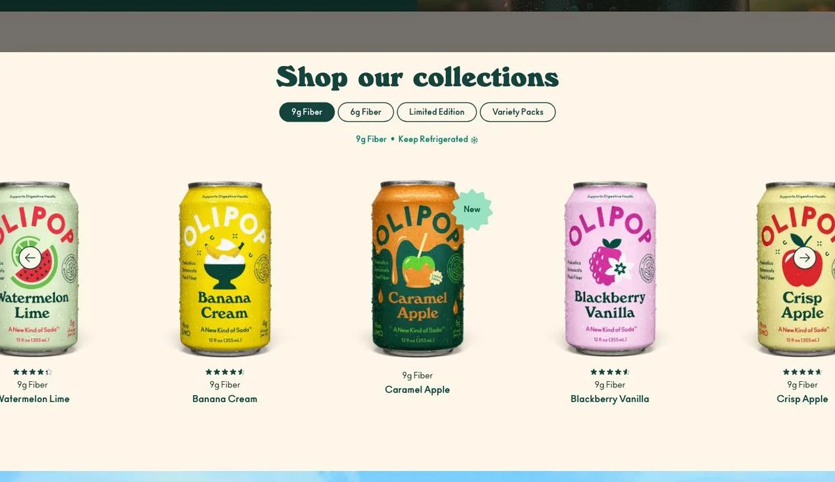
Page: Olipop homepage
What’s on the page: The shop section shows each flavor as a card with the product image, the name, and a star rating with the review count directly underneath. The proof is attached to the individual product, not to the brand.
Why it works: Someone choosing between five flavors doesn’t need a brand testimonial. They need to know which one people liked, at the exact moment they are choosing.
Steal this: Attach ratings to the thing being chosen: the plan, the product, the template.
Numbers as social proof
No quotes at all. These three let scale do the arguing.
13. Zapier: one number that covers everyone
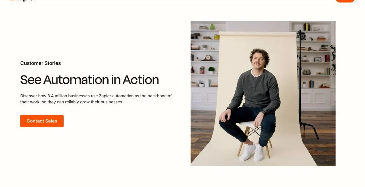
Page: Zapier customer stories
What’s on the page: “See Automation in Action,” with a single line underneath: discover how 3.4 million businesses use Zapier automation as the backbone of their business. A photograph of one customer sits beside it, with a “Contact Sales” button.
Why it works: For a product used by millions of small teams, no individual logo is impressive. The count is the proof, and one photo keeps it human.
Steal this: If your customer base is broad rather than famous, lead with the count.
14. Attio: live product usage as proof
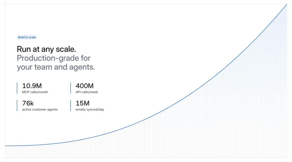
Page: Attio homepage
What’s on the page: Under “Run at any scale,” four usage numbers: 10.9M calls a month to its integration layer, 400M API calls a week, 76k active customer agents, 15M emails synced a day. A rising curve sits behind them.
Why it works: Usage numbers are harder to fake than testimonials and they answer a question quotes can’t: will this hold up at my volume?
Steal this: Publish two or three product usage numbers. They double as proof and as a reliability claim.
15. PostHog: data about who buys you

Page: PostHog customers page
What’s on the page: A chart headed “Who brings PostHog in?” breaking customers down by the role of the person who introduced the product: engineering, product, marketing, founders. The caption answers it in one line: an engineer, usually, then everybody else.
Why it works: It is proof aimed at a specific worry. An engineer wondering whether this is a tool for their team can see that it usually is. It also reads as honest, because it shows a breakdown instead of a boast.
Steal this: Publish a chart from your own customer data that answers “are people like me using this?”
Customer story examples
When the purchase is complicated, adjectives don’t help. These five give the buyer detail they can take into a meeting.
16. Stripe: state the problem before the praise
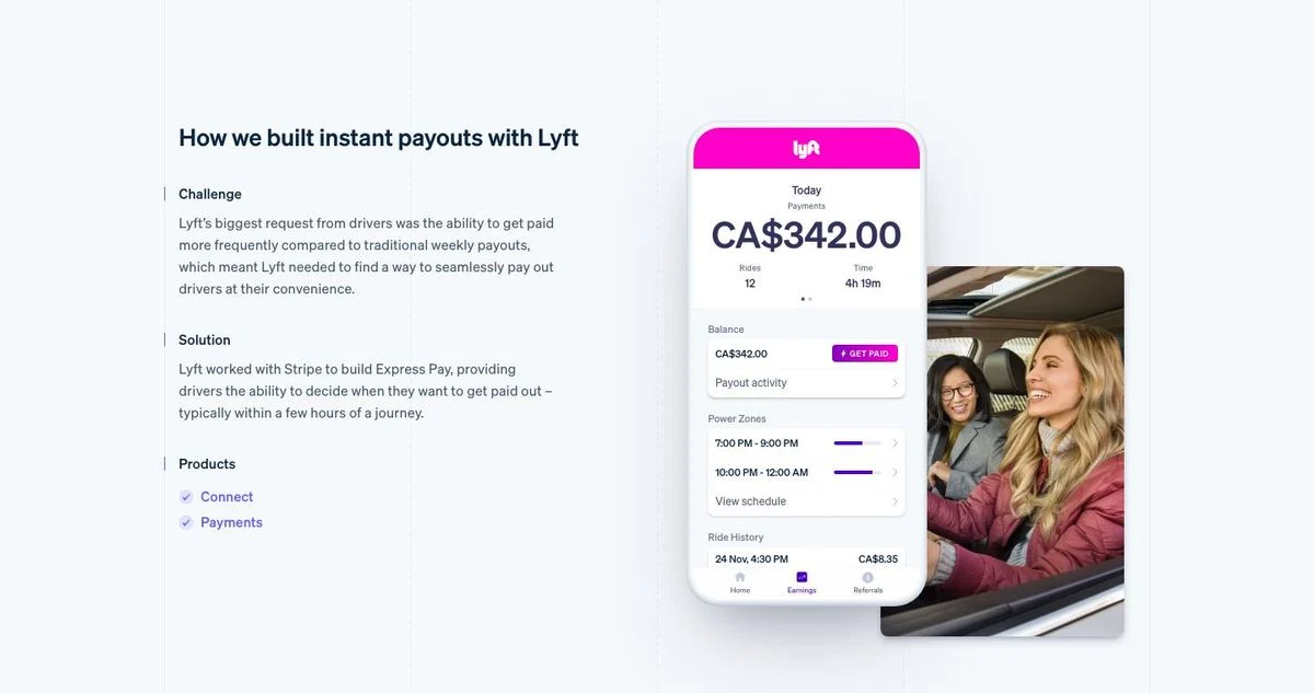
Page: Stripe customers page
What’s on the page: Under “We partner with customers to build breakthrough products,” a case study titled “How we built instant payouts with Lyft,” split into Challenge, Solution and Products, with the two products used listed as links. A phone screenshot shows the actual payout screen.
Why it works: It reads like a build log, not a testimonial. The Challenge paragraph describes a problem in the customer’s words, which makes the Solution paragraph credible.
Steal this: Structure every story as challenge, solution, products used. Name the products so a reader can map it to their own stack.
For more on how Stripe builds pages, read our Stripe breakdown.
17. Gusto: lead the card with the outcome
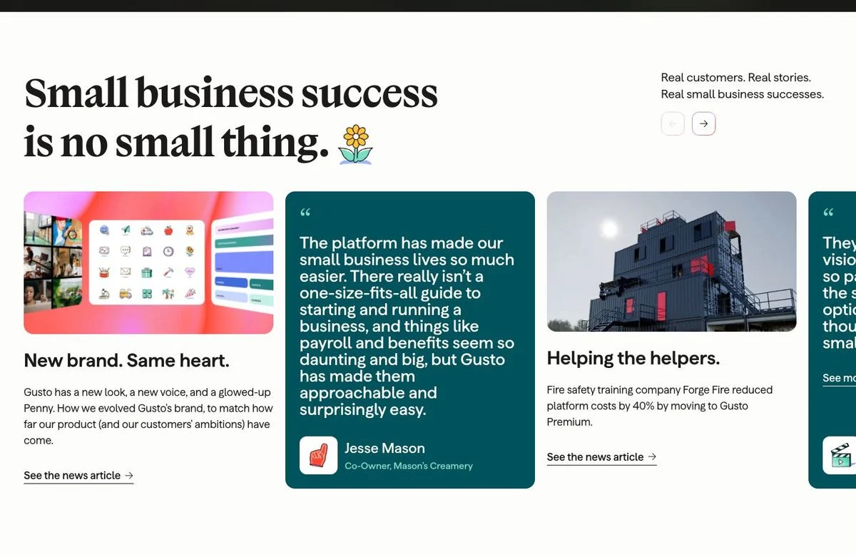
Page: Gusto homepage
What’s on the page: “Small business success is no small thing,” with the line “Real customers. Real stories. Real small business successes.” The cards below each lead with a result. One says a fire safety training company reduced platform costs by 40% by moving to Gusto Premium. Another carries a quote from a named co-owner of a creamery about payroll and benefits.
Why it works: The headline of each card is the outcome, not the customer’s name. A reader scanning three cards still leaves with three results.
Steal this: Write your story card headlines as results. The logo can come second.
18. Linear: a story index you can scan
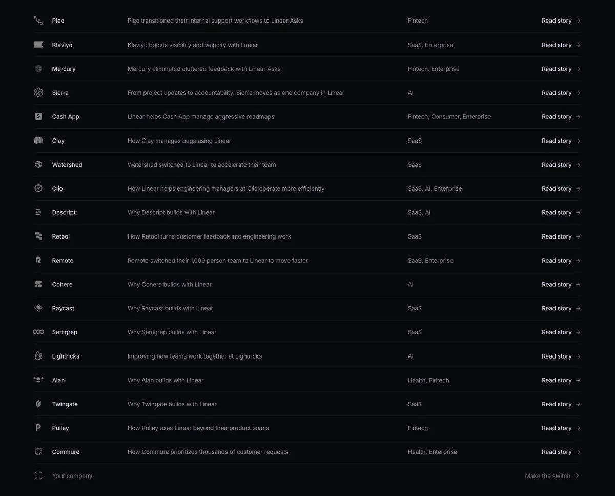
Page: Linear customers page
What’s on the page: No cards. A table. Each row is a company, a one-line summary of what they did with Linear, an industry tag, a company size, and a “Read story” link. Twenty-odd rows fit on one screen.
Why it works: It respects a buyer who is scanning for someone like themselves. A grid of cards shows six stories per screen; this shows twenty, with the industry and size right there.
Steal this: Once you have more than 15 stories, switch from cards to a table with industry and size columns.
See our Linear breakdown for the rest of their approach.
19. Zendesk: sort the stories by industry
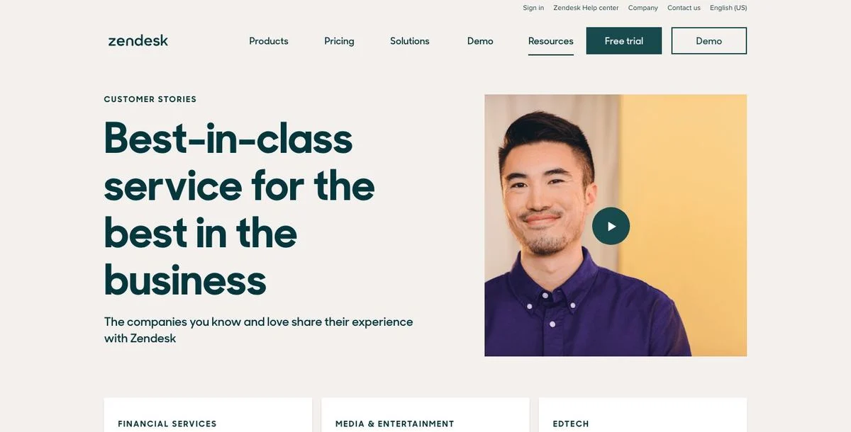
Page: Zendesk customer stories
What’s on the page: “Best-in-class service for the best in the business,” with a video and a row of industry tabs underneath: financial services, media and entertainment, edtech.
Why it works: Industry is the first filter a buyer applies in their head. Putting the tabs directly under the hero means nobody has to scroll through stories about a business unlike theirs.
Steal this: Make industry the first sort on your customer page, not the last.
20. Gong: a proof library, linked from the main nav
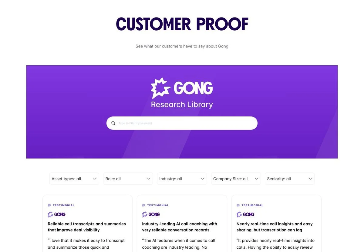
Page: Gong raving fans
What’s on the page: A page titled “Customer proof” holding a searchable research library, with filters for asset type, role, industry, company size and seniority. Each result is a card labeled “testimonial” with a headline summarizing what the customer said. One of the visible cards reads “Nearly real-time call insights and easy sharing, but transcription can lag.” The page is reachable from the main navigation, which lists it as “Raving fans.”
Why it works: Two things stand out. Proof gets a slot in the top-level navigation, next to Product and Pricing. And they publish a card with a complaint in it, which makes every other card more believable.
Steal this: Give proof a permanent place in your navigation, and keep one honest caveat in the mix.
Video testimonial examples
Only three of the 25 use video at all, and in every case the text beside the player is doing the work.
21. Calendly: put the number in the caption
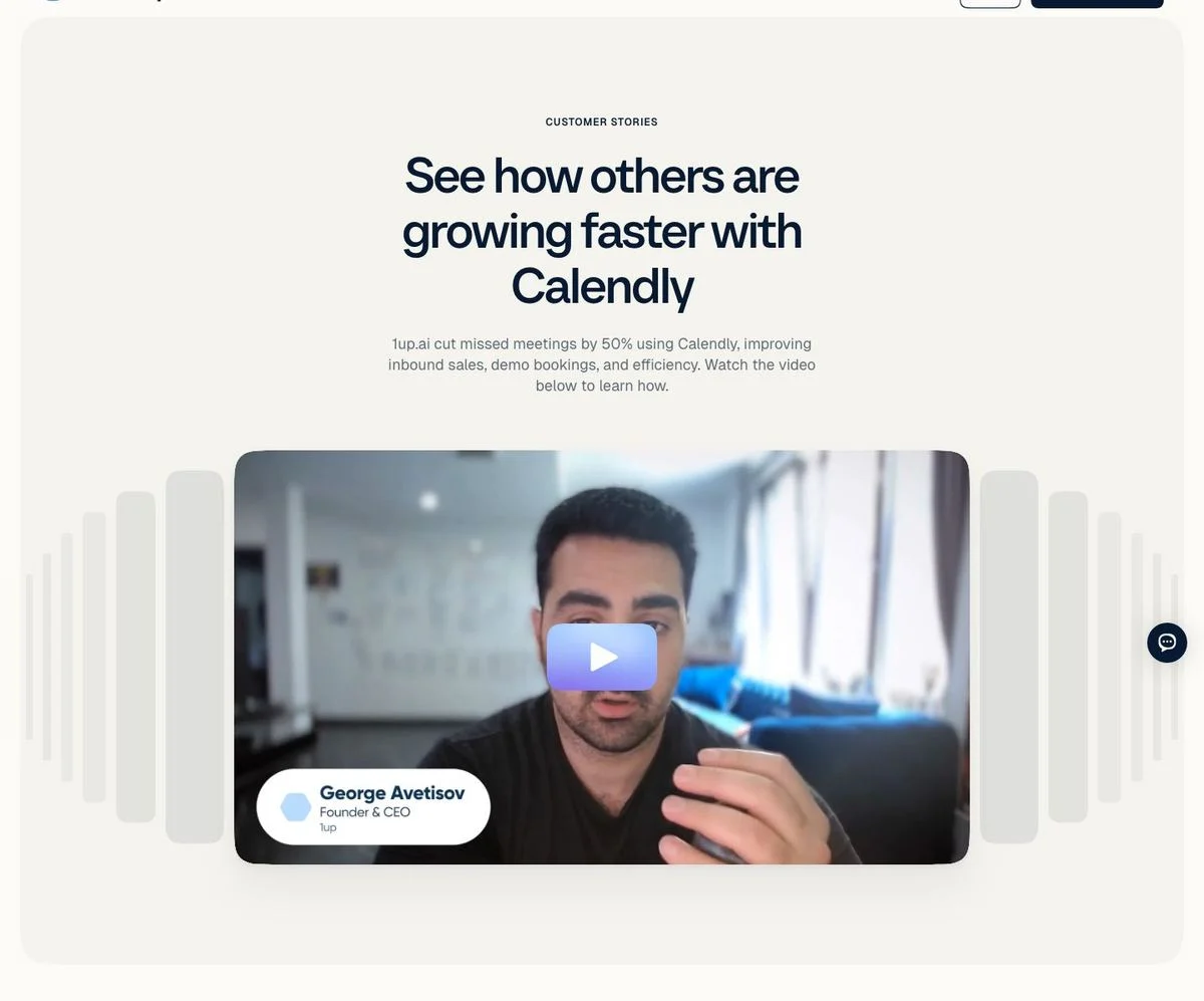
Page: Calendly customer stories
What’s on the page: “See how others are growing faster with Calendly,” with a line underneath describing a customer that cut instant meetings by 92% and improved inbound sales and demo bookings. The video below is framed as a card, with the speaker’s name and title (founder and CEO) in a floating label on the player.
Why it works: Most visitors will not press play. The caption carries the result, so the page still works for the people who only skim, and the video rewards the ones who don’t.
Steal this: Write the caption so the video is optional. If the number only exists inside the video, most people will never see it.
22. Asana: let the overlay do the selling
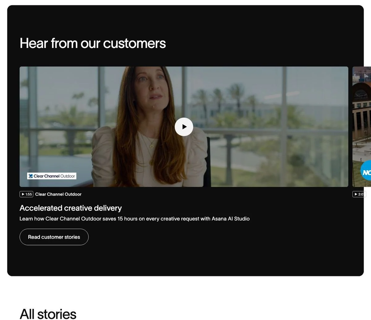
Page: Asana customers page
What’s on the page: “Hear from our customers,” with a wide video. The overlay on the player names the outcome: an outdoor advertising company saves 15 hours on every creative request. A “Read customer stories” button sits underneath for people who would rather read.
Why it works: The overlay does what a thumbnail usually wastes: it states the result before the click, and offers a reading route for anyone who won’t watch.
Steal this: Put the outcome on the video thumbnail, and always pair a video with a text link.
Press and customer reviews
Two more sources of proof you don’t have to write yourself.
23. Oura: press headlines instead of press logos
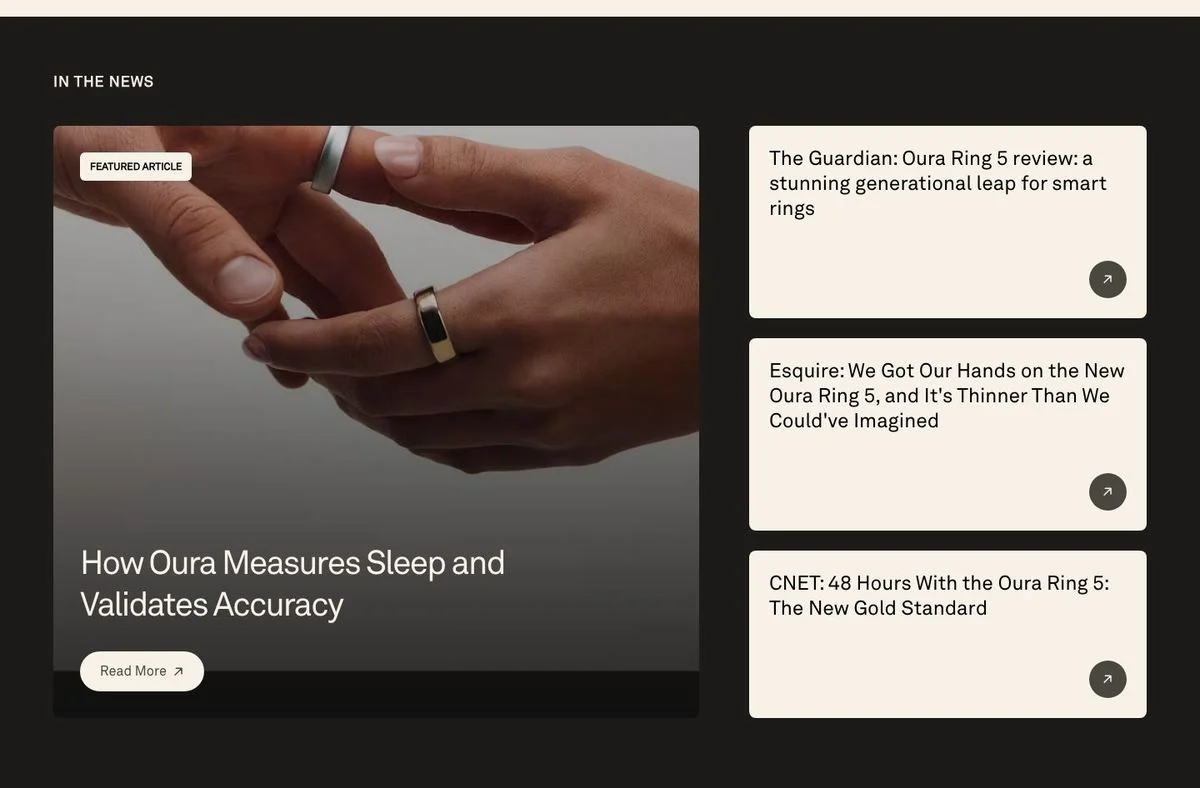
Page: Oura homepage
What’s on the page: A section headed “In the news,” with a featured article about how Oura measures sleep and validates accuracy, beside three press headlines: The Guardian calling the new ring a stunning generational leap, Esquire on how thin it is, and CNET calling it the new gold standard.
Why it works: A row of grey newspaper logos says “we were mentioned.” Headlines say what was actually written. The featured article also turns press into an argument about accuracy, which is the objection buyers have.
Steal this: Quote the headline, not the logo, and lead with the piece that answers your hardest objection.
24. AG1: reviews with titles, dates and the product named
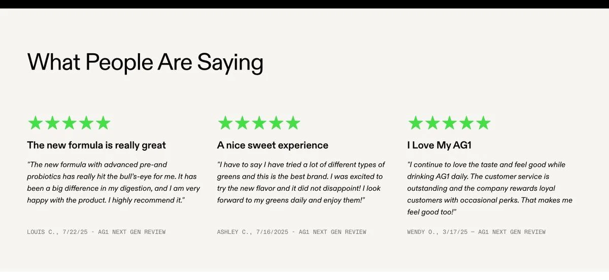
Page: AG1 homepage
What’s on the page: “What People Are Saying,” with three reviews. Each has five stars, a bold title (“The new formula is really great”), a body, and a footer line carrying the reviewer’s first name and initial, the date, and which product was reviewed.
Why it works: The date and the product name make the review checkable and current. A reviewer talking about the formula you’re selling today is worth more than an undated rave.
Steal this: Show the date and the specific product or plan on every review. Undated proof reads as old proof.
Collecting proof in public
25. Superhuman: ask for the testimonial on the page
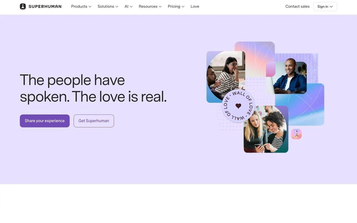
Page: Superhuman love page
What’s on the page: A page called Love, listed in the main navigation, headed “The people have spoken. The love is real.” Two buttons sit under it: “Share your experience” and “Get Superhuman.” A collage of customer photos circles a “wall of love” graphic.
Why it works: The page does two jobs at once. It shows existing proof to prospects and collects new proof from happy customers, who are the people most likely to be on that page in the first place.
Steal this: Put a “share your experience” button on your testimonial page. The audience is already self-selected.
What makes a testimonial convert
From the patterns across all 25:
- Name the person, the role, and the company. Only 9 of 25 do all three. “VP of Marketing at [company]” is worth more than a first name and a stock photo.
- Get a number into the quote. Four of the 25 manage it. Ask your customer what changed and by how much, then keep it inside the quotation marks.
- Keep third-party proof looking third-party. Stars, source badges and slightly awkward review wording are the signals that it wasn’t written by you.
- Match the quote to the job. Descript groups quotes by use case. A visitor who came for one thing should find proof about that thing.
- Put one proof element next to the form. Rippling is the only homepage here with proof in the first screen, and it sits beside the email field.
- Let people filter once you have volume. Industry, company size and role. Five of the 25 do it, and they’re all selling to enterprises.
- Keep one caveat. Gong publishes a card mentioning a lag in transcription. The honest note makes the rest credible.
- Date it. A review from this quarter beats a better review with no date on it.
Build proof into pages people can trust
Ploy helps you ship testimonial sections that fit your brand and connect proof to the action each page needs.
Testimonial section template
The sections that worked had roughly the same anatomy. Use this testimonial template as a starting point and delete whatever you can’t fill in honestly:
- Heading that makes a claim, not the word “Testimonials.” (“Loved by customers,” “Don’t just take our word for it,” “Helping busy people through busy days.”)
- One line of context if the proof needs it: the aggregate rating, the number of reviews, or the customer count.
- Three to six quotes, each with a photo or logo, a name, a role and a company.
- A number inside at least one quote.
- Filters by industry, size or use case once you have more than a dozen.
- A link to the full story on every card, for the buyer who wants detail.
- A call to action at the end of the section, and a way for happy customers to add their own.
How to ask for a testimonial
The reason most testimonials are vague is that the request was vague. “Would you write us a testimonial?” produces “great product, great team.”
Ask these five instead, and edit the answers into a quote:
- What were you doing before, and what was annoying about it?
- What changed after you switched? Try to put a number on it.
- What nearly stopped you from buying?
- Who else on your team noticed a difference?
- Who would you recommend this to, and who would you not?
Send the request right after a moment of success: a renewal, a launch, a support ticket that went well. Offer to write the first draft from their answers, and always send the exact sentence back for approval with their name, role and company attached. For help turning the answers into copy that fits the page, see the conversion copywriting ploybook.
How to add these to your site
Most testimonial sections go stale because updating one means a design ticket, a copy doc, and a deploy. So the quotes stay as they were at launch, and the numbers in them age.
The faster route:
- Pick the format above that matches your proof. One strong quote, a filterable grid, a rating row, or a story table.
- Click “Rebuild this in Ploy” under any example. Ploy’s AI landing page builder recreates the layout in your fonts, colors and components, and you edit the copy in chat.
- Swap the proof by segment. Show manufacturing logos to manufacturing visitors with website personalization, the same way how Avoca runs ABM tailors pages by account.
- Test it. Move the block up the page, swap the quote for one with a number, and run A/B tests rather than arguing about it. Our conversion benchmarks by industry give you a baseline to judge the result against.
Frequently asked questions
How do you write a testimonial?
Write it as a short story with three parts: what was hard before, what you did differently, and what changed. Keep a number in it if you can. Two to four sentences is plenty. Sign it with your full name, your role, and your company, because an unsigned testimonial is worth very little to the reader.
What is a short testimonial?
One or two sentences naming a single result or a single change in behavior. “Record a Loom instead” style testimonials work because they describe a new habit. A short testimonial still needs attribution: a name, a role, and a company.
Can you give some examples of positive customer reviews?
The AG1 and Brex sections above are both real examples. A strong review usually has a title that summarizes the point (“An advanced system for managing expenses”), a body explaining the situation, a rating, and a date. Reviews that name the specific product or plan are more useful than general praise about the brand.
What is an example of a testimonial letter?
A testimonial letter is a longer written endorsement, usually from a client to a supplier, on letterhead. For a website you rarely need one. The customer story format Stripe uses (challenge, solution, products used) does the same job and is easier to scan.
What is social proof?
Social proof is evidence that other people already chose you: quotes, ratings, reviews, customer counts, logos, press coverage, and usage numbers. A testimonial is one type. As the 25 examples here show, most of the proof on good websites isn’t quotes at all.
Where should testimonials go on a page?
Two places. One proof element next to your main call to action, where hesitation happens, and a fuller section further down. Across the homepages we measured, the main proof block sat a median of 43% down the page, and only one put anything in the first screen.
How many testimonials should a page have?
Three to six in a section is typical among these examples. Beyond a dozen, move them to a dedicated page and add filters, the way Miro, Zendesk and Gong do. More quotes on a landing page is not more persuasive; more relevant quotes is.
Put your best customer proof to work
Use Ploy to build and improve on-brand pages with testimonial formats that make specific outcomes easy to find.