Most landing pages get built the week before a campaign goes live. Someone writes a headline, someone finds a hero image, the page ships, and nobody opens it again until the next campaign.
The best ones don’t work like that. They get rewritten, tested, and swapped out so often that the page you see today may not be the page the next visitor sees. While we were researching this post, Fin’s homepage showed us two different headlines in two captures.
So we went looking for landing page examples from teams that treat their pages as a system, not a project: Stripe, Ramp, Notion, Gong, Apple, DoorDash, and 24 more. We loaded all 30 pages at desktop size and wrote down what is actually above the fold: the headline, the buttons, the form, the proof, and the navigation.
Some of it matches the usual advice. Some of it doesn’t. The patterns come first, then every page with a screenshot, a breakdown, and one thing to steal.
The short version: the best landing pages lead with a short headline, ask for one thing, show the product doing its job, and save most of the persuasion for the scroll. The pages are long. The heroes are not.
Build a focused landing page in your own brand
What 30 of the best landing pages have in common
Here is what showed up when we compared the 30 pages side by side:
- Headlines are short. The median is five words. 26 of the 30 main headlines are seven words or fewer. The subhead does the explaining.
- Most pages ask for one thing. 18 of 30 have exactly one button in the hero, and 29 of 30 have two or fewer. Zapier’s Agents page is the only one with three.
- When there are two buttons, they split by readiness. 7 of the 10 two-button pages pair a self-serve action (start free, sign up) with a sales action (book a demo, contact sales). The other three split by visitor: new or returning (Duolingo), app or therapy (Headspace), Google or Microsoft (Calendly).
- Most pages keep the navigation. The usual advice is to strip the menu from a landing page. Only 6 of 30 do, and every one of them has a single job: three demo requests, one event, one switch page, and Duolingo’s signup.
- Proof usually comes after the scroll, except next to a form. Only 8 of 30 show logos, ratings, or a customer count before you scroll. But 4 of the 7 pages that ask for an email or a form in the hero put proof right beside it.
- The pages are long. The heroes aren’t. The median page runs about 11 screens deep. Only the three demo request pages fit in one or two.
- The hero is not fixed. Fin showed two different headlines, Headspace rotates its headline, and DoorDash showed a bonus for the visitor’s own area.
How we reviewed them: we loaded each page in a desktop browser at 1440 × 900 in September 2026, mostly from a US connection, and captured the screenshots below. Where a site blocked that connection, we used a second location and checked the page for regional differences. For every page we recorded the main headline, the buttons in the hero, any form fields, whether the main site navigation was present, whether proof appeared before scrolling, and how many screens deep the page ran. Pages change often, so check the live version before you copy anything.
30 landing page examples, grouped by type
Pick the type closest to the page you need to build, then jump to it.
| Type | Use it for | Examples |
|---|---|---|
| SaaS product pages | Selling a product or a feature | Stripe, Notion, Slack, Figma, Zapier, Clay, Granola, Fin |
| B2B email-first pages | Starting signup in the hero | Ramp, Brex, Mercury, Rippling |
| Free trial pages | Product-led signup | Canva, Calendly, Loom |
| Demo request pages | Sales-led conversion | Gong, Rippling, Zendesk |
| Switch and data pages | Champions, analysts, and press | Linear, Ramp |
| Event pages | Registrations | Stripe Sessions, Gong Celebrate |
| Marketplace signup pages | Recruiting sellers and workers | Etsy, DoorDash, Uber |
| Ecommerce and product pages | Selling a physical product | Apple, AG1, Oura |
| App pages | Consumer signups | Headspace, Duolingo |
SaaS landing page examples
Product and feature pages carry most B2B pipeline. The strongest ones show the product working in the hero and keep the ask small.
1. Stripe Billing: the product is the hero image
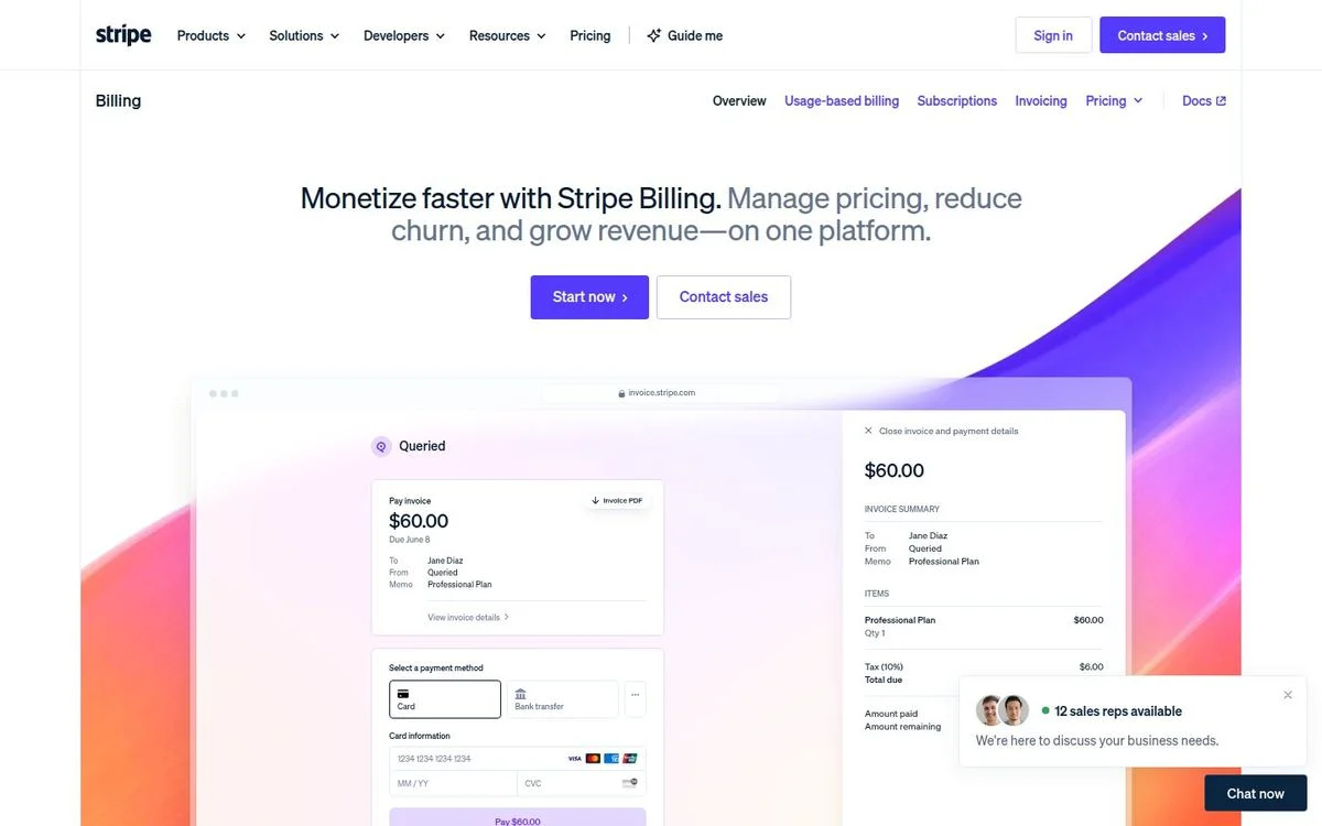
Page: Stripe Billing page
Above the fold: 5-word headline · 2 buttons · no form · full navigation · no proof
What’s on the page: “Monetize faster with Stripe Billing.” runs straight into a lighter subhead: “Manage pricing, reduce churn, and grow revenue—on one platform.” Two buttons sit under it, “Start now” and “Contact sales.” The hero image is a working invoice for $60.00 with a payment form, and a chat widget shows how many sales reps are available right now. A product menu (Usage-based billing, Subscriptions, Invoicing, Pricing, Docs) sits under the main navigation. Further down, customer stories lead with numbers, like Fox Sports increasing subscription revenue by 20%.
Why it works: The headline and subhead read as one sentence: the benefit, then three outcomes. And the hero shows what Billing actually produces, an invoice, instead of an abstract illustration.
Steal this: Put the output of your product in the hero: the invoice, the report, the finished page. People believe what they can see.
For the full teardown, read our full Stripe breakdown.
2. Notion AI: sell the team, not the feature
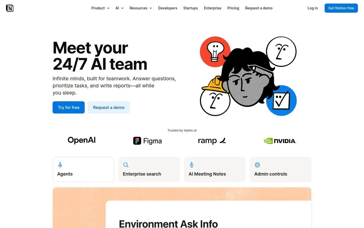
Page: Notion AI page
Above the fold: 5-word headline · 2 buttons · no form · full navigation · logos
What’s on the page: “Meet your 24/7 AI team,” followed by “Infinite minds, built for teamwork. Answer questions, prioritize tasks, and write reports—all while you sleep.” The buttons are “Try for free” and “Request a demo.” Directly under them: “Trusted by teams at” OpenAI, Figma, Ramp, and NVIDIA. Four tabs preview the product: Agents, Enterprise search, AI Meeting Notes, and Admin controls. The illustration is in Notion’s own hand-drawn style.
Why it works: It frames AI as a team you hire, not a feature you toggle on. The four logos are companies known for AI, so the proof matches the claim. And the “Admin controls” tab answers IT’s first question before IT asks it.
Steal this: Pick three or four logos that prove the specific claim in your headline, not your 20 biggest customers.
More in our Notion landing page breakdown.
3. Slack Enterprise: four objections, four cards
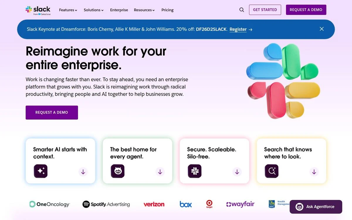
Page: Slack Enterprise page
Above the fold: 6-word headline · 1 button · no form · full navigation · logos
What’s on the page: “Reimagine work for your entire enterprise.” One button: “Request a demo.” Under it, four cards, each with an arrow that jumps down the page: “Smarter AI starts with context,” “The best home for every agent,” “Secure. Scaleable. Silo-free.” and “Search that knows where to look.” A row of customer logos, including Verizon, Box, and Wayfair, closes the first screen. Further down, a form invites you to contact the enterprise sales team.
Why it works: Enterprise buyers rarely sign themselves up, so the page asks for one thing: a conversation. The four cards cover the four questions an enterprise buyer brings to the call: AI, agents, security, and search.
Steal this: Turn your top four objections into cards in the hero, and make each one jump to its answer.
See our Slack enterprise breakdown for the rest of the page.
4. Figma Dev Mode: name the feature, explain it once
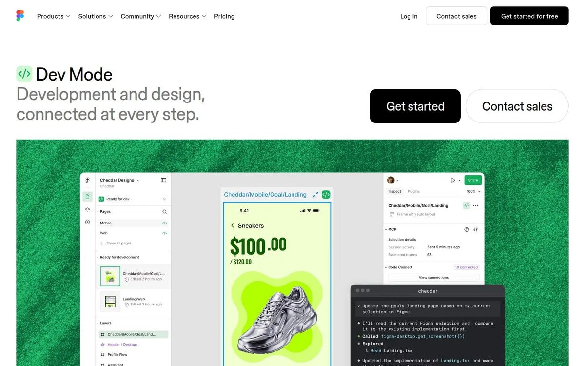
Page: Figma Dev Mode page
Above the fold: 2-word headline · 2 buttons · no form · full navigation · no proof
What’s on the page: The headline is just “Dev Mode,” with one line underneath: “Development and design, connected at every step.” Buttons: “Get started” and “Contact sales.” The hero shows a product page design (a sneaker at $100.00) next to the code and inspect panels. Three numbered tabs follow: “Add Figma context to an IDE,” “Connect design and code components,” and “One dedicated dev view.” The next section is “Go from canvas to code—and code to canvas.”
Why it works: Visitors arrive already knowing Figma, so the page doesn’t sell Figma again. It explains one feature, and the numbered tabs tell developers exactly what they get.
Steal this: On a feature page, name the feature and explain it in one line. Skip the parent-product pitch.
More in our Figma landing page breakdown.
5. Zapier Agents: three buttons for three stages
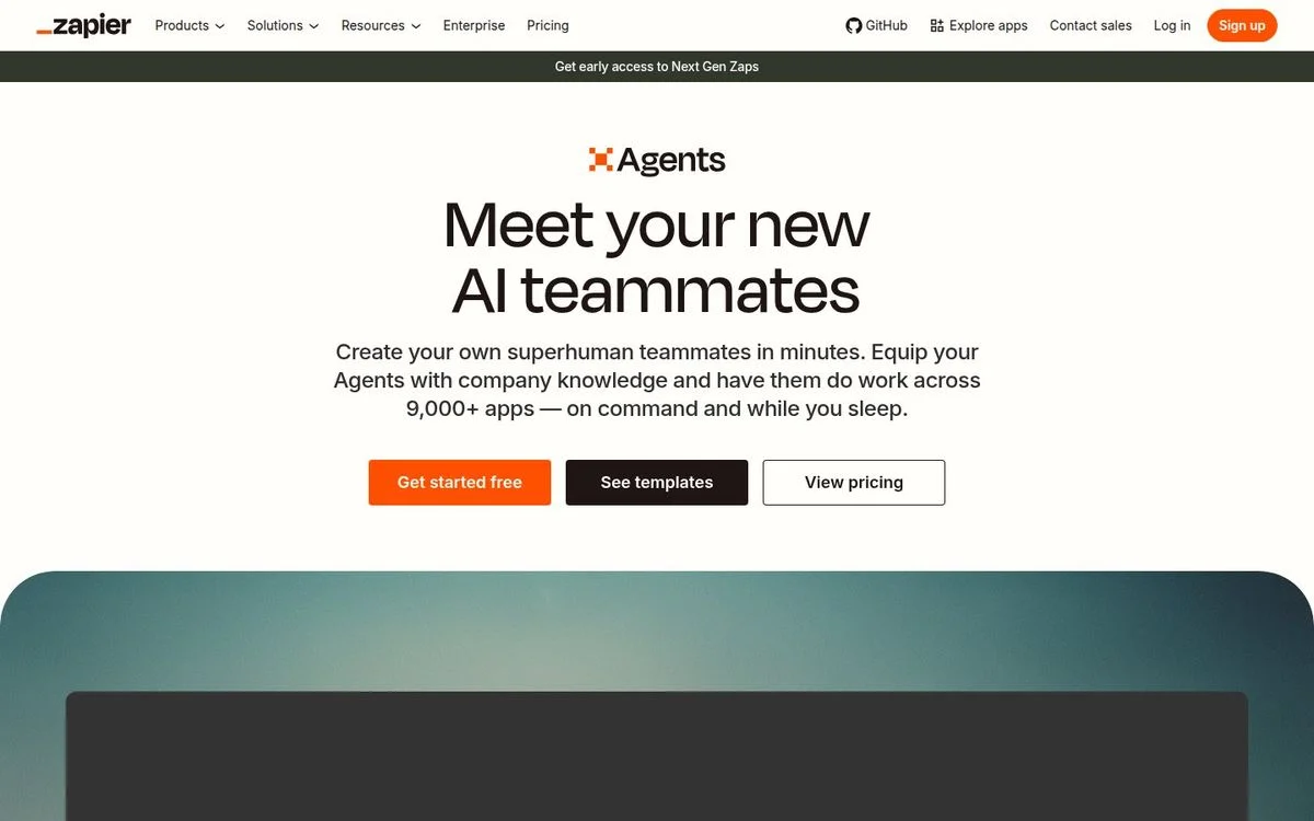
Page: Zapier Agents page
Above the fold: 5-word headline · 3 buttons · no form · full navigation · no proof
What’s on the page: “Meet your new AI teammates,” then “Create your own superhuman teammates in minutes. Equip your Agents with company knowledge and have them do work across 9,000+ apps — on command and while you sleep.” Three buttons: “Get started free” in orange, “See templates” in black, and “View pricing” in outline. A bar above the navigation offers early access to Next Gen Zaps. Further down: “Watch Zapier Agents in action,” “See why customers love Zapier Agents,” and “Power your agents with live business data.”
Why it works: It is the only page of the 30 with three hero buttons, and it gets away with it because each one serves a different visitor: ready to start, curious, or checking the cost. The styling makes the main action obvious.
Steal this: If you need a third button, give each one a different stage of readiness and make one of them clearly the main action.
6. Clay: speak to the role you helped name
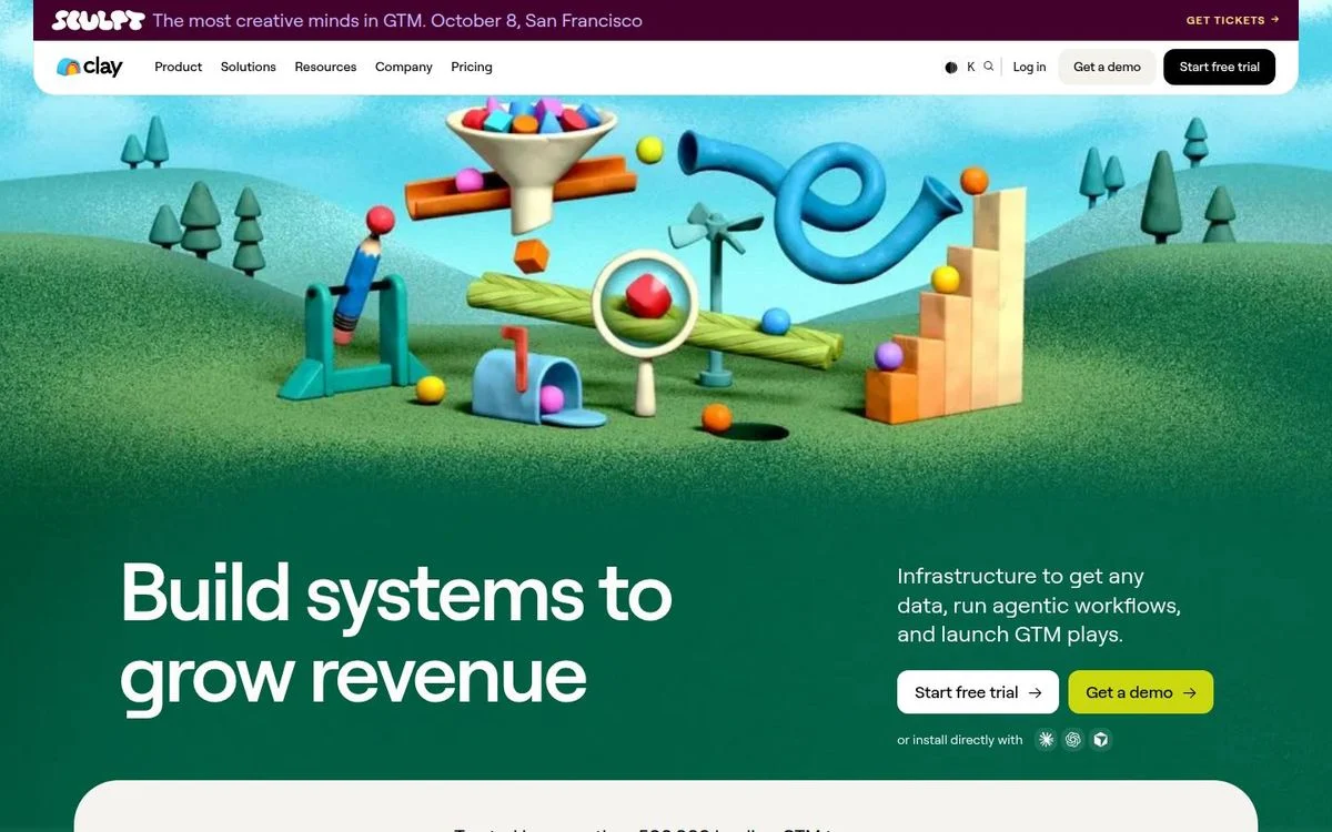
Page: Clay homepage
Above the fold: 5-word headline · 2 buttons · no form · full navigation · proof on the fold line
What’s on the page: “Build systems to grow revenue,” beside “Infrastructure to get any data, run agentic workflows, and launch GTM plays.” The buttons are “Start free trial” and “Get a demo.” The hero is a playful 3D machine in a green landscape, not a dashboard. “Trusted by more than 500,000 leading GTM teams of all sizes” starts right at the fold line, and a bar at the top sells tickets to Sculpt, Clay’s conference. The first section after the hero is titled “GTM engineers build on Clay.”
Why it works: It names its buyer, the GTM engineer, in the first scroll. And in a category full of dashboard screenshots, an illustration is the thing you remember.
Steal this: Name your buyer’s role on the first screen or the second, so the right visitor knows the page is for them.
7. Granola: say what you are not
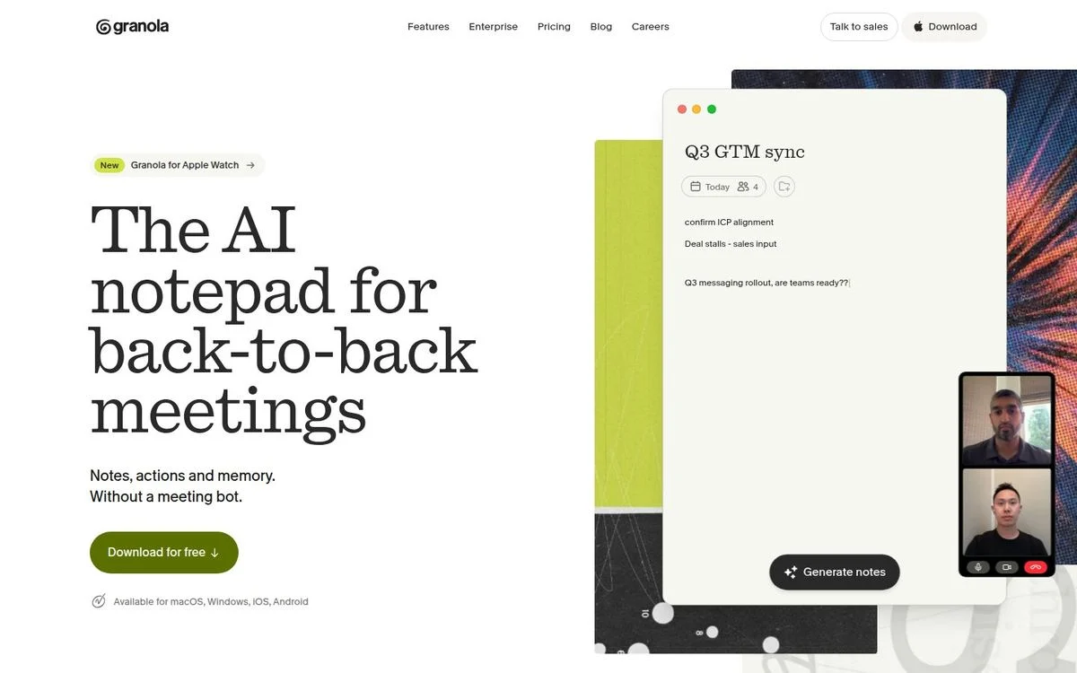
Page: Granola homepage
Above the fold: 6-word headline · 1 button · no form · full navigation · no proof
What’s on the page: “The AI notepad for back-to-back meetings,” then “Notes, actions and memory. Without a meeting bot.” One button, “Download for free,” with “Available for macOS, Windows, iOS, Android” underneath. A small badge announces Granola for Apple Watch. The hero shows real notes from a “Q3 GTM sync” next to a video call. Later on, a section is headed “Humans in the room, not bots.”
Why it works: “Without a meeting bot” names the biggest annoyance in the category without naming anyone. The platform line answers “will it work on my machine?” before the click.
Steal this: Add a “without X” line that removes your category’s most common complaint.
8. Fin: a hero that keeps changing
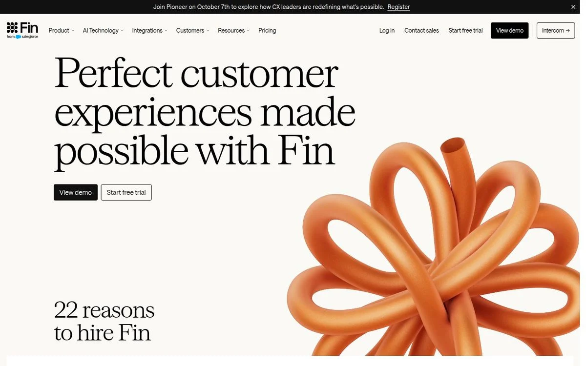
Page: Fin homepage
Above the fold: 7-word headline · 2 buttons · no form · full navigation · no proof
What’s on the page: From a US connection, the headline read “Perfect customer experiences made possible with Fin,” with “View demo” and “Start free trial” underneath and a section titled “22 reasons to hire Fin” right below. From our second location, the headline was “The highest performing AI Agent for every customer conversation,” followed by “Fin customers average a 76% resolution rate, across 12,000+ businesses” and “14 day free trial. No credit card required.” The navigation keeps a link to Intercom, the company’s former name.
Why it works: Two different heroes means Fin is testing, rotating, or localizing its headline: one version sells the aspiration, the other sells a number. And “22 reasons to hire Fin” talks about software the way you would talk about a new hire.
Steal this: Treat your headline as an experiment. Test an outcome claim against a hard number, and run A/B tests until the data picks one.
B2B landing page examples: start the signup in the hero
These four finance and HR platforms put an email field in the hero. Typing an email feels like a smaller step than clicking “Sign up,” and it starts the funnel on the first screen.
9. Ramp: two asks for two kinds of visitor
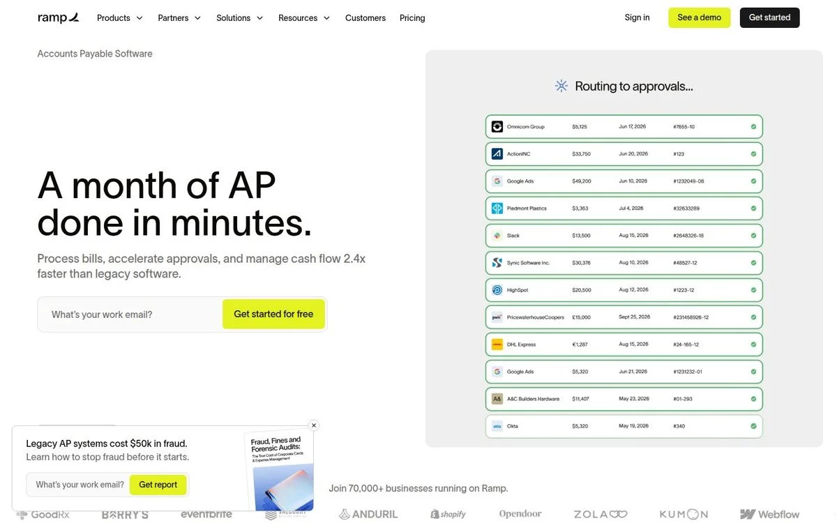
Page: Ramp accounts payable page
Above the fold: 7-word headline · email field and 1 button · full navigation · customer count
What’s on the page: Under the label “Accounts Payable Software,” the headline reads “A month of AP done in minutes.” The subhead: “Process bills, accelerate approvals, and manage cash flow 2.4x faster than legacy software.” A work email field sits next to “Get started for free.” Under the hero: “Join 70,000+ businesses running on Ramp,” with a row of logos. A separate box offers a report, “Legacy AP systems cost $50k in fraud. Learn how to stop fraud before it starts,” with its own email field.
Why it works: The headline turns a month into minutes, and the subhead backs it with a number (2.4x). The fraud report catches the visitors who aren’t ready to sign up today.
Steal this: Add a smaller second ask, like a report or a checklist, for the visitors who won’t take the first one.
10. Brex: promise both sides of the trade-off
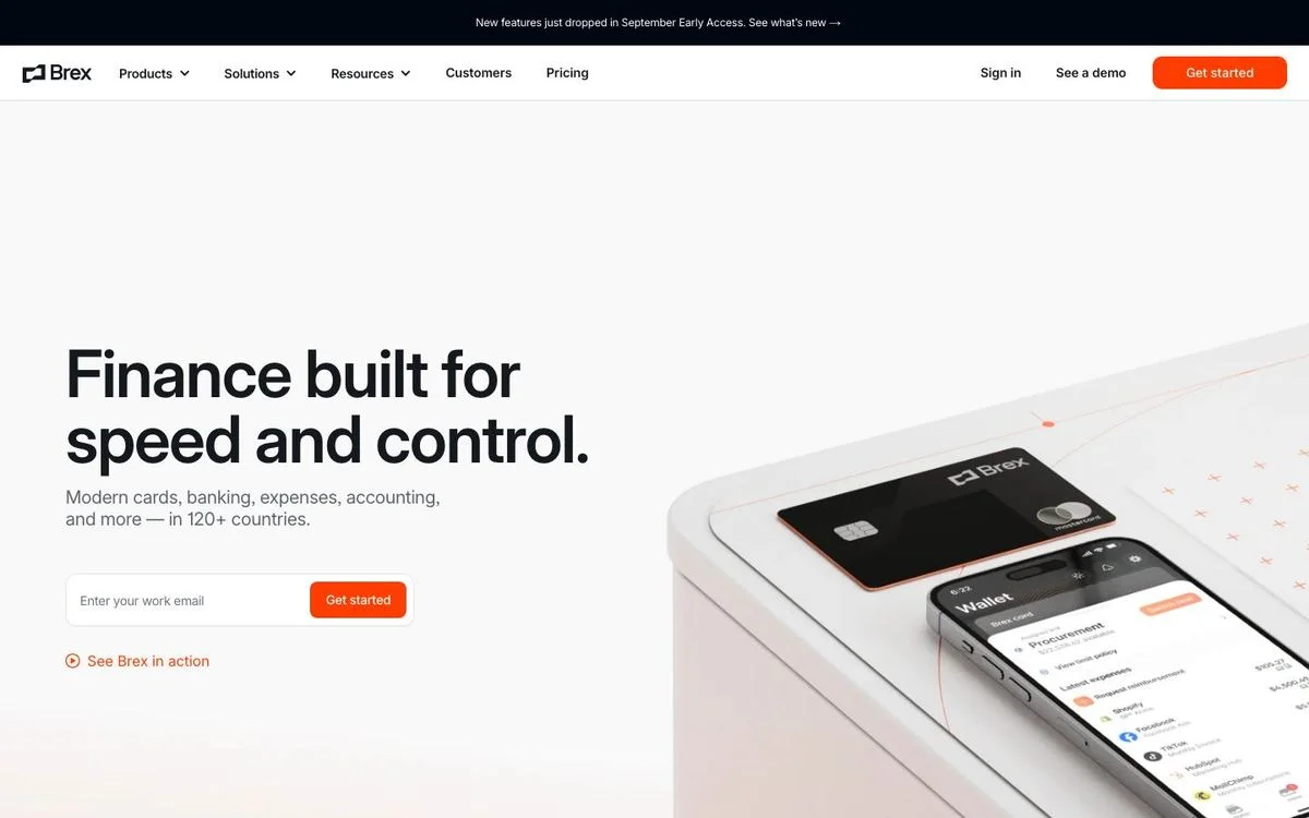
Page: Brex homepage
Above the fold: 6-word headline · email field and 1 button · full navigation · no proof
What’s on the page: “Finance built for speed and control.” The subhead: “Modern cards, banking, expenses, accounting, and more — in 120+ countries.” A work email field with “Get started,” and a text link, “See Brex in action.” The hero image is a card and a phone. The next section is “Trusted by 35,000+ top companies,” and later the page splits into solutions for startups, mid-size companies, and enterprises.
Why it works: Finance teams usually trade speed for control or control for speed. The headline promises both in six words.
Steal this: If your buyer is stuck choosing between two things, put both of them in the headline.
11. Mercury: let people try before they apply
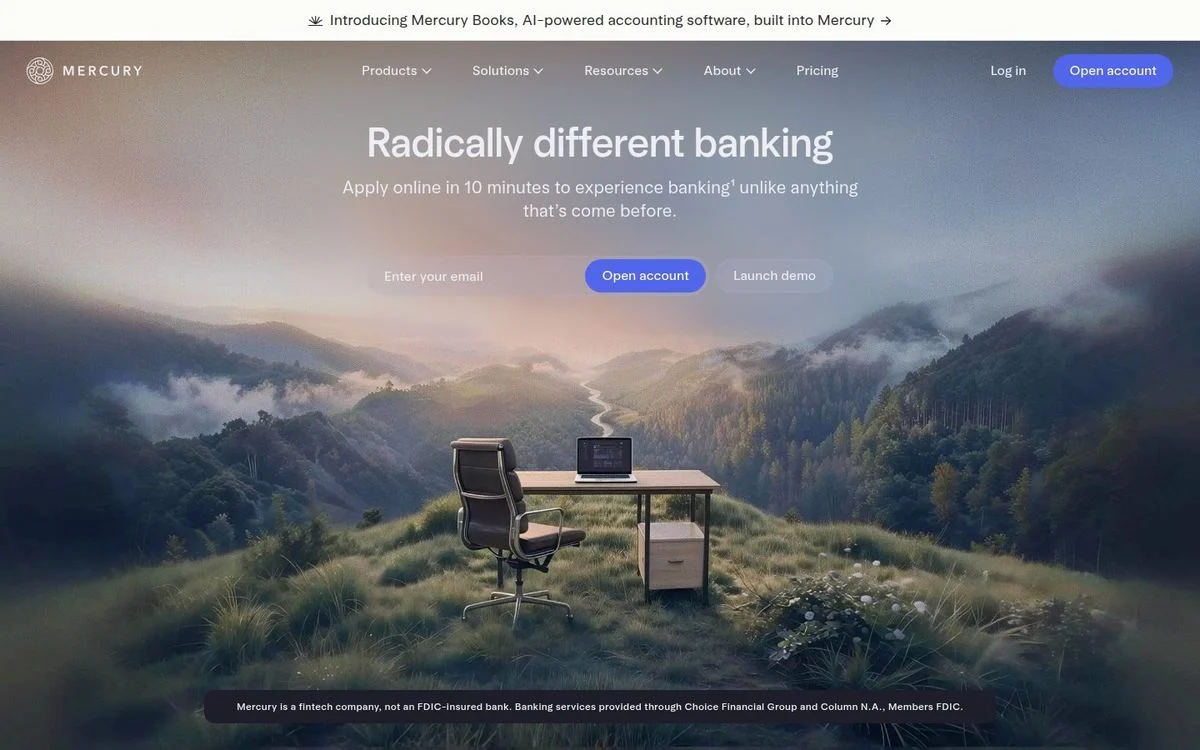
Page: Mercury homepage
Above the fold: 3-word headline · email field and 2 buttons · full navigation · no proof
What’s on the page: “Radically different banking,” over a full-width photo of a desk sitting in a mountain meadow. The subhead: “Apply online in 10 minutes to experience banking unlike anything that’s come before.” An email field with “Open account,” plus a second button, “Launch demo.” The required disclosure (Mercury is a fintech company, not an FDIC-insured bank) sits in small type at the bottom of the hero. Further down: “Loved by 300K+ of the most ambitious entrepreneurs on the planet.”
Why it works: “Launch demo” lets a visitor use the product without applying for anything, which is the lowest-commitment second button there is. “10 minutes” tells them exactly what the main button will cost them.
Steal this: Make your second button an interactive demo instead of “Book a demo.”
12. Rippling: proof at the point of the ask
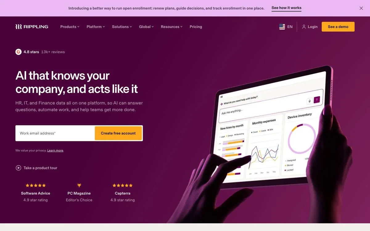
Page: Rippling homepage
Above the fold: 9-word headline · email field and 1 button · full navigation · ratings
What’s on the page: “AI that knows your company, and acts like it,” then “HR, IT, and Finance data all on one platform, so AI can answer questions, automate work, and help teams get more done.” Above the headline: 4.8 stars from 13K+ reviews. A work email field with “Create free account,” then a “Take a product tour” link. Right under the form, a row of ratings: Software Advice 4.9, PC Magazine Editor’s Choice, Capterra 4.9.
Why it works: The reviews wrap around the email field, so the visitor sees proof at the exact moment they decide whether to type.
Steal this: Move your review score next to your form. Not the footer.
Build around one clear action
Ploy turns a focused brief into an on-brand landing page you can ship, measure, and improve without a separate design and development queue.
Free trial landing page examples
For product-led companies, the landing page has one job: get someone into the product. These three remove every step they can.
13. Canva Pro: a button that says exactly what happens
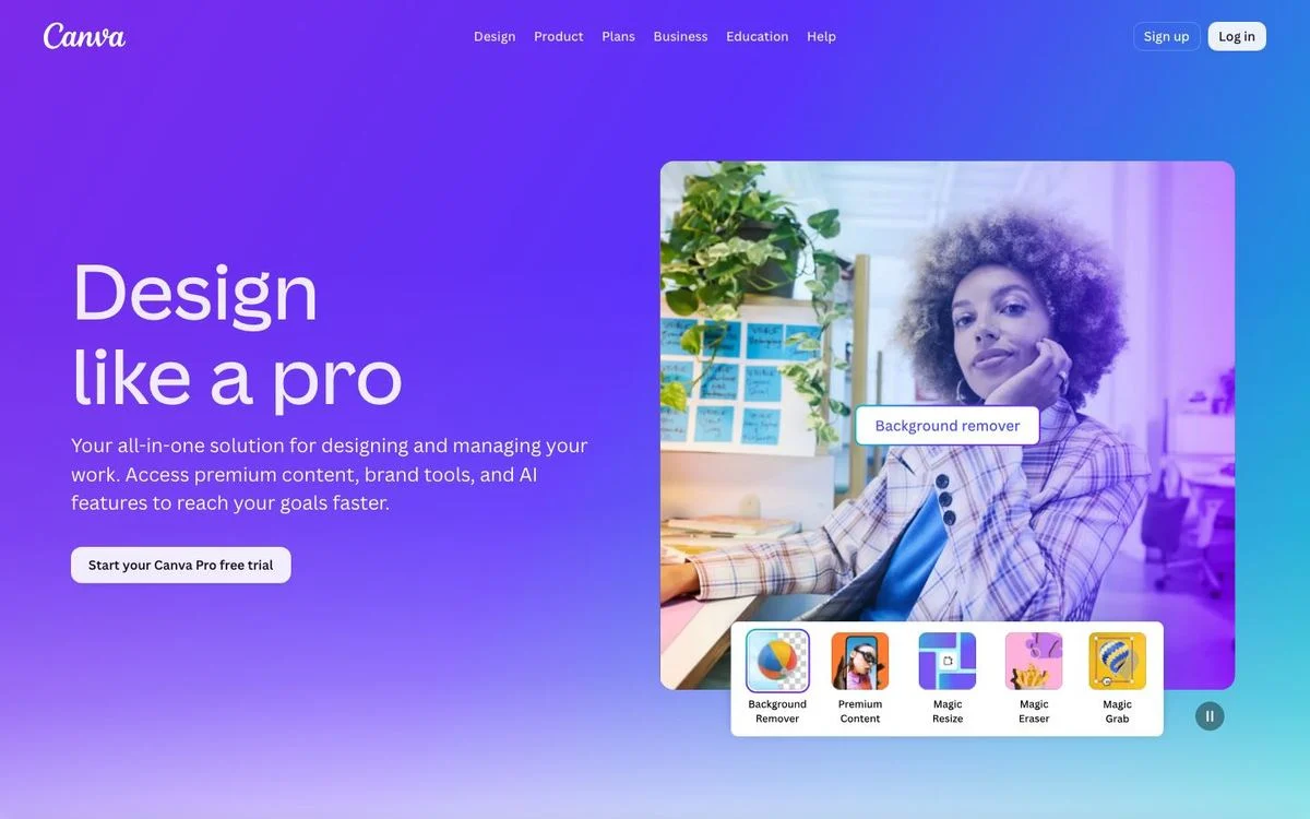
Page: Canva Pro page
Above the fold: 4-word headline · 1 button · no form · full navigation · no proof
What’s on the page: “Design like a pro,” then “Your all-in-one solution for designing and managing your work. Access premium content, brand tools, and AI features to reach your goals faster.” One button: “Start your Canva Pro free trial.” The hero photo carries labeled feature chips: Background Remover, Premium Content, Magic Resize, Magic Eraser, and Magic Grab. Below: “Why choose Canva Pro?” and “Pro tools for every task.”
Why it works: The button repeats the offer word for word, a free trial of Pro, so there’s no guessing about what the click does. The feature chips turn abstract features into things you can see.
Steal this: Write button labels that describe the next step. “Start your free trial” beats “Get started.”
See our Canva breakdown for how Canva moves free users to paid.
14. Calendly: sign up with the calendar you already use
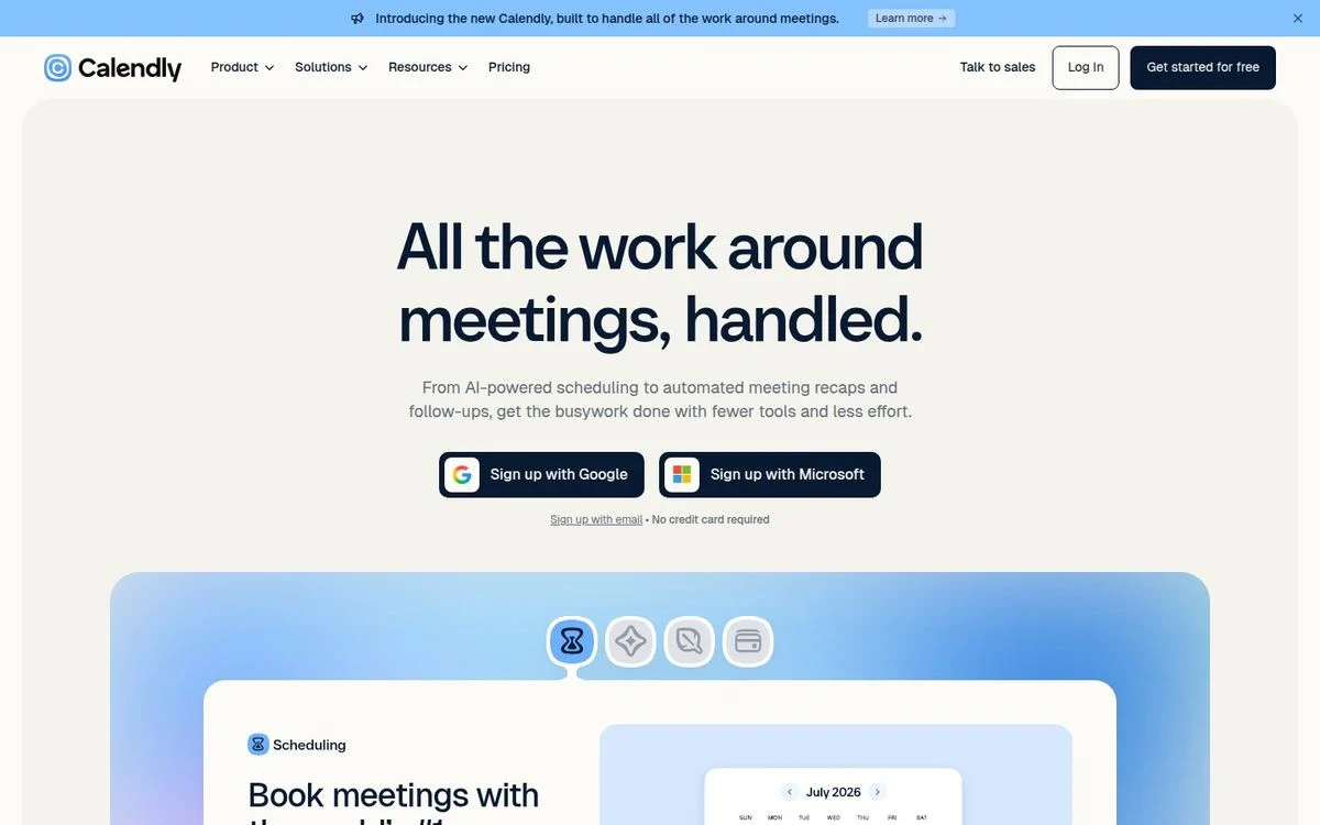
Page: Calendly homepage
Above the fold: 6-word headline · 2 buttons · no form · full navigation · no proof
What’s on the page: “All the work around meetings, handled.” The subhead: “From AI-powered scheduling to automated meeting recaps and follow-ups, get the busywork done with fewer tools and less effort.” The two buttons are “Sign up with Google” and “Sign up with Microsoft,” with “Sign up with email • No credit card required” underneath. A bar at the top introduces “the new Calendly, built to handle all of the work around meetings.”
Why it works: Calendly only works once it’s connected to your calendar, so signing up and connecting are the same click. No password, no form. And “No credit card required” sits right where the doubt shows up.
Steal this: If your product connects to Google or Microsoft, make single sign-on your main button.
15. Loom: one line everyone already knows
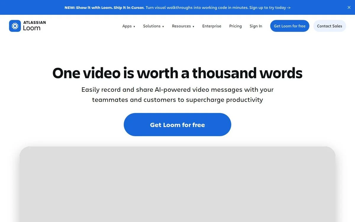
Page: Loom homepage
Above the fold: 7-word headline · 1 button · no form · full navigation · no proof
What’s on the page: “One video is worth a thousand words,” then “Easily record and share AI-powered video messages with your teammates and customers to supercharge productivity.” One large button: “Get Loom for free.” (Our second capture also showed an “Install Chrome Extension” button.) The next section opens with “Millions of people across 400,000 companies choose Loom.”
Why it works: It borrows a phrase everyone already knows and makes it literal. There is nothing to decode.
Steal this: Take a phrase your reader already uses and make it your product’s promise.
Demo request landing page examples
Demo pages are where the classic landing page advice actually shows up: no navigation, one form, nothing else. They are also where the biggest differences show up in how much each company asks for.
16. Gong: one field, then enrich
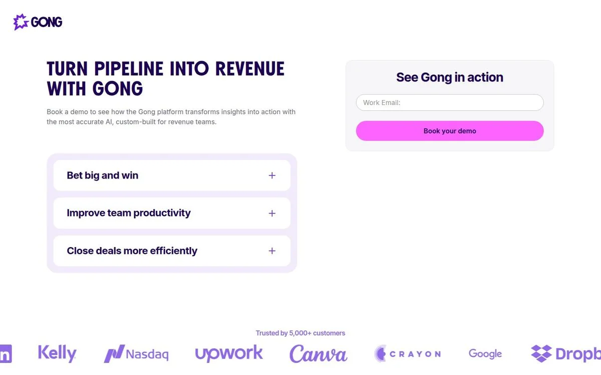
Page: Gong demo page
Above the fold: 6-word headline · 1-field form · no navigation · logos and customer count
What’s on the page: “Turn pipeline into revenue with Gong,” then “Book a demo to see how the Gong platform transforms insights into action with the most accurate AI, custom-built for revenue teams.” The form, titled “See Gong in action,” asks for a work email and nothing else, then “Book your demo.” Three expandable benefits sit beside it: “Bet big and win,” “Improve team productivity,” and “Close deals more efficiently.” Under everything: “Trusted by 5,000+ customers,” with logos. The header is just the Gong logo, and the whole page is about two screens long.
Why it works: One field is the lowest effort a demo form can ask for, and everything else (company, size, industry) can be looked up after the fact. The expandable benefits let a visitor read more without leaving the form.
Steal this: Cut your demo form to a work email and fill in the rest with visitor identification and enrichment.
17. Rippling: a long form, done right
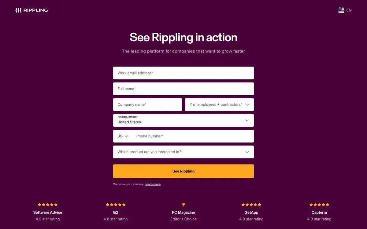
Page: Rippling demo page
Above the fold: 4-word headline · 7-field form · no navigation · ratings
What’s on the page: “See Rippling in action,” then “The leading platform for companies that want to grow faster.” Seven required fields: work email, full name, company name, number of employees and contractors, headquarters, phone number, and which product you’re interested in. The button is “See Rippling.” Under it, five ratings in a row: Software Advice 4.9, G2 4.8, PC Magazine Editor’s Choice, GetApp 4.9, and Capterra 4.9. There is no navigation at all.
Why it works: It is the opposite of Gong. Rippling sells several products to companies of very different sizes, so it needs to know who you are before routing the demo. It pays for the longer form with five ratings and removes every other distraction.
Steal this: If you need a long form, strip everything else off the page and put your strongest proof under the button.
18. Zendesk: start with a question, not a form
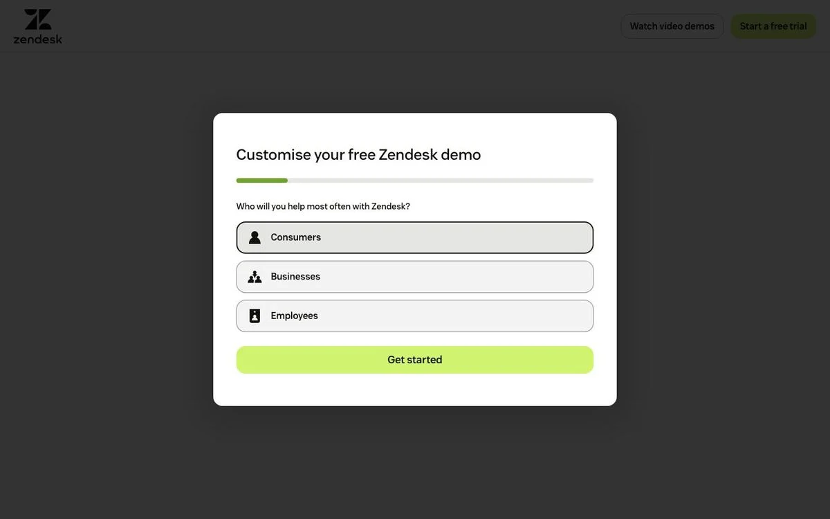
Page: Zendesk demo page
Above the fold: 5-word headline · 1 question · minimal navigation · no proof
What’s on the page: A single card invites you to customize your free Zendesk demo. Step one is one question, “Who will you help most often with Zendesk?”, with three choices: Consumers, Businesses, and Employees. A progress bar shows how far along you are, and “Get started” moves you to the next step. The header offers two other routes: “Watch video demos” and “Start a free trial.” The whole page is about 20 words.
Why it works: Picking an option is easier than filling in a blank field, and the answer routes the visitor to the right demo. The progress bar promises the whole thing is short.
Steal this: Open your demo form with one multiple-choice question about how the visitor will use your product.
Switch and data landing pages
Not every landing page sells to the buyer directly. These two are built for the people who influence the buyer: the internal champion, and the analysts and journalists who cite your numbers.
19. Linear: a switch page written for the champion
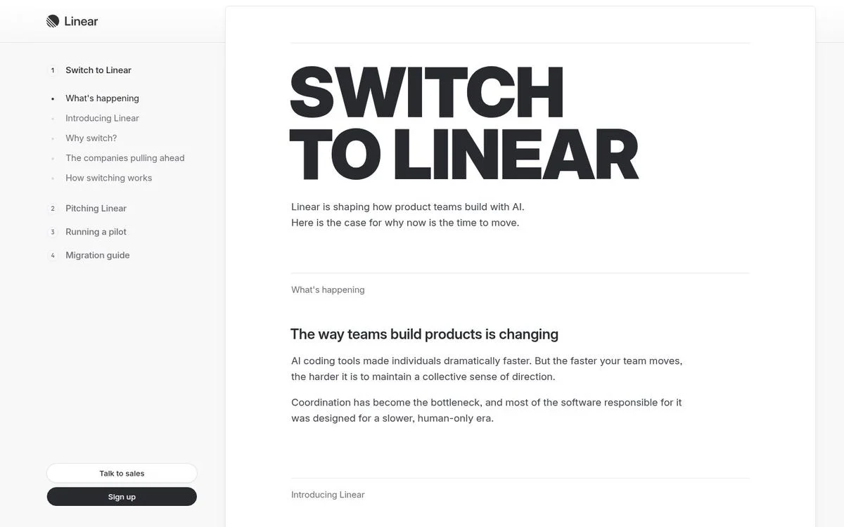
Page: Switch to Linear page
Above the fold: 3-word headline · 2 buttons · no main navigation · no proof
What’s on the page: “Switch to Linear,” then “Linear is shaping how product teams build with AI. Here is the case for why now is the time to move.” A sidebar works like a table of contents in four parts: Switch to Linear (What’s happening, Introducing Linear, Why switch?, The companies pulling ahead, How switching works), Pitching Linear, Running a pilot, and Migration guide. “Sign up” and “Talk to sales” stay pinned at the bottom of the sidebar. Further down: “Linear is the tool of choice for more than 20,000 organizations.”
Why it works: The person reading a switch page usually isn’t the one who signs off. It’s the champion who has to convince a team. Linear hands them the pitch, the pilot plan, and the migration steps in one place.
Steal this: Build your switch page as a playbook for the internal champion, not as an attack on the tool they use today.
More in our Linear landing page breakdown.
20. Ramp AI Index: a lead magnet with no gate
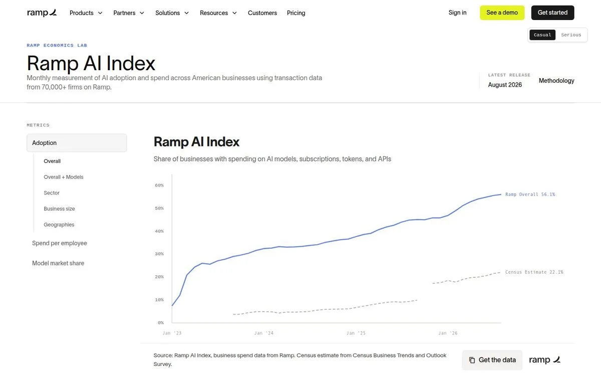
Page: Ramp AI Index
Above the fold: 3-word headline · 1 button · full navigation · no proof
What’s on the page: Under a “Ramp Economics Lab” label: “Ramp AI Index,” described as a “Monthly measurement of AI adoption and spend across American businesses using transaction data from 70,000+ firms on Ramp.” It shows the latest release (August 2026) and links to the methodology. The main event is an interactive chart of the share of businesses paying for AI models, subscriptions, tokens, and APIs, with filters for sector, business size, geography, spend per employee, and model market share. A “Get the data” button sits under the chart, and Ramp’s regular navigation, with “See a demo” and “Get started,” stays at the top.
Why it works: Nobody else has this data. A monthly release gives journalists, analysts, and buyers a reason to come back and cite it, and because there is no form, the payoff is attention and links instead of leads.
Steal this: If your product produces data nobody else has, publish it as a recurring index. For a gated version, see Clay’s interactive lead magnets.
Event landing page examples
Event pages have a deadline built in. The good ones answer what, when, and where in the first screen and spend the rest of the page on why it’s worth the trip.
21. Stripe Sessions: date, place, register
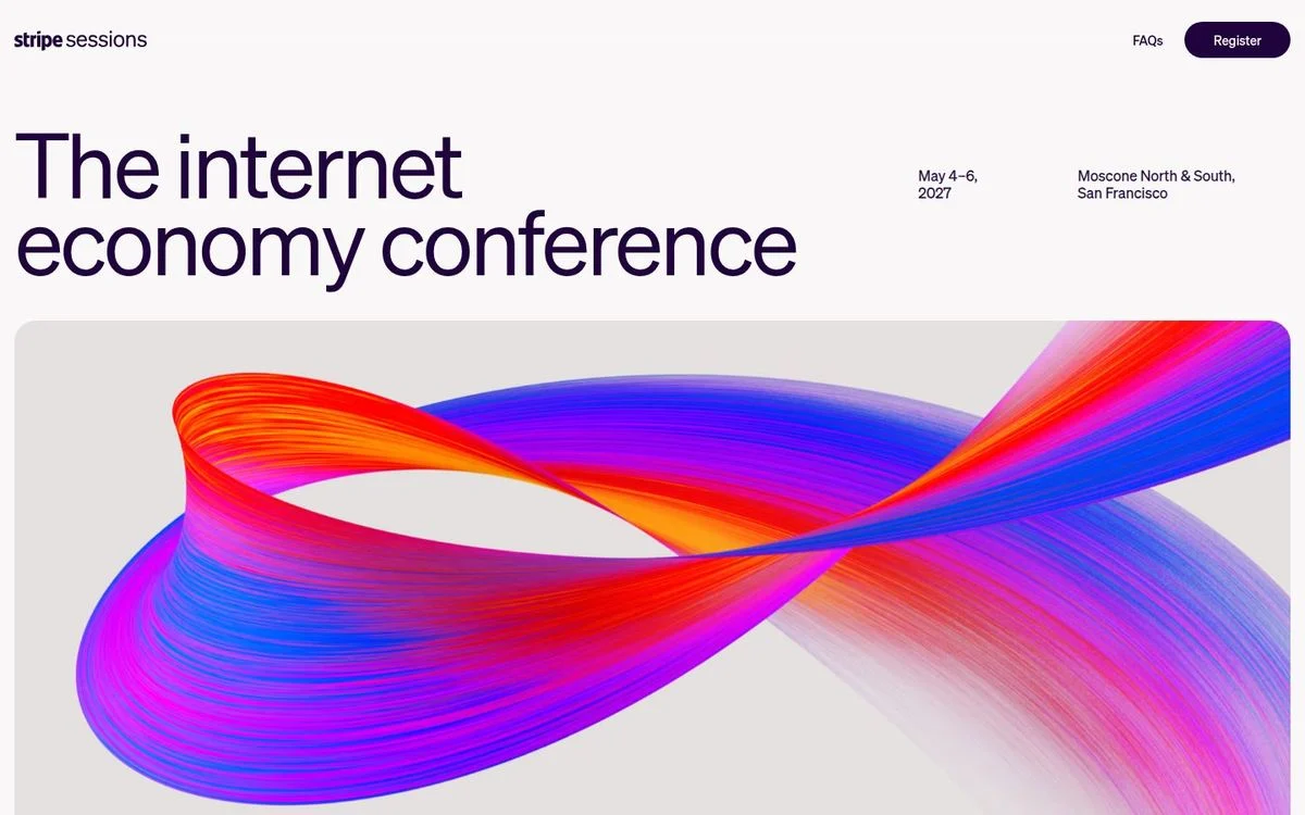
Page: Stripe Sessions site
Above the fold: 4-word headline · 1 button in the header · minimal navigation · no proof
What’s on the page: The conference has its own domain. The header holds two things: FAQs and Register. The hero reads “The internet economy conference,” with “May 4–6, 2027” and “Moscone North & South, San Francisco” beside it, over a large gradient ribbon. Below: About Sessions, a three-day agenda, a call for proposals, conference passes starting with early-bird admission, speakers, past highlights, and sponsors.
Why it works: More than seven months out, the first screen already answers what, when, and where, and the page is already selling early-bird passes. Nothing on it points back to the product site.
Steal this: Give each event its own page with a two-link header: information and registration. A subdomain keeps it separate from your main site.
22. Gong Celebrate: the numbers that justify three days
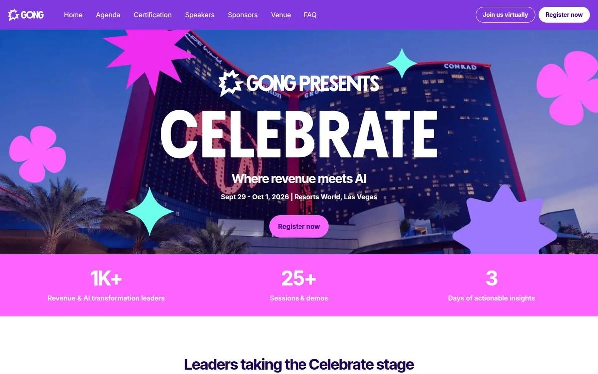
Page: Gong Celebrate page
Above the fold: 1-word headline · 1 button and a virtual option · event navigation · attendee numbers
What’s on the page: “Gong presents Celebrate,” with the tagline “Where revenue meets AI,” the dates “Sept 29 - Oct 1, 2026,” the venue “Resorts World, Las Vegas,” and “Register now.” A pink band underneath: “1K+ Revenue & AI transformation leaders,” “25+ Sessions & demos,” “3 Days of actionable insights.” The event’s own menu covers Agenda, Certification, Speakers, Sponsors, Venue, and FAQ, with “Join us virtually” next to “Register now.” The next section is “Leaders taking the Celebrate stage.”
Why it works: Three numbers answer the question every attendee has to sell to their manager: is this worth three days away? The virtual option catches everyone who can’t travel.
Steal this: Next to your main button, offer a lower-commitment version of the same thing.
Marketplace signup landing pages
Two-sided marketplaces use landing pages to recruit the supply side: sellers, drivers, and couriers. These three lead with money and flexibility, not features.
23. Etsy: sell the demand, not the tools
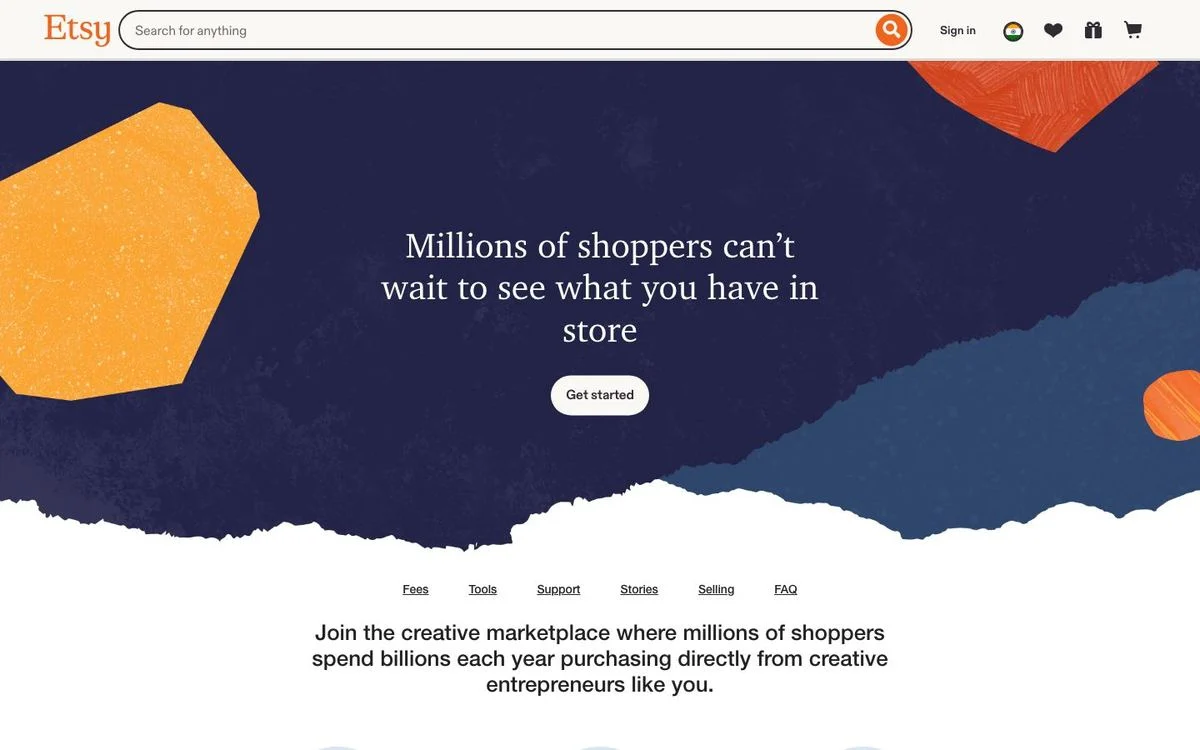
Page: Sell on Etsy page
Above the fold: 12-word headline · 1 button · marketplace header · no proof
What’s on the page: “Millions of shoppers can’t wait to see what you have in store,” with a single “Get started” button. Under it, a small menu (Fees, Tools, Support, Stories, Selling FAQ) and the line “Join the creative marketplace where millions of shoppers spend billions each year purchasing directly from creative entrepreneurs like you.” Further down, the fees are laid out plainly, alongside “No additional monthly fees” and “Seller protection.”
Why it works: It is the longest headline of the 30, and it still works because it is about the seller’s future customers, not about Etsy. Putting the fees on the page answers the question every seller has before they sign up.
Steal this: On a two-sided product, recruit one side by showing them the other side.
24. DoorDash: an offer for your neighborhood
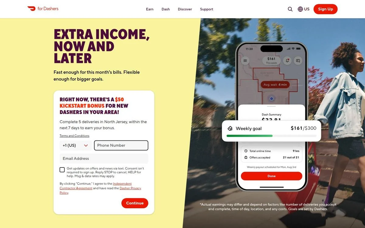
Page: Become a Dasher page
Above the fold: 5-word headline · 2-field form · full navigation · no proof
What’s on the page: “Extra income, now and later,” then “Fast enough for this month’s bills. Flexible enough for bigger goals.” The signup form sits in the hero: phone number, email, and “Continue.” From our US connection, the form carried a local offer: “Right now, there’s a $50 kickstart bonus for new Dashers in your area! Complete 5 deliveries in North Jersey within the next 7 days to earn your bonus.” A phone mockup shows a weekly goal of $161 out of $300.
Why it works: The offer changes with the visitor’s location, so it reads as current and local instead of generic. And the form asks for a phone number first, because Dashers work from their phones.
Steal this: Localize your offer by region or segment with website personalization.
25. Uber: answer the objection before it’s asked
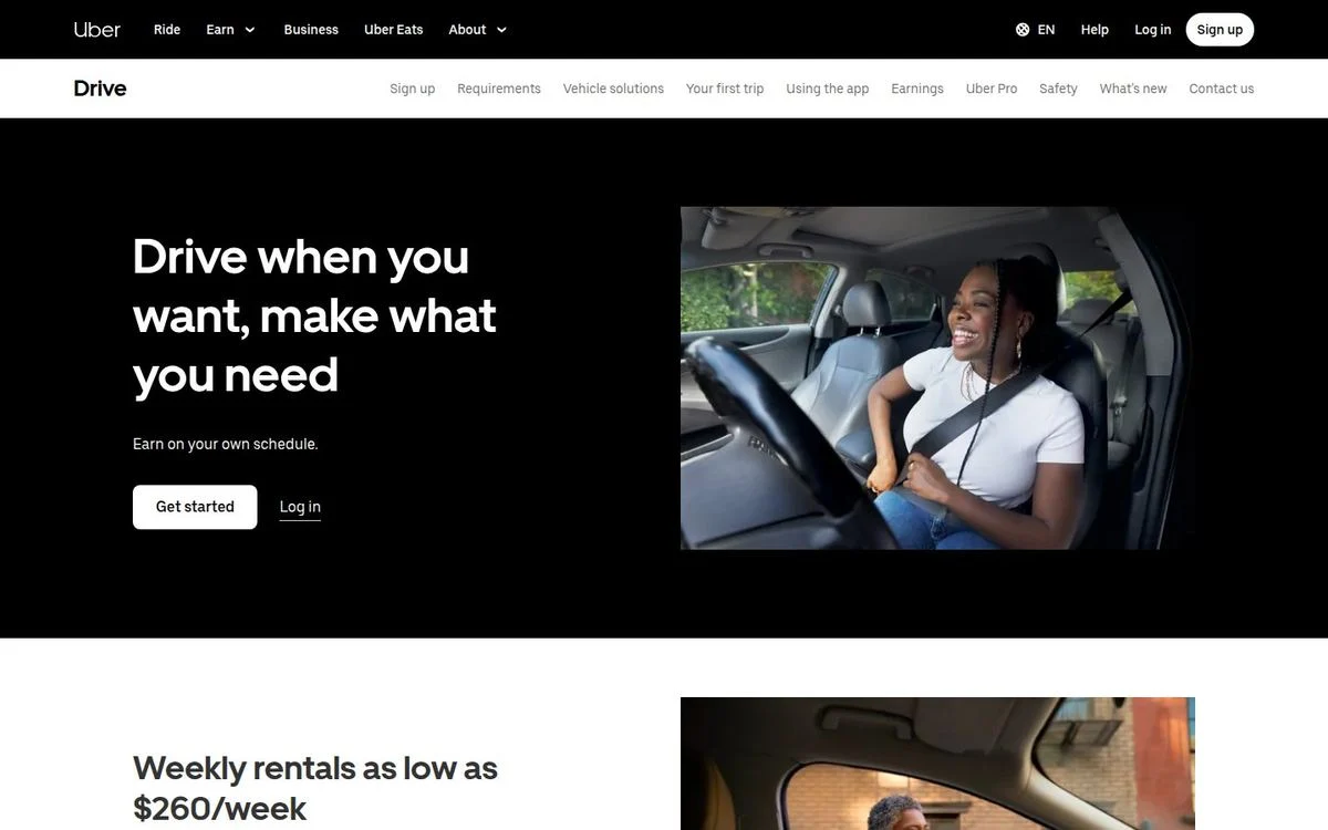
Page: Drive with Uber page
Above the fold: 8-word headline · 1 button and a login link · full navigation · no proof
What’s on the page: “Drive when you want, make what you need,” then “Earn on your own schedule.” A “Get started” button and a “Log in” link sit next to a photo of a smiling driver. Directly under the hero: “Weekly rentals as low as $260/week.” A second menu covers requirements, vehicle solutions, your first trip, earnings, and safety. Further down: “Set your own hours,” “Get paid fast,” and a checklist of the documents you’ll need.
Why it works: The most common reason someone doesn’t sign up to drive is not having a car. The section right under the hero answers that with a price.
Steal this: Put the answer to your biggest objection directly under the hero.
Ecommerce and product landing page examples
Product pages for physical goods lean on imagery more than B2B pages do. The best ones still keep the first screen to one claim and one action.
26. Apple AirPods Pro 3: one claim, one number, one price
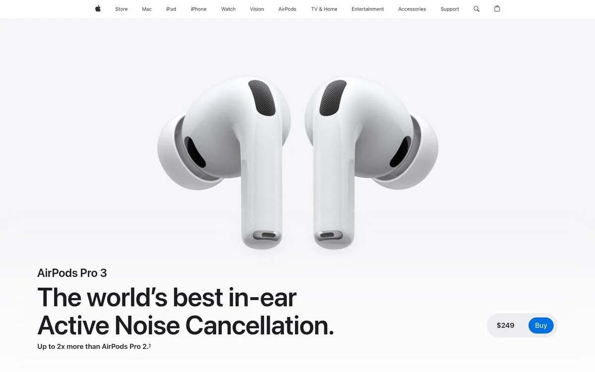
Page: AirPods Pro page
Above the fold: 7-word headline · 1 button and a price · product navigation · no proof
What’s on the page: “AirPods Pro 3,” then “The world’s best in-ear Active Noise Cancellation.” and “Up to 2x more than AirPods Pro 2.” The product floats in white space. At the bottom right: “$249” and a “Buy” button. A product menu covers Overview, Hearing Health, Tech Specs, Compare, and Buy. It is by far the longest page in this list, more than 30 screens deep with over a dozen videos.
Why it works: The first screen does exactly one thing: one claim, one number to back it, and the price. All of the storytelling waits for the people who want it.
Steal this: If your price is a selling point, put it right next to the button.
27. AG1: a hero that follows the calendar
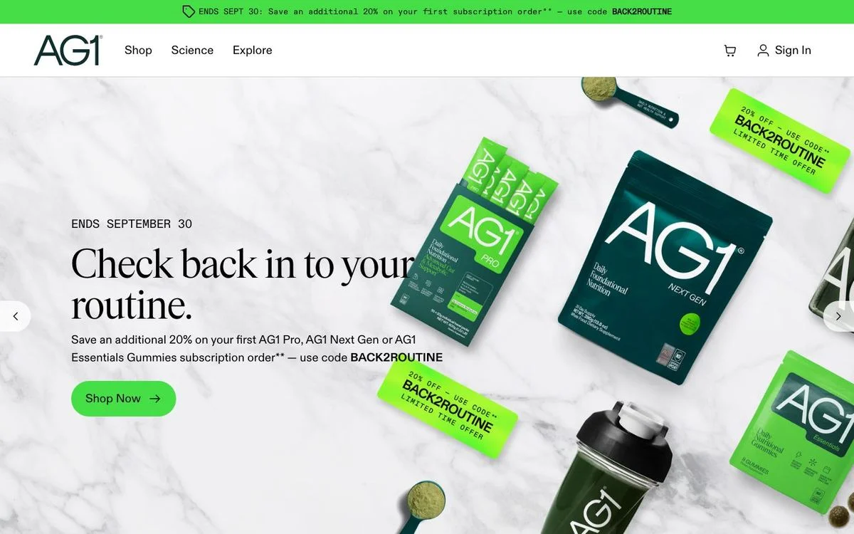
Page: AG1 homepage
Above the fold: 6-word headline · 1 button · full navigation · no proof
What’s on the page: A bar across the top: “ENDS SEPT 30: Save an additional 20% on your first subscription order — use code BACK2ROUTINE.” The hero repeats the deadline, “Ends September 30,” over the headline “Check back in to your routine.” and the same offer, with a “Shop Now” button. Further down: “Compare AG1 Products,” “What People Are Saying,” “Over 60,000 Satisfied Customers and Counting,” and an FAQ that asks “Is this another greens powder?”
Why it works: A back-to-routine offer in September matches what buyers are already thinking about. The deadline makes it urgent, and the code makes it trackable.
Steal this: Rotate your hero with the calendar and give every offer a real end date.
28. Oura: show scale without a spec sheet
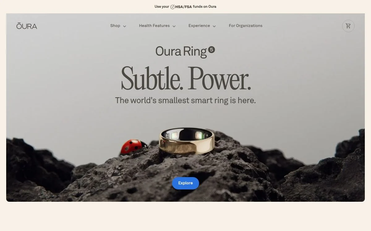
Page: Oura homepage
Above the fold: 2-word headline · 1 button · full navigation · no proof
What’s on the page: “Oura Ring 5,” then “Subtle. Power.” and “The world’s smallest smart ring is here,” with one button, “Explore.” The photo shows the ring on a rock next to a ladybug. A bar at the top reads “Use your HSA/FSA funds on Oura.” From our second location, the hero promoted Oura Ring 4 instead (“Sleeker. Smarter. Made for you.”). Further down: “86% of Oura Members see their health improve” and a row of press reviews of Oura Ring 5.
Why it works: The ladybug shows how small the ring is without a single measurement. The HSA/FSA line removes a price objection for US buyers before it comes up.
Steal this: Use the top bar for the objection that stops people from paying.
App landing page examples
Consumer app pages have the least time to work. These two do it with very little text and a very clear choice.
29. Headspace: two products, two buttons
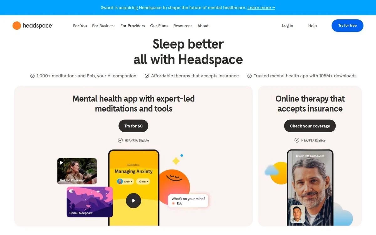
Page: Headspace homepage
Above the fold: 5-word headline · 2 buttons · full navigation · download count
What’s on the page: The headline rotates. It read “Sleep better all with Headspace” in one capture and “Feel less anxious all with Headspace” in the other. Under it, three checkmarks: “1,000+ meditations and Ebb, your AI companion,” “Affordable therapy that accepts insurance,” and “Trusted mental health app with 105M+ downloads.” Two cards split the offer: “Mental health app with expert-led meditations and tools” with “Try for $0,” and “Online therapy that accepts insurance” with “Check your coverage.”
Why it works: The rotating headline speaks to several reasons people arrive (sleep, anxiety) without picking just one. The two cards give each product a button that fits it: nobody wants to “sign up” for therapy, but everyone wants to check their coverage.
Steal this: When you sell two things, give each its own card and a button verb that fits it.
30. Duolingo: almost nothing to read
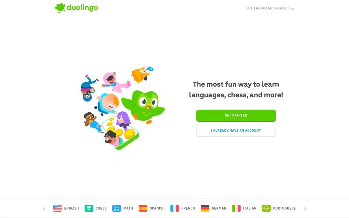
Page: Duolingo homepage
Above the fold: 10-word headline · 2 buttons · no navigation · no proof
What’s on the page: “The most fun way to learn languages, chess, and more!” Two buttons: “Get started” and “I already have an account.” The mascot illustration fills the left side, and a row of courses runs along the bottom: English, Chess, Math, Spanish, French, and more. The header holds only the logo and a site language picker. The whole page is fewer than 200 words.
Why it works: Nothing competes with the green button. Returning users get their own button, so they never have to hunt for a login link.
Steal this: Give returning visitors an obvious exit so new visitors have exactly one path.
Landing page best practices from 30 real pages
These come straight from the patterns above, not from a style guide:
- Keep the headline to seven words or fewer. 26 of 30 do. Let the subhead do the explaining.
- Ask for one thing. 18 of 30 have one button in the hero. Add a second only for a different stage or a different visitor.
- Label buttons with what happens next. “Start your Canva Pro free trial,” “Check your coverage,” and “Book your demo” all beat “Submit.”
- Show the product doing its job. Stripe shows an invoice, Ramp shows its approval queue, and Figma shows the code panel.
- Put proof next to the ask. Rippling and Gong wrap ratings and logos around the form, not the footer.
- Remove navigation only on single-job pages. Demo, event, and signup pages did it. Product pages didn’t.
- Answer your biggest objection right under the hero. Uber shows a rental price, Calendly says “No credit card required,” and Oura mentions HSA/FSA funds.
- Treat the hero as a test, not a finished page. Fin, Headspace, and DoorDash all showed different heroes to different visitors. That is conversion rate optimization done continuously, not once a quarter.
Landing page structure: a simple template
Most of the SaaS pages above follow the same order. Use it as a starting point:
- Announcement bar (optional): a launch, an event, or a deadline, like AG1’s September offer or Clay’s conference.
- Hero: a short label, a headline of seven words or fewer, a one-line subhead, one or two buttons, and a product visual.
- Proof strip: logos, a rating, or a customer count.
- Jobs or objections: three to five sections with one idea each, like Slack’s four cards.
- Customer stories with numbers: Stripe leads its stories with results, like a 20% lift in subscription revenue.
- How it works, or pricing.
- FAQ: the questions your sales team hears most.
- Closing call to action: the same button as the hero.
Expect the finished page to run long. The median page in this list is about 11 screens deep. Demo request pages are the exception at one or two.
How to create a landing page like these
The slow way is a brief, a design file, a copy doc, two review rounds, and a dev ticket. By the time the page is live, the campaign has moved on.
The faster way:
- Pick one visitor and one action. If you can’t name both, the page isn’t ready to build.
- Pick the closest example above and copy its structure, not its words.
- Write three things first: the headline, the subhead, and the button label. Everything else on the page supports those.
- Build it in your brand. Click “Rebuild this in Ploy” under any example, and Ploy’s AI landing page builder recreates the layout with your fonts, colors, and components. Edit the copy in chat and publish to your site or a subdomain without a dev ticket.
- Measure it, then change it. Compare your numbers with our landing page conversion benchmarks, then test the headline and the button first.
If you need many versions of the same page, one per segment, account, or keyword, look at personalized ABM pages and programmatic landing pages. To see what that looks like across a full sales cycle, read how Avoca runs ABM.
Frequently asked questions
What is a landing page?
A landing page is a single web page built for one action: sign up, book a demo, register, or buy. It is usually where visitors land after clicking an ad, an email, or a search result. Gong’s demo page is a good example. It asks for one thing, a work email, and removes the site navigation so nothing competes with the form.
What is the difference between a landing page and a website?
A website serves many visitors with many goals and gives them navigation to move between pages. A landing page serves one visitor with one goal. In practice the line is blurry: 24 of the 30 pages in this list keep the full site navigation, because product landing pages also work as regular site pages. Demo, event, and signup pages are the ones that strip it out.
Which website has the best landing page?
There is no single winner, because “best” depends on the job the page has to do. For B2B demos, Gong’s one-field form is hard to beat. For product-led signup, Calendly’s Google and Microsoft buttons remove almost every step. For a physical product, Apple’s AirPods Pro 3 page shows one claim, one number, and a price, and nothing else.
What are common landing page mistakes?
Based on the 30 pages above: headlines that try to say everything (the median here is five words), too many buttons (only one page used three), proof buried in the footer instead of next to the form, generic button labels like “Submit,” and leaving a page untouched for months. The strongest pages in this list are tested and updated all the time.
How long should a landing page be?
Longer than most people expect. The median page here runs about 11 screens deep. The exceptions are demo request pages, which fit in one or two screens because they have a single job. What stays short is the hero: a short headline and one or two buttons.
Should a landing page have navigation?
Only if people will also browse it like a regular product page. Six of the 30 pages remove navigation, and all six have one job: three demo requests, an event, a switch page, and Duolingo’s signup. The other 24 keep the full menu.
How can I create a simple landing page?
Pick one visitor and one action. Then write a headline of seven words or fewer, a one-line subhead, and a button label that says what happens next. Add one proof point and one product visual. Duolingo and Canva Pro are good models for a simple page. With Ploy, you can rebuild any page in this list in your own brand and publish it the same day.
Can ChatGPT build a landing page?
AI chat tools like ChatGPT can write the copy and generate code for a page. What they don’t do is host it in your brand, connect the form to your CRM, show you who visited, or test a new headline next week. That ongoing work is what decides whether a landing page converts, and it’s the part Ploy’s agents handle.
Turn one proven structure into your next page
Choose the example that fits your visitor and goal. Ploy builds it in your brand and keeps the page ready to test after it ships.