Every SaaS website now has the same pages. Docs, a blog, customers, a status page, a security page, pricing. We checked all 20 sites in this list, and every one of them publishes every one of those pages.
So the page list isn’t what separates a good SaaS website from a forgettable one. What separates them is how the homepage picks its buyer, and what the pricing page is willing to say.
We loaded 20 of the best SaaS websites, measured the homepage and the pricing page on each, and verified the rest of the site over HTTP. The homepages have converged: median headline 64px, about 90 words above the fold. The pricing pages have not. Eighteen of the 20 publish prices, two make you ask, and only twelve quote a price per seat.
Below is each site, the page that carries its best idea, and what to copy.
The short version: the homepage decides who keeps reading, and the pricing page decides whether they contact you. Everything else on a SaaS site is table stakes.
Build a SaaS page that speaks to your buyer.
What we found across 20 SaaS websites
Every number here comes from the live sites on 28 September 2026:
- The page set is standard now. All 20 publish docs, a blog, a customers page, a status page, a security or trust page, and pricing. Nineteen of the 20 publish a changelog. Deel is the only one without one at a standard URL.
- Homepages have converged. The median homepage headline is 64px and the median homepage carries about 90 words above the fold. The range is wide: Notion ships 36 words, Pendo ships 380.
- Almost nobody puts proof above the fold. Only 3 of the 20 homepages show a logo row, a rating or a customer count before you scroll: Slack, Zendesk and Clerk.
- “Free” is the most common word above the fold. Thirteen of 20 homepages use it in the first screen.
- Most publish prices, but not all. Eighteen of 20 show a number on the pricing page. Vanta and Pendo show plan tiers with no prices and ask you to request them.
- Every one keeps a path to sales. All 20 have a contact-sales, talk-to-sales or book-a-demo route on the pricing page, including the ones with a free tier.
- Per-seat pricing is no longer the default. Twelve of the 20 pricing pages quote a price per user or seat, and Zendesk prices per agent. The rest charge by usage: events, monthly active users, service connections, transactions or a share of revenue.
- Annual discounts are almost universal. Twelve of the 20 put a monthly or annual toggle on the pricing page, usually with the yearly saving stated on the switch.
- Half the pricing pages answer questions in place. Ten of 20 include an FAQ on the pricing page and nine include a full feature comparison.
How we checked: on 28 September 2026 we loaded each homepage and pricing page in a headless Chrome browser at 1440 × 900, dismissed cookie banners, and read the values out of the page: headline size, words above the fold, plan names, prices, toggles, and whether a comparison table or FAQ was present. The page-set check was done separately with direct requests to each standard URL, including subdomains, so a status page at status.example.com counts even when the homepage doesn’t link to it. Where a page blocked text extraction, we confirmed the detail from the screenshot instead. Each example below shows the page that carries its lesson, which is the homepage for twelve of them and the pricing page for eight. Prices are in US dollars as shown to a US visitor on that date, and they change often, so check the live page before quoting any of them.
The 20 best SaaS websites
| What they do well | Sites |
|---|---|
| Homepages that name the buyer | Front, Pendo, Mixpanel, 1Password |
| Homepages that show the product working | Linear, Miro, Asana, Amplitude |
| Homepages that make the offer obvious | Notion, Twilio, Postman, Deel |
| Pricing pages that answer the question | Atlassian, Slack, Stripe, Clerk, LaunchDarkly |
| Pricing done differently | Paddle, Zendesk, Vanta |
Homepages that name the buyer
1. Front: name the customer you don’t want

Site: Front homepage
Measured: 62px headline · 213 words above the fold · two buttons: request a demo, start free trial · pricing at $25, $65 and $105 per seat with an annual discount
What’s on the page: “AI for simple support is everywhere. Complex customer operations demand Front.” The subheading explains that Front brings teams, conversations and AI into one coordinated system. Three tabs sit underneath for cross-team coordination, multi-step workflows and an AI command centre, and a live chat widget offers a demo, pricing or a product tour.
Why it works: The first clause gives away the simple end of the market, which makes the second clause credible. A visitor with a basic support queue self-selects out, and the ones who stay are worth a demo.
Steal this: Name the customer you are not for. It costs you unqualified demos and buys credibility with everyone else.
2. Pendo: a headline that picks a fight

Site: Pendo homepage
Measured: 52px headline · 380 words above the fold, the most of the 20 · “over 1 billion user experiences elevated by Pendo” above the headline · no prices on the pricing page
What’s on the page: “The antidote to AI slop.” Underneath, a paragraph argues that the companies winning the AI era ship software people genuinely love to use. A usage figure sits above the headline, and below the fold a proof band mixes a named customer quote, a 70% result and logos from Okta, Nasdaq and Q2.
Why it works: It takes a position on the thing its buyers are anxious about right now, then immediately backs it with a number. Most category pages in analytics say the same neutral sentence about insights.
Steal this: Write the headline as an argument someone could disagree with. Neutral headlines are forgettable.
3. Mixpanel: say what the buyer is trying to do

Site: Mixpanel homepage
Measured: 48px headline · 146 words above the fold · two buttons: book a demo, get started free · free-forever plan with a pricing calculator
What’s on the page: “Build like your customers are right beside you,” then “Know exactly what user behavior is trying to tell you.” The product sits directly underneath with tabs for analytics, session replay, experiments and metric trees, showing a real question (“What’s the root cause behind the signup drop?”) and an answer.
Why it works: The headline describes the feeling a product team wants, not the software category. The product panel then shows the literal question a PM would type, which closes the gap between promise and proof in one screen.
Steal this: Put a real customer question inside your product screenshot rather than dummy data.
4. 1Password: an audience switch inside the hero
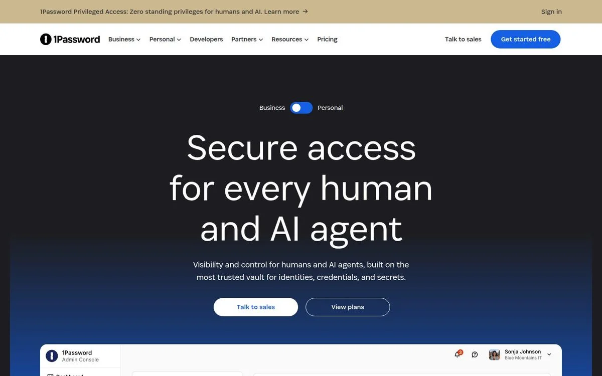
Site: 1Password homepage
Measured: 88px headline · 60 words above the fold · business and personal toggle above the headline · pricing at $24.95 for a ten-person bundle or $8.99 per user
What’s on the page: A toggle labelled Business and Personal sits above “Secure access for every human and AI agent.” Flipping it changes the page. The buttons are “Talk to sales” and “View plans,” and the product screenshot below shows an admin console.
Why it works: One product, two completely different buyers, and the switch is the first thing you see. It is a cleaner solution than the usual approach of burying a second audience in the navigation.
Steal this: If you sell to two audiences, put the switch above the headline, not in the menu.
Homepages that show the product working
5. Linear: the product screenshot is the design

Site: Linear homepage
Measured: 64px headline · 139 words above the fold · near-black page · pricing at $0, $10 and $16 per user with an enterprise tier
What’s on the page: “The product development system for teams and agents,” one line of support copy, and a full-width screenshot of the product showing issues, a triage view and an activity feed with real ticket names.
Why it works: The screenshot is legible at full width, which is rare. Most SaaS homepages shrink the product until it becomes a grey smudge, then compensate with an illustration.
Steal this: Give your product screenshot enough width to be readable, and fill it with realistic content rather than lorem data.
More in our Linear breakdown.
6. Miro: put the signup inside the product

Site: Miro homepage
Measured: 56px headline · 204 words above the fold · email field with “get started free” inside the hero · pricing at $0, $8 and $20 per member
What’s on the page: “Human collaboration at the speed of AI” sits in the middle of an illustrated canvas. Around it float the things you would actually make in Miro: a customer feedback table, a flow process, a BPMN diagram, collaborator avatars. The email capture is placed in the centre of that canvas, not above it.
Why it works: The signup field sits inside a picture of the finished work, so the ask and the payoff occupy the same space.
Steal this: Frame your email capture with the output the customer wants, not with an empty hero.
7. Asana: signup as the first step of the workflow

Site: Asana homepage
Measured: 102px headline, the largest of the 20 · 58 words above the fold · Google and Microsoft signup plus an email field · pricing at $0, $10.99 and $24.99 per user
What’s on the page: “AI agents your business can trust” at 102px, with “Asana connects every agent to real work and real owners” underneath. Google and Microsoft signup buttons sit above an email field, and the whole thing is drawn inside a workflow diagram that runs from “Launch product in 4 weeks” through approvals to “Product launched!”
Why it works: The illustration turns signup into step one of a process that ends in a shipped product. It is the same single-sign-on pattern everyone uses, with a story wrapped around it.
Steal this: Show the outcome of the workflow around your signup form, so the first click reads as progress.
8. Amplitude: let the visitor choose the demo
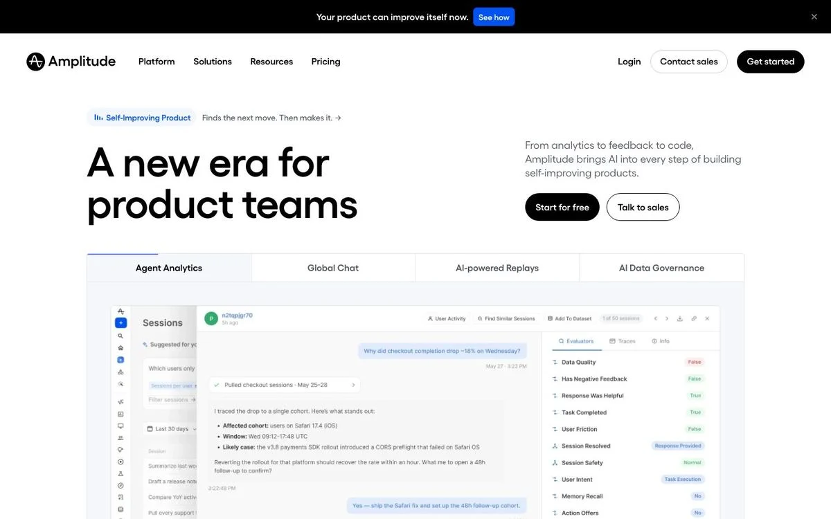
Site: Amplitude homepage
Measured: 72px headline · 274 words above the fold · two buttons: start for free, talk to sales · free tier with 2M events a month
What’s on the page: “A new era for product teams,” with a short paragraph about bringing AI into every step of building products. Directly below, a tabbed product panel lets you switch between agent analytics, global chat, AI-powered replays and data governance, each showing a different screen.
Why it works: A platform with four capabilities usually gets four sections and a long scroll. Tabs put all four in the first screen and let the visitor pick the one they came for.
Steal this: If your product has several distinct jobs, tab them in the hero instead of stacking them down the page.
Homepages that make the offer obvious
9. Notion: the leanest homepage of the 20
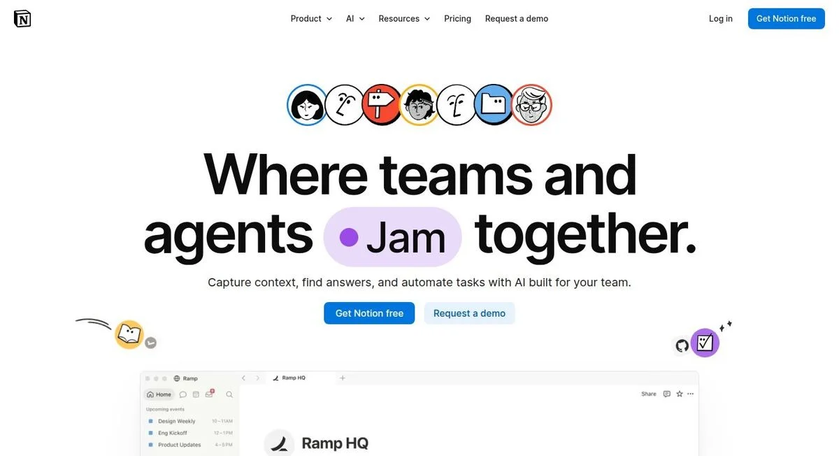
Site: Notion homepage
Measured: 96px headline · 36 words above the fold, the fewest of the 20 · two buttons: get Notion free, request a demo · free plan at $0 with per-user paid tiers
What’s on the page: A 96px headline where one verb sits in a pill and changes as you watch, one line of supporting copy, and two buttons. That is the entire first screen, apart from a row of illustrated avatars.
Why it works: Thirty-six words is a third of the median homepage here. It works because the free plan is the offer, so there is nothing to explain before someone can try it.
Steal this: The stronger your free tier, the shorter your homepage can be. If you need 200 words above the fold, the problem may be the offer rather than the copy.
10. Twilio: answer the three objections under the button

Site: Twilio homepage
Measured: 56px headline · 63 words above the fold · “start for free” plus a secondary link · three reassurance lines under the buttons · usage-based pricing
What’s on the page: “The platform for conversations in the AI era,” a two-line explanation, and two buttons. Underneath them, three short lines with icons: free trial, no credit card required, flexible pricing. A brand film plays to the right.
Why it works: Those three lines answer the exact objections that stop a developer signing up, and they sit where the hesitation happens rather than on the pricing page.
Steal this: Put your three biggest objections in one line under the primary button.
11. Postman: one sentence, then get out of the way
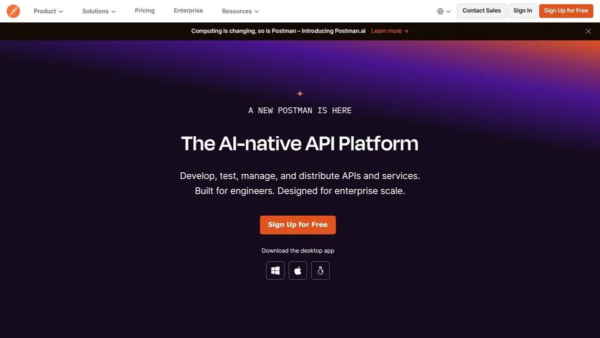
Site: Postman homepage
Measured: 55px headline · 289 words above the fold · “sign up for free” plus desktop app downloads · pricing at $0, $9 and $19 per user
What’s on the page: An eyebrow announces a new Postman, then “The AI-native API Platform,” then one sentence: develop, test, manage and distribute APIs and services, built for engineers, designed for enterprise scale. One orange signup button, and under it direct download links for Windows, Mac and Linux.
Why it works: The download links matter. For a desktop-first tool, the real conversion is installing the app, and the page treats that as a first-class action rather than hiding it behind signup.
Steal this: If your product is used outside the browser, put the install path in the hero next to the signup button.
12. Deel: ask the visitor what they came for

Site: Deel homepage
Measured: 60px headline · 78 words above the fold · five checkbox options in the hero · two review scores under the button · pricing split by product
What’s on the page: “Hire, manage, pay, & equip anyone, anywhere.” Under it, a question: “What would you like to do with Deel?” with five checkboxes, from hiring anywhere to running payroll to shipping equipment. A “book a demo” button sits underneath, with review scores from two sites. The product collage on the right shows a completed payroll of $360,450 and a named customer quote.
Why it works: Deel sells five things. Rather than picking one headline and losing the other four, it asks the visitor to self-select, which also tells sales what the lead wants before the call.
Steal this: If you sell several jobs to be done, ask the visitor which one they want in the hero, and pass that answer to sales.
Pricing pages that answer the question
13. Atlassian: a pricing page that does the arithmetic

Site: Jira pricing page
Measured: Free $0, Standard $7.91 per user/month, Premium $14.54 per user/month, Enterprise billed annually · team-size input · monthly and annual switch marked “save up to 17%” · comparison table
What’s on the page: “Transparent pricing for every team,” with two controls directly beneath: a team size input and a billing switch. Change the team size and every price on the page updates. Premium is labelled recommended, and Enterprise pricing only appears once you switch to annual billing.
Why it works: Per-seat pricing forces the buyer to do mental arithmetic before they can compare anything. Putting the calculator at the top removes that work, and the number on screen becomes the number they will actually pay.
Steal this: If you price per seat, put the seat count control above the plans rather than in a calculator further down.
14. Slack: give people permission to start small

Site: Slack pricing page
Measured: Free $0, Pro and Business+ each showing a struck-through price beside a promotional one, Enterprise+ via sales · per-user pricing · comparison table and FAQ · customer logos on the page
What’s on the page: “Choose a paid plan built for businesses. Or start with the basics for free, and upgrade at any time.” Four plans follow, with two of them showing the standard price crossed out next to a lower promotional one, and a logo row under the heading.
Why it works: The subheading does something most pricing pages avoid: it says the free plan is fine and upgrading later is easy. That lowers the stakes on the page where visitors are most afraid of choosing wrong.
Steal this: Write one line under your pricing heading that makes it safe to start small.
15. Stripe: one rate, and a separate door for the complex case

Site: Stripe pricing page
Measured: 2.9% + 30¢ per successful domestic card transaction · a custom path offering interchange-plus pricing, volume discounts, multi-product discounts and country-specific rates · tabs for standard pricing, custom pricing and FAQs
What’s on the page: “Pricing built for businesses of all sizes,” then two cards. The standard card carries one formula and states there are no setup fees, monthly fees or hidden fees. The dark custom card lists what a negotiated package can include. A chat widget shows how many sales reps are available right now.
Why it works: Payments pricing is genuinely complicated, and Stripe resolves that by publishing one number that covers most visitors and a clearly separate door for everyone else. Nobody reads the complicated version unless they are the complicated case.
Steal this: Publish the simple formula that covers most customers, then link the complex path separately instead of merging both into one table.
Our Stripe breakdown covers the rest of the site.
16. Clerk: print the overage next to the plan

Site: Clerk pricing page
Measured: Hobby free with no credit card required, Pro $20/month, Business $250/month, Enterprise custom · a monthly and annual switch on each card · included usage and per-unit overage listed per plan · comparison table
What’s on the page: “Plans for every stage. Clear pricing that scales.” Four dark cards, each with its own billing toggle. Under each plan the add-ons are itemised: how many monthly active users are included, the per-user price beyond that, and prices for extra features.
Why it works: Usage pricing usually hides the overage. Clerk prints it beside the plan, so a developer can estimate the bill on the page rather than after the first invoice.
Steal this: Publish your overage rates next to the plan price. Hiding them costs you trust with the technical buyer who will check.
17. LaunchDarkly: make the pricing model the argument

Site: LaunchDarkly pricing page
Measured: Developer $0/month forever with no credit card, Foundation pay-as-you-go from $10 per service connection/month and $8.33 per 1,000 client-side monthly active users, Enterprise custom · “compare all features” link
What’s on the page: “Flexible pricing for every stage and team.” Three plans: a free developer tier, a pay-as-you-go tier with per-unit prices and a line stating there are no platform or seat fees, and a custom enterprise tier with its own trial.
Why it works: “No platform or seat fees” is a competitive claim aimed at buyers who have been burned by per-seat pricing in this category, and it sits on the page where the comparison actually happens.
Steal this: If your pricing model is friendlier than your category’s norm, say so on the pricing page rather than in a blog post.
Pricing done differently
18. Paddle: one rate, and what it absorbs

Site: Paddle pricing page
Measured: pay-as-you-go at 5% + 50¢ · one custom tier · no seats and no monthly platform fee
What’s on the page: “Our pricing. Your payments, billing, tax compliance, and more at an all-inclusive price. No added costs, no hidden fees.” Two cards: pay-as-you-go at 5% + 50¢, and custom pricing for larger businesses. The first card lists what the rate absorbs, including cross-border sales tax compliance and fraud and chargeback protection.
Why it works: Five per cent looks expensive next to a payment processor until you see the list of things it replaces. Putting the absorbed costs directly under the number reframes the comparison.
Steal this: When your price looks high against a narrower competitor, list what it includes right underneath, not on a separate page.
19. Zendesk: one pricing page, three audiences

Site: Zendesk pricing page
Measured: audience tabs for customer service, employee service and contact centre · Support Team $19, Suite Team $55, Suite Professional $115 per agent/month paid yearly, Suite Enterprise + Copilot via sales · FAQ on the page
What’s on the page: “Pricing for the #1 AI customer service solution,” with three audience tabs above the plans. Switching tabs changes the entire plan set. Suite Professional is marked most popular, and each plan lists the AI capability it adds over the one before it.
Why it works: One company sells to three different budgets here. Tabs mean each buyer sees a plan set that matches their problem instead of scrolling past two products that aren’t theirs.
Steal this: When you sell the same platform to different departments, switch the plans by audience rather than making one table serve everyone.
20. Vanta: tiers without prices
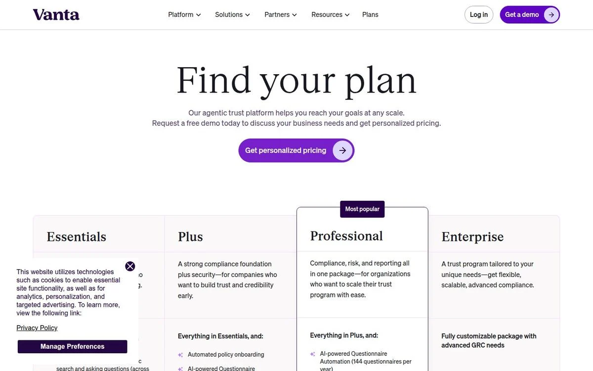
Site: Vanta pricing page
Measured: four tiers (Essentials, Plus, Professional, Enterprise) · no prices anywhere on the page · one button: get personalised pricing · feature comparison included
What’s on the page: “Find your plan,” with a line explaining that the platform scales and inviting you to request a demo for personalised pricing. Four columns describe what each tier covers, with Professional marked most popular. There is not a single number on the page.
Why it works: Compliance pricing depends on frameworks, headcount and audit scope, so a published price would be wrong for most visitors. What Vanta still does is show the tier structure, so a buyer arrives at the call knowing roughly where they sit.
Steal this: If you can’t publish prices, publish the shape of the plans anyway. “Contact us” with no tiers tells a buyer nothing.
What every SaaS website now has
The page set has standardised. All 20 of these sites publish the same six things, so treat them as table stakes rather than differentiators:
| Page | How many of the 20 | Notes |
|---|---|---|
| Pricing | 20 | Atlassian prices per product rather than at one URL |
| Customers or case studies | 20 | Usually filterable by industry and company size |
| Blog | 20 | |
| Docs or developer reference | 20 | Often on a subdomain rather than a path |
| Status page | 20 | Almost always on a status subdomain |
| Security or trust page | 20 | Sometimes a full trust centre with live controls |
| Changelog or release notes | 19 | Deel is the exception at a standard URL |
If you are missing two or three of these, that is the cheapest work on your list. None of them need a redesign.
Make your offer easier to evaluate
Build on-brand pages that explain the product and give buyers a clear next step.
SaaS website structure: the pages that actually sell
From the patterns above, a SaaS site that sells has five jobs to do, in this order:
- A homepage that names the buyer. Median headline 64px, about 90 words above the fold. Say who it is for, and if you can, say who it isn’t for.
- A pricing page that answers the question. Publish a number if you can. If you can’t, publish the tier structure anyway.
- Proof a buyer can filter. Customers by industry and company size, not a wall of logos.
- Docs, status and security. These are what a technical evaluator checks before the call, and all 20 of these companies publish all three.
- A changelog. The cheapest ongoing proof that the product is alive.
How to build a SaaS website like these
Most of what makes these sites good is structure, not art direction. That is good news, because structure is quick to change:
- Cut the homepage to one buyer. If your headline could belong to three competitors, it isn’t doing any work.
- Fix the pricing page next. It is where deals are decided, and the page most SaaS teams update least.
- Add the missing table-stakes pages. A changelog and a trust page cost you a template each.
- Split pricing by audience or job if you sell more than one thing, the way Zendesk and Deel do.
- Measure the result. Compare against our conversion benchmarks by industry, then run A/B tests on the homepage headline and the plan order.
With Ploy’s AI landing page builder, each of those is a chat instruction against your existing brand system, published to your site or a subdomain without a dev ticket. If the whole site needs work rather than a page, start with a website redesign plan.
Frequently asked questions
What is SaaS website design?
It is the design of a marketing site for a software product sold by subscription. In practice it means a homepage, a pricing page, product pages, customer proof, docs, and the trust pages a buyer checks before a call. What separates it from other web design is how much of the selling happens on the pricing page, because most buyers reach it before they ever speak to a person.
What pages does a SaaS website need?
Based on all 20 sites we checked: pricing, customers, blog, docs, a status page and a security or trust page. Nineteen of the 20 also publish a changelog. Everything else, including an integrations directory and a resource hub, is optional and depends on your motion.
Should a SaaS company publish its prices?
Usually yes. Eighteen of these 20 do. The two that don’t, Vanta and Pendo, sell products where scope genuinely determines price, and both still publish the tier structure so a buyer knows where they would land. If you withhold prices, withhold the number, not the shape.
What makes a good SaaS homepage?
A short headline at around 64px, about 90 words above the fold, one primary action, and a clear statement of who the product is for. Only 3 of the 20 homepages here show customer logos or ratings above the fold, so proof can wait until the second screen.
How many pricing tiers should a SaaS product have?
Three or four, plus an enterprise option. Every site in this list uses that shape. What varies is the metric: 12 of the 20 quote a per-user or per-seat price and Zendesk prices per agent, while the rest charge by usage, such as events, monthly active users or transactions.
Should the pricing page have a comparison table?
Only if your plan lists can’t carry the weight. Nine of these 20 include a full comparison; Linear deliberately doesn’t, and its four feature lists do the job instead. Ten of the 20 include an FAQ on the pricing page, which is often a better use of the space.
How much does a SaaS website cost to build?
It depends on whether you are paying for design, development or both, and whether you need a CMS migration. Our guide to web design agency cost breaks down what drives the quote. The changes in this article, homepage positioning and pricing page structure, cost far less than a rebuild and usually matter more.
Build the page your SaaS buyers need
Turn the patterns worth using into a page that fits your product and your brand.