
Most brand guidelines are written once, saved as a PDF and never opened again.
The companies that get them right treat them differently. Their brand guidelines are live websites, updated as the brand changes, written for a specific reader, and built so that someone outside the design team can use the brand correctly without asking for help.
So we looked at 20 public brand guideline sites from companies including Dropbox, GitHub, Mozilla, Spotify and Apple. For each one we recorded who it is written for, what it covers and how you get to the assets. Every site below was checked on October 23, 2026.
The short version: most public brand guidelines are not written for the company’s own designers. They are written for partners, developers, press and customers, and the best ones say so on the first screen.
Keep your brand guidelines close to the site.
What are brand guidelines?
Brand guidelines, sometimes called a brand style guide, are the rules for how a company presents itself: its logo, colors, typography, imagery, and often its voice and tone. They exist so that anyone producing something for the brand, inside or outside the company, gets it right without starting from scratch.
The examples below fall into four groups:
- Full brand systems that cover visuals and voice in depth.
- Partner and developer guides written for people outside the company.
- Compact logo and color guides that cover the essentials on one page.
- Gated brand portals where the full guide or assets need a sign-in.
How we checked these 20
Each site was loaded in a desktop browser at 1440 × 900 on October 23, 2026. We recorded the sections each guide lists in its navigation and headings, who the guide says it is for, and whether its assets are free to download or need a sign-in or request.
We also checked eight more brand sites and left them out: LinkedIn’s blocked automated access, Mastercard’s returned an access-denied page, Starbucks’ failed a security certificate check, Twilio’s opened to a blank portal, and Coinbase, Stripe, Medium and Cloudflare either showed a press page instead of guidelines or started a file download.
What the 20 showed:
| What we checked | Result |
|---|---|
| Guides written explicitly for people outside the company | At least 9 of 20 |
| Guides with a section on voice, tone or writing | 6 of 20 |
| Guides that put assets or the full guide behind a sign-in or request | 5 of 20 |
| Guides published as a website rather than a PDF | 20 of 20 |
The audience is the biggest difference. Spotify, Apple, Pinterest, NASA, Google, Meta, Figma, Slack and Supabase all say, in one way or another, that their guide is for partners, developers, businesses or press. Only a handful, led by Dropbox, GitHub and Mozilla, publish their full internal brand system.
Voice is the most skipped section. Only six of the 20 include anything on how the brand writes. Logos and colors are nearly universal; words are not.
All 20 at a glance
| Company | Type | Written for | Voice or writing section |
|---|---|---|---|
| Dropbox | Full brand system | Anyone using the brand | Yes |
| GitHub | Full brand system | Anyone using the brand | Yes |
| Mozilla | Full brand system | Anyone using the brand | Yes |
| Atlassian | Full brand system | Product and design teams | Yes (content) |
| Wise | Full brand system | Anyone interested in the brand | No |
| Spotify | Partner and developer guide | Developers | No |
| Apple | Partner and developer guide | App developers | Yes |
| Partner and developer guide | Businesses | Yes (language) | |
| NASA | Partner and developer guide | Partners and vendors | No |
| Partner and developer guide | Partners | No | |
| Meta | Partner and developer guide | Partners | No |
| Linear | Compact guide | Press and partners | Naming only |
| Discord | Compact guide | Community and partners | No |
| Asana | Compact guide | Partners | No |
| Supabase | Compact guide | Integration partners | No |
| Figma | Compact guide | The community | No |
| Slack | Compact guide | Press | No |
| Uber | Gated portal | Partners and staff | Not public |
| Netflix | Gated portal | Partners | Not public |
| Zapier | Gated portal | Partners | Not public |
Full brand systems
1. Dropbox
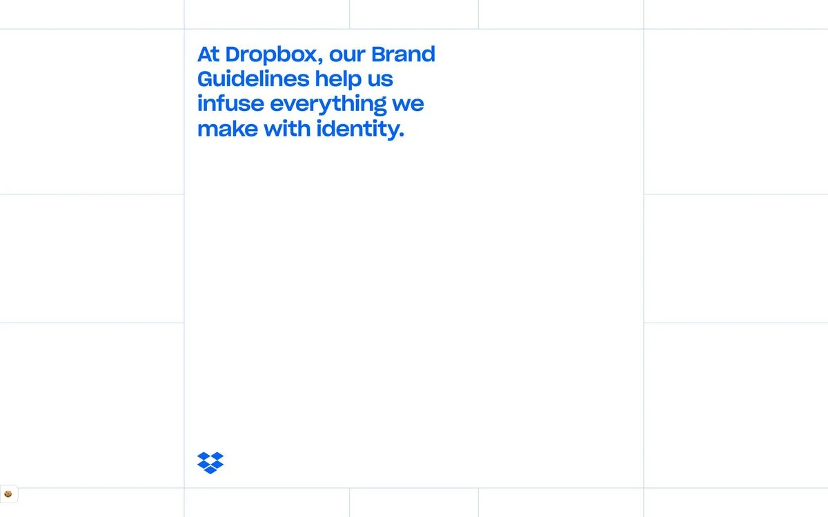
Example: Dropbox brand guidelines
What it covers: A dedicated brand site opening with “At Dropbox, our Brand Guidelines help us infuse everything we make with identity.” The navigation runs through framework, voice and tone, logo, typography, iconography, color, imagery and motion, with separate links to a brand partner toolkit and legal branding resources.
Why it works: It is one of the most complete public brand systems on the web. Voice and tone sits in the same list as logo and color, which treats how Dropbox sounds as part of the brand rather than an extra.
Steal this: Put voice and tone in the same navigation as your visual rules, not in a separate document.
2. GitHub
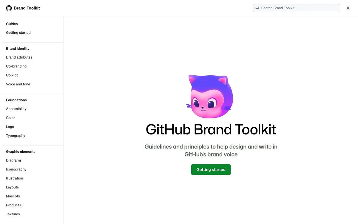
Example: GitHub Brand Toolkit
What it covers: “Guidelines and principles to help design and write in GitHub’s brand voice.” The sidebar has brand identity (attributes, co-branding, Copilot, voice and tone), foundations (accessibility, color, logo, typography), graphic elements (diagrams, iconography, illustration, layouts, mascots, product UI, textures), brand in action (presentations, social, swag, web and more) and motion identity.
Why it works: “Brand in action” shows the brand applied to real formats such as presentations, social posts and swag, so people can copy a finished example instead of assembling one from rules.
Steal this: Add a section of finished examples. Rules tell people what not to do; examples show them what good looks like.
3. Mozilla
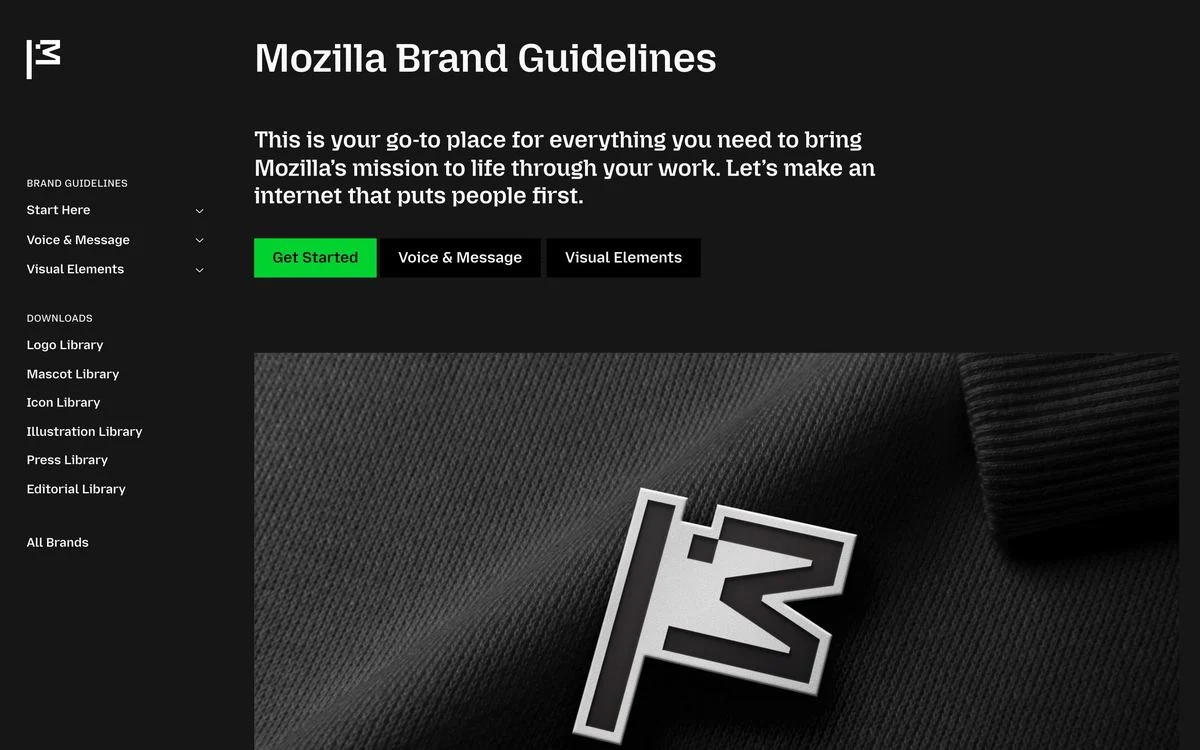
Example: Mozilla brand portal
What it covers: “Mozilla Brand Guidelines”, with three starting points (start here, voice and message, visual elements) and a set of downloadable libraries: logos, mascots, icons, illustrations, press and editorial. A link to “All Brands” covers Mozilla’s other products.
Why it works: The guide separates rules from assets. You read the guidelines in one place and download from libraries in another, so the assets are easy to find without wading through instructions.
Steal this: Keep your downloadable assets in their own clearly labelled libraries.
4. Atlassian
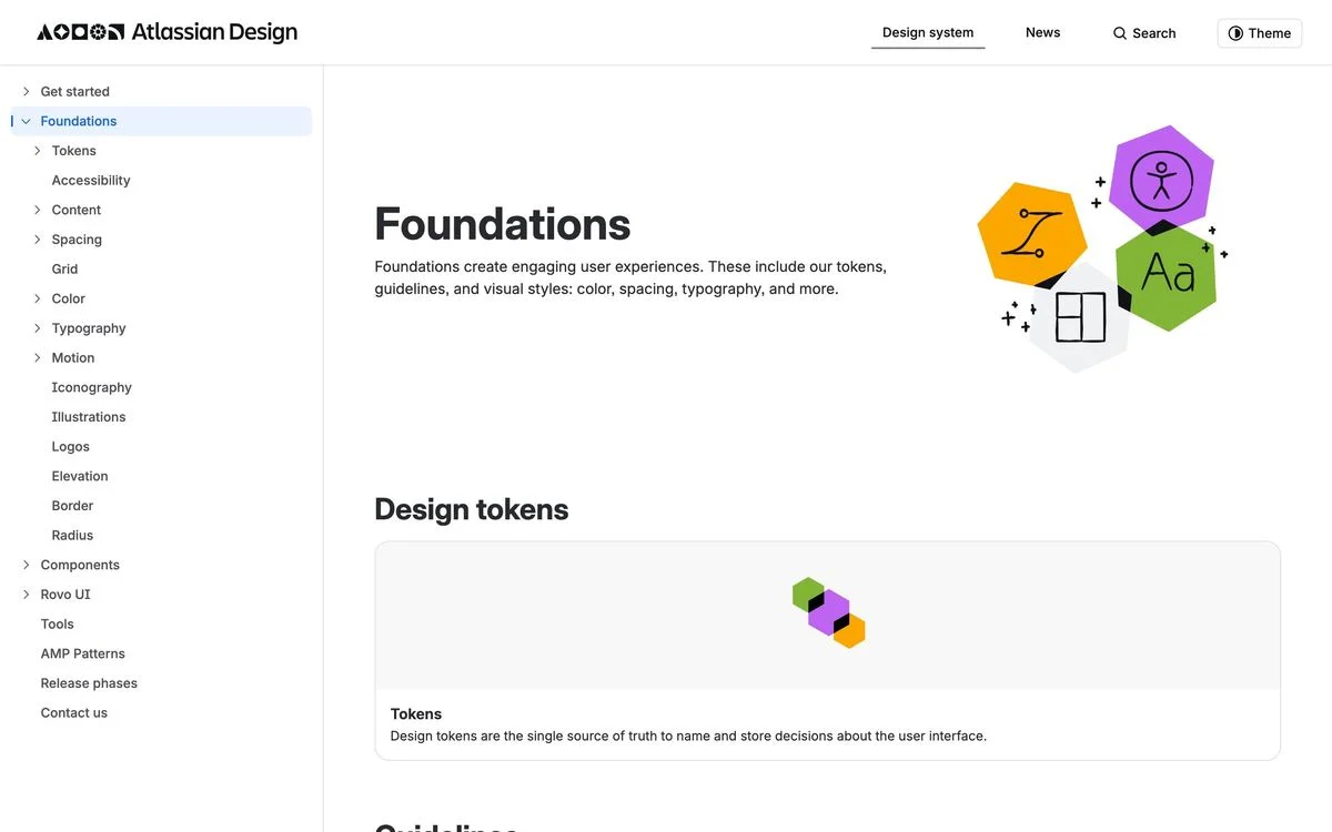
Example: Atlassian Design foundations
What it covers: The foundations of Atlassian’s design system: design tokens, accessibility, content, spacing, grid, color, typography, motion, iconography, illustrations, logos, elevation, border and radius.
Why it works: It connects brand to product. Colors and type are defined as design tokens, the same values developers use in code, so the brand on the website and the brand in the product cannot drift apart.
Steal this: If you have a product, define your brand colors and type as tokens that both marketing and engineering use.
5. Wise
Example: Wise Design
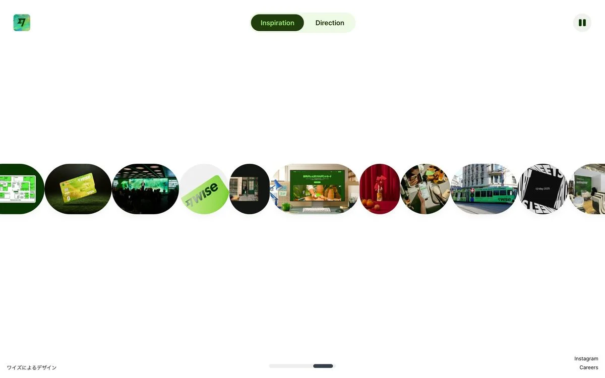
What it covers: A design site titled “Building a System for a Borderless World”, opening on a moving strip of photographs of the brand in use, with a switch between “Inspiration” and “Direction”.
Why it works: It leads with the brand out in the world, on cards, screens and signs, before any rules. For a global money brand, showing it working across countries is the argument.
Steal this: Open your guidelines with the brand in use, not with the logo.
Guides for partners and developers
6. Spotify
Example: Spotify branding guidelines
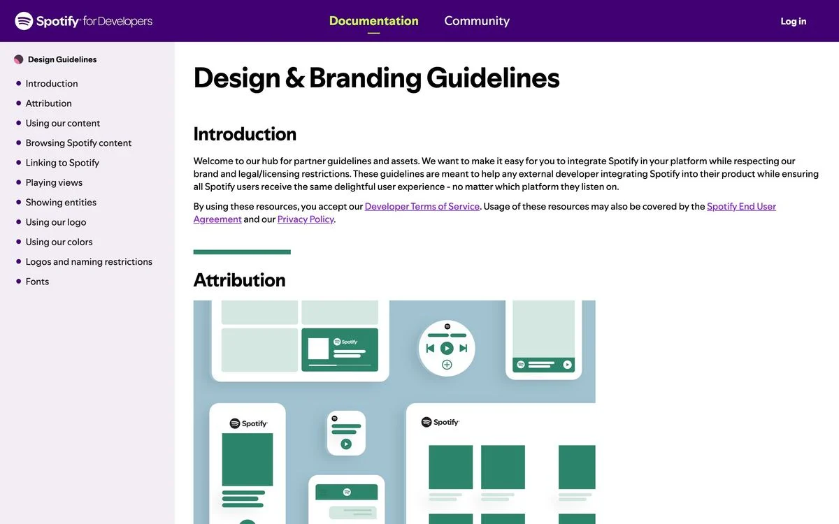
What it covers: “Design & Branding Guidelines” for developers building with Spotify: attribution, using Spotify content, browsing and linking, playing views, showing artists and tracks, using the logo and colors, naming restrictions and fonts.
Why it works: It is organised by what a developer is building, not by brand element. A developer showing an album cover finds the rule for exactly that situation.
Steal this: If developers use your brand, organise the guide around the things they build.
7. Apple
Example: Apple marketing guidelines
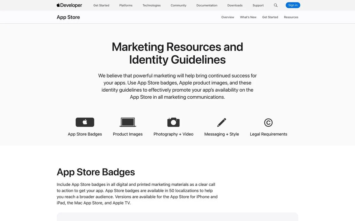
What it covers: “Marketing Resources and Identity Guidelines” for app developers, split into App Store badges, product images, photography and video, messaging and style, and legal requirements. The page says the badges are available in 50 localizations.
Why it works: Five icons at the top cover the five things a developer needs. The guide includes a writing section on product names and messaging, because getting “iPhone” wrong is as much a brand problem as a stretched logo.
Steal this: If people write about your product, tell them exactly how to write its name.
8. Pinterest
Example: Pinterest brand guidelines
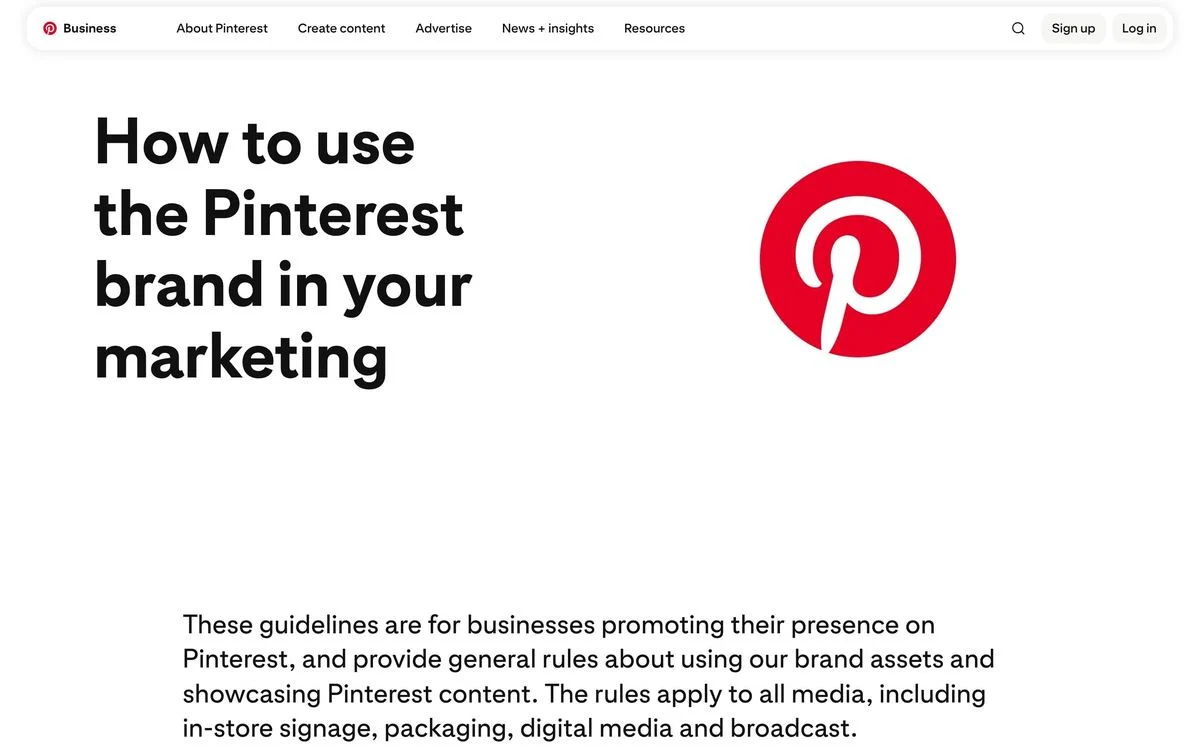
What it covers: “How to use the Pinterest brand in your marketing”, for businesses promoting their presence on Pinterest. It covers the basics, full guidelines, the logo, call-to-action lockups, broadcast and social, language, product depictions and press assets.
Why it works: It names its reader and its scope in the first lines: businesses, across “in-store signage, packaging, digital media and broadcast.” No one has to guess whether the rules apply to them.
Steal this: State who the guide is for and where the rules apply, before any rule.
9. NASA
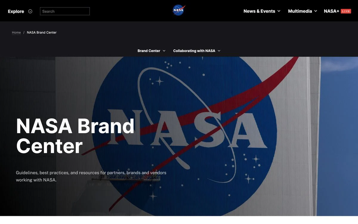
Example: NASA Brand Center
What it covers: “Guidelines, best practices, and resources for partners, brands and vendors working with NASA”, with sections on the brand center and collaborating with NASA.
Why it works: NASA’s insignia is one of the most recognised marks in the world, and many outside companies want to use it. The guide is built for those partners, with collaboration guidance alongside the brand rules.
Steal this: If many outside companies want to use your mark, write a section just for them.
10. Google
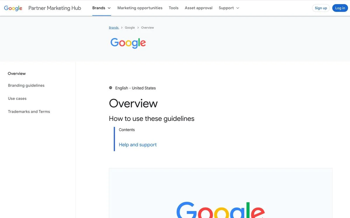
Example: Google brand guidelines
What it covers: Google’s brand guidance sits inside its Partner Marketing Hub: an overview, branding guidelines, use cases and trademarks and terms, with an asset approval process for partners.
Why it works: Approval is built in. Partners submit what they plan to publish, which means Google checks brand use before it goes live rather than after.
Steal this: If brand misuse is costly, add an approval step to your partner guidelines.
11. Meta
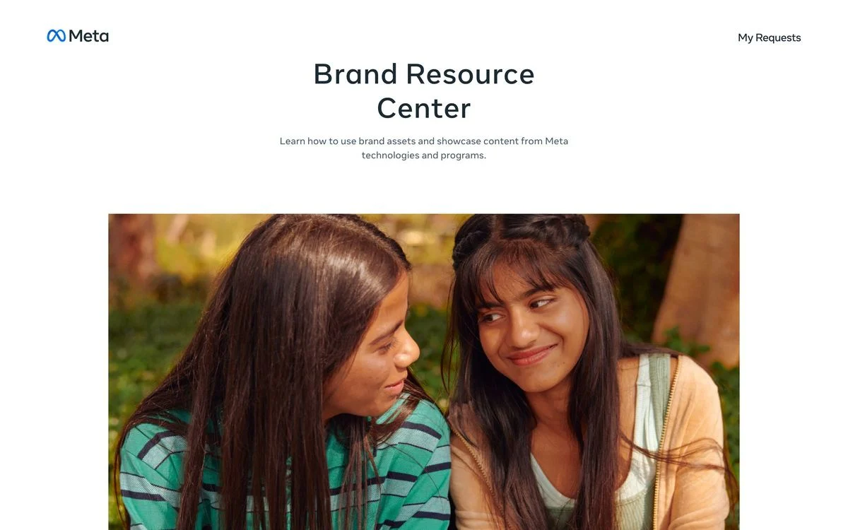
Example: Meta Brand Resource Center
What it covers: A “Brand Resource Center” explaining how to use brand assets and showcase content from Meta’s technologies and programs, with a “My Requests” area for asset requests.
Why it works: One hub covers several brands, each with its own guidance. Anyone working with Meta’s products starts in the same place.
Steal this: If you own several brands, give them one shared front door.
Turn your brand rules into components
Ploy builds pages from your design system, so colors, type and spacing follow the same rules your guidelines set.
Compact logo and color guides
12. Linear
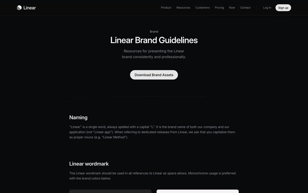
Example: Linear brand guidelines
What it covers: “Resources for presenting the Linear brand consistently and professionally”, a “Download Brand Assets” button, then naming, the wordmark, the logo, the icon and colors on one page.
Why it works: Naming comes first. The guide states that “Linear” is one word, always spelled with a capital “L”, which is the mistake press and partners make most often.
Steal this: Put the most common mistake people make with your brand at the top of the page.
13. Discord
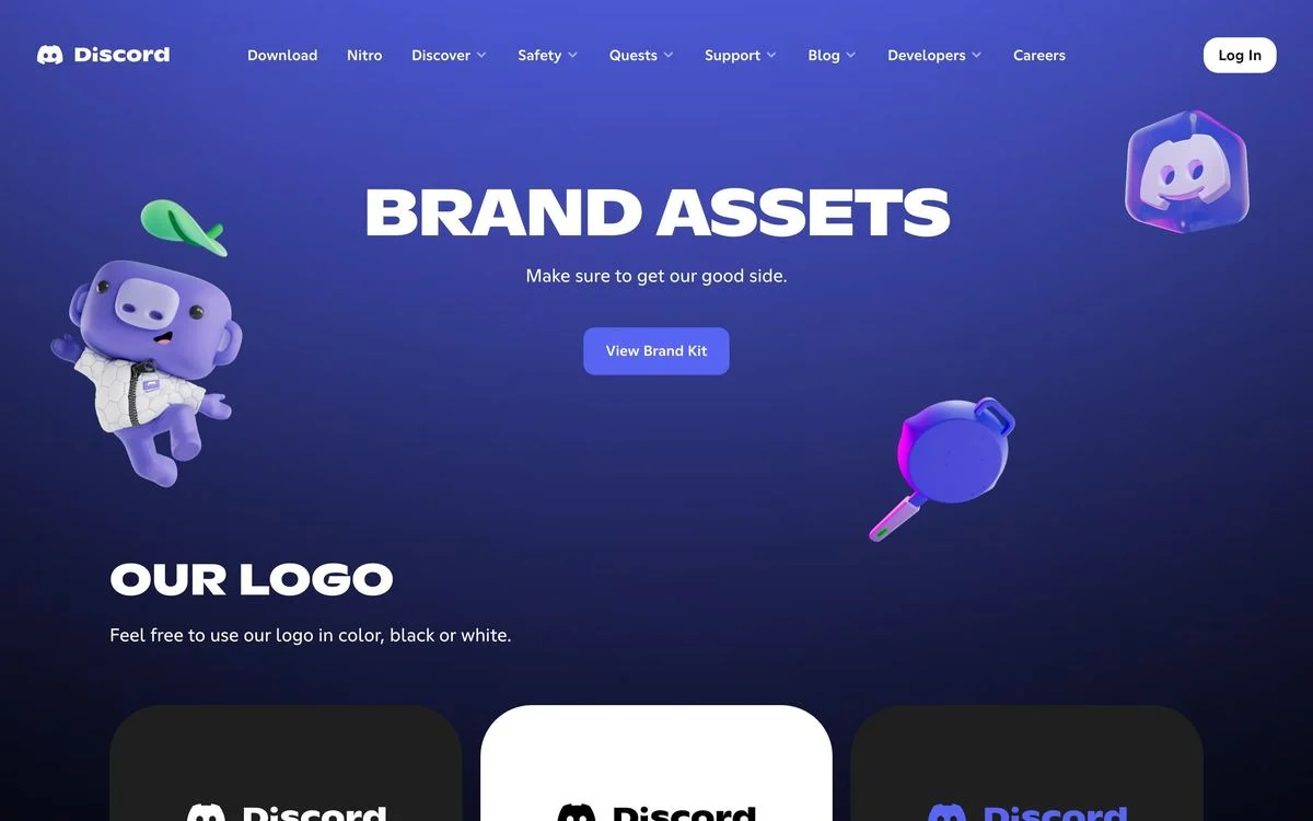
Example: Discord brand assets
What it covers: “Brand Assets: Make sure to get our good side.” A “View Brand Kit” button leads into the logo, symbol, clear space, colors, banners and legal brand guidelines.
Why it works: The tone of the guide matches the brand. A playful line and mascot illustrations make the rules feel like Discord, not like a legal notice.
Steal this: Write your guidelines in your brand’s own voice.
14. Asana
Example: Asana brand guidelines
What it covers: “Download this simple kit to learn more about using the Asana logo in conjunction with our trademark guidelines.” Sections cover the logo, clear space, color, logo don’ts and partnerships.
Why it works: It is short on purpose. Most people visiting a brand page need the logo, the rules for using it and the color values, and Asana gives them exactly that.
Steal this: If most visitors only need the logo, make that the whole page.
15. Supabase
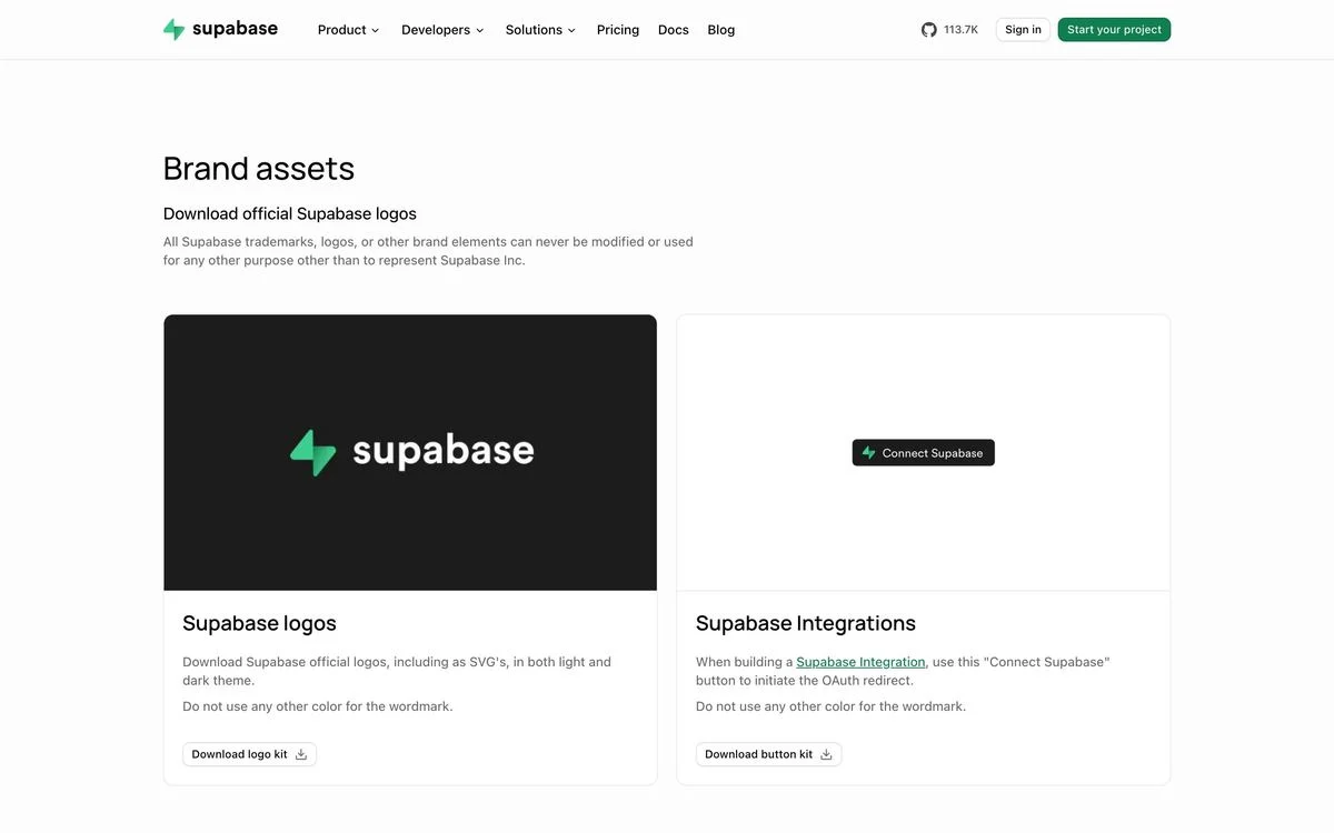
Example: Supabase brand assets
What it covers: “Download official Supabase logos”, in light and dark versions, plus a “Connect Supabase” button kit for companies building integrations. A note says the trademarks and logos can never be modified.
Why it works: It gives integration partners a ready-made button, so every “Connect Supabase” button across other products looks the same.
Steal this: If partners link to your product, give them the button, not just the logo.
16. Figma
Example: Figma brand guidelines
What it covers: “Figma trademark guidelines”, explaining how to use the Figma name, logo and wordmark “out in the wild”, with downloadable logos and a dos and don’ts section marked with simple icons: “Please don’t do this” and “Feel free to do this”.
Why it works: The guide is written for Figma’s community, which makes plugins, files and content about Figma. The dos and don’ts are visual, so they are quick to scan.
Steal this: Show dos and don’ts as pictures, side by side.
17. Slack
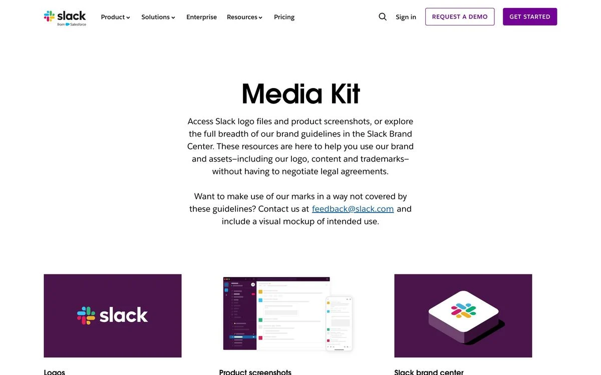
Example: Slack media kit
What it covers: A “Media Kit” with three parts: logos, product screenshots and a link to the Slack brand center. It ends with an email address for requests not covered by the guidelines, asking people to include a mockup of how they plan to use the brand.
Why it works: Product screenshots are often the asset journalists need most, and Slack offers them right next to the logos.
Steal this: Add approved product screenshots to your press kit.
Gated brand portals
18. Uber
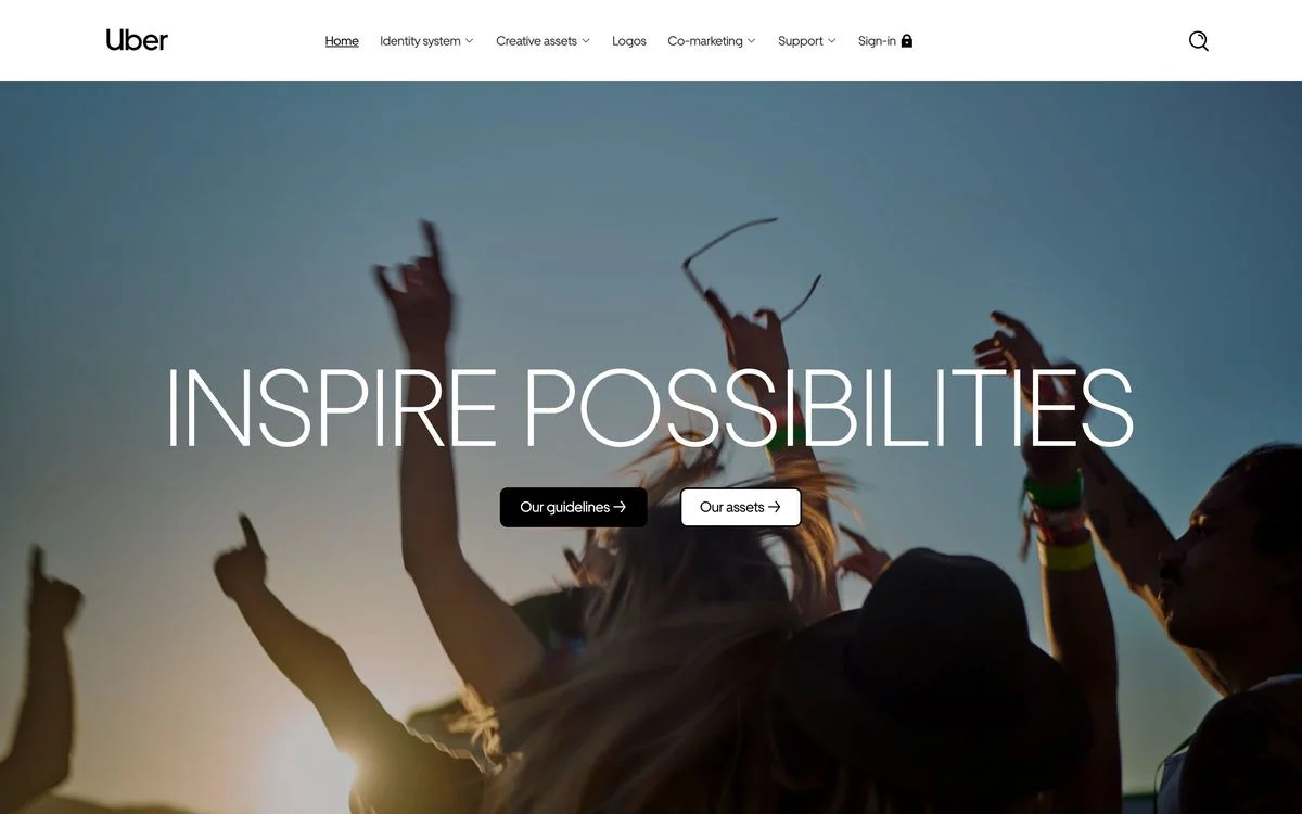
Example: Uber brand site
What it covers: A full-screen photograph with “Inspire possibilities” and two buttons, “Our guidelines” and “Our assets”. The navigation covers the identity system, creative assets, logos, co-marketing and support, with a sign-in for protected material.
Why it works: The front page is public and inspiring, while the detailed assets sit behind a sign-in. Partners get a good first impression even before they have access.
Steal this: If you gate your assets, keep a public front page that explains the brand.
19. Netflix
Example: Netflix brand site
What it covers: “Welcome to the Netflix Brand Site”, with three options: brand logos, sign in and account request.
Why it works: Logos are public; everything else needs an account. The front page makes that split obvious in three buttons.
Steal this: Tell people on the first screen what is public and how to request the rest.
20. Zapier
Example: Zapier brand site
What it covers: A dedicated brand site with two entry points, “Read Guidelines” and “Browse Assets”, the second marked with a lock, above a very large Zapier wordmark.
Why it works: Reading the guidelines is open to anyone; downloading assets needs access. The two doors make the difference clear.
Steal this: Separate reading the rules from downloading the files.
What the best brand guidelines have in common
- They are websites, not PDFs. All 20 here are live web pages, which means they can be updated as the brand changes and linked to directly.
- They know their reader. At least nine are written for people outside the company, and the clearest ones say so in the first lines.
- They lead with the common mistake. Linear’s naming rule and Apple’s product-name rules exist because those are the errors people actually make.
- They show finished examples. GitHub’s “brand in action” and Wise’s photographs show the brand applied, not just described.
- They include voice, but rarely. Only six cover writing. If yours does, it is ahead of most.
How to create brand guidelines
- Decide who the guide is for. Your own team, partners, developers or press each need different things.
- Start with the essentials: logo, clear space, colors, typography.
- Add the most common mistake near the top, whether it is your name, your logo or your colors.
- Add voice and tone, with real examples of how the brand writes.
- Show the brand in use: finished social posts, pages, slides or ads.
- Make assets easy to download, in clearly labelled libraries.
- Publish it as a web page you can update, not a PDF.
Brand guidelines also make it easier to build new pages that stay on brand. With Ploy’s AI landing page builder, new pages are built from your existing brand components, so colors, type and layout stay consistent without starting from a blank page. For how brands apply these rules on their sites, see our breakdowns of modern website design and website headline examples.
Bring your brand into every page in Ploy
Slurp your current site into Ploy to start from your existing colors, fonts and layout.