Most roundups of modern website design are screenshots with adjectives underneath. Clean. Bold. Immersive. None of it tells you what to change on your own site on Monday.
So we measured instead. We loaded 25 well-designed sites in a desktop browser and read the numbers straight out of the page: headline sizes in pixels, the actual typefaces, background colors, button corner radii, backdrop blur, gradients, autoplaying video, and how many words sit above the fold.
Some of the results match what designers say about 2026. Type is enormous, serifs are back, and dark is a default rather than a toggle. Other results cut the opposite way: most of these sites are not minimal, and almost none of them use an off-the-shelf font.
Below are the 25 examples, grouped by the approach they take, each with the measurements from its homepage and one thing worth copying.
The short version: the median headline is 64px, 20 of 25 use a licensed or custom typeface, 11 of 25 are dark by default, and the median homepage has 93 words above the fold.
Build a website that carries your brand forward.
What we measured across 25 modern websites
Every number below comes from the live pages, not from an opinion:
- Headlines are big and getting bigger. The median headline measures 64px. Eighteen of 25 sit at 56px or larger and 11 are 72px or larger. The largest is Pitch at 180px, set letter by letter so each character can animate. The smallest is PostHog at 36px.
- Off-the-shelf fonts are out. Twenty of the 25 set their headline in a licensed or custom typeface. Only five use something you can grab for free or by default: Linear, Raycast and Brex use Inter, Supabase uses Manrope, and Apple uses its own SF Pro.
- The serif revival is real but small. Five of the 25 set their display type in a serif: Granola, Descript, Resend, Typeform and Oura. The other 20 are sans.
- Dark is a design choice, not a toggle. Eleven of the 25 render dark by default. Only four offer a light and dark switch: Retool, Supabase, Resend and Sierra.
- Gradients are everywhere again. Sixteen of the 25 have at least one gradient in the first two screens.
- Glassmorphism survives as a technique. Eighteen of the 25 apply a backdrop blur somewhere on the page, and nine of those use it on four or more elements. We counted the effect, not where it sits: on many sites the blur is the sticky header rather than a decorative glass card.
- The hero moves. Nine of 25 autoplay video in the hero, nine render a canvas element, and 19 had at least one animation already running by the time the page finished loading.
- Corners are soft, not round. Ten of the 25 use fully rounded pill buttons. Among the rest, the median button radius is 8px.
- Modern does not mean minimal. The median homepage carries 93 words above the fold. Apple is the leanest at 27 words. PostHog packs in 291.
- The product is the hero image. On 17 of the 25, the main visual is the product interface itself rather than a photo, an illustration or an abstract shape.
How we measured it: in September 2026 we loaded each homepage in a headless Chrome browser at 1440 × 900, dismissed cookie banners, and read computed styles out of the DOM. Headline size is the largest text block in the top 900 pixels. Background is sampled from what is actually painted behind the fold, so a dark page reads as dark even when the body element is transparent. Blur counts elements with a backdrop filter of 4px or more. Animation counts what was running when the page settled. Five judgments were made by eye rather than by script: whether a typeface is a serif, and whether the hero visual is a product interface, a photograph, an illustration or an abstract graphic. Sites change constantly, so check the live page before you copy anything.
25 modern website design examples
| Approach | What it solves | Examples |
|---|---|---|
| Oversized display type | Nobody remembers your subheading | Pitch, Gusto, Sentry, Brex |
| Serif and editorial | Looking considered rather than generic | Granola, Descript, Resend, Typeform, Oura |
| Dark by default | Technical products that want to look precise | Linear, Raycast, Retool, Gong |
| Product interface as hero | Proving the thing exists | Ramp, Rippling, Miro, Supabase, PostHog |
| Gradient, glow and 3D | Making software feel physical | Stripe, Clay, Sierra |
| Photography and illustration | Selling something you can hold, or feel | Mercury, Apple, Ridge, Headspace |
Oversized display type
The clearest shift in the data. When the headline is 80px or more, it has to be short, and short headlines are the ones people remember.
1. Pitch: type at 180px, animated letter by letter
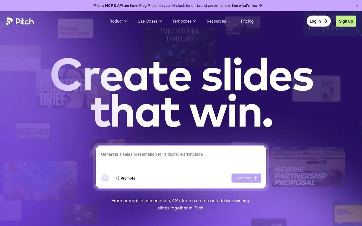
Site: Pitch homepage
Measured: headline 180px, Mark Pro Bold · light background · 64 words above the fold · pill buttons
What’s on the page: “Create slides that win.” fills most of the screen in white on a deep purple and magenta field. Each letter is its own element, which is how the headline animates in. Under it sits a prompt box where you describe the deck you want, and behind the type there are ghosted words from earlier versions of the layout.
Why it works: At 180px the headline is the entire design. Everything else on the screen is small and quiet by comparison, so the eye has exactly one place to start.
Steal this: If your headline is four words or fewer, try setting it at three times your current size before you add anything else to the page.
2. Gusto: display type with personality
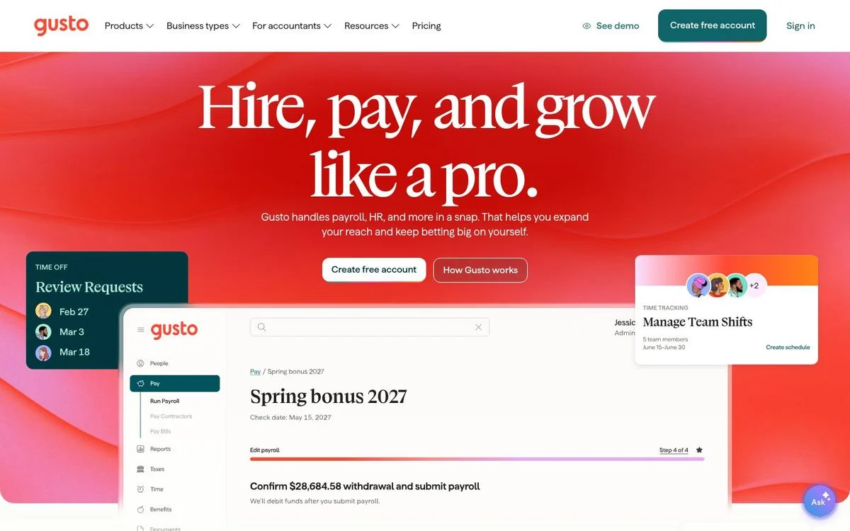
Site: Gusto homepage
Measured: headline 110px, Boogy Brut · light background · 77 words above the fold · 20 animations running at load
What’s on the page: “Hire, pay, and grow like a pro.” runs across a warm red and orange gradient in a quirky display face with irregular letterforms. Product cards showing review requests, a spring bonus and a payroll confirmation float over the gradient.
Why it works: Payroll is a category where everyone looks the same shade of corporate blue. An unusual typeface does more for differentiation here than another illustration would.
Steal this: Your typeface is the cheapest brand asset you own. A distinctive display face changes how a page feels before a single word is read.
3. Sentry: a headline that breaks on purpose
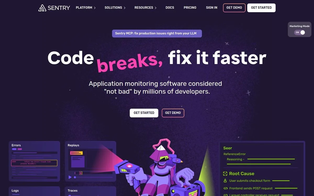
Site: Sentry homepage
Measured: headline 88px, Dammit Sans, weight 700 · dark purple background (#1f1633) · 42 words above the fold
What’s on the page: “Code breaks, fix it faster,” with the word “breaks” set in a different color and a slightly glitched treatment. Under it, a line that calls the product “application monitoring software considered ‘not bad’ by millions of developers,” then two buttons and a row of product panels with a cartoon mascot.
Why it works: The typographic joke and the self-deprecating line do the same job: they signal that this company talks like its customers. Developers are the audience least likely to respond to polished corporate copy.
Steal this: Emphasize one word in your headline with color or weight. It gives a long line a focal point without extra design.
4. Brex: big type, product photography, nothing else
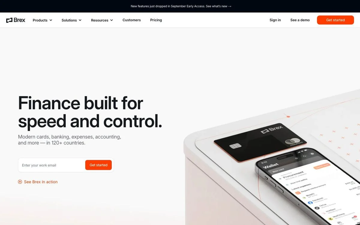
Site: Brex homepage
Measured: headline 72px, Inter · white background · 47 words above the fold · no gradient, no blur, no video
What’s on the page: “Finance built for speed and control.” in near-black on white, a one-line subhead about cards, banking and expenses in 120+ countries, an email field with a button, and a photograph of a card next to a phone showing the app.
Why it works: It is the plainest page in this list and one of the most confident. There is no gradient, no blur and no motion, so the product photograph carries the whole aesthetic.
Steal this: If your product photography is good, cut the decoration. Brex proves a modern page can be typography plus one photo.
Serif and editorial
Five of the 25 set their display type in a serif. In a category where nearly everyone uses a geometric sans, that alone reads as considered.
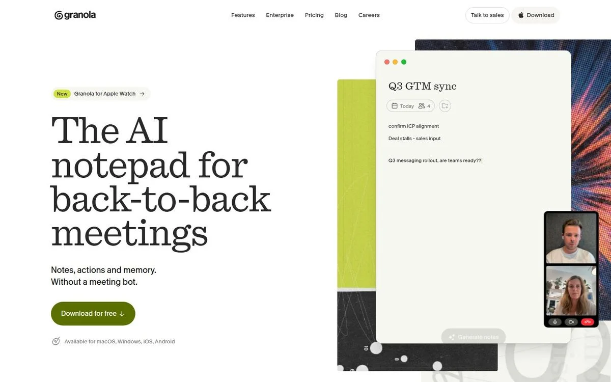
5. Granola: an editorial page for a utility product
Site: Granola homepage
Measured: headline 86px serif (Quadrant) · white background · 209 words above the fold · 41 animations running at load
What’s on the page: “The AI notepad for back-to-back meetings” in a large serif, with “Notes, actions and memory. Without a meeting bot.” underneath. One green download button, a line listing the platforms it runs on, and a window showing real meeting notes next to a video call.
Why it works: The serif makes a note-taking app feel like a writing tool rather than another AI product. The type does the positioning work.
Steal this: Pick a typeface that argues for your category, not just your brand. A serif says craft; a geometric sans says software.
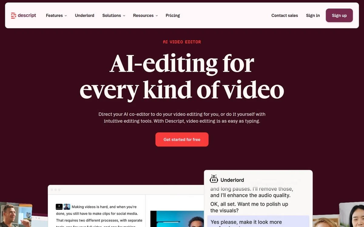
6. Descript: serif on a deep maroon field
Site: Descript homepage
Measured: headline 88px serif (Gamuth Display) · dark maroon background (#390a1a) · 77 words above the fold · autoplaying video in the hero
What’s on the page: “AI-editing for every kind of video” in a light serif over a dark maroon background, with a red button and a floating panel showing the editor in use, including a conversation with the AI co-editor.
Why it works: The color is the differentiator. Maroon is rare on software sites, and pairing it with a serif moves a video editor away from the neon-on-black look that most AI tools have adopted.
Steal this: Choose a background color your competitors don’t use. It costs nothing and it is the first thing a returning visitor recognizes.
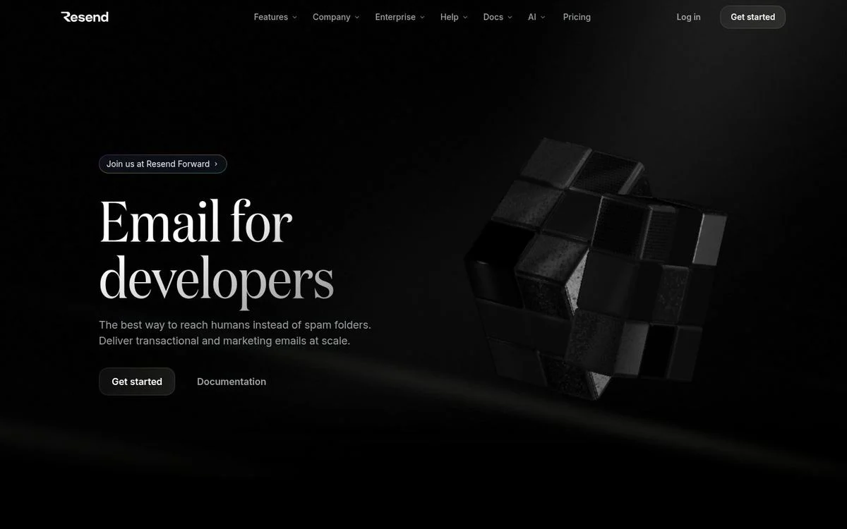
7. Resend: black, serif, and almost empty
Site: Resend homepage
Measured: headline 96px serif (Domaine) · black background · 39 words above the fold · theme toggle present
What’s on the page: “Email for developers” in a large serif on pure black, one supporting sentence, two small buttons, and a slowly rotating arrangement of black 3D cubes to the right.
Why it works: Thirty-nine words above the fold makes this one of the leanest pages here, and the serif keeps the black page from looking like every other developer tool. The 3D object adds depth without adding noise.
Steal this: Black plus a serif plus one object is a complete design. Restraint reads as expensive.
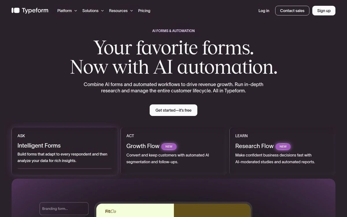
8. Typeform: serif over a dark plum background
Site: Typeform homepage
Measured: headline 80px serif (Tobias) · dark plum background (#2a222b) · 93 words above the fold · six gradient elements · video in the hero
What’s on the page: “Your favorite forms. Now with AI automation.” in a serif, over a plum background, above three labeled cards: Ask, Act, Learn. Each card explains one part of the workflow in a sentence.
Why it works: The three cards under the hero are doing navigation work. A visitor can pick which part of the product matters to them without scrolling or using the menu.
Steal this: Put three labeled cards directly under the hero, one per audience or job. It beats a longer subheading.
9. Oura: editorial serif and macro photography
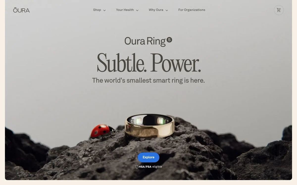
Site: Oura homepage
Measured: headline 110px serif (Editorial New), weight 300 · warm off-white background (#f7f1e8) · 32 words above the fold · seven blurred elements
What’s on the page: “Subtle. Power.” in a light-weight serif at 110px, with “The world’s smallest smart ring is here” underneath and one button. The product sits on rough ground in a macro photograph, with a ladybird beside it for scale.
Why it works: A thin serif at 110px is the opposite of a heavy sans at 110px: it reads as jewelry rather than gadget. The photograph carries the size claim without a specification.
Steal this: Weight matters as much as size. A light weight at a huge size feels premium; a bold weight at the same size feels loud.
Dark by default
Eleven of the 25 render dark. These four commit hardest, and all of them sell to technical buyers.
10. Linear: the reference implementation

Site: Linear homepage
Measured: headline 64px, Inter Variable at weight 510 · near-black background (#08090a) · 141 words above the fold · 83 animations running at load
What’s on the page: “The product development system for teams and agents” in near-white on near-black, one line of support text, and a full-width screenshot of the product with issues, projects and activity visible.
Why it works: The weight is 510, not 400 or 700, which is the kind of detail that separates this page from imitations of it. The dark background makes the product screenshot the brightest thing on screen.
Steal this: If you use a variable font, tune the weight to an in-between value. Small typographic decisions are what make a familiar layout feel bespoke.
See our Linear breakdown for how the rest of the page converts.
11. Raycast: dark with one piece of generative art
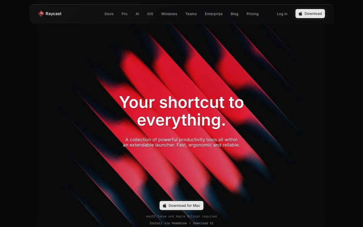
Site: Raycast homepage
Measured: headline 64px, Inter · near-black background (#07080a) · 45 words above the fold · 17 blurred elements, the most in this list after Retool
What’s on the page: “Your shortcut to everything.” centered over a field of red and orange diagonal streaks that look like light through a prism. One download button, one line of supporting copy.
Why it works: Forty-five words and one image. The artwork is abstract rather than a product screenshot, which suits a launcher that does hundreds of things and can’t be shown in one frame.
Steal this: When your product is too broad to screenshot, commission one abstract image instead of showing six small ones.
12. Retool: dark, dimensional, and blurred
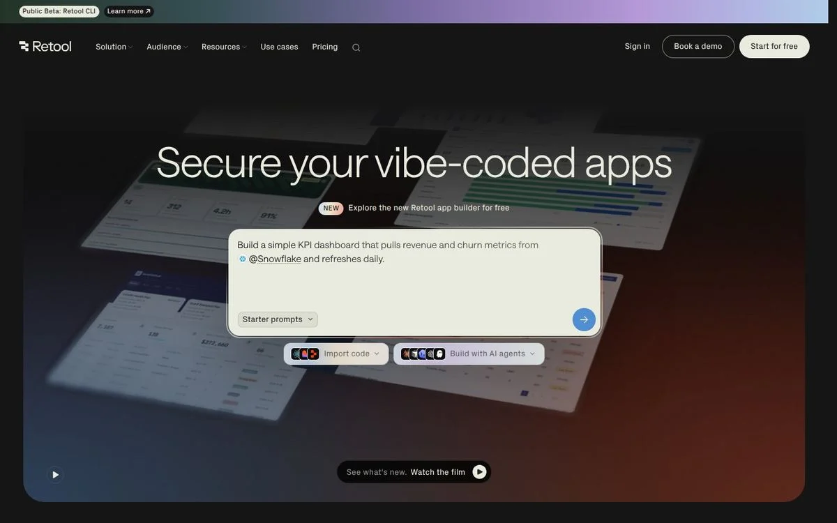
Site: Retool homepage
Measured: headline 72px at weight 300 · near-black background (#151515) · 139 words above the fold · 34 blurred elements, the most of any site here · theme toggle present
What’s on the page: “Secure your vibe-coded apps” in a light weight, over a dark scene where panels of product interface are tilted in perspective and layered with depth-of-field blur, so the front panels are sharp and the back ones soft.
Why it works: The blur is doing depth, not decoration. That is the useful version of glassmorphism: it creates a foreground and a background so the eye knows where to look.
Steal this: Use blur to push things back, not to make a frosted card. Depth of field is what makes a flat screenshot look composed.
13. Gong: black, uppercase, high contrast
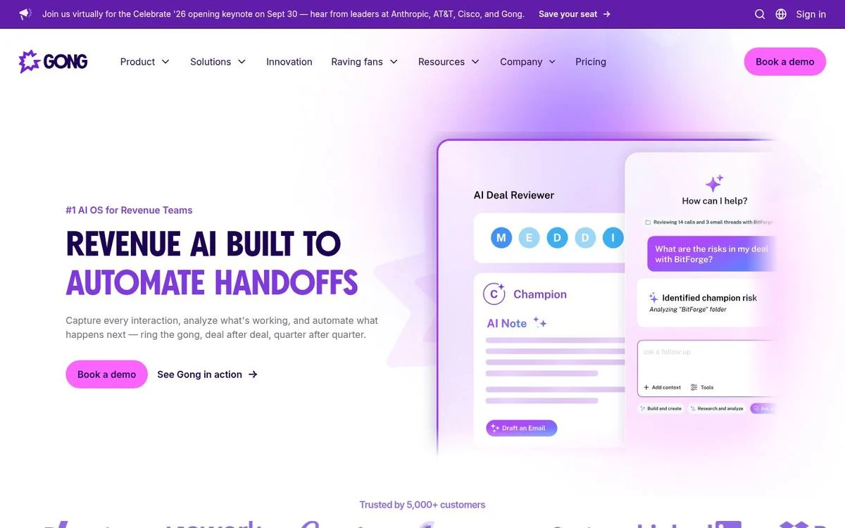
Site: Gong homepage
Measured: headline 60px at weight 700, set uppercase · black background · 96 words above the fold · ten animations running at load
What’s on the page: “Revenue AI built to automate handoffs” in uppercase, with the second half in a bright purple against white text. Product panels showing an AI deal reviewer and a call summary sit to the right, and a customer logo strip closes the fold.
Why it works: Uppercase at 60px reads as louder than lowercase at 80px. For a sales product sold to competitive teams, that tone is the point.
Steal this: Uppercase is a volume control. Use it when your category rewards confidence, and never for more than about eight words.
Product interface as the hero
On 17 of the 25 sites the main image is the product itself. These five make the interface the whole composition.
14. Ramp: a live counter instead of a claim

Site: Ramp homepage
Measured: headline 64px, Lausanne · near-white background (#f7fafc) · 138 words above the fold · ten blurred elements · video in the hero
What’s on the page: Above the headline, a live ticker counts US corporate payments processed by Ramp, digits moving as you watch. “Time is money. Save both.” sits under it, then an email field. Below, an invoice being matched to a purchase order, and a strip of live operational counters: agents at work today, accounting fields coded, invoices processed.
Why it works: The counters turn scale into something happening now rather than a static number. It is the same argument as “70,000+ businesses,” but it moves.
Steal this: If you have a number that grows, show it counting. A live figure is more convincing than a rounded one.
15. Rippling: one product shot, deeply saturated
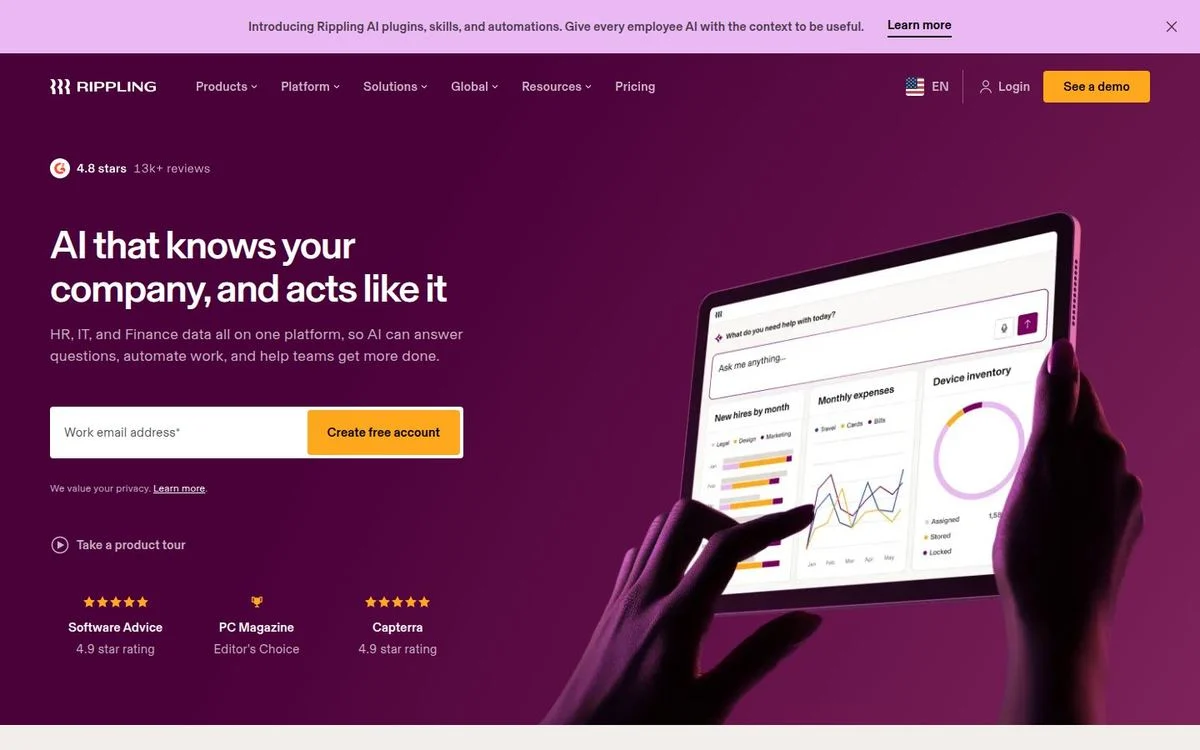
Site: Rippling homepage
Measured: headline 48px · deep magenta background (#4a0039) · 92 words above the fold · 4px button radius
What’s on the page: “AI that knows your company, and acts like it” in white on deep magenta, an email field with a yellow button, a star rating with review count above the headline, and a photograph of hands holding a tablet with the product on screen, tinted to match the background.
Why it works: Tinting the photograph to the brand color is what holds this together. A stock-looking device photo becomes part of the design rather than an asset dropped on top of it.
Steal this: Color-grade your product photography to your brand palette. It is the difference between a composition and a collage.
16. Miro: bright accents on near-white

Site: Miro homepage
Measured: headline 56px, Roobert · light grey background (#f0f0f0) · 147 words above the fold · nine typefaces loaded, second only to Pitch
What’s on the page: “Human collaboration at the speed of AI” on the left with an email field, and on the right a canvas showing sticky notes, cursors with collaborator names, and a yellow sweep of color behind it all. A customer logo row runs along the bottom.
Why it works: The named cursors are the detail that sells it. They show several people in the file at once, which is the product’s entire argument, without a word of copy.
Steal this: Put evidence of other people into your product screenshot: cursors, avatars, comments. Empty interfaces look unused.
17. Supabase: the developer aesthetic, done plainly
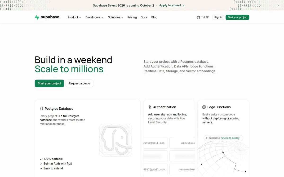
Site: Supabase homepage
Measured: headline 46px, Manrope · light background · 269 words above the fold · eight gradient elements · theme toggle present
What’s on the page: “Build in a weekend” in near-black with “Scale to millions” underneath in the brand green. A short paragraph lists what you get, then three feature cards for the database, authentication and edge functions, each with a small technical diagram.
Why it works: It is one of the wordiest pages in this list at 269 words above the fold, and for developers that is correct. The audience wants specifics before aesthetics.
Steal this: Match density to audience. Technical buyers read; executives skim. Don’t copy a minimal hero if your buyer needs the details.
18. PostHog: the anti-corporate homepage
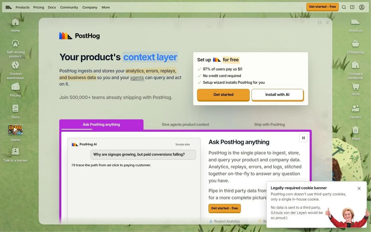
Site: PostHog homepage
Measured: headline 36px, the smallest here · light sage background (#e5e7e0) · 291 words above the fold, the most here · hand-drawn illustration
What’s on the page: “Your product’s context layer” at a modest 36px, surrounded by overlapping windows: a signup box, a chat panel asking PostHog a question, notes in a handwritten font, and a hedgehog mascot. Even the cookie banner is a joke about cookie banners.
Why it works: It breaks nearly every rule in this article and works because the tone is consistent everywhere else the company shows up. The design is a filter: engineers who like it will like the product.
Steal this: Personality is a positioning decision, not a decoration. If you commit to it, commit everywhere, including the legally required parts.
Gradient, glow and 3D
Sixteen of the 25 have a gradient in the first two screens. These three treat it as the main image rather than a background wash.
19. Stripe: the gradient that everyone copied
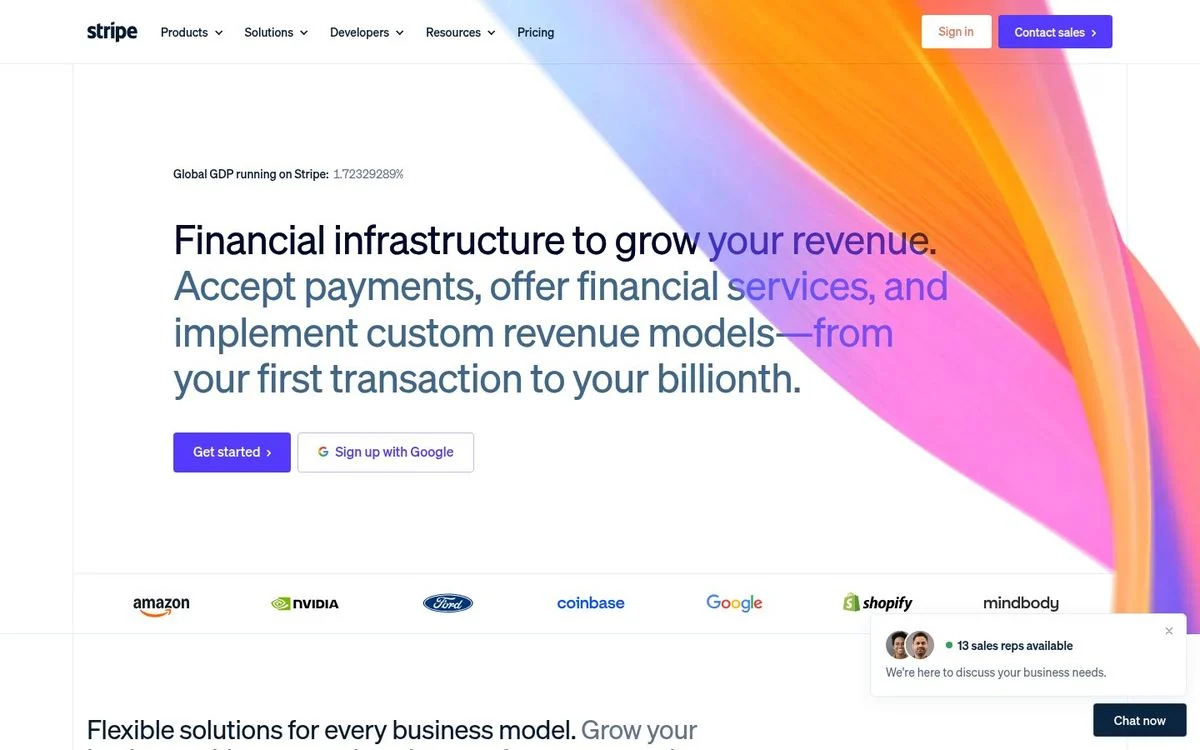
Site: Stripe homepage
Measured: headline 48px, Söhne · white background · 128 words above the fold · nine gradient elements, the most here · canvas element in the hero
What’s on the page: A wide ribbon of orange, pink and blue sweeps across the top right, rendered on a canvas so it moves. The copy is left-aligned in black: “Financial infrastructure to grow your revenue,” a three-line explanation, two buttons, and a customer logo row underneath.
Why it works: The gradient is the only ornament on an otherwise plain page. Black text on white with one piece of color is a far easier composition to keep tidy than a fully gradient page.
Steal this: One colorful element against a plain page beats color everywhere. Give the gradient a job and a boundary.
Read our Stripe breakdown for how the product pages use the same system.
20. Clay: a 3D world instead of a screenshot
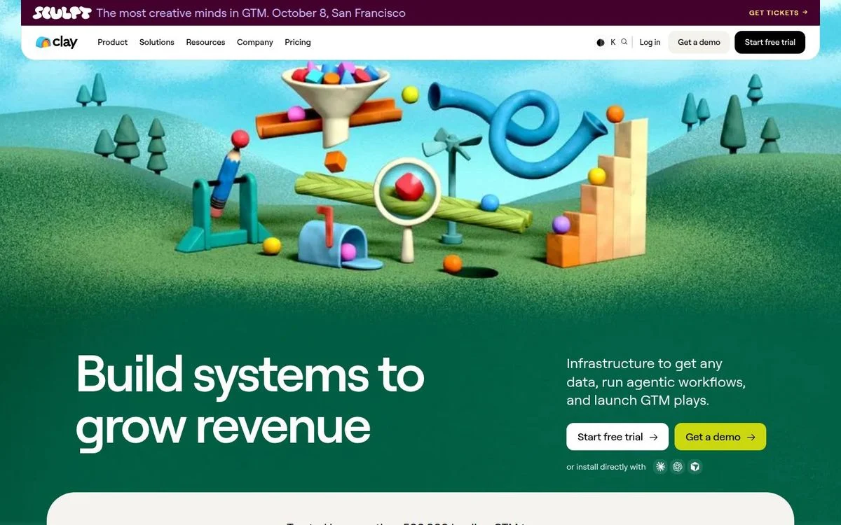
Site: Clay homepage
Measured: headline 88px, Roobert · deep green background (#035d44) · 241 words above the fold · eight blurred elements · seven gradient elements · video in the hero
What’s on the page: A 3D landscape in soft greens: a funnel, a seesaw, balls rolling down a chute, chart bars growing out of the grass. “Build systems to grow revenue” sits at the lower left with two buttons, and a conference banner runs across the top.
Why it works: Clay sells assembling data and workflows. A literal machine made of parts communicates that faster than a dashboard screenshot would, and it is impossible to confuse with a competitor.
Steal this: If your product is a system rather than a screen, illustrate the system. Screenshots are weak when the value is in what connects.
21. Sierra: warm photography with the product layered on
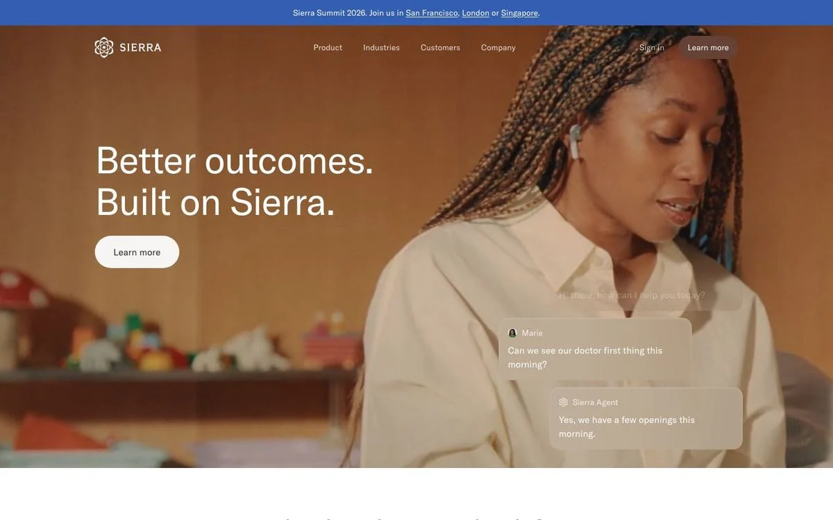
Site: Sierra homepage
Measured: headline 65px, GT America · white background · 67 words above the fold · four blurred elements · video in the hero · theme toggle present
What’s on the page: A full-bleed film of a person talking, warm and softly lit, with “Better outcomes. Built on Sierra.” over it. Chat bubbles from a real conversation with the AI agent fade in over the footage, showing a patient asking about an appointment and the agent answering.
Why it works: The footage supplies the emotion and the overlaid conversation supplies the proof. Either alone would be weaker: the video would be generic, the transcript would be dry.
Steal this: Layer your interface over human footage rather than choosing between the two.
Photography and illustration
For products you can hold or feel, the image carries more weight than the interface.
22. Mercury: one landscape, one sentence
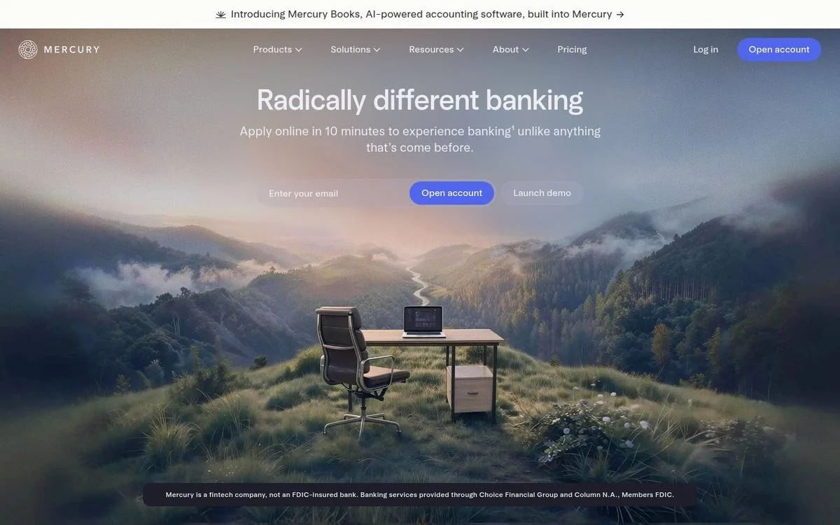
Site: Mercury homepage
Measured: headline 49px, Arcadia Display · dark background (#171721) · 196 words above the fold · video in the hero
What’s on the page: A desk and chair sitting alone in a misty mountain meadow, filling the screen. “Radically different banking” is centered over it with an email field and two buttons. The required disclosure about not being a bank sits in small type at the bottom of the image.
Why it works: Banking sites default to product screenshots and stock offices. A surreal landscape is the visual equivalent of the word “radically” in the headline, so the image and copy make the same claim.
Steal this: Pick imagery that argues the same point as your headline. Decorative photography that says nothing is worse than no photography.
23. Apple: 27 words and a product
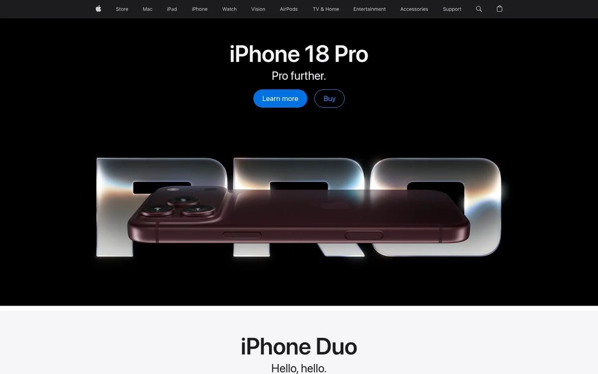
Site: Apple homepage
Measured: headline 56px, SF Pro Display · black background · 27 words above the fold, the fewest here · video in the hero
What’s on the page: “iPhone 18 Pro” with “Pro further.” underneath, two small links, and the product photographed against black, lit so the edges glow. Nothing else.
Why it works: Twenty-seven words is a third of the median in this list. It works because the product is famous enough to explain itself, which is exactly the condition most companies wrongly assume applies to them.
Steal this: Copy the discipline, not the word count. Cut your hero to the shortest version that still makes sense to a stranger.
24. Ridge: product grid as the hero
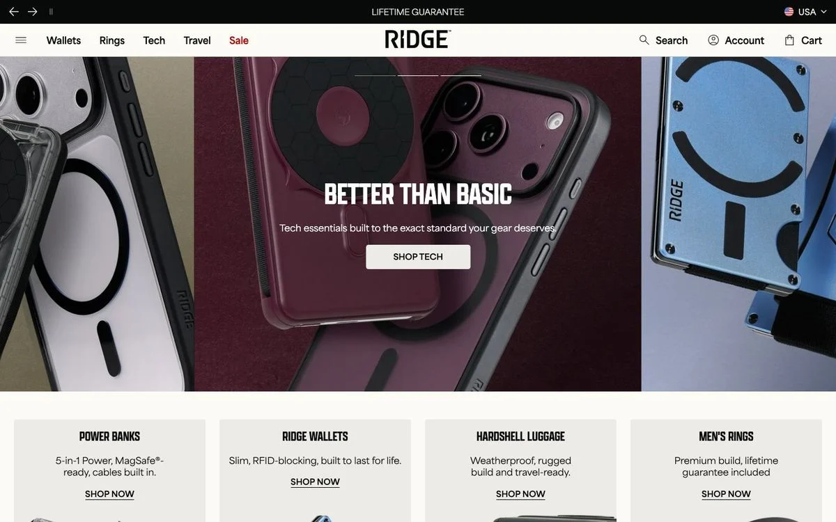
Site: Ridge homepage
Measured: headline 54px, Apotek Extra Condensed, uppercase · off-white background (#fcfbf6) · 150 words above the fold · eight gradient elements
What’s on the page: “Better than basic” in a tall condensed uppercase face over a dark product photograph, and directly beneath it a four-up grid of categories, each with its own photo and a Shop button.
Why it works: The condensed face lets a long headline stay on one line at a large size, and the category grid under the hero means a returning shopper can get to a product in one click.
Steal this: A condensed typeface buys you size without wrapping. For ecommerce, put the category grid above the fold on desktop.
25. Headspace: illustration doing emotional work
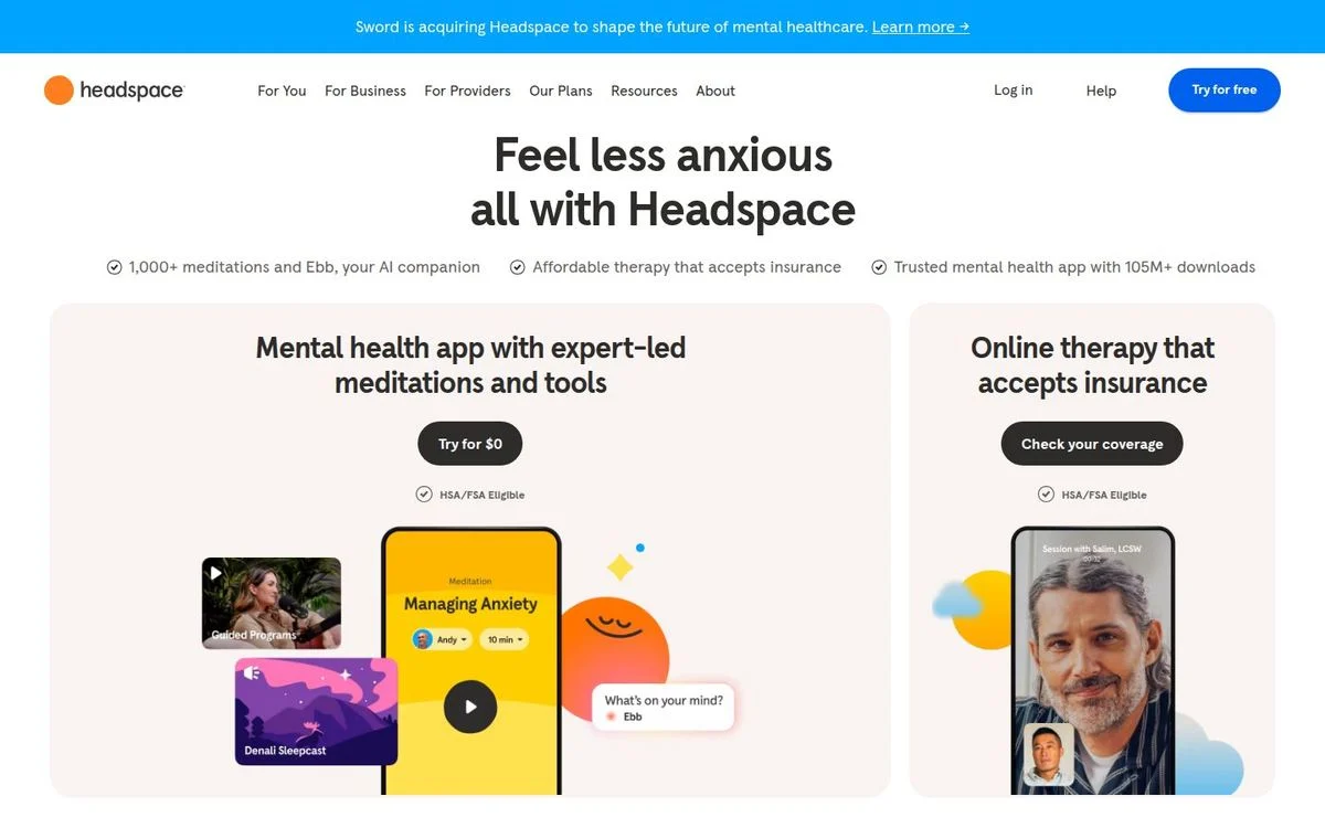
Site: Headspace homepage
Measured: headline 52px at weight 700 · warm off-white background (#f9f4f2) · 74 words above the fold · no gradient, no blur, no video
What’s on the page: “Feel less anxious all with Headspace,” where the first phrase rotates through different benefits. Soft illustrated shapes drift around the type, and two cards below show the app and the therapy service, each with its own button and phone screenshots.
Why it works: The rounded shapes and warm off-white do work that words can’t in a mental health category: they lower the temperature of the page before anyone reads a sentence.
Steal this: In sensitive categories, let color and shape set the emotional tone, and keep the copy plain.
The web design trends behind them
Pulling the measurements together, here is what modern web design actually means in 2026:
- Display type at 56px and up. The median headline is 64px and 11 of the 25 are 72px or larger. Big type is the cheapest way to look current, and it forces shorter copy.
- Licensed typefaces over free ones. Twenty of 25 use a custom or licensed face. This is the single biggest visual difference between these sites and a template.
- Serif for products that want to feel considered. Five of 25, all of them in categories where craft is part of the pitch.
- Dark as a stance. Eleven of 25 are dark by default and only four offer a toggle. Dark is chosen for identity, not accessibility.
- Gradients as a focal object. Sixteen of 25 use one, and the best of them contain it to one shape rather than washing the page.
- Blur for depth, not frost. Eighteen of 25 use a backdrop blur. The most effective use, as on Retool, is depth of field behind layered panels.
- Motion on load. Nineteen of 25 had animation running before any interaction: counters, drifting shapes, autoplaying product loops.
- Soft corners, not round. Median button radius is 8px among the sites that don’t use pills.
- Density is back. The median page has 93 words above the fold. Minimalist website design is a choice a few brands can afford, not the default.
- The interface is the artwork. Seventeen of 25 lead with the product itself, usually angled, layered or set inside a larger scene rather than shown flat.
Choose what fits your site
Use the patterns that serve your content, then build the page in your own brand.
What to copy, and what to skip
Worth copying at almost any budget: larger headline type, a licensed typeface, a background color your competitors don’t use, and one considered image instead of three stock ones. These are the website design ideas that change how a page reads without touching the layout.
Worth copying if you have the assets: color-graded product photography (Rippling), a live counter (Ramp), a product screenshot with other people visibly in it (Miro).
Skip unless it fits your audience: heavy 3D scenes, autoplaying video heroes, and extreme minimalism. Apple can ship 27 words because everyone knows the product. Supabase ships 269 because developers want the detail. Copying either without the matching audience is how a redesign loses conversions.
Before you change anything, note your current numbers so you can tell whether the redesign helped. Our conversion benchmarks by industry and the data in our website redesign ROI post give you a baseline.
How to modernize your site without a six-month redesign
Most of the changes above are typography, color and spacing. None of them require a rebuild:
- Set your headline 1.5 to 2 times larger and cut it to seven words or fewer.
- License one display typeface and use it only for headlines. Keep the body text in something plain and readable.
- Pick a background that isn’t white for one section, and make sure your buttons hit a consistent radius.
- Replace the busiest hero image with one composed asset: a product shot on an angle, a photograph, or one abstract graphic.
- Add one piece of motion that means something, like a counter or a live product loop, and nothing that just moves.
With Ploy’s AI landing page builder, each of those is a chat instruction against your existing brand system rather than a design ticket, and it publishes to your site or a subdomain. If the whole site needs work, start with a website redesign plan, then run A/B tests on the new hero rather than arguing about it in a review meeting.
Frequently asked questions
What makes a website look modern in 2026?
Based on the 25 sites we measured: a headline at 56px or larger, a licensed typeface rather than a default one, a deliberate background color, soft-but-not-round button corners, and one composed image instead of several stock ones. Dark backgrounds and gradients are common but optional. What is not optional is consistency: the sites that look modern use one type scale, one radius and one palette everywhere.
What are the current web design trends?
The measurable ones are oversized display type (median 64px), custom typefaces (20 of 25), dark backgrounds (11 of 25), gradients (16 of 25), backdrop blur (18 of 25), and motion running on load (19 of 25). The trend that surprised us is density: the median homepage carries 93 words above the fold, so minimalism is much rarer than design roundups suggest.
What fonts make a website look modern?
Two routes. Buy a licensed display face and use it only for headlines, which is what 20 of these 25 do. Or use a well-made free face with care: Linear, Raycast and Brex all use Inter, and Supabase uses Manrope. The mistake is using a free font at default weights and sizes, which is what makes a page look like a template.
Should my website use dark mode?
Only if it suits your buyer. Eleven of the 25 are dark, and they skew heavily to developer and technical products. Four sites offer a light and dark toggle, and three of them are developer tools. If you sell to a general business audience, a light page with one strong color usually reads as more approachable.
Is minimalist website design still a trend?
Less than people assume. The median page here has 93 words above the fold, and the wordiest (PostHog at 291, Supabase at 269) are aimed at technical buyers who want detail. True minimalism, like Apple’s 27 words, works when the product is already famous.
What is glassmorphism?
A style where panels look like frosted glass, created with a CSS backdrop filter that blurs whatever sits behind an element. We found a backdrop blur on 18 of the 25 sites, though often on the sticky header rather than on decorative cards. The most useful version is Retool’s, where blur creates depth of field so the front panels read as closer than the back ones.
How much does a modern website cost?
It depends on whether you are buying design or building it. Agency projects are quoted per scope, and our guide to web design agency cost breaks down what drives the number. The changes that deliver most of the “modern” effect, typography, color and spacing, cost far less than a full rebuild, which is why it is worth making them first and measuring the result.
Put the design choices to work
Build an on-brand page with the type, layout, and imagery that suit your offer.