Most B2B websites have one page nobody wants to touch. It was written during the last rebrand, approved by a committee, and never opened again.
It is also the page your most important visitors read: the buyer doing diligence before a demo, the candidate deciding whether to apply, the journalist checking a fact, the investor checking everything.
So we went looking for About Us page examples that actually do that job. We loaded the live About pages of 25 companies in September 2026, from Stripe and Notion to Ramp and Liquid Death, and wrote down what is really on each one: the headline, the sections, the numbers, the word count.
A few patterns showed up on almost every page, and some of them cut against the usual advice. You will find those patterns first, then all 25 pages with a screenshot, why each one works, and one thing to steal.
The short version: the best About Us pages do not describe the company. They make one clear argument about why the company exists, prove it with numbers or names, show the humans behind it, and give the visitor a next step. Most do it in under 700 words.
What the 25 best About Us pages have in common
Here is what showed up when we compared the structure of all 25 pages:
- 25 of 25 link to careers. The About page is a recruiting page whether you planned it that way or not. Every single company routes visitors to open roles, and some (Clay is one) make hiring the primary call to action.
- Only 4 of 25 use “About us” as the main headline. The rest lead with a belief or a mission: “We’re humans who think computers should do more work” (Zapier), “Setting finance free to build healthier businesses” (Ramp). The label goes in a small eyebrow above the headline, if it appears at all.
- About two-thirds put hard numbers on the page. Customers, countries, dollars saved, tasks automated. Numbers are the fastest way to convert “we’re great” into something a skeptical buyer believes.
- 14 of 25 link to press or a newsroom, and 7 of 25 embed video. Video is the exception, not the rule. Proof from third parties is far more common.
- The median page is about 670 words. Fourteen of the 25 come in under 700. The long ones (monday.com, Buffer) are long because of a timeline or a full team directory, not because of paragraphs of copy.
How we reviewed them: we loaded each page in a desktop browser at 1440px in September 2026, captured the screenshot you see below, and recorded the headline, section structure, word count, and whether the page links to careers, press, and video. Every detail quoted in this article comes from the live page on that date. Pages change, so check the source before you cite a number.
25 About Us page examples, grouped by pattern
Those findings give you the building blocks. The About Us page examples below show six different ways to assemble them. Pick the pattern that fits your company, then jump to it.
| Pattern | Use it when | Examples |
|---|---|---|
| Story-led | Your origin explains your product | Notion, Wise, Warby Parker, Gong, Asana, HubSpot |
| Numbers-led | You have scale worth showing | Slack, Airbnb, Ramp, Zapier, Canva, Atlassian, Calendly |
| People-led | Your team is the differentiator | Buffer, Linear, Nike |
| Belief-led | You have a strong point of view | Stripe, Anthropic, 37signals, Liquid Death |
| Timeline-led | Your trajectory is the proof | monday.com, Fin (Intercom) |
| Credibility-led | Buyers need reassurance first | Mercury, Clay, Gusto |
About Us page examples by business type
- B2B SaaS: Ramp, Clay, Gong, Linear, Zapier, Asana, Calendly, Slack
- Fintech and regulated industries: Stripe, Mercury, Wise, Ramp
- Ecommerce and online stores: Warby Parker, Liquid Death
- Large enterprises: Nike, Atlassian, HubSpot, Airbnb
- Small teams and small businesses: Buffer and 37signals are small companies by headcount, and Gusto’s 200-word page is the easiest structure for a small business to copy
Story-led About Us pages
These pages let the origin story do the selling. The test of a good one: could a competitor paste the story onto their own site? If yes, it is not specific enough.
1. Notion: a founder’s letter instead of a company bio
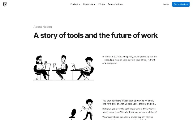
URL: notion.com/about
What’s on the page: The headline is “A story of tools and the future of work,” and the body is a first-person letter that opens “Hi there! If you’re reading this, you’re probably like me.” It walks from the typewriters and file cabinets of the Industrial Revolution, through the room-sized computers of the 1950s, to the 1970s pioneers (Alan Kay, Doug Engelbart, Ted Nelson) who imagined computers as tools for thought. Hand-drawn black and white illustrations break up the text. The page closes with “Join us” and “In the news.”
Why it works: It never lists features. It places Notion inside a 150-year story about tools, which makes the product feel inevitable rather than just another app.
Steal this: Write your About page as a letter from one named person to one reader. First person beats corporate “we” every time.
2. Wise: the origin story is the product demo
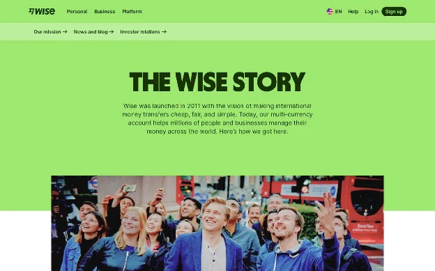
URL: wise.com/us/about/our-story
What’s on the page: “Like many good stories, this one starts with two friends.” Taavet, Skype’s first employee, lived in London but was paid in euros. Kristo worked at Deloitte, was paid in pounds, and had a mortgage in euros back in Estonia. Each month they swapped money between their own accounts at the mid-market rate and skipped the bank fees. The page then states the mission (“money without borders”) and three principles: low-cost and fair, easy, fast.
Why it works: By the time you finish the founding story, you understand exactly how the product works and why it is cheaper. The story and the explainer are the same paragraph.
Steal this: If your founders built the product to solve their own problem, tell that story with real names, real jobs, and real numbers.
3. Warby Parker: one sentence that frames everything
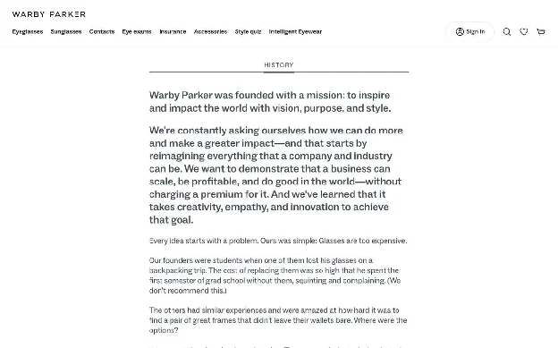
What’s on the page: A single centered column of text, no hero image. The key line: “Every idea starts with a problem. Ours was simple: Glasses are too expensive.” It tells how a founder lost his glasses on a backpacking trip and spent a semester of grad school without them “(We don’t recommend this.)”, explains that one company dominates the eyewear industry and keeps prices high, and then moves into the Buy a Pair, Give a Pair program and how frames are designed.
Why it works: It names a villain (an industry that overcharges), a simple problem, and a fix. The parenthetical jokes keep a long text page readable.
Steal this: Finish this sentence for your company and put it near the top: “Every idea starts with a problem. Ours was simple: ___.“
4. Gong: lead with the worst day, not the best one
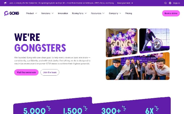
URL: gong.io/about
What’s on the page: The headline is “WE’RE GONGSTERS.” Animated counters show customers, employees, and partners. The story section is titled “It started with the worst quarter ever”: co-founder Amit was CEO of another company that had its worst quarter and had no idea why, because leaders only heard part of what customers were saying. He called his friend Eilon Reshef and they started working on it. Below that: “Life at Gong,” “How we work,” “How we lead,” a map of offices, and “Join the team.”
Why it works: The founding pain is the exact pain Gong’s buyers have. A revenue leader reading it thinks “that was my Q3.”
Steal this: Give your team a name and your origin a low point. Failure stories are more believable than success stories.
5. Asana: make the customer the main character
URL: asana.com/company
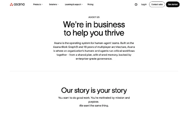
What’s on the page: Headline: “We’re in business to help you thrive.” The second section is titled “Our story is your story”: “You want to do good work. You’re motivated by mission and purpose. We want the same thing.” The origin (“Where it began”) describes founders Dustin Moskovitz and Justin Rosenstein watching talented people at Facebook lose more than half their day to meetings and status updates. A section called “Built for what’s next” retells the company history as a series of problems solved, ending with its current positioning around humans and AI agents working together.
Why it works: It reframes company history as a list of customer problems. Even the timeline is about the reader.
Steal this: Rewrite your history section so each milestone starts with the customer problem, not the product launch.
6. HubSpot: story first, then the receipts
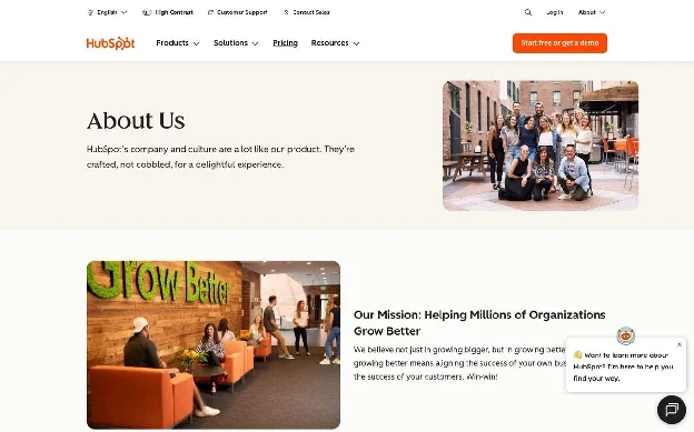
What’s on the page: The opening line says HubSpot’s company and culture are “crafted, not cobbled,” the same phrase it uses for its product. Then the mission (“Helping Millions of Organizations Grow Better”), the 2004 MIT origin with Brian Halligan and Dharmesh Shah, and a “HubSpot By the Numbers” block: 15 global offices, 9,000+ employees, 306,000 customers, and #1 rankings in 571 reports. Every number has a “Learn more” link.
Why it works: Each stat is a doorway. Offices lead to contact, employees lead to careers, customers lead to case studies. The About page works as a router to the rest of the site.
Steal this: Link every number on your About page to the page that proves it.
If you want to see how HubSpot applies the same thinking to conversion pages, read our HubSpot landing page breakdown.
Numbers-led About Us pages
When you have scale, show it early. These pages put proof above the fold and let the story come second.
7. Slack: mission as headline, three numbers, done
URL: slack.com/about
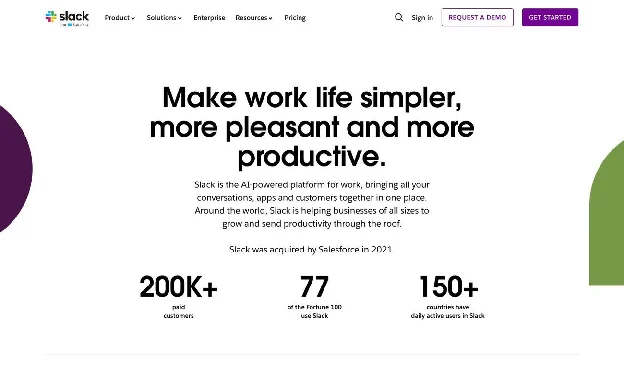
What’s on the page: The headline is the mission itself: “Make work life simpler, more pleasant and more productive.” Directly underneath: 200K+ paid customers, 77 of the Fortune 100, daily active users in 150+ countries. The page states plainly that Slack was acquired by Salesforce in 2021, then covers its app ecosystem (2,500+ apps), careers, global offices, and recent news.
Why it works: Three numbers, each answering a different question: do real companies pay for this, do big companies trust it, does it work where I am.
Steal this: Pick three stats that answer three different objections. Do not list eight.
More on how Slack sells upmarket in our Slack enterprise landing page breakdown.
8. Airbnb: a fact sheet with a “last updated” date
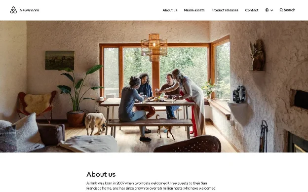
What’s on the page: One paragraph of story (“born in 2007 when two hosts welcomed three guests to their San Francisco home”), then a “Fast facts” grid of eight stats, including 9M+ active listings, 5.5M+ hosts, 2.5B+ guest arrivals, and $380B+ earned by hosts. The grid is stamped “Last updated May 2026.” Founders and a year-by-year “Airbnb Story” selector follow, starting with the 2008 SXSW launch that got just two bookings.
Why it works: It lives in the newsroom and is built for journalists and analysts who need a number they can cite. The date stamp makes the numbers trustworthy, and it makes the page citable by AI answer engines too.
Steal this: Add “Last updated [month, year]” under your stats and actually keep it current.
9. Ramp: customer proof segmented by company size
URL: ramp.com/about-us
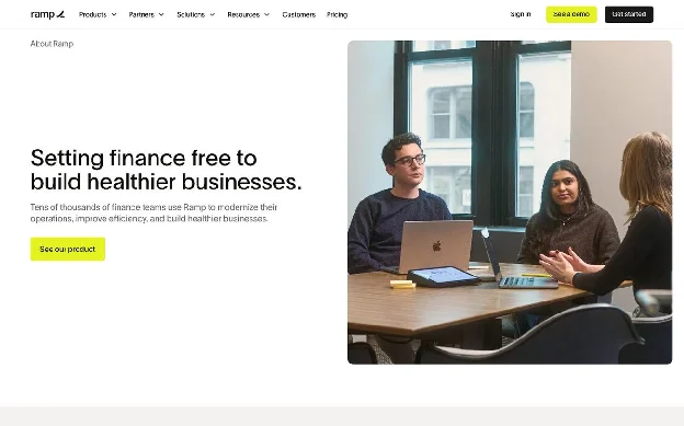
What’s on the page: Headline: “Setting finance free to build healthier businesses.” Four outcome stats: 27M+ hours saved, $12B+ saved for customers, 70,000+ customers, 200+ countries supported. Then “Our customers love us,” with three quotes labeled SMB, Mid-Market, and Enterprise. Values sit in an expandable list (“Grow without fear,” “Amp it up,” “Take ownership”). The press section, “Saving money (and making news),” includes a downloadable press kit.
Why it works: Two of the four stats are customer outcomes, not company vanity metrics. And the testimonials are tagged by segment, so every visitor finds someone who looks like them.
Steal this: Lead with what customers got (hours, dollars), not what you have (employees, offices).
10. Zapier: a headline with a point of view
URL: zapier.com/about
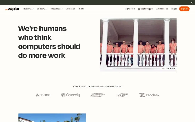
What’s on the page: “We’re humans who think computers should do more work.” Then “Zapier at a glance”: 9,000+ apps, 81 billion tasks automated, 25 million Zaps created, used by 69% of the Fortune 1000. A remote-work block (“800+ people across 38 countries”), five named values (“Default to action,” “Empathy over ego,” “Build the robot”), awards, and customer logos. The hero photo is a full-team retreat shot.
Why it works: The headline is a belief you can agree or disagree with, which is what makes it memorable. The values have names you would actually hear used inside the company.
Steal this: Write a headline a competitor would not be comfortable copying.
11. Canva: mission, scale, and values on one screen
URL: canva.com/about
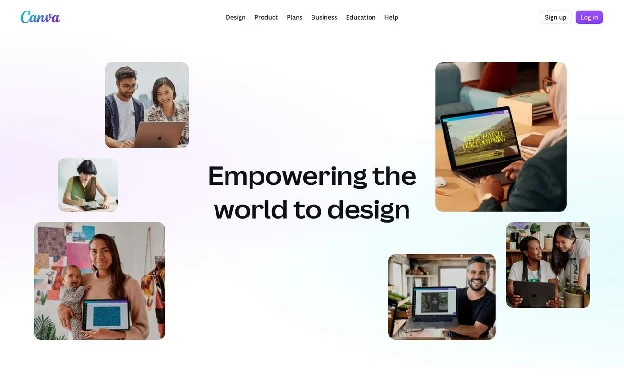
What’s on the page: “Empowering the world to design,” surrounded by a floating collage of people using the product. One sentence on the 2013 launch and mission, then four stats: 220M+ monthly active users, 30B+ designs created, 190 countries, 100+ languages. Six values follow (“Make complex things simple,” “Set crazy big goals and make them happen”), then commitments (its Two-Step Plan, sustainability, Trust Center) and recent awards.
Why it works: The hero shows users, not the office or the founders. For a product whose mission is “everyone,” that is the right cast.
Steal this: Match your hero imagery to your mission. If the mission is about customers, show customers.
See also our Canva landing page breakdown.
12. Atlassian: one playful stat makes the serious ones land
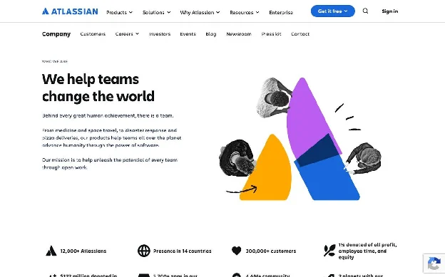
What’s on the page: “We help teams change the world,” with teams ranging “from medicine and space travel, to disaster response and pizza deliveries.” An icon grid of stats: 12,000+ Atlassians, 300,000+ customers, 5,700+ Marketplace apps, 4.6M+ community members, $132 million donated in community licenses, and “2 planets with our software on them.” A “brief history” timeline starts with two 18-year-olds meeting at university in 1998. A company sub-navigation links to Customers, Careers, Investors, Events, Newsroom, and Press kit.
Why it works: The “2 planets” line gives people something to repeat. The sub-navigation turns About into a hub for every non-buyer audience.
Steal this: Include one stat that makes people smile. It makes the rest more memorable.
13. Calendly: stats with a source, and a founder line with teeth
URL: calendly.com/about
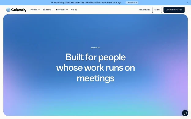
What’s on the page: “Built for people whose work runs on meetings.” The intro names the insight the company was built on (“When finding time to meet is easy, real connections happen sooner”). Stats: 50M+ people, 240+ countries, 1.3B+ meetings booked, with a note that the statistics come from Calendly’s own research. The leadership section says founder Tope Awotona started the company in 2013 “through sheer grit, perseverance, and the complete and utter emptying of his personal savings accounts.”
Why it works: The headline defines the audience, not the product. And the founder line is specific and a little funny, which is rare in a leadership section.
Steal this: Say where your numbers come from. One line of sourcing buys a lot of trust.
People-led About Us pages
If your team is the reason customers choose you, put the team on the page. All of it.
14. Buffer: the entire company, filterable
URL: buffer.com/about
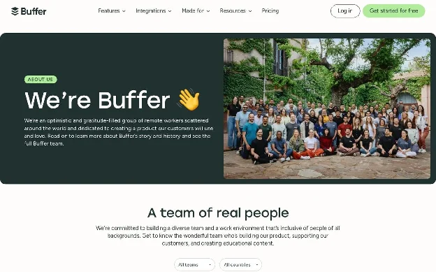
What’s on the page: “We’re Buffer 👋,” described as “an optimistic and gratitude-filled group of remote workers scattered around the world.” The main section, “A team of real people,” is a directory of every employee with name, role, and city. You can filter by team (Advocacy, Engineering, Marketing) and by country. One of the location options is “Nomad.”
Why it works: Buffer’s brand is transparency, and the page proves it instead of claiming it. You can see exactly who will answer your support ticket.
Steal this: Show everyone, not just the executives. If that is too many people, show the teams customers actually talk to.
15. Linear: a three-minute film and a list of makers
URL: linear.app/about
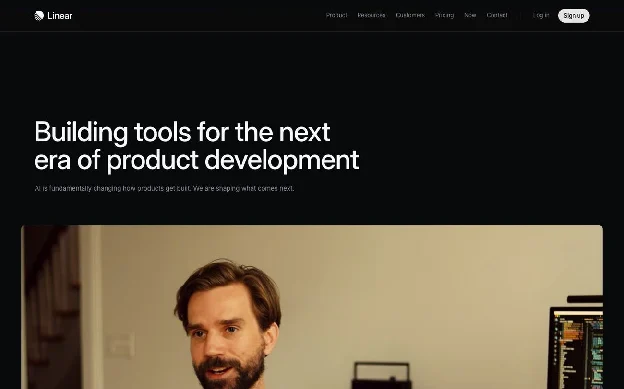
What’s on the page: A dark page headlined “Building tools for the next era of product development,” with a 3:18 film in the hero. A short manifesto (“A new species of product tool”) gives the facts: founded in 2019, used by more than 40,000 companies including OpenAI, Coinbase, and Ramp. “Meet the team behind Linear” describes the team as “designers and engineers. Problem solvers and storytellers,” lists people by name, and links to hiring. Then “Backed by the best.”
Why it works: The page looks and feels like the product: dark, precise, fast. It is proof of craft, which is what Linear sells.
Steal this: Your About page should be the best-designed page on your site. It is the one page that is supposed to be about your standards.
See our Linear landing page breakdown for how the same approach drives signups.
16. Nike: a corporate site that stays out of the store’s way
URL: about.nike.com/en/company
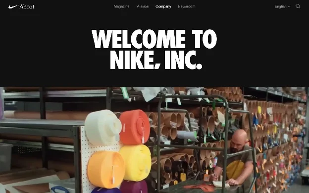
What’s on the page: “WELCOME TO NIKE, INC.” over a montage of film clips. One sentence defines the company as the Nike, Jordan, and Converse brands. Then a full leadership list, four headquarters, and a “Contact Us” block that routes by audience: Consumer Affairs, Student Inquiries, Media Requests, Investor Relations.
Why it works: It lives on its own subdomain, so shoppers never trip over investor content and investors never dig through product pages. Each audience gets a clear door.
Steal this: Add audience-based routing to your About page: customers, candidates, press, investors. You do not need to be Nike to run a focused microsite for a specific audience, either.
Belief-led About Us pages
These pages skip the story and the stats and lead with what the company believes. High risk, high reward: it only works if you really have a point of view.
17. Stripe: no headings, no hero, just an argument
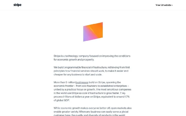
URL: stripe.com/about
What’s on the page: Almost nothing but text. There are no section headings at all. It opens: “Stripe is a technology company focused on improving the conditions for economic growth and prosperity.” It states that more than 5 million businesses build on Stripe and process trillions of dollars a year, “equivalent to around 1.7% of global GDP,” and that “our own growth is wholly contingent on the success of the businesses building on Stripe.” A single small gradient graphic sits at the top.
Why it works: The restraint is the message. A company this confident in its writing does not need a carousel. The mission is framed at the level of the economy, not the product.
Steal this: Try writing your About page as a 300-word essay with zero design. If it does not hold up as plain text, design will not save it.
Compare it with how Stripe handles conversion pages in our Stripe landing page breakdown.
18. Anthropic: principles in a grid, almost no imagery
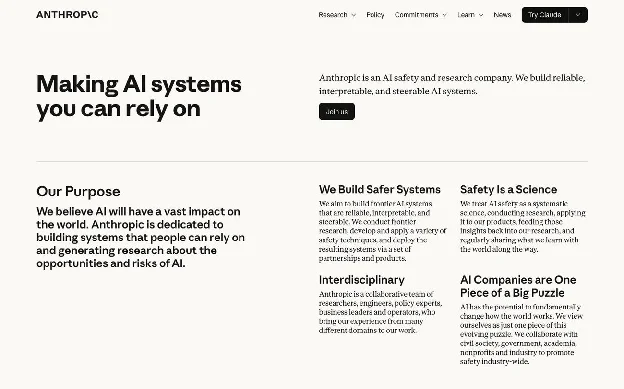
What’s on the page: “Making AI systems you can rely on.” A purpose statement, then four short principle blocks: “We Build Safer Systems,” “Safety Is a Science,” “Interdisciplinary,” and “AI Companies are One Piece of a Big Puzzle.” A team section, then “What we value and how we act,” with values such as “Hold light and shade” and “Ignite a race to the top on safety.” The whole page is typography on a cream background.
Why it works: In a category where trust is the product, a calm, text-first page signals seriousness. The values are unusual enough that they could not belong to anyone else.
Steal this: Run the swap test on your values. If they would fit on any competitor’s site, rewrite them.
19. 37signals: the About page is a table of contents
URL: 37signals.com
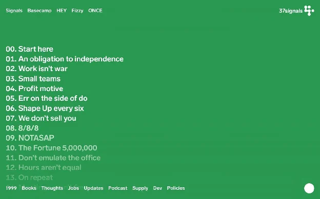
What’s on the page: A full-screen green page with a numbered list from 00 to 37: “Work isn’t war,” “Meetings aren’t free,” “Companies aren’t families,” “Planning is guessing,” “JOMO not FOMO.” Each line opens a short essay. There is no company description anywhere on the index.
Why it works: By the time you have read five of the titles, you know whether you would want to buy from them or work for them. It filters as much as it attracts.
Steal this: List the five things your company believes that most of your industry does not. That is your About page outline.
20. Liquid Death: brand voice with zero off switch
URL: liquiddeath.com/pages/manifesto
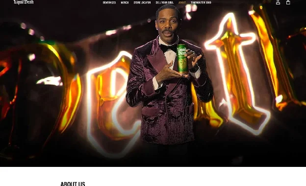
What’s on the page: “Liquid Death will not kill you. But make no mistake, our infinitely recyclable cans of premium low-calorie beverages will absolutely murder your thirst.” The copy explains, in character, that funny marketing used to be reserved for junk food, and that a portion of proceeds goes to fighting plastic pollution. It ends: “But enough about us and our boring story. Tell us about you,” with a contact button.
Why it works: Most brands drop their voice the moment they reach the About page. Liquid Death keeps it and still gets the real points across: recyclable cans, healthier drinks, donations.
Steal this: Read your About page out loud next to your homepage. If it sounds like a different company wrote it, fix the About page.
Timeline-led About Us pages
A timeline works when the trajectory itself is the proof. The trick is choosing milestones a buyer cares about.
21. monday.com: a question for a headline, a timeline that ends in the future
URL: monday.com/p/about
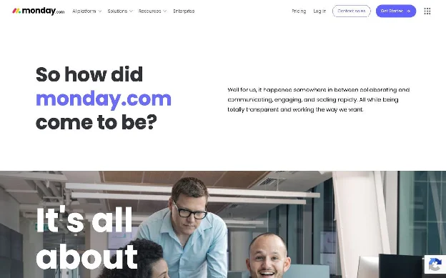
What’s on the page: The headline asks “So how did monday.com come to be?” A short intro covers the 2021 Nasdaq listing, then a scrolling timeline runs from 2012 (founding by Roy Mann and Eran Zinman, a $1.5 million seed round, “Our first customers!”) to a June 2026 entry about its venture arm, and one final card: “The Future. Stay tuned…”
Why it works: The question headline mirrors what the visitor is actually wondering. The early timeline entries are humble, which makes the later ones more impressive.
Steal this: End your timeline with an open card about what is next. It tells the reader the story is still going.
22. Fin (formerly Intercom): an About page that handles a rebrand
URL: fin.ai/about (intercom.com/about now redirects here)
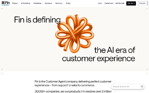
What’s on the page: “Fin is defining the AI era of customer experience.” The intro gives current proof: 30,000+ companies, more than 2 million conversations resolved weekly, and over $400M in annual recurring revenue. Then it addresses the change directly: “Founded as Intercom in 2011… When it was clear AI would fundamentally reshape the industry, we reinvented the company.” The “Our journey” timeline runs in reverse, and the milestone titles are business results: “$50M ARR,” “Unicorn Status,” “$150M Revenue,” “Fin Launches.”
Why it works: Visitors who knew the old brand need one sentence that connects the dots, and they get it. Putting the newest milestones first keeps the page about where the company is going.
Steal this: If you have pivoted or rebranded, say so in plain words on the About page. Run your timeline newest-first.
Credibility-led About Us pages
In categories where buyers are nervous (money, data, payroll), the About page has one job: reassurance.
23. Mercury: compliance language that does not ruin the design
URL: mercury.com/about
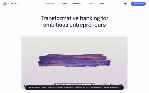
What’s on the page: “Transformative banking for ambitious entrepreneurs,” followed immediately by the required disclosure that Mercury is a fintech company, not an FDIC-insured bank, and which partner banks provide services. “Backed by the best” covers venture investors, angels, and 2,500+ community investors. “Mercury in the news” uses pull quotes instead of logos, including a Forbes line about picking up more than $2 billion in deposits within days of the Silicon Valley Bank failure. Separate contacts for general and press inquiries, and a “Disclaimers and footnotes” section at the bottom.
Why it works: Regulated companies often bury disclosures or let them wreck the page. Mercury puts the disclosure right under the headline in small, clean type, which reads as honesty. Quotes beat logos because they carry an actual claim.
Steal this: If you work in fintech, health, or insurance, design your disclosures instead of hiding them. Replace one row of press logos with one strong press quote.
24. Clay: customer results on the About page
URL: clay.com/about
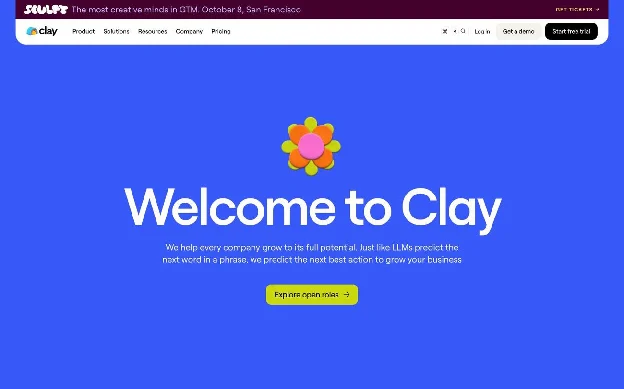
What’s on the page: “Welcome to Clay,” with the line “Just like LLMs predict the next word in a phrase, we predict the next best action to grow your business.” The main button is “Explore open roles.” Below it, customer result cards: OpenAI doubled enrichment coverage, ElevenLabs saw a 50% lift in SQLs, Mistral AI mapped its market 4x faster. Then “We power GTM engineers,” with personal stories of people who built careers on the product, followed by story, team, investors, and press coverage of its funding rounds. The navigation even lets you copy the logo or download brand assets.
Why it works: It treats the About page as a second homepage for three audiences at once: candidates (hiring CTA first), buyers (results), and press (news plus instant brand assets).
Steal this: Add two or three customer results to your About page. It is where skeptical buyers go, so meet them with proof.
25. Gusto: short, warm, and organized like a front desk
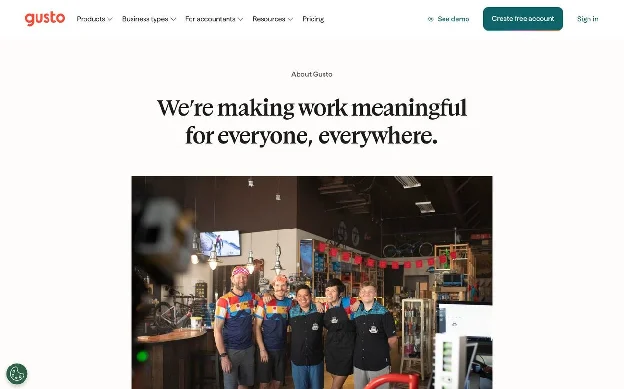
URL: gusto.com/about
What’s on the page: “We’re making work meaningful for everyone, everywhere,” over a photo of a small business team. One paragraph of facts: launched in 2012 as ZenPayroll, now serving more than 500,000 businesses. Four values (“Customer Obsessed,” “Dream Big, then Make it Real”). Then a tidy routing block: Investors, Press, Contact, each with one sentence and one link. The whole page is a little over 200 words.
Why it works: It mentions the old company name, which helps anyone who remembers ZenPayroll. And it respects the visitor’s time: every audience finds their door in one scroll.
Steal this: You can do this in 200 words. Headline, one paragraph of facts, values, three doors.
A simple About Us page template
Based on the 25 pages above, here is a structure that works for most B2B companies. You do not need every block. Pick five.
- Eyebrow + belief headline. Small “About us” label, big statement of what you believe or who you serve. (Zapier, Calendly, Ramp)
- Two-sentence summary. What you do, for whom, since when. Include the fact a journalist would need. (Gusto, Slack)
- Three proof numbers. At least one should be a customer outcome. Add a “last updated” date. (Ramp, Airbnb)
- Origin story. One specific problem, real names, 150 words or fewer. (Wise, Warby Parker, Gong)
- People. Leadership at minimum, the whole team if you can. (Buffer, Linear)
- Values you actually use. Three to six, with names nobody else would choose. (Zapier, Anthropic)
- Third-party proof. Investors, press quotes, awards, or customer results. (Mercury, Clay)
- Doors. Careers, press kit, contact, and a product CTA. All 25 pages link to careers. (Gusto, Nike, Atlassian)
How to build an About Us page like these
The slow way is a design brief, a copy doc, three review rounds, and a dev ticket. That is why most About pages are years out of date.
The faster way: pick the About Us page example above that fits your company, click “Rebuild this layout in your brand with Ploy,” and Ploy will generate the page structure using your own brand system, fonts, and colors. You edit the copy in chat, publish to your existing site or a subdomain, and update the numbers whenever they change.
If the About page is one of several pages that need work, start with a website redesign plan instead, and see how your current pages compare using our website conversion rate benchmarks.
Frequently asked questions
What should you write in an About Us page?
A belief-driven headline, a two-sentence summary of what the company does, two or three proof points (customer numbers, outcomes, or press), a short origin story, the people behind the company, and clear next steps for different visitors: customers, job candidates, and press. Every one of the 25 pages we reviewed links to careers.
What does a good About Us page look like?
A good About Us page opens with a clear belief or mission instead of the words “About us,” shows two or three proof points near the top, and keeps the copy short. In the 25 About Us page examples we reviewed, only 4 used “About us” as the headline, about two-thirds showed hard numbers, and the median length was roughly 670 words. Visually, the strongest pages look like the rest of the brand: Linear’s is dark and precise, Liquid Death’s is loud, Stripe’s is almost all text.
How long should an About Us page be?
Shorter than you think. The median length across the 25 pages we reviewed was about 670 words, and 14 of them were under 700. Gusto’s is a little over 200. Pages that run long do so because of a timeline or a team directory, not long paragraphs.
What is the difference between an About Us page and an Our Story page?
An About Us page is a hub: who you are, proof, people, and links onward. An Our Story page is a single narrative about how the company started. Wise and Warby Parker publish a dedicated story page. Most companies only need one page that includes a short story section.
Should an About Us page have a call to action?
Yes, and usually more than one. About pages attract mixed audiences, so the best ones offer several doors: open roles, press kit, contact, and a product or demo link. Clay makes hiring the primary button. Ramp leads with “See our product.”
How do I write an About Us page for a B2B company?
Start with the customer problem that led to the company, not the founding date. Use real names and real numbers. Add customer outcomes as proof, the way Ramp and Clay do. Keep the brand voice consistent with your homepage, and link every claim to a page that backs it up.
How often should I update my About Us page?
Any time a number on it changes, and at least twice a year. Airbnb stamps its stats with a “last updated” date, which is a good forcing function. Outdated customer counts and old leadership photos are the most common trust-killers on About pages.