Most contact pages are a form and a hope.
Somebody lands there with real intent - they want to buy something, or something is broken - and the page hands them six identical boxes and a Submit button, with no indication of who reads it, when they reply, or whether this is even the right place to ask. The message goes somewhere. Nobody is sure where.
A contact us page is not a design exercise. It is a routing problem with a deadline attached, and the good ones solve it in three moves: send the message to the right team, say what happens next, and offer at least one way to reach a human that is not a form.
So we opened 20 contact pages and counted what each one actually does. Not how it looks - what it asks, what it publishes, and who it sends you to.
The short version: the best contact pages ask you who you are before they ask you anything else.
Build a contact page around your visitors' questions.
How we checked these pages
Each page was loaded in a desktop browser at 1440 × 900 on 5 October 2026 and read from the rendered page. For every one we counted the visible form fields, the number of distinct routes offered, whether a real email address or phone number is published, and whether existing customers are separated from people who have not bought yet.
As on previous roundups, the automated pass was treated as a hint and not an answer — it counted search boxes as contact forms and missed routes rendered as cards. Every number below was confirmed on the screenshot.
What the 20 showed:
| What we counted | Result |
|---|---|
| Pages with no contact form at all | 7 of 20 |
| Pages that separate existing customers from prospects | 12 of 20 |
| Pages that publish an email address you can write to | 5 of 20 |
| Pages that print a phone number | 3 of 20 |
| Pages that say anything about when you will hear back | 1 of 20 |
That last row is the gap. Nineteen of these twenty companies will answer you, and exactly one of them tells you when.
If you are working through the rest of your site, we have done the same exercise for about us pages and for landing page examples across B2B and consumer.
Pages that route the message
1. Stripe
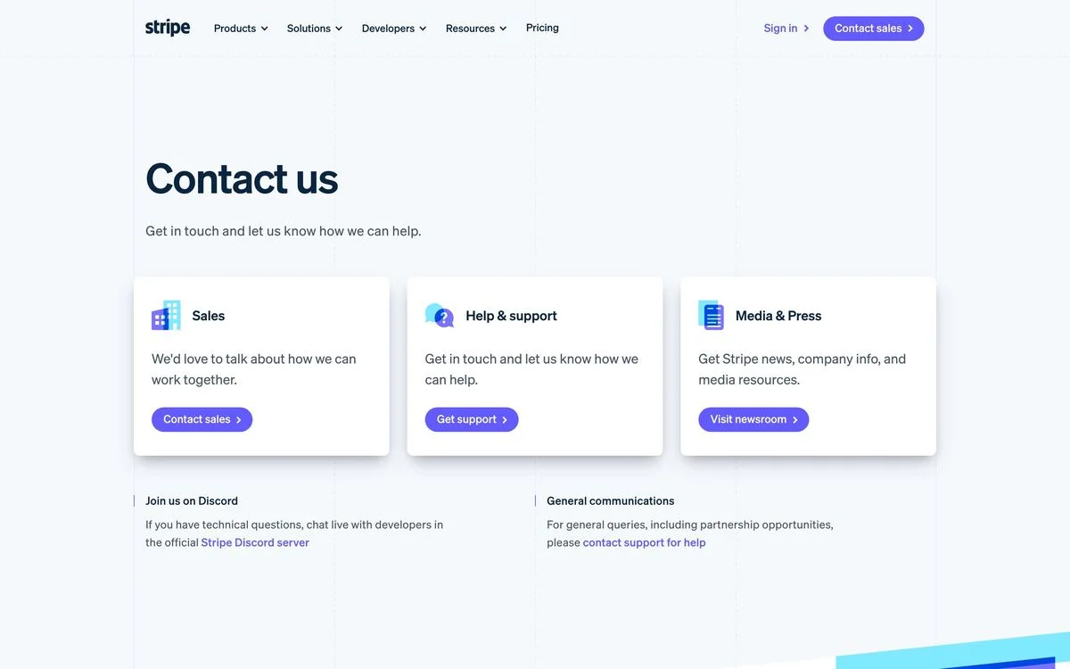
Example: Stripe contact page
What it does: Three cards — Sales, Help and support, Media and press — each with one sentence of explanation and its own button. No form anywhere on the page.
Why it works: The page’s whole job is to be a switchboard. Each card explains who it is for before you click, so the sales team does not receive bug reports and support does not receive press enquiries. Underneath, a smaller row points developers to a Discord server and general queries to a support address.
Steal this: If your contact page serves more than one team, make the page a menu, not a form. The form belongs on the other side of the click.
2. Atlassian
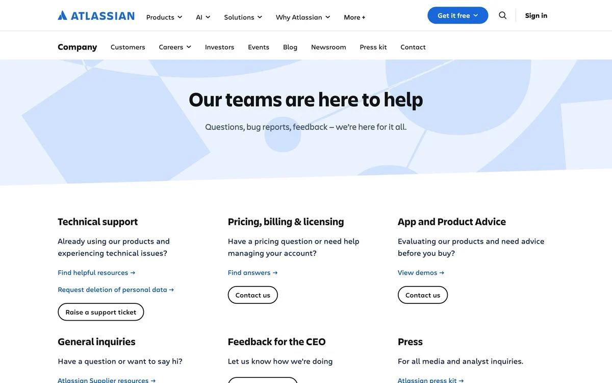
Example: Atlassian contact page
What it does: “Our teams are here to help”, then six routes in a grid: technical support, pricing and billing, product advice for people still evaluating, general enquiries, press — and feedback for the CEO.
Why it works: Splitting “technical support” from “product advice before you buy” is the distinction most contact pages miss, and it is the one that matters most, because those two messages go to completely different teams. The CEO route is unusual and does real work: it gives the furious customer somewhere to go that is not the support queue.
Steal this: Add a route for the escalation you currently receive by accident. If angry messages are reaching your support inbox, give them their own door.
3. Zoom
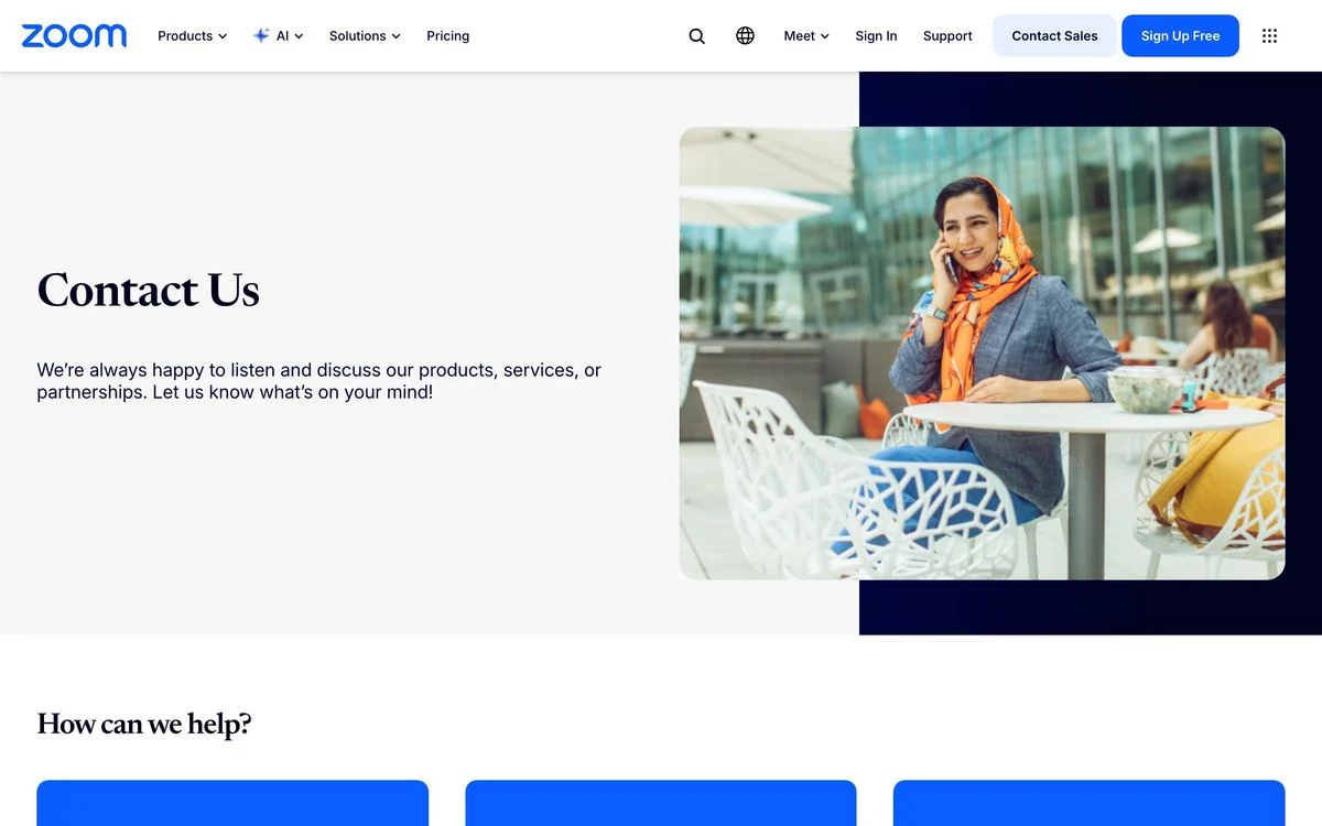
Example: Zoom contact page
What it does: A short, warm opening — “We’re always happy to listen and discuss our products, services, or partnerships. Let us know what’s on your mind!” — then a “How can we help?” row of routes beneath.
Why it works: The copy does something most contact pages skip entirely: it names what the company is willing to talk about. Products, services, partnerships. A visitor with a partnership idea now knows this is the right place, which is the difference between a message sent and a message not sent.
Steal this: Say what you want to hear about. A contact page that lists its topics gets fewer wasted messages and more of the useful ones.
4. Datadog
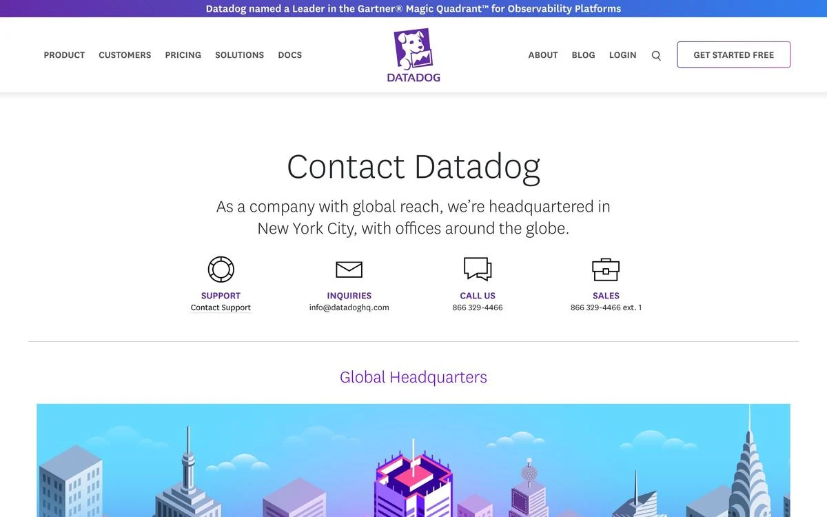
Example: Datadog contact page
What it does: Four routes as icons across one row — support, general enquiries, call us, sales — with a real email address and a real phone number printed underneath, plus a sales extension. Below that, global headquarters.
Why it works: This is the most generous page in the set. Publishing info@ and a phone number with an extension is a decision most companies avoid because it creates noise. Datadog accepts the noise in exchange for being reachable, which is the entire point of the page.
Steal this: Print one real email address. A page that hides every human behind a form reads as a company that does not want to hear from you.
5. Paddle
Example: Paddle contact page
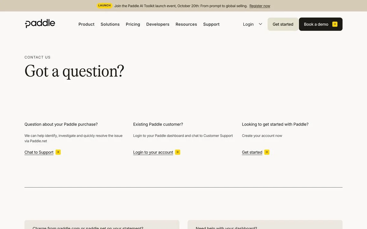
What it does: “Got a question?” and then three routes defined by relationship: a question about a Paddle purchase, an existing Paddle customer, or someone looking to get started.
Why it works: Paddle is a merchant of record, so a large share of the people landing on this page are not its customers at all — they are its customers’ customers, looking at a charge on a statement. Giving that person their own route first keeps them out of the sales queue entirely.
Steal this: If a third party ever ends up on your contact page, give them a labelled route. Otherwise they will take the only one you offered.
6. Mercury
Example: Mercury contact page
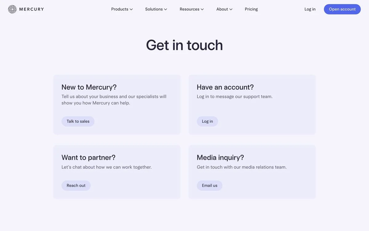
What it does: Four cards, each addressed to a person rather than a topic: new to Mercury, have an account, want to partner, media enquiry.
Why it works: “Have an account?” routes existing customers to log in and message support from inside the product, where the company already knows who they are. That one decision removes the most common contact-form message — an existing customer with an account problem — from the general inbox.
Steal this: Write your routes as questions about the reader, not labels for your departments. “Have an account?” is easier to answer than “Technical support”.
7. Checkr
Example: Checkr contact page
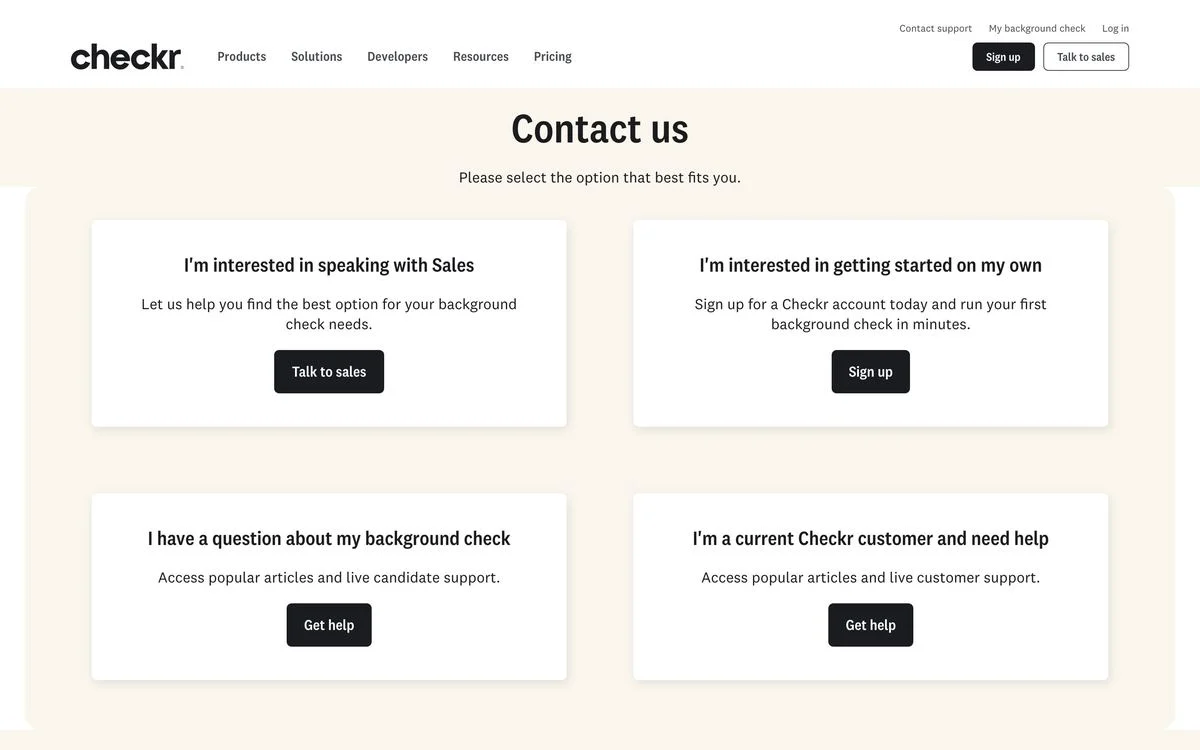
What it does: “Please select the option that best fits you”, then four cards written in the first person: I’m interested in speaking with sales, I’m interested in getting started on my own, I have a question about my background check, I’m a current Checkr customer and need help.
Why it works: Checkr runs background checks, so the person asking about one is usually the candidate being screened — not a customer, and not a prospect. Writing the routes as sentences the visitor would say about themselves makes that distinction obvious in a second.
Steal this: Phrase routes in the first person. “I’m a current customer and need help” is unambiguous in a way that “Support” never is.
Pages that separate customers from prospects
8. Brex
Example: Brex contact page
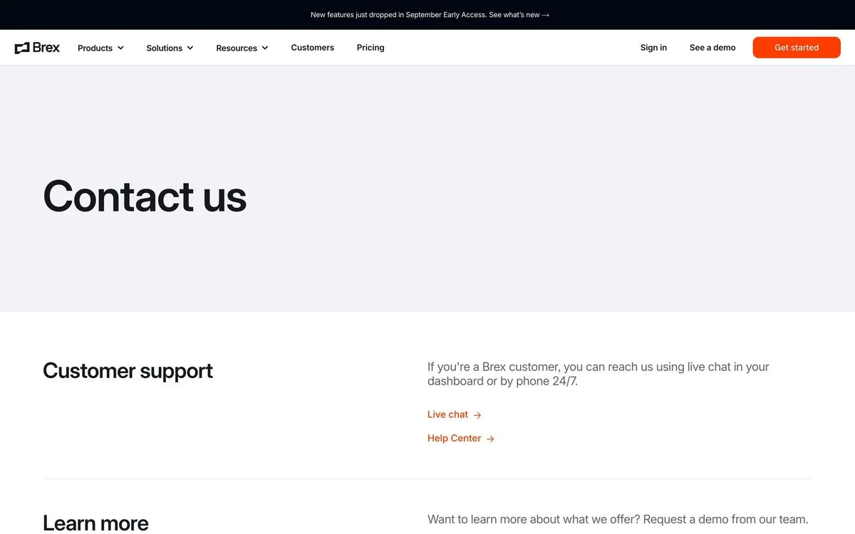
What it does: Two stacked sections. Customer support comes first — if you are already a customer, you can reach Brex by live chat inside the dashboard or by phone, around the clock — and “learn more”, the demo request, comes second.
Why it works: Putting existing customers above prospects on a contact page is a statement about priorities, and it is also just efficient: the customer with an urgent problem is the one most likely to be on this page at 2am.
Steal this: Order the page by urgency, not by revenue. The person with a broken thing should not have to scroll past your sales pitch.
9. Linear
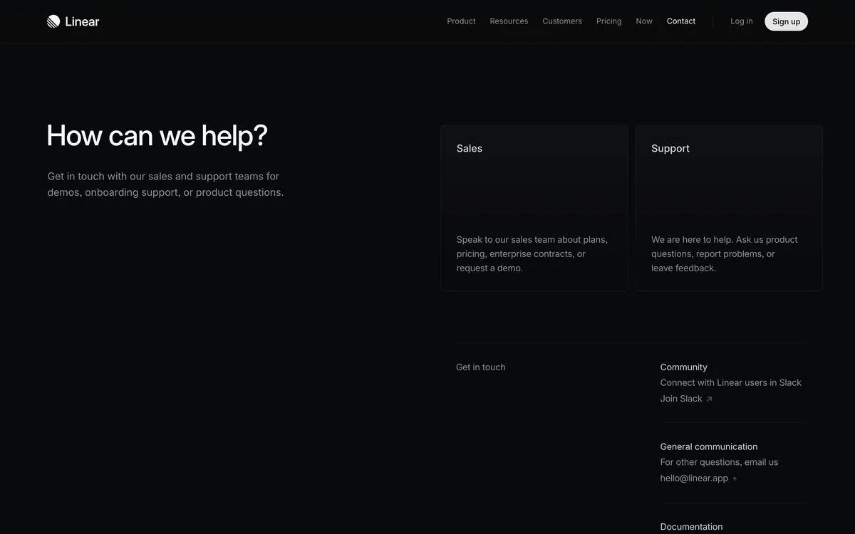
Example: Linear contact page
What it does: “How can we help?” above two cards, sales and support, each describing exactly what that team handles. Underneath, a quieter block offers the community Slack, a general email address, and the documentation.
Why it works: The sales card lists plans, pricing, enterprise contracts and demos; the support card lists product questions, problems and feedback. A visitor can tell in one read which box their message belongs in, and the third block catches everything that fits neither.
Steal this: Describe what each team handles in a sentence. Two labelled boxes beat one unlabelled form every time.
10. Clay

Example: Clay contact page
What it does: “Get in touch with Clay.” Then a plain instruction: log in and click the question-mark icon in the product, or email the support address to open a ticket. One dropdown asks what you need help with.
Why it works: The page is almost rude in its brevity, and that is the point — it pushes existing customers into the in-product support flow where their account context already exists, instead of making them re-explain who they are in a form.
Steal this: If your in-app support is better than your contact form, say so on the contact page and send people there.
Give each visitor a clear contact route
Use Ploy to build an on-brand contact page with clear paths for customers and prospective buyers.
11. Mixpanel
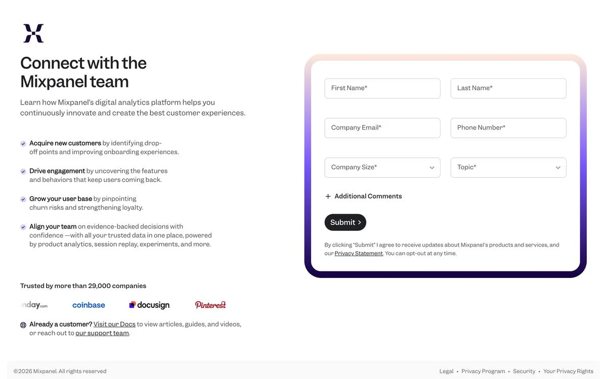
Example: Mixpanel contact page
What it does: “Connect with the Mixpanel team”, four bullets describing what the conversation will cover, a six-field form, and a customer count with a logo row. At the very bottom, one line: already a customer? Visit the docs, or reach out to the support team.
Why it works: The bullets sell the call rather than the product — acquire customers, drive engagement, grow your user base, align your team — so the form has a reason to exist. The customer escape hatch at the bottom keeps support tickets out of the sales inbox.
Steal this: Next to a sales form, write what the conversation will actually cover. “Submit” is not a reason to fill anything in.
Pages that publish something a human can use
12. Flexport
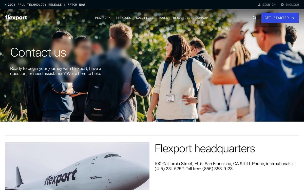
Example: Flexport contact page
What it does: A short invitation, then the headquarters address in full, an international phone number and a toll-free number.
Why it works: Flexport moves physical freight for companies that need to know a real business exists at a real address. Printing the street address and two phone numbers is a credibility move specific to the category — in logistics, a company with no address is a risk.
Steal this: If your buyer’s risk is “is this company real”, publish the address. In some categories the contact page is a trust page.
13. Okta
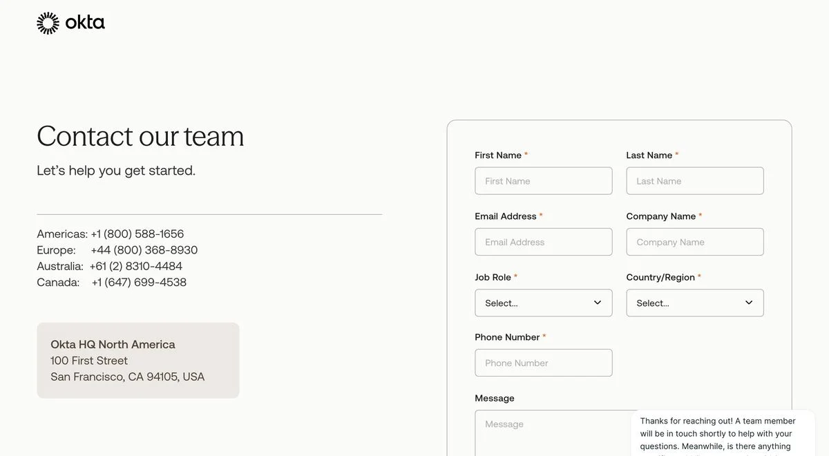
Example: Okta contact page
What it does: Phone numbers for the Americas, Europe, Australia and Canada, the North America headquarters address, and a form beside them.
Why it works: Four regional numbers tell an international buyer that someone in their timezone will answer. For enterprise software bought by committees in several countries, that is a more useful signal than any amount of copy about global support.
Steal this: If you sell across timezones, publish a number per region. It answers “will anyone pick up at my hours” without saying it.
14. Zip
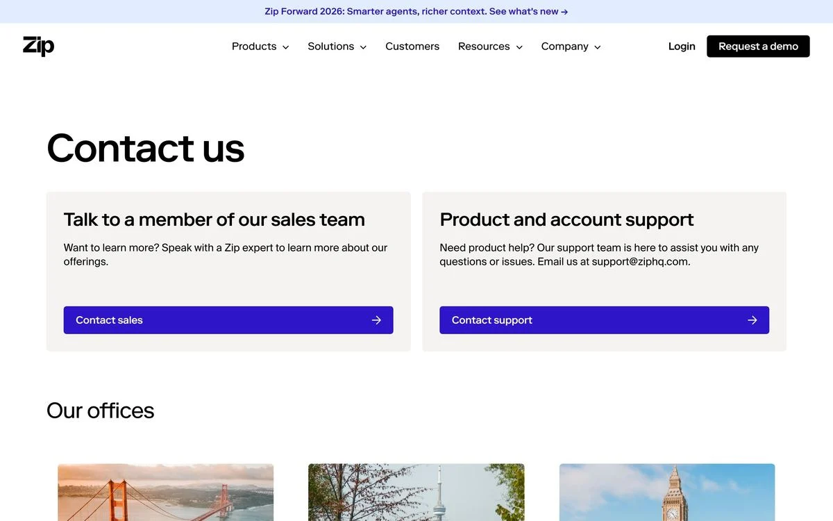
Example: Zip contact page
What it does: Two cards — talk to sales, or product and account support with a published support address — and then a row of office photographs under the heading “Our offices”.
Why it works: The office photographs are doing a quiet trust job for a procurement product sold to large companies: here are the actual places, in the actual cities. It is the same instinct as Flexport’s address, expressed visually.
Steal this: Photographs of real offices outperform a stock image of a headset. If you have offices, show them. The same instinct runs through the best SaaS websites we measured.
Forms worth filling in
15. PostHog
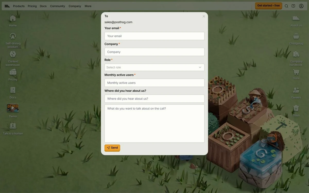
Example: PostHog contact page
What it does: The page is called “Talk to a human”, and the form is styled as an email you are composing — a To field already addressed to the sales team, then your email, company, role, monthly active users, where you heard about them, and what you want to discuss on the call. The button says Send.
Why it works: Dressing a form as an email changes what it feels like you are doing. You are not submitting a ticket into a void; you are writing to a named address. The page name does the same work in three words.
Steal this: Name the page after what the visitor wants. “Talk to a human” converts better than “Contact us” because it answers the fear rather than the category.
16. Databricks
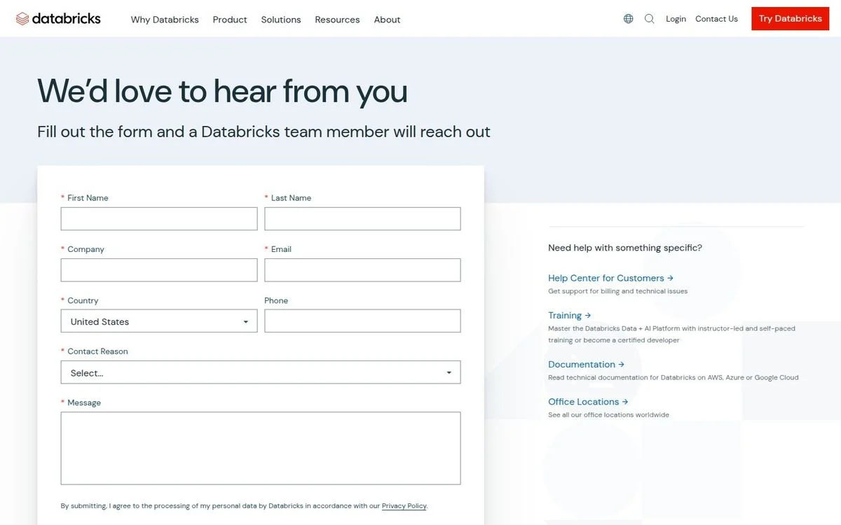
Example: Databricks contact page
What it does: “We’d love to hear from you. Fill out the form and a Databricks team member will reach out.” Eight fields, including a contact-reason dropdown, beside a column of links for people who need something specific — the help centre, training, documentation and office locations.
Why it works: The side column is the valuable half. Four of the most common reasons to contact a company are answered before the form, so the eight fields are only paid by people who genuinely need a human.
Steal this: Put your self-serve answers beside the form, not after it. Every question answered there is a form you do not have to process.
17. Ramp
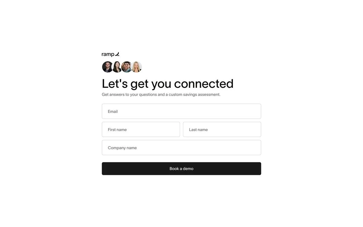
Example: Ramp contact sales
What it does: The contact-sales link leads to a booking page: four photographs of the people you would be meeting, the line “Let’s get you connected”, and a four-field form promising answers and a custom savings assessment.
Why it works: The faces are the mechanic. A form that shows the actual humans on the other side is a different proposition from a form that shows nothing, and the offer is specific — a savings assessment, not a “consultation”.
Steal this: Put faces on the form. And promise something concrete in return for the fields, not a conversation.
18. GitLab
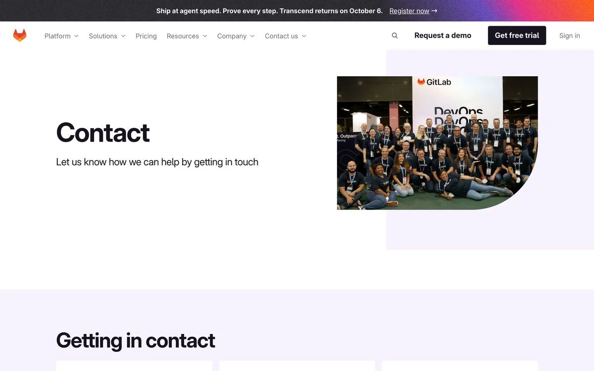
Example: GitLab contact page
What it does: “Contact. Let us know how we can help by getting in touch”, next to a photograph of a large group of GitLab people at an event, with the routes below.
Why it works: The photograph is not a stock image of a call centre — it is the actual company, visibly a lot of real people. For an open-source company whose contributors and customers overlap, that picture says “you are contacting a community” rather than “you are contacting a vendor”.
Steal this: If you use a photo on a contact page, use one of your own team. A stock headset photo is worse than no photo.
Support-first pages
19. Basecamp
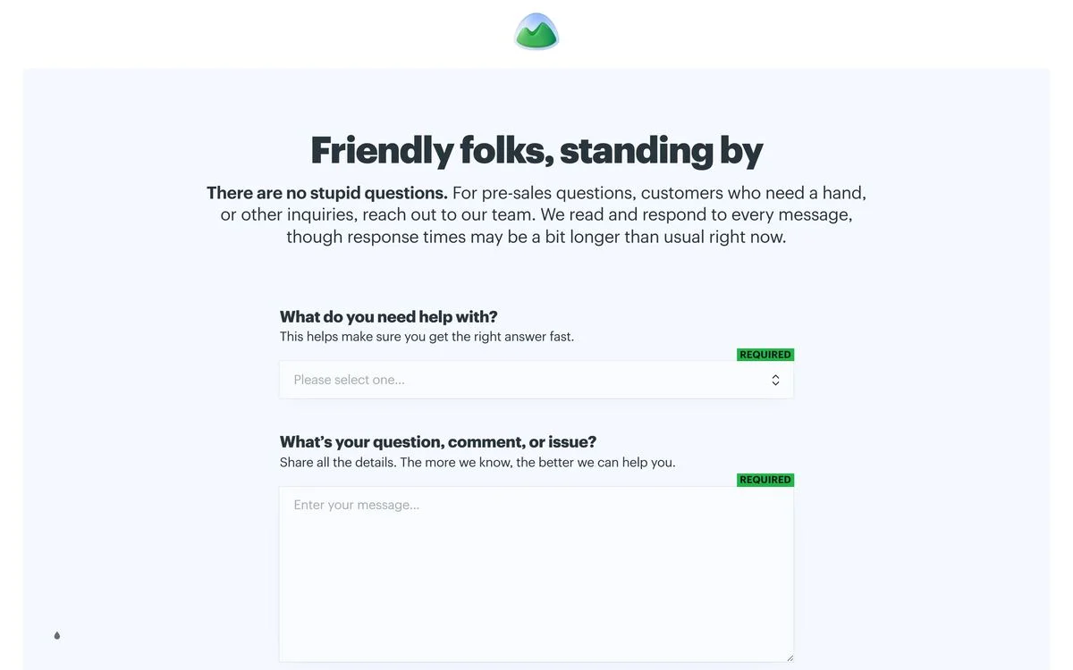
Example: Basecamp support page
What it does: “Friendly folks, standing by. There are no stupid questions.” Then the only honest sentence on any page in this set: they read and respond to every message, though response times may be a bit longer than usual right now. Two required fields follow — what you need help with, and your question.
Why it works: It is the only page of the twenty that sets any expectation about timing, and it does it by admitting things are slow. That is more reassuring than silence, because silence is what every other page offers and silence is what makes people send the same message three times.
Steal this: Say when you will reply. If you cannot promise a time, say that — an honest “slower than usual” beats no information at all.
20. Wise
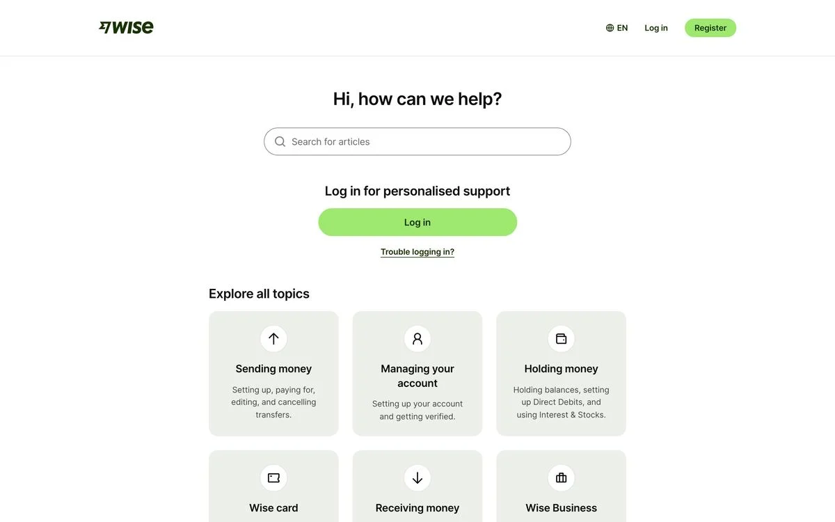
Example: Wise help centre
What it does: “Hi, how can we help?” with a search box, a prompt to log in for personalised support, and a grid of topics — sending money, managing your account, holding money, the card, receiving money, business.
Why it works: At Wise’s volume, most contact attempts are questions that already have answers. Leading with search and logged-in context deflects those, so the messages that reach a human are the ones that need one.
Steal this: If you get the same questions repeatedly, put search above the form. Deflection is not avoidance when the answer is genuinely there.
What the best contact pages have in common
- They ask who you are before what you want. Twelve of the twenty separate existing customers from prospects, and the clearest of them — Mercury, Checkr, Paddle — do it in the first thing you read.
- They route before they collect. Seven have no form at all. The form, where it exists, sits behind a choice.
- They publish something. Five print an email address and three print a phone number. Every one of those is a company choosing to be reachable over being tidy.
- The good forms explain themselves. Mixpanel lists what the call covers, Databricks puts the self-serve answers alongside, Ramp shows the people and names the deliverable.
- Almost none of them set an expectation. One page in twenty says anything about when you will hear back. It is the cheapest improvement available to the other nineteen.
How to build a contact page that gets replies
- List every kind of message you actually receive. Sales, support, press, partnerships, billing, candidates, and the ones that arrive by accident.
- Give the top four their own route, written in the reader’s words rather than your org chart’s.
- Send existing customers somewhere else — in-app support, the help centre, or a logged-in channel where you already know who they are.
- Publish one real address or number. Pick the one you can live with.
- Say when you will reply, even if the honest answer is “within two business days, usually sooner”.
- Put the form last, and only ask for what changes how you route the message.
If the contact page is one symptom of a wider problem, a website redesign plan is the better starting point.
A contact page is also one of the easiest pages to test, because the outcome is countable: messages received, and how many landed in the right queue. A/B testing the routing is more valuable than testing the headline here. With Ploy’s AI landing page builder, restructuring the routes is a chat instruction against your existing components rather than a developer ticket.
Build a contact page with a clear next step
Use Ploy to draft the routes and response expectations your contact page needs, in your own brand.