A B2B homepage has a harder job than a consumer one. It has to survive a committee.
The person who lands on it is rarely the person who signs. They are researching on behalf of four other people, half of whom will never visit the site, and they need something they can forward. That changes what the page has to do: it has to be legible in ten seconds, specific enough to repeat in a meeting, and honest about how you actually buy the thing.
So we opened 20 B2B websites and looked at the only part every visitor sees — the first screen. For each one we recorded what the headline claims, what the page asks you to do, and whether it shows any proof before you scroll.
The short version: most B2B homepages are not fighting about design. They are making one decision — whether to send you to a product or to a person — and the good ones commit.
Build a B2B homepage in your own brand.
What we checked, and how
Each site was loaded in a desktop browser at 1440 × 900 in early October 2026 and read from the rendered page. We counted the calls to action in the hero, whether an email field appears before the click, and whether any logo, rating, customer count or live number is visible above the fold.
Two notes on method, because they change how much to trust the numbers. We ran an automated pass as a cross-check and treated it as a hint rather than an answer — on this set it over-counted words on long pages and mistook interface chrome for content. And several of these headlines rotate: Checkr cycles the noun in “Verify ___ with confidence”, Gong swaps its hero line, and Snowflake animates a two-word headline. Nothing below quotes a line that changes on reload without saying so.
What the 20 showed:
| What we counted | Result |
|---|---|
| Sites offering both a self-serve and a sales path in the hero | 7 of 20 |
| Sites whose hero leads to sales only | 5 of 20 |
| Sites with an email field in the hero | 5 of 20 |
| Sites showing proof above the fold | 7 of 20 |
| Sites whose headline does not say what the product does | 4 of 20 |
That last row is the interesting one, and we will come back to it.
If you want the software-specific version of this, we measured 20 SaaS websites separately, including their pricing pages. For what these pages should be converting at, start with our B2B website benchmarks.
Finance and fintech
1. Ramp
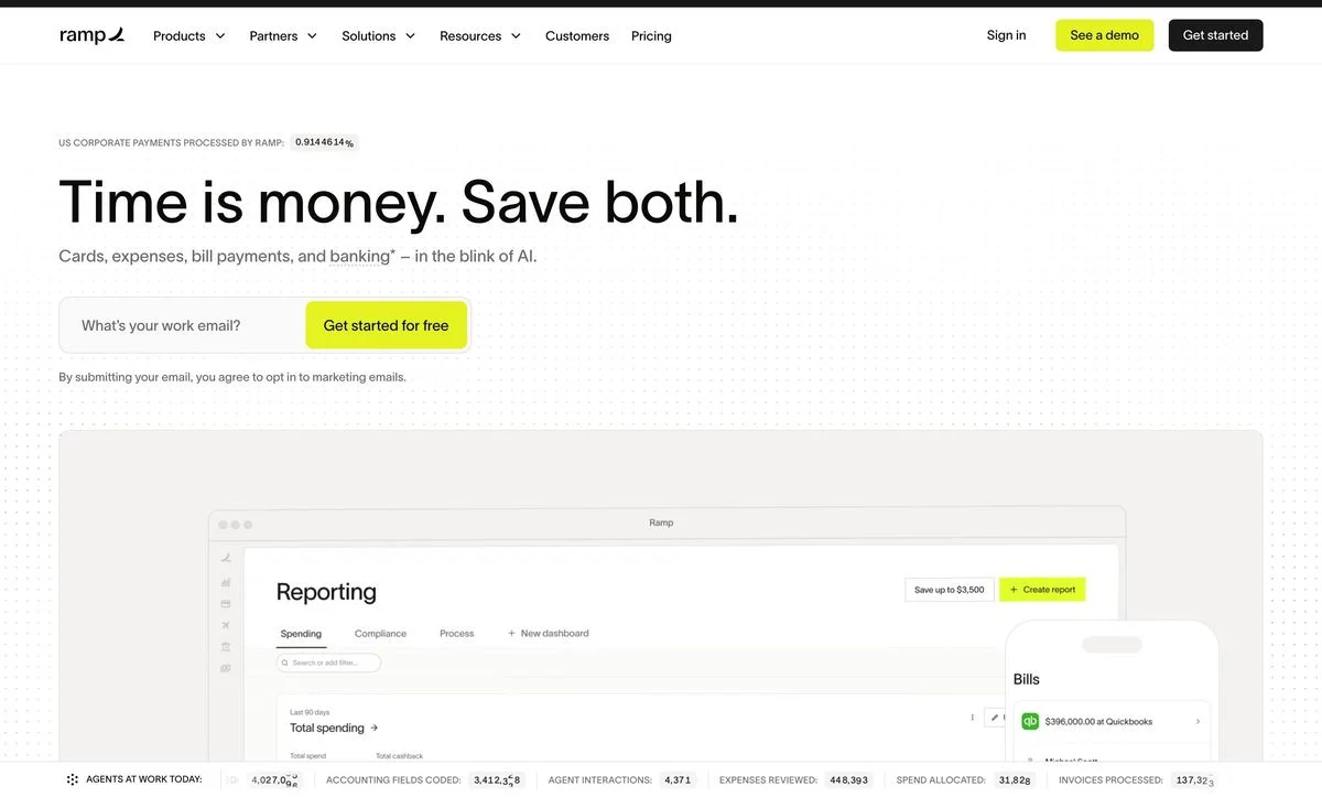
Example: Ramp homepage
The headline: “Time is money. Save both.”
The ask: A work email field and one button, “Get started for free”.
The mechanic: Along the bottom of the first screen runs a strip of live counters — agents at work today, accounting fields coded, agent interactions, expenses reviewed, spend allocated, invoices processed — with the numbers ticking up as you watch. It is proof that cannot be faked by a design team, and it does the job a logo wall usually does, without borrowing anyone else’s brand.
Steal this: If your product generates volume, put the counter on the homepage. A number that moves is more convincing than a number that sits.
2. Brex
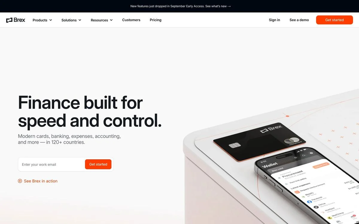
Example: Brex homepage
The headline: “Finance built for speed and control.”
The ask: Work email and “Get started”, with “See Brex in action” underneath as a softer second option.
The mechanic: The headline names both halves of a trade-off that finance buyers assume they have to make. Speed is what the startup wants; control is what the CFO wants. Promising both, in six words, is a committee-friendly sentence — the researcher can repeat it to the person who signs.
Steal this: Write the headline for the person who is not on the site. If it cannot be repeated accurately from memory, it is too long.
3. Plaid
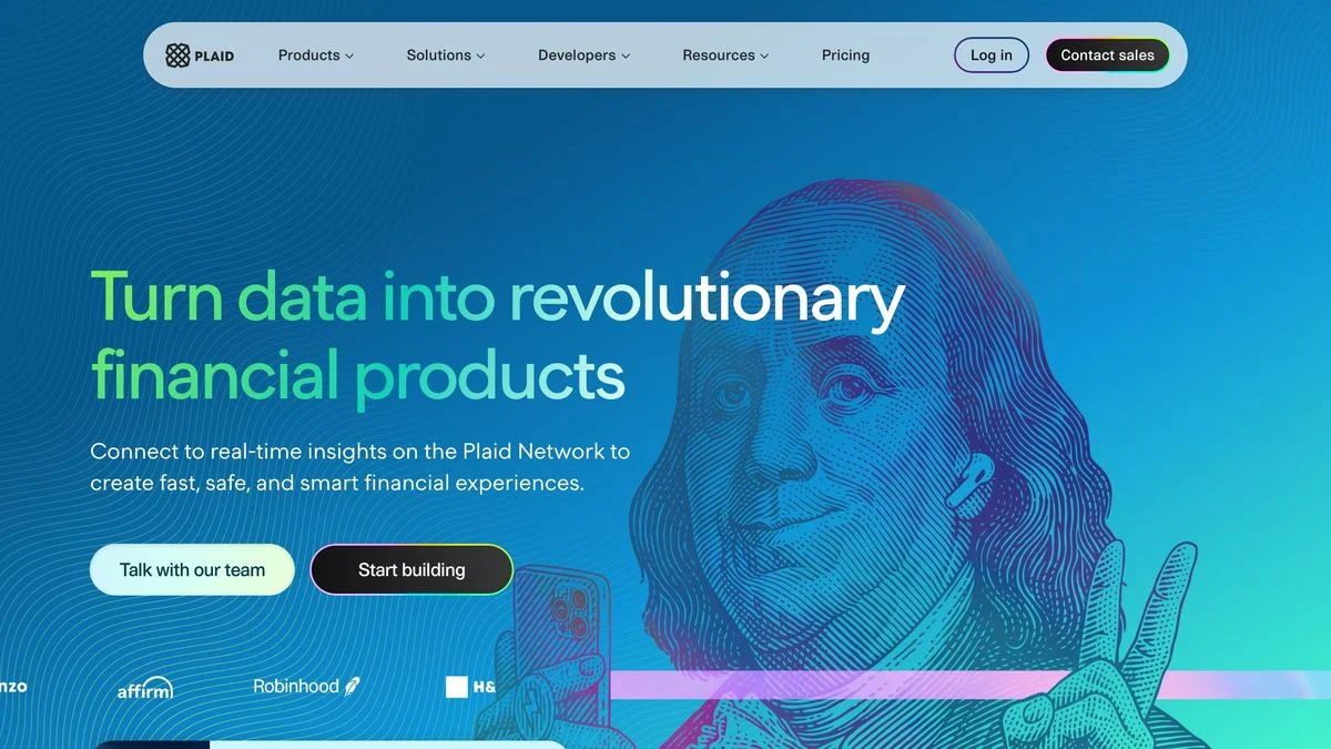
Example: Plaid homepage
The headline: “Turn data into revolutionary financial products.”
The ask: Two buttons of equal weight — “Talk with our team” and “Start building” — with a customer logo strip directly beneath.
The mechanic: Plaid sells to developers and to the executives who fund them, so the hero refuses to choose. Putting a sales path and a build path side by side is an admission that two different people arrive at the same URL, which is truer of B2B infrastructure than of almost anything else.
Steal this: When two audiences genuinely arrive at one page, give them two buttons rather than guessing. Only do it when they are different people, not different moods.
4. Modern Treasury
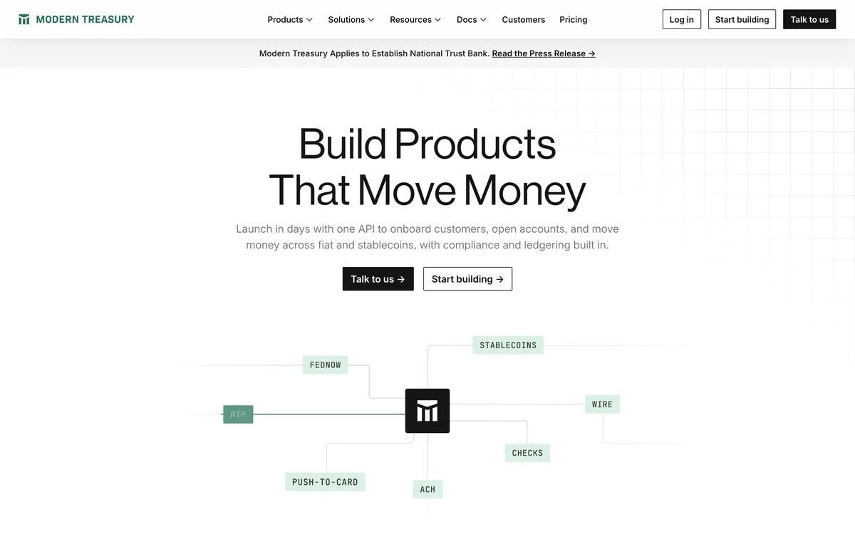
Example: Modern Treasury homepage
The headline: “Build Products That Move Money”
The ask: “Talk to us” and “Start building”, again as a pair.
The mechanic: Underneath sits a schematic — FedNow, RTP, ACH, wire, checks, push-to-card, stablecoins wired into a single hub. For a payments operations buyer, that diagram answers the only question that matters, which is whether the rails they already use are supported. It replaces a feature list with a picture you can scan in two seconds.
Steal this: If your buyer’s first question is “does it support X”, draw the answer. A diagram of what you connect to beats a paragraph about connectivity.
Go-to-market
5. Clay
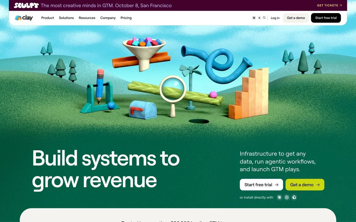
Example: Clay homepage
The headline: “Build systems to grow revenue”
The ask: “Start free trial” and “Get a demo”, plus a small line offering to install directly into the tools you already use.
The mechanic: The hero is dominated by a large, strange, hand-made illustration — a Rube Goldberg machine of funnels and balls. In a category where every competitor ships the same dark dashboard screenshot, refusing to show the product is the differentiator. The illustration also quietly argues the product’s thesis: that go-to-market is a machine you assemble.
Steal this: If every site in your category looks the same, the cheapest differentiation is an art direction nobody else is using. It only works if the picture argues for the product.
6. Gong
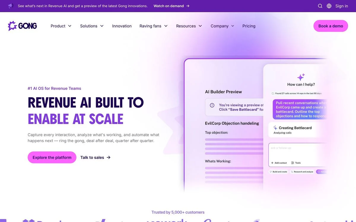
Example: Gong homepage
The headline: An eyebrow reading “#1 AI OS for Revenue Teams” above a hero line that rotates between claims.
The ask: “Talk to sales” as the primary, “Take a tour” as the secondary, and “Trusted by 5,000+ customers” under the fold line.
The mechanic: Gong names the buyer in four words before the headline even starts. “Revenue teams” is not a category Gong invented by accident — if you identify with the label, the rest of the page is for you, and if you do not, you leave early. That is a feature.
Steal this: Put the audience in an eyebrow above the headline. It costs three words and it disqualifies the wrong visitor before they cost you a sales call.
Build a hero around your buying process
Use Ploy to draft a B2B homepage that connects your headline, proof and next step in your own brand.
Operations
7. Deel
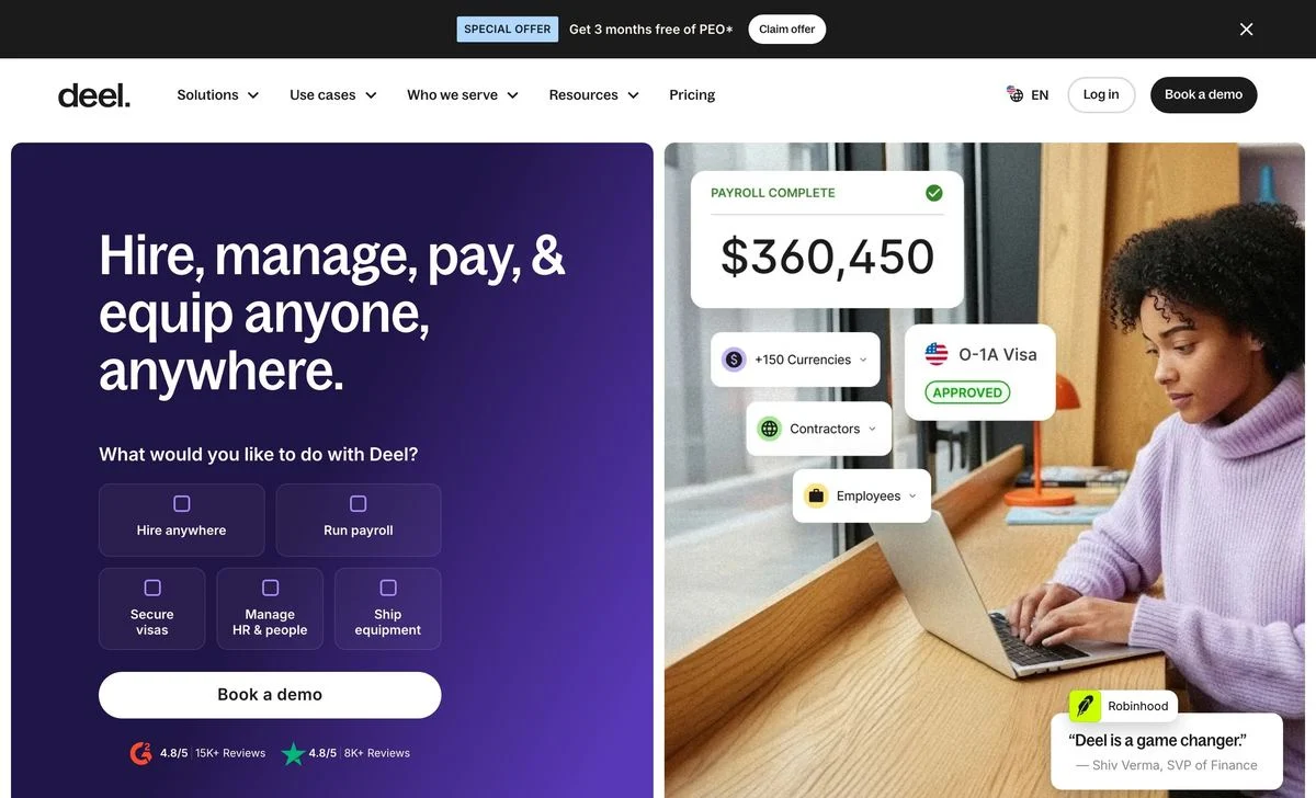
Example: Deel homepage
The headline: “Hire, manage, pay, & equip anyone, anywhere.”
The ask: A grid of checkboxes — “What would you like to do with Deel?” — offering hire anywhere, run payroll, secure visas, manage HR and people, ship equipment, above a single “Book a demo” button. Two review scores of 4.8 out of 5 sit beneath.
The mechanic: The chooser turns an overwhelming product into a self-selected one. Deel does five jobs, and listing all five in a headline would make the page unreadable; letting the visitor tick the one they came for routes the demo and tells the rep what to show.
Steal this: If your product does more than three jobs, ask the visitor which one they came for instead of describing all of them.
8. Navan
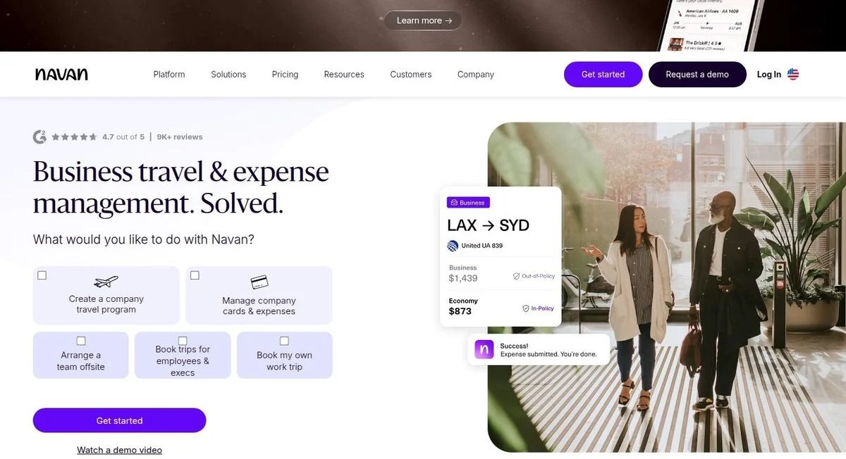
Example: Navan homepage
The headline: “Business travel & expense management. Solved.”
The ask: The same pattern as Deel — “What would you like to do with Navan?” with four checkboxes, then “Get started” and a quieter “Watch a demo video”. A 4.7 out of 5 rating from 9K+ reviews sits above the headline.
The mechanic: Two companies in unrelated categories independently arrived at the same hero. That is worth noticing: when a product serves several jobs for the same buyer, the self-select grid is becoming the default answer, because it converts the hero from a claim into a question.
Steal this: Put the rating above the headline, not below the fold. Navan’s sits in the first 40 pixels, where a sceptical visitor is still deciding whether to read.
9. Zip
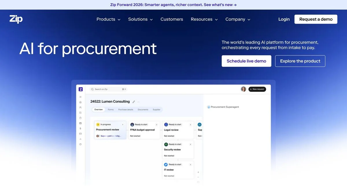
Example: Zip homepage
The headline: “AI for procurement”
The ask: “Schedule live demo” and “Explore the product”.
The mechanic: Three words. No adjectives, no promise, no outcome — just the category and the buyer. It works because procurement teams searching for software do not need to be sold on the concept, only told that this is the thing. The supporting line does the positioning work underneath.
Steal this: A three-word headline is only safe when your category is already understood. If people do not know they need the category, you need a sentence, not a label.
Trust and identity
10. Vanta
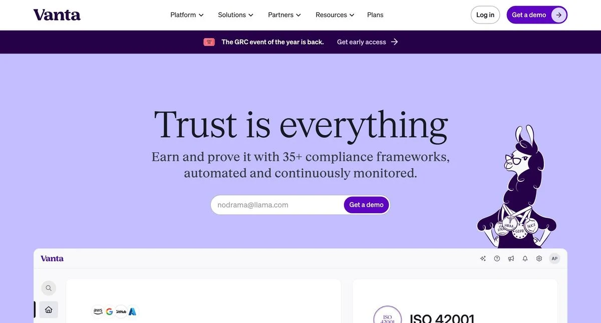
Example: Vanta homepage
The headline: “Trust is everything”
The ask: An email field and “Get a demo”.
The mechanic: The headline says nothing about compliance. The line underneath does the work — earn and prove it with 35+ compliance frameworks, automated and continuously monitored — and the number is the part a buyer repeats. Vanta can afford an abstract headline because it already owns the category; a newer entrant making the same move would simply be unclear.
Steal this: Abstract headlines are a privilege of incumbents. If you are not the default answer in your category, say what you do.
11. Middesk
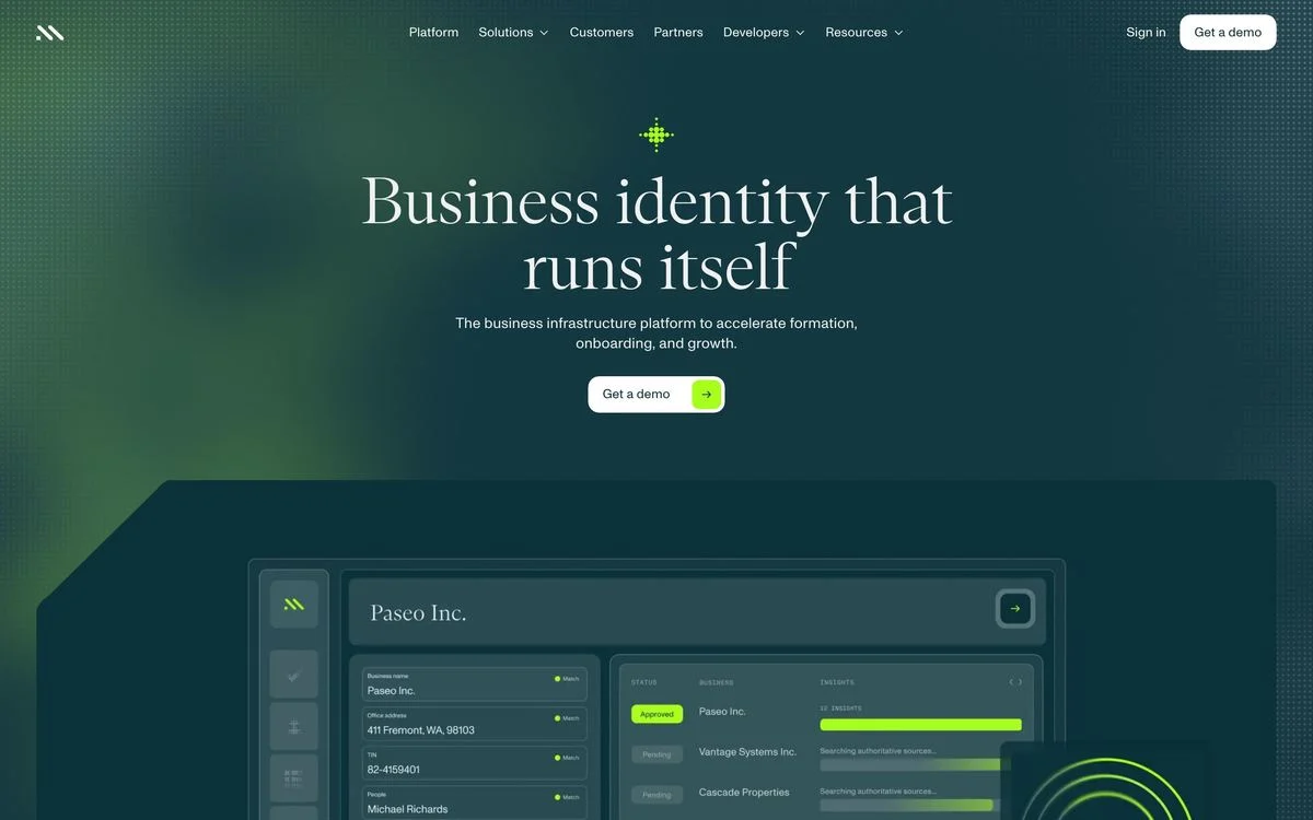
Example: Middesk homepage
The headline: “Business identity that runs itself”
The ask: One button. “Get a demo”, and nothing else.
The mechanic: This is the most disciplined hero in the set. One claim, one button, one screenshot, on a dark field with no competing links. For a product sold entirely through a sales conversation, every extra option in the hero is a leak.
Steal this: If every deal goes through a rep, delete the second CTA. A single button on a quiet page converts better than a choice nobody asked for.
12. Checkr
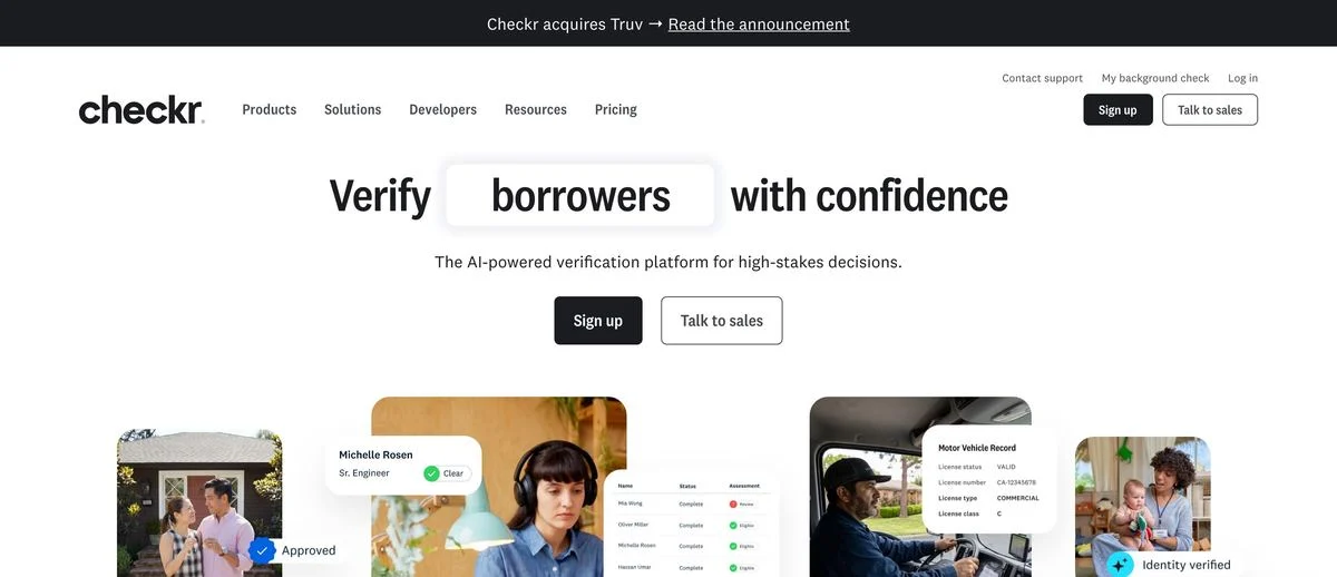
Example: Checkr homepage
The headline: “Verify ___ with confidence”, with the middle word rotating through the people a customer might screen.
The ask: “Sign up” and “Talk to sales”, side by side and equally weighted.
The mechanic: The rotating noun is doing segmentation inside a single sentence. Rather than building five audience pages, Checkr lets one headline speak to five buyers in turn, and the boxed word makes the swap feel deliberate rather than glitchy.
Steal this: A rotating word in the headline is a cheap substitute for audience pages — but box it, so it reads as a design decision and not a bug.
Data and AI
13. Databricks
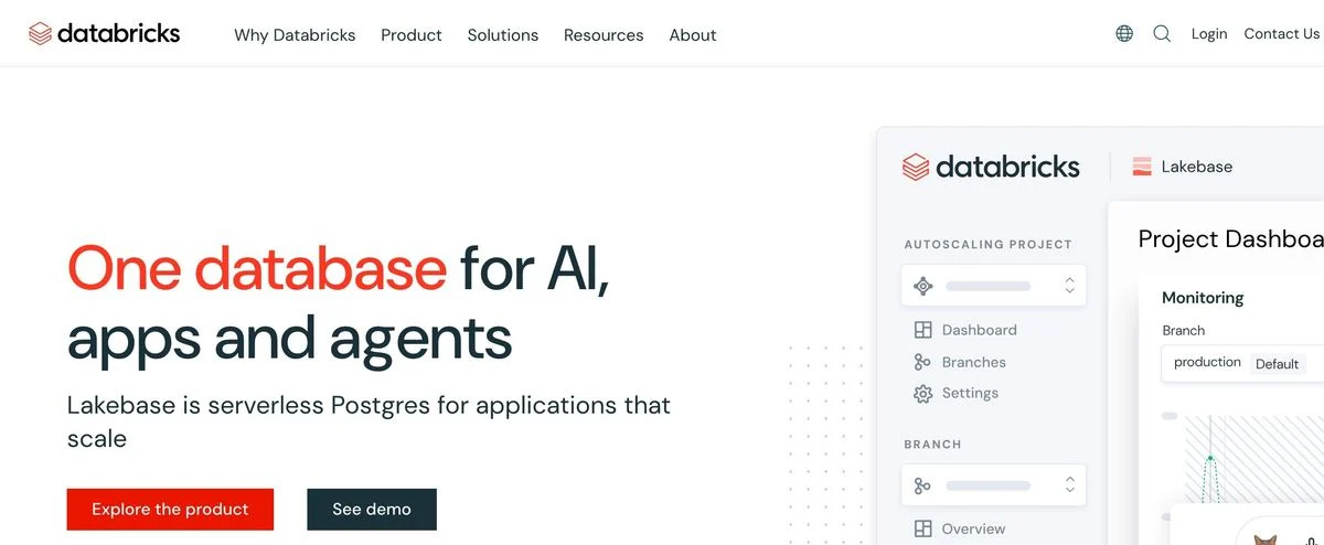
Example: Databricks homepage
The headline: “One database for AI, apps and agents”
The ask: “Explore the product” and “See demo”.
The mechanic: Both buttons are self-guided. Neither says “contact us”. For a technical buyer who will evaluate the product before they ever speak to a human, that is the honest sequence, and it matches how the purchase actually happens.
Steal this: Match the first click to the first real step in your sales process. If engineers evaluate before sales talks, the hero should offer evaluation.
14. Snowflake
Example: Snowflake homepage
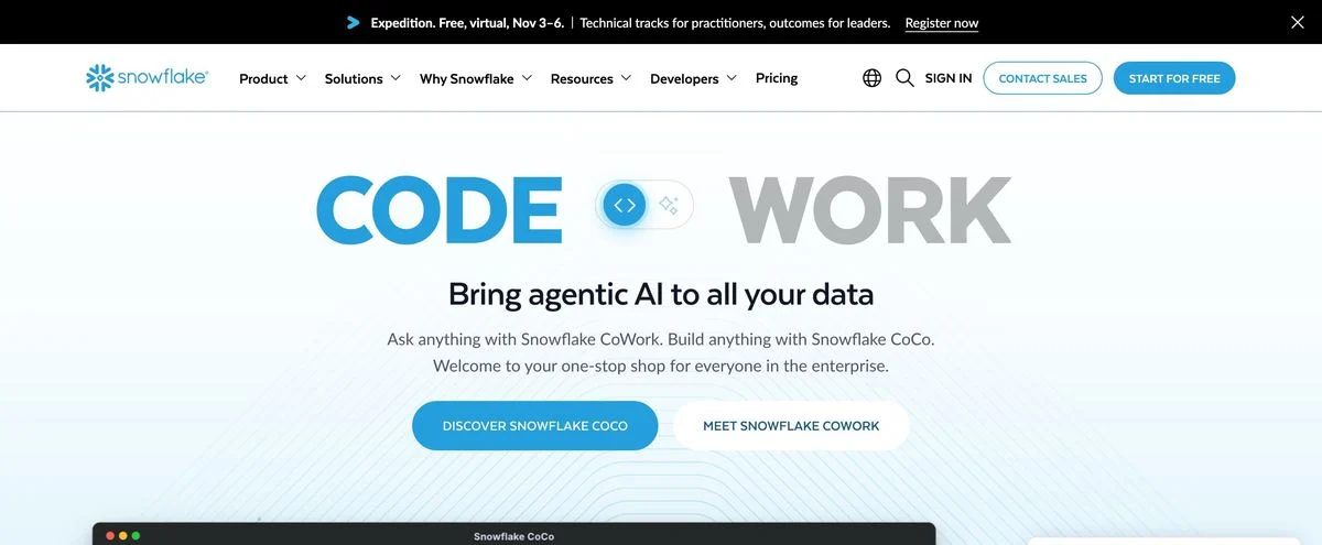
The headline: An animated two-word line that resolves between “CODE” and “WORK”, over “Bring agentic AI to all your data”.
The ask: Two product-named buttons in the hero, with “Contact sales” and “Start for free” held in the navigation.
The mechanic: The hero sells two named products rather than the platform. That only works at Snowflake’s scale, where the brand is the category and visitors arrive already knowing what the company does — the homepage can spend its first screen on what is new instead of on what it is.
Steal this: Only sell the launch on the homepage once the homepage no longer has to explain you.
15. Scale

Example: Scale homepage
The headline: “The world’s most important decisions need reliable AI systems.”
The ask: “Get Started”.
The mechanic: A full-bleed photograph of a patient in a medical scanner fills the screen, with the headline laid over it. There is no product, no interface and no logo wall. The page is making an argument about stakes rather than features, which is the right move when your buyer is a government or a defence contractor and the real objection is trust.
Steal this: When the objection is seriousness rather than capability, show the consequence of the work, not the software.
Vertical AI
16. Harvey
Example: Harvey homepage
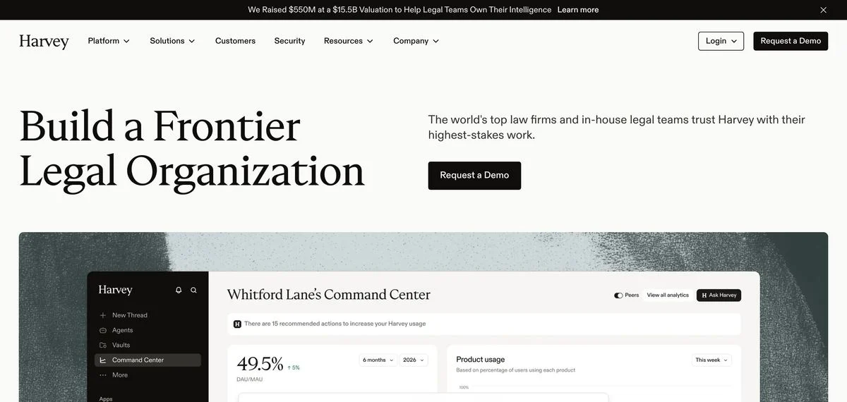
The headline: “Build a Frontier Legal Organization”
The ask: “Request a Demo”. One button.
The mechanic: The supporting line claims the world’s top law firms and in-house legal teams trust Harvey with their highest-stakes work, and the typography is a serif — unusual in AI, entirely normal in law. The site is dressed for the buyer’s industry rather than for its own.
Steal this: Borrow the visual conventions of the industry you sell into, not the one you work in.
17. Sierra
Example: Sierra homepage
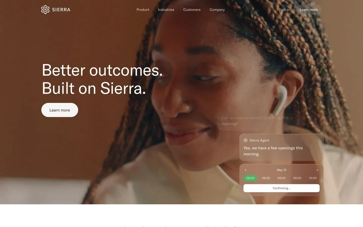
The headline: “Better outcomes. Built on Sierra.”
The ask: “Learn more” — the softest call to action in the set.
The mechanic: The hero is a video of a person mid-conversation with a transcript of the agent booking an appointment layered over it. Showing the product doing the job, on a real person’s face, is a stronger argument for a customer-service agent than any dashboard, because the thing being sold is an interaction.
Steal this: If your product talks to your customer’s customers, show that conversation happening rather than the console that configures it.
18. ServiceTitan
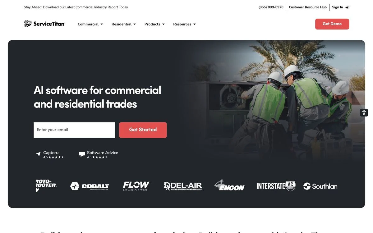
Example: ServiceTitan homepage
The headline: “AI software for commercial and residential trades”
The ask: An email field and “Get Started”, with two review-site ratings and a wall of contractor logos directly beneath.
The mechanic: This is the least fashionable page in the list and one of the most effective. It names the industry in the headline, puts the proof where a sceptical contractor will see it, and uses logos from real trade businesses rather than recognisable tech brands — which is what the buyer actually wants to see.
Steal this: Use customer logos your buyer recognises, not logos that impress your investors.
Marketplaces and logistics
19. Faire
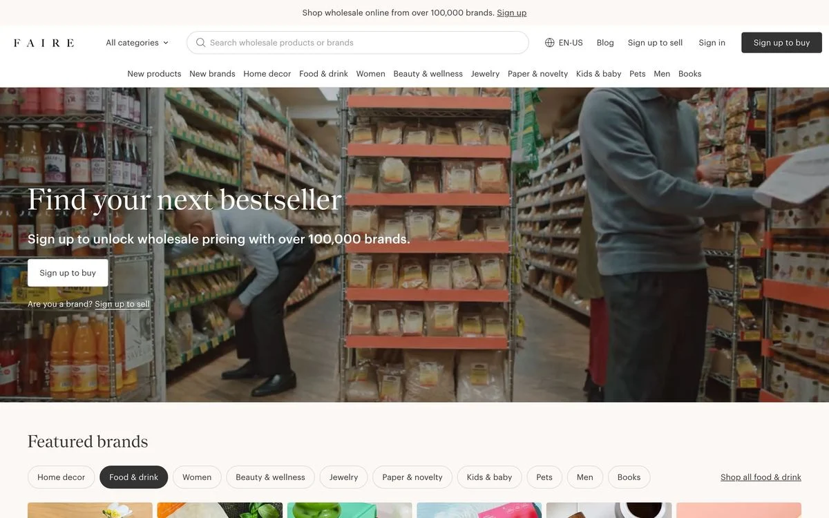
Example: Faire homepage
The headline: “Find your next bestseller”
The ask: “Sign up to buy”, with a quieter “Are you a brand? Sign up to sell” underneath.
The mechanic: A marketplace has two sides and only one hero, so Faire picks a side. The headline speaks to retailers, the photograph is a crowded independent shop, and sellers get a small secondary link. Choosing the harder-to-acquire side and demoting the other is the whole marketplace playbook in one screen.
Steal this: On a two-sided business, write the hero for the side you are short of and give the other side a link, not a column.
20. Flexport
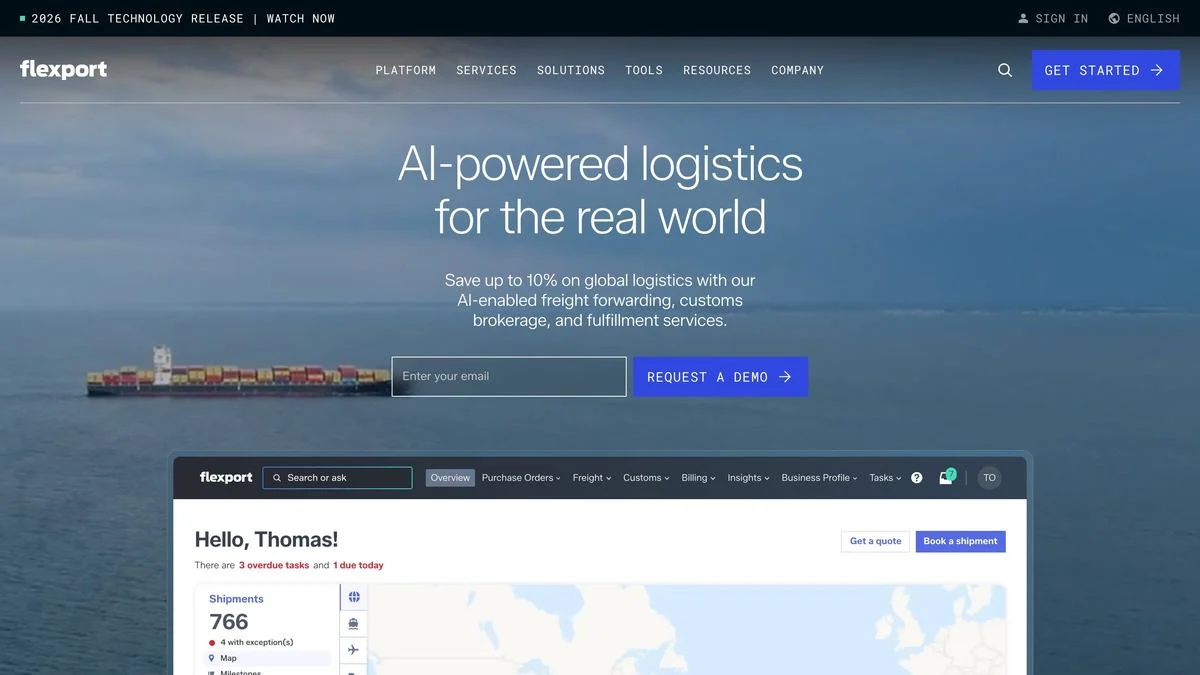
Example: Flexport homepage
The headline: “AI-powered logistics for the real world”
The ask: An email field and “Request a demo”.
The mechanic: The subhead leads with a number — save up to 10% on global logistics — and names the three services that deliver it. In freight, where buyers compare quotes rather than features, putting the saving in the first sentence is the only positioning that registers.
Steal this: If your category buys on price, put the number in the subhead. Everything else on the page is a footnote to it.
What the best B2B websites have in common
Five things show up again and again across the 20.
- They commit to one motion. The weakest heroes hedge between self-serve and sales; the strongest either hand you a product or hand you a person. Seven of the twenty offer both paths deliberately, and in every case the two paths serve two genuinely different buyers.
- They name the buyer, or they have earned the right not to. Zip says procurement. Gong says revenue teams. ServiceTitan says trades. The four that lead with an abstract line — Ramp, Vanta, Scale and Sierra — are all category leaders whose names already carry the meaning.
- Proof is specific, and it is early. Only seven show proof above the fold at all, but those that do use numbers with units: 4.8 out of 5 from 15,000 reviews, 5,000+ customers, 100,000 brands, a live counter.
- The picture argues. The best heroes do not decorate. Modern Treasury draws its rails, Scale shows the stakes, Sierra shows the conversation, Clay shows its thesis as a machine.
- They respect the forwarder. Short, repeatable headlines win, because the person reading is going to have to describe your product to someone who will never visit the page.
How to apply this to your own site
A short sequence that follows from the 20:
- Decide the motion first. Self-serve, sales, or two paths for two real audiences. Everything else on the page follows from that.
- Say what you do, unless you are the category. Be honest about which one you are.
- Move one proof point above the fold. A rating with a count, a customer number, or a live figure — not a vague trust badge.
- Make the hero image carry an argument. If it would work on a competitor’s site, it is decoration.
- Cut the second CTA if every deal goes through a rep.
Before you change anything, record where you are: our conversion benchmarks by industry give you the baseline, and A/B testing the hero will tell you whether the change paid for itself. If the whole site needs rethinking, start with a website redesign plan.
The practical constraint for most B2B teams is not taste, it is throughput: every hero variant needs a developer, so the page you launched with is the page you keep. With Ploy’s AI landing page builder, a new hero is a chat instruction against your existing brand components, published to your site or a subdomain without a ticket.
Put these B2B homepage lessons to work
Build a homepage variant in Ploy using your existing brand components and the proof your team can defend.