A website layout is not a look. It is a decision about what the visitor does first: read one sentence, pick between two things, scan a list, or start typing.
Most layout advice skips that part. You get a gallery of screenshots and a caption that says “clean and modern,” which tells you nothing about when to use it or what it costs you.
So this is 12 website layouts that real companies run today, each with the page it comes from, what the structure actually is, who it suits, and where it breaks. We loaded every one at desktop size and again on a phone, because the second view is where most layouts fall apart.
The short version: pick the layout from the job, not the mood board. A centred column sells one idea, a split sells a product you can photograph, a sidebar sells depth, and a table sells scale.
Build the layout that fits your brand in Ploy.
How we checked these layouts
We opened each page in a desktop browser at 1440 × 900 and then again at 390 × 844, the width of a current iPhone, on 28 September 2026. The structure described below is what is visible in those two views: how many columns, what is pinned, what collapses.
Two things worth knowing before the list. None of the 12 pages scrolled sideways on a phone, which is the most common layout bug on a real site. And every one of them runs its main content in a single column at 390px — the only things still sitting side by side are small paired controls: Asana’s two sign-in buttons, Mercury’s two hero buttons and a two-up tile row on Zapier.
The phone captures are of the first screen, so the notes below describe what is visible above the fold at 390px rather than the whole page.
Layout descriptions here come from reading the rendered pages, not from inspecting CSS. Sites change often, so check the live page before copying anything.
The 12 layouts
| Group | Layouts |
|---|---|
| Hero layouts | Centred single column, centred with inline signup, split hero, full-bleed media, hero above the product |
| Content layouts | Three-column row, mixed-size card grid, tabbed panel |
| Browse layouts | Directory with filters, sidebar and content, dense index |
| Choice layouts | Two-up split offer |
Hero layouts
1. The centred single column
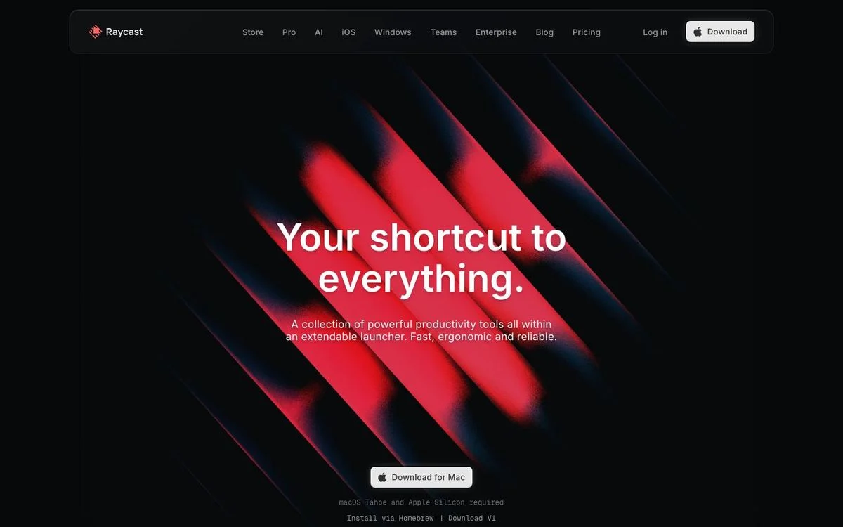
Example: Raycast homepage
What it is: One column, centred, with everything stacked: headline, one line of support copy, one button. The artwork sits behind the text rather than beside it, so there is no second column to balance.
Best for: A product with one clear action, or a page where the headline is the whole argument. It is also the fastest layout to build well, because there is nothing to align.
Watch out for: It gives you nowhere to put a second message. If you have two audiences or two products, this layout will push one of them below the fold.
On mobile: Unchanged. A centred column is already a phone layout, which is why it survives the transition better than anything else here.
Steal this: If your page has one job, resist the second column. Centre it and make the headline carry the weight.
2. Centred, with the signup inside the hero
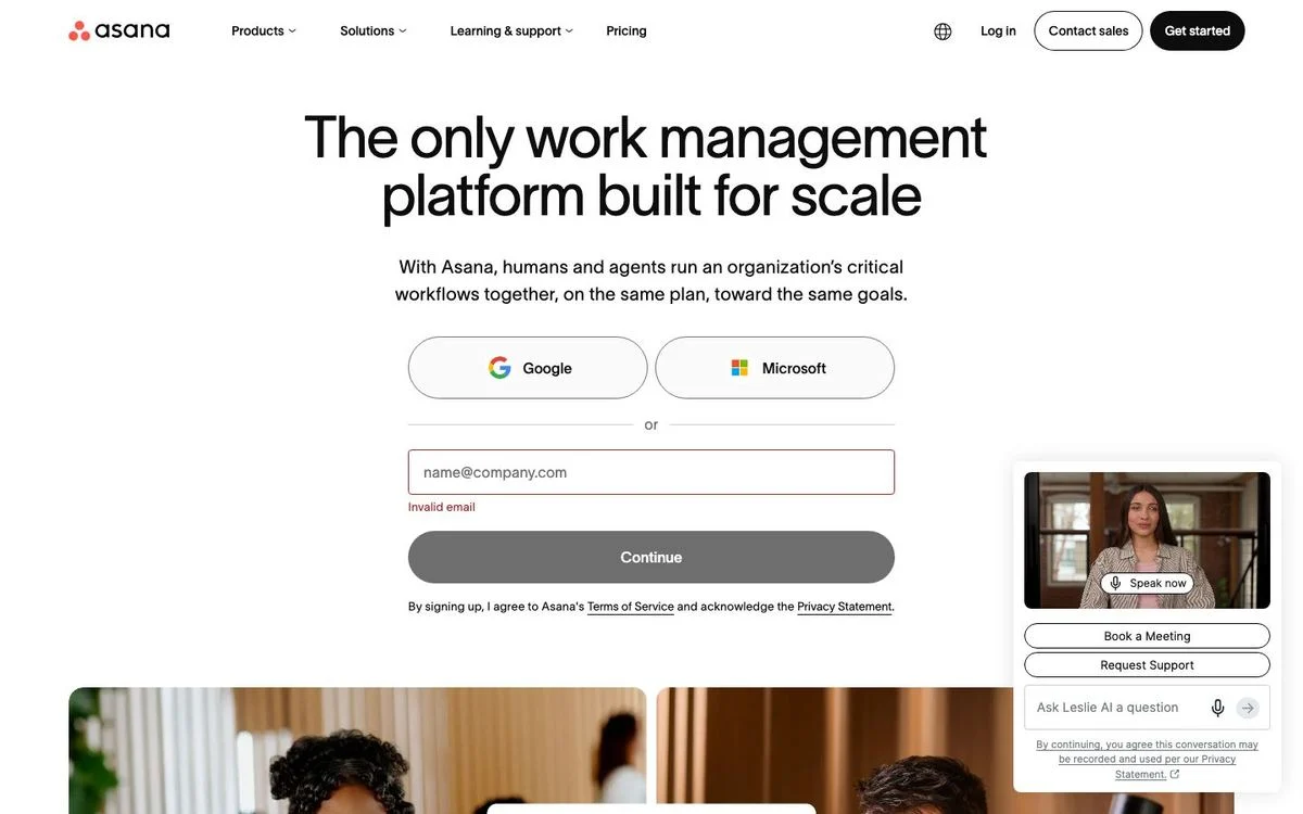
Example: Asana product page
What it is: The same centred column, but the form replaces the button. Headline, one line of copy, two single sign-on buttons, a divider, an email field, then the submit button, all stacked down the middle.
Best for: Product-led signup, where the fastest path is to get someone into the product rather than onto a second page.
Watch out for: The form is long for a hero. Every extra field pushes the supporting proof further down, and on this layout there is nothing else above the fold to reassure a hesitant visitor.
On mobile: The column stacks in the same order. The two sign-on buttons stay side by side while the email field and the submit button run full width, so the fastest option is still the first thing under the copy.
Steal this: If signup is one click through Google or Microsoft, put it in the hero. A form only belongs there when it is genuinely shorter than the page it would replace.
3. The split hero
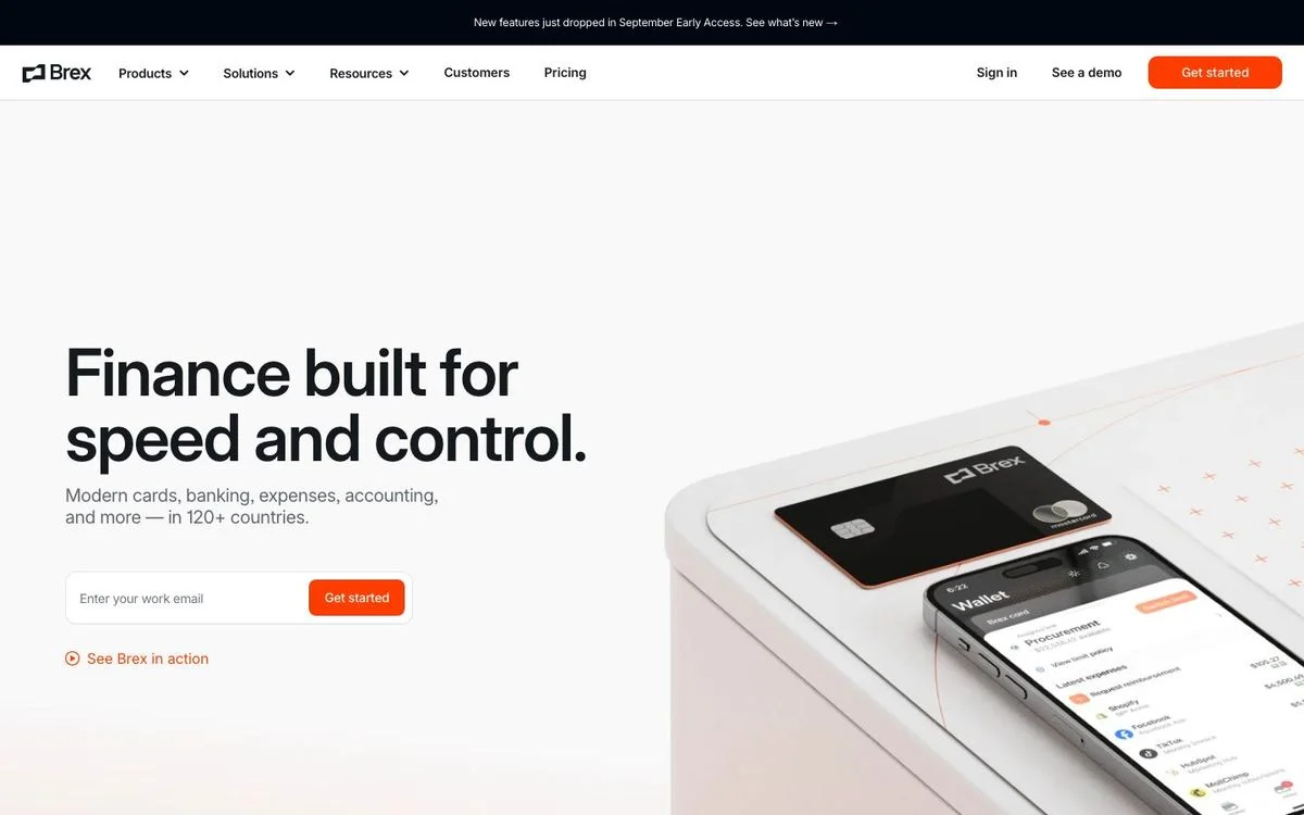
Example: Brex homepage
What it is: Two columns. Copy, email field and button on the left; a photograph of the product on the right. The two halves sit on the same baseline, and the image bleeds off the right edge of the screen.
Best for: Products you can photograph or screenshot. The image earns its space by showing the thing, and the left column stays narrow enough to read.
Watch out for: The classic failure is a stock photo on the right that proves nothing. If the image would work equally well on a competitor’s page, the split is wasted.
On mobile: The columns stack, copy first, image second. That order matters: the image should never come first on a phone, because it pushes the headline off the screen.
Steal this: Use a split hero only when the right-hand side shows your actual product. Otherwise use a centred column.
4. The full-bleed media hero
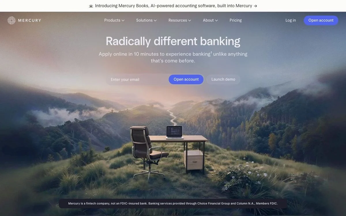
Example: Mercury homepage
What it is: One photograph fills the entire viewport. The text sits centred on top of it, with the email field and buttons directly beneath, and a small legal line at the base of the image.
Best for: Brands where the feeling is the differentiator, and for categories where everyone else ships a product screenshot.
Watch out for: Text over an image is a contrast problem that never fully goes away. It also costs you the most weight on the page, and the copy has nowhere to expand.
On mobile: The photograph still fills the screen and the text stays on top of it, but the crop is much tighter — the centre of a wide landscape is not the centre of a phone screen, so check that the part you care about survives.
Steal this: If you use a full-bleed image, put a subtle dark overlay behind the text block rather than relying on the photo staying dark in the right places.
5. Hero above the product

Example: Linear homepage
What it is: Headline and one line of copy at the top left, then a product screenshot running nearly the full width of the page underneath. Two rows, not two columns.
Best for: Software where the interface is the sell. Giving the screenshot the full width makes it legible, which a side-by-side split usually cannot.
Watch out for: A wide screenshot has to be readable at 1440px and still make sense cropped on a phone. Blurry or shrunken product shots are worse than none.
On mobile: The screenshot crops to its left edge rather than scaling down to an unreadable thumbnail, and the page stays one column.
Steal this: If your product screenshot is your best asset, give it the whole width and put the copy above it.
See our Linear breakdown for the rest of the page.
Content layouts
6. The three-column row
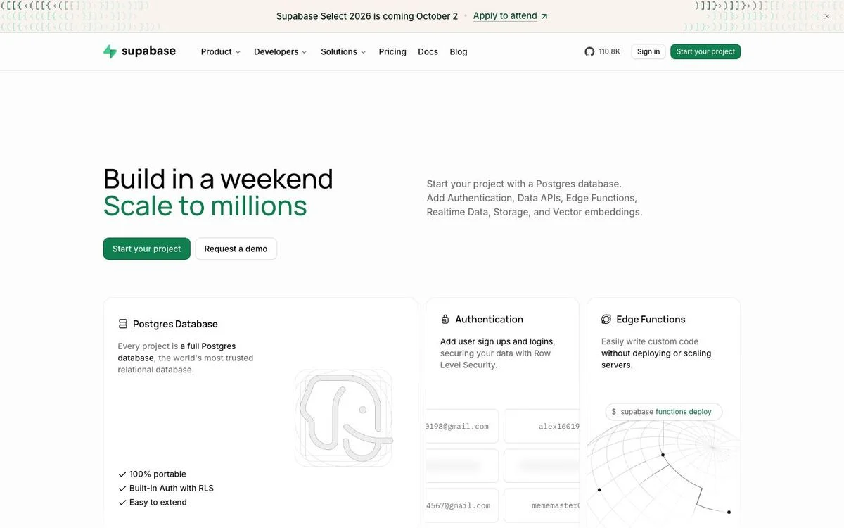
Example: Supabase homepage
What it is: Three equal cards in a row under the hero, each with a small diagram, a bolded name and two lines of copy. The row reads left to right as a set.
Best for: Three things of equal weight: three products, three jobs, three steps. Three is the highest number people can compare without scrolling back.
Watch out for: Four columns at this width squeezes the text, and five turns into wallpaper. If you have six features, this is the wrong layout.
On mobile: The three cards stack. Put the most important one first, because on a phone this becomes a ranked list whether you intended it or not.
Steal this: Cap feature rows at three across. If you have more, group them or move them into tabs.
7. The mixed-size card grid
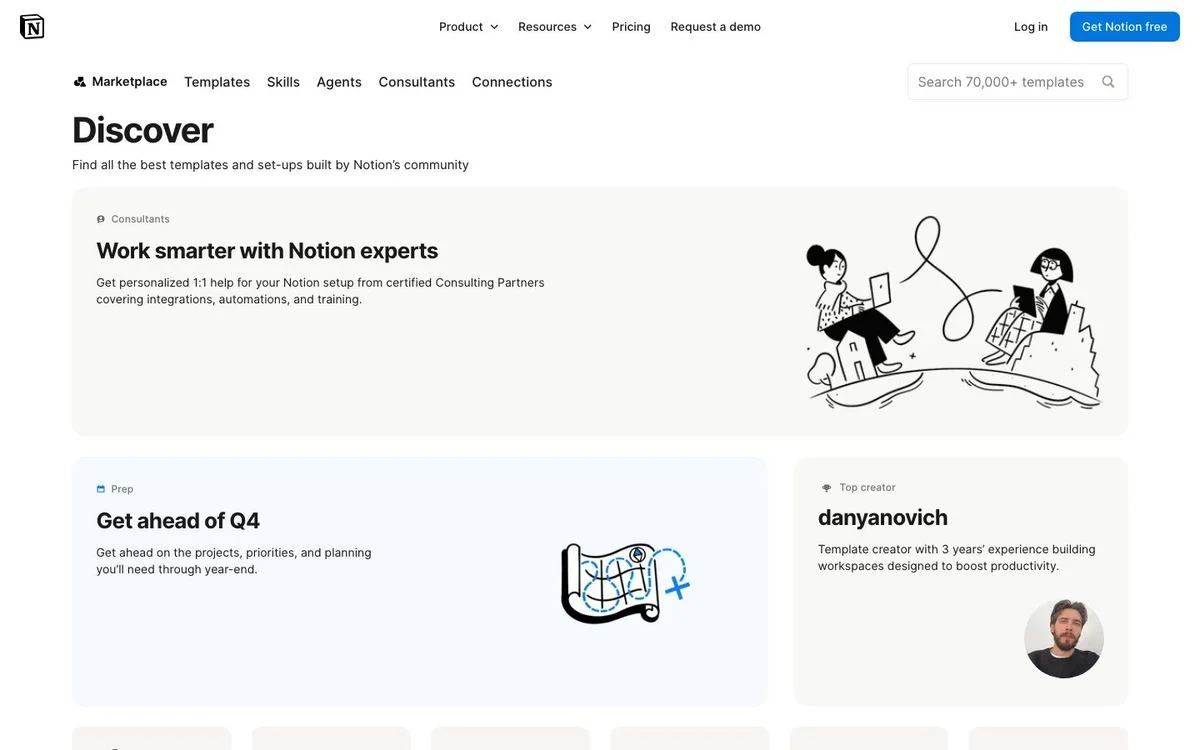
Example: Notion templates
What it is: A grid where the cells are deliberately unequal. One wide card spans the row, then two narrower cards sit beneath it, each carrying its own illustration or portrait. The variation in size is what signals importance.
Best for: Browsing pages with a mixed catalogue, where some items deserve more room than others: templates, collections, resource hubs.
Watch out for: Unequal cells only read as intentional when the sizes follow a rule. Random sizes look like a bug, and every card still needs to work as a link target.
On mobile: Everything becomes one column, and the size hierarchy disappears, so the running order has to carry the priority instead.
Steal this: Use two sizes, not five. One feature cell per row, standard cells everywhere else.
8. The tabbed panel
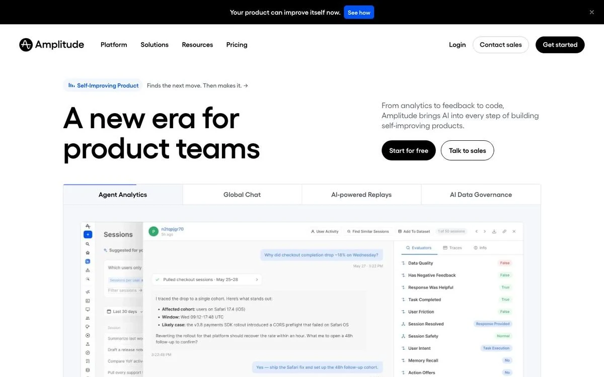
Example: Amplitude homepage
What it is: One panel under the hero with a row of tabs across the top. Each tab swaps the screenshot and the copy beneath it without moving the page.
Best for: Platforms with several distinct capabilities, where a visitor only cares about one. Tabs put four stories in the space of one.
Watch out for: Anything behind a tab is invisible to a skimmer, and search engines see it but readers may not. Never hide your primary message in tab two.
On mobile: The hero stacks and its two buttons stay side by side. Below that, a tab row has to become a scrolling strip, and any tab past the third is easy to miss — so order them by demand, not by org chart.
Steal this: Tabs are for parallel options a visitor chooses between, never for a sequence they should read in order.
Browse layouts
9. The directory with filters
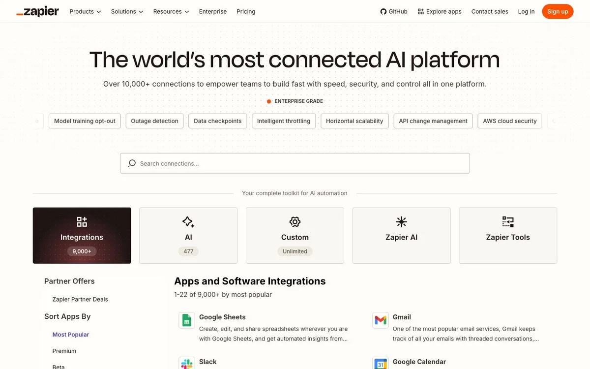
Example: Zapier apps directory
What it is: A narrow filter column on the left and a wide results area on the right, with a search field above the results and category tiles across the top. Two columns, heavily unequal.
Best for: Large catalogues where people arrive knowing roughly what they want: integrations, templates, apps, partners. These pages also tend to earn a lot of long-tail search traffic.
Watch out for: A filter column is only worth the space if the catalogue is genuinely large. With 20 items, filters are friction.
On mobile: The filter column disappears. Filters become chips in a horizontal scroll row plus a dropdown, and the results stack, with a two-up tile row kept near the top.
Steal this: If your directory earns search traffic, give each item a real page rather than a modal, and let the filters map to those pages. Our guide to programmatic landing pages covers how that scales.
10. Sidebar and content
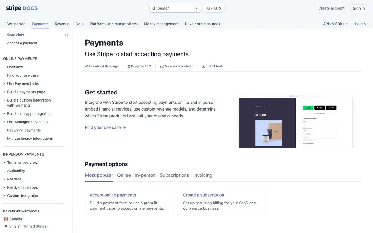
Example: Stripe payments docs
What it is: A persistent navigation column on the left, the article in the middle, and a row of sub-tabs inside the content for the next level down. The sidebar stays put while the content scrolls.
Best for: Documentation, help centres, knowledge bases, anything a reader arrives at from search and then needs to move around inside.
Watch out for: The sidebar is a commitment. It has to be maintained, and if it grows past two levels most readers stop using it and go back to search.
On mobile: The sidebar collapses into a single menu control at the top of the page, the content becomes one column, and the in-page tabs turn into a horizontal scroll strip.
Steal this: Keep the sidebar to two levels, and make sure every page in it works as a search landing page on its own, because most readers will never see the level above it.
Our Stripe breakdown covers how their marketing pages are built.
11. The dense index
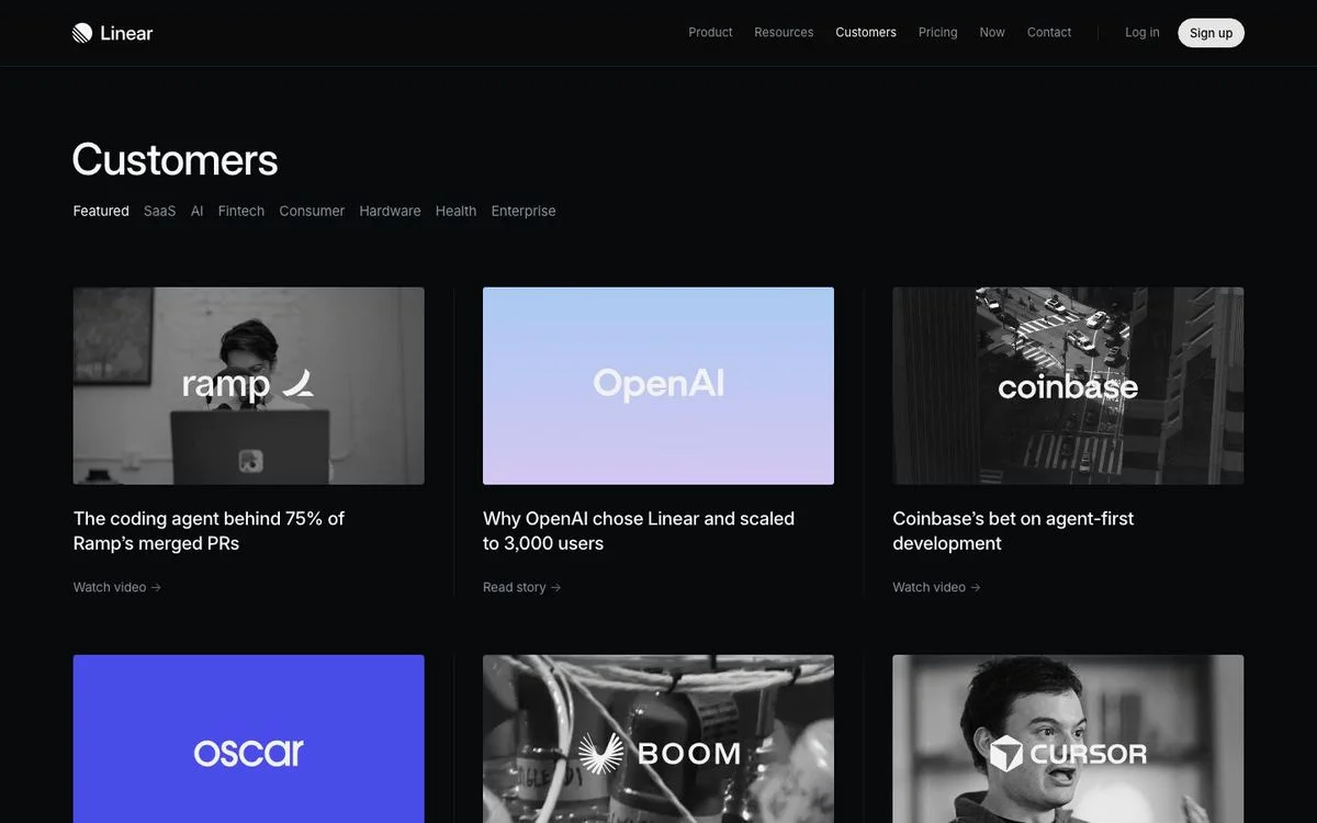
Example: Linear customers page
What it is: A table. Each row is one item with columns for the name, a one-line summary, a category and a size, and a link at the end. Around twenty rows fit in a screen with no cards, no images and no padding to speak of.
Best for: Readers who are scanning for one specific thing: a customer like them, a release, an integration. A table shows three times as many options per screen as a card grid.
Watch out for: Tables look austere, and they need real columns to justify themselves. If the only column is a title, use a list.
On mobile: This is the layout that changes most. The table becomes a card list with images, and the columns become a horizontal filter row above it.
Steal this: Once a listing page passes about 15 items, switch from cards to a table with sortable columns. Scanning beats browsing at that point.
Choice layouts
12. The two-up split offer
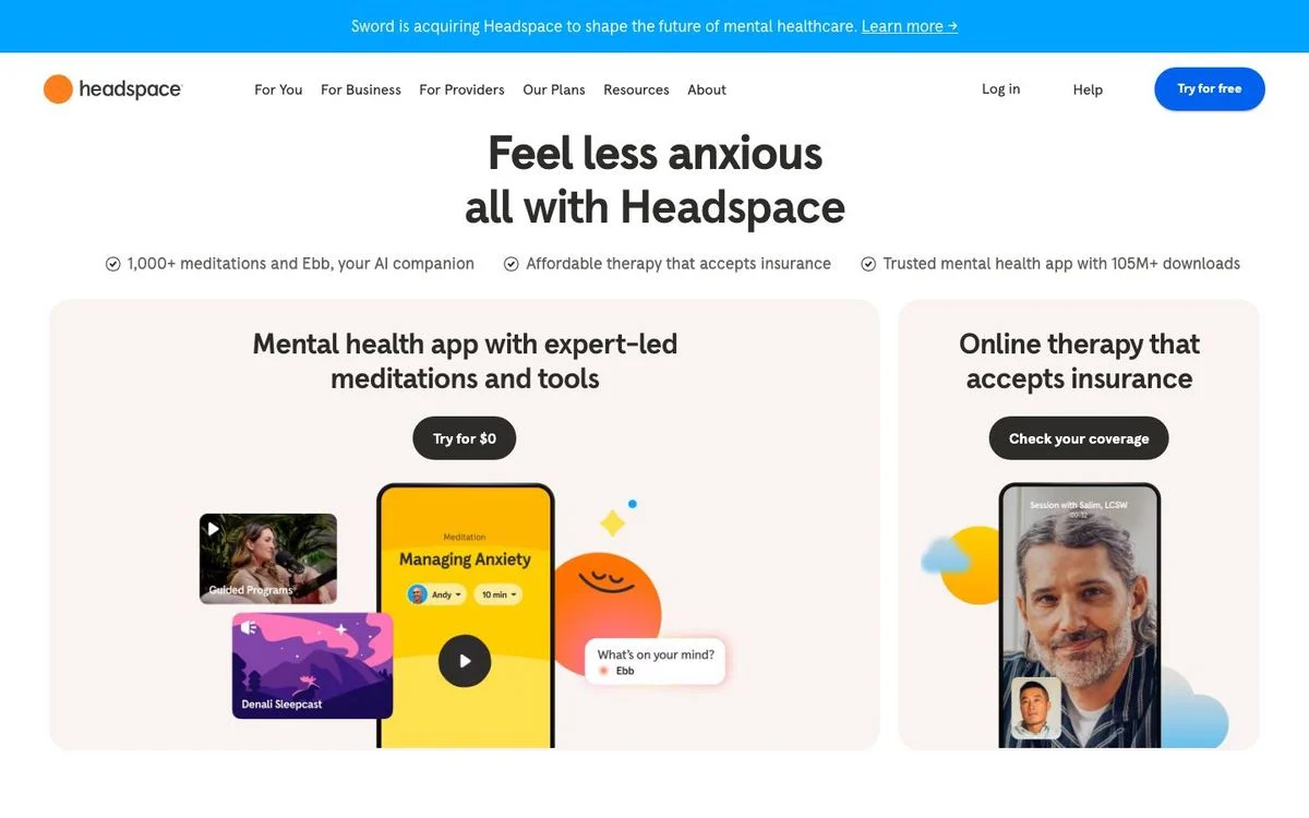
Example: Headspace homepage
What it is: Below a short centred hero, two equal cards side by side, each with its own image, its own description and its own button with a different verb.
Best for: Two genuinely different products or audiences, where sending everyone down one path would lose half of them.
Watch out for: Two equal cards means no recommendation. If most visitors should pick one of them, mark it rather than presenting a tie.
On mobile: The cards stack, so the top card gets most of the attention. Decide which audience deserves that position.
Steal this: Give each card its own call to action verb. Matching the verb to the offer beats “Learn more” twice.
How to choose a website layout
Work from the job, not the screenshot:
- One message, one action: centred single column.
- Signup is the action: centred with the form in the hero.
- The product photographs well: split hero.
- The brand feeling is the differentiator: full-bleed media.
- The interface is the sell: hero above a wide product shot.
- Three things of equal weight: three-column row.
- A mixed catalogue: card grid with two cell sizes.
- Several capabilities, one reader: tabbed panel.
- A large catalogue people search: directory with filters.
- Depth people navigate: sidebar and content.
- Many similar items to compare: dense index.
- Two real audiences: two-up split.
Then check three things before you ship: the page does not scroll sideways at 390px, the stacking order puts the important half first, and anything hidden behind a tab is not your main message.
Put the right layout to work
Build an on-brand page around the way your visitors read, compare, and choose.
Website layout best practices
These hold across all 12:
- Decide the mobile order deliberately. Every one of these layouts collapses to a single column, which turns your columns into a ranked list. Pick the rank rather than inheriting it from the HTML.
- Never let the page scroll sideways. None of the 12 pages do. It is the fastest way to look broken.
- Keep the reading column narrow. Every text block on these pages sits in a contained column even when the background runs edge to edge.
- Match the number of columns to the number of ideas. Three across for three ideas. If you have six, group them or tab them.
- Put one action per screen. Layouts fail when two buttons of equal weight compete in the same space.
Before you change a layout, record where you are: our conversion benchmarks by industry give you the baseline, and running A/B tests on the new arrangement will tell you whether the change earned its keep.
How to build these layouts
Layouts are the part of a redesign that usually needs a developer, which is why most sites keep whichever one they launched with.
- Pick the layout from the list above that matches the job your page has to do.
- Write the content first. A layout decision is easy once you know whether you have one message or three.
- Build it in your brand. With Ploy’s AI landing page builder, each of these arrangements is a chat instruction against your existing components, published to your site or a subdomain without a dev ticket.
- Check it at 390px before you publish, then test the stacking order.
If the whole site needs rethinking rather than one page, start with a website redesign plan.
Frequently asked questions
What is the layout of a website?
The layout is how a page arranges its parts: how many columns it uses, what is fixed while you scroll, what sits above the fold, and how everything re-stacks on a phone. It is a structural decision, separate from colours and typography, and it is usually what determines whether a visitor finds the thing they came for.
What are the 7 types of layout?
Most lists name single column, split screen, grid, sidebar, F-pattern, Z-pattern and magazine or asymmetrical. Those are useful labels, but they describe shapes rather than jobs. The 12 above are grouped by what the page has to achieve, which is a more practical way to choose: hero layouts for a first impression, content layouts for explaining, browse layouts for finding, and choice layouts for deciding.
What is the best layout design for a website?
There isn’t one. For a single product with one action, a centred column converts better than anything more elaborate. For a catalogue, a directory with filters beats a beautiful hero. The best layout is the one that matches the job of the page and still works when it collapses to one column.
Should a website have a sidebar?
Only for depth people navigate, like documentation or a large help centre. Three of the 12 layouts here use a persistent side column, and all three are browse or reference pages. On a marketing page, a sidebar usually just narrows the reading column.
How do website layouts change on mobile?
They collapse to one column. Across the 12 pages we checked, every one ran its main content in a single column at 390px, with only small paired controls left side by side. The documentation sidebar became a single menu control, in-page tabs became a horizontal scroll strip, and the dense table became a card list. None of the pages scrolled sideways.
What are the golden rules of a good website layout?
Five that hold up: one job per page, one primary action per screen, a reading column narrow enough to read comfortably, a deliberate stacking order on mobile, and nothing important hidden behind a tab or a carousel.
Build your next page on your brand
Turn the layout you chose into a page that fits your site and its content.